Amazon.ca: THESE are real Wii U boxes

Original on the left, and "Remastered" on the right.


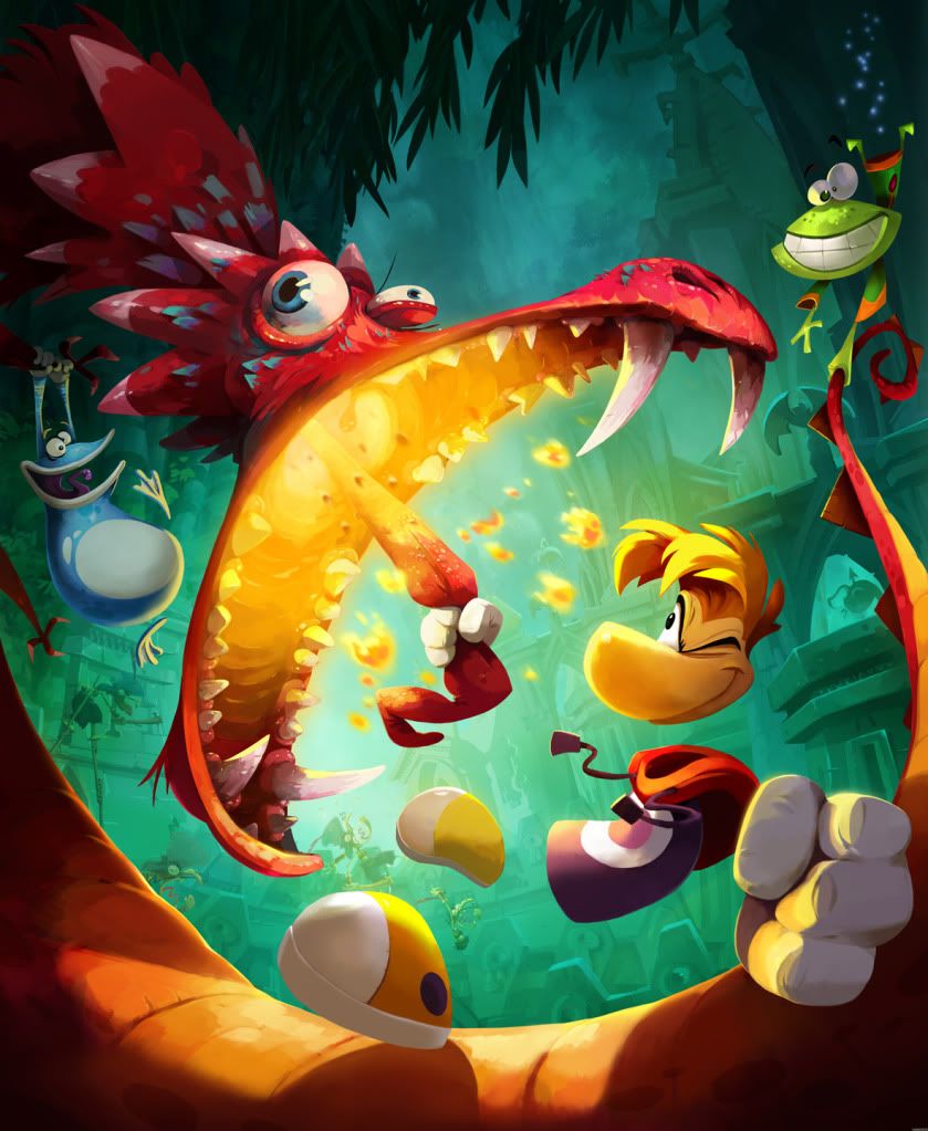
As you can see, the actual picture that's used in the cover is slightly different than the one on the actual cover. Slightly different depth of field angle, and take a look at his hand. Not to mention the contrast. I did edit the levels a bit, but too lazy to get it to look exactly like the one on the cover, since entire colors are replaced (his bow, for instance).

Damn, didn't notice. O_o

Not a bad job, but the banner is jagged, but thanks for trying it. :)
 
So I tried to make a mock up for New Super Mario Bros. U.

Regular box art:
noonlyon.png


Only on Wii U box art:
 
Final remastered version. No more, I promise (unless you ask nicely
and give me moneys
). I also uploaded the logo, which is uncompressed, and contains no artifacts, for those of you who want to make your own covers.

EDIT: Added a cover with Nintendo Network logo, again, for those of you who want to make your own covers.

 
Blue cases with a "tad" of yellow are FANTANSTIC!!

It's feels so FRESH! Aww yeah!

All this Nintendo DS, 3DS and WII case-white is starting to get really boring.

Nintendo wants to have the Wii U games stand out on the shelves - and I welcome the new design and color-sheme of the new cases very much!
 
I'm starting to like it less when used on more games.

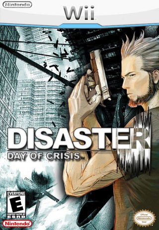
I think some of the mockups that fans did back in 2006 would have been better choices for the Wii U instead of that:

3074-disaster-day-of-crisis.jpg


That one is from July 2006.
 
I'm enjoying this boxes, yeaah the yellow kind break the whole thing, but I'm getting used to it.

If the yellow turns out to be gold shine, it will be spot on actually.

Oh man! Yeah, what if it turns out that stripe is a gold foil stamp on every game? Suddenly, Wii U is like the "deluxe" version of everything!
 
It's definitely growing on me. I think it looks great on anything that isn't a very dark and black box art (BLOPS 2)

Also, ZOMBIU: Rated E for Everyone
 
Wow, so much negativity! Maybe the yellow is superfluous, but at the same time, I don't think it's obtrusive enough to elicit such hatred and aversion. I'm obviously speaking only for myself here, but when I look at the boxarts, the thin yellow strip doesn't draw my focus in the least. It's just there.
 
Yeah, the yellow is still not working for me with any of those game covers. I really hope Nintendo changes it to white or just takes it out so only the blue tab remains. Well, there's goes the chance of that happening ...

Update: Ubisoft rep officially confirms Wii U boxart is real to GameTrailers.

"Why yes, the Wii U box art you sent is legit; in fact, it’s too legit to quit." - Ubisoft PR rep, Mr. Michael Beadle

http://www.gametrailers.com/side-mission/24589/our-first-looks-at-wii-u-box-art
 
Posted this in the WiiU thread but nobody cared :(

You know what the box art logo reminds me of? Nintendo's YouTube thumbnails.

default.jpg


default.jpg


default.jpg


Baby Blue has been Wii's color for it's last few years, and I expect it to be WiiU's for the years ahead. It's a nice color :)
 
Yeah, the yellow is still not working for me with any of those game covers. I really hope Nintendo changes it to white or just takes it out so only the blue tab remains. Well, there's goes the chance of that happening ...

Update: Ubisoft rep officially confirms Wii U boxart is real to GameTrailers.


http://www.gametrailers.com/side-mission/24589/our-first-looks-at-wii-u-box-art

FFS. Nintendo, you have let me down this time.. There better be some amazing pantone colours hiding behind these rgb-versions.
 
Yellow line looks weird but otherwise pretty good. I have to give the benefit of the doubt, seeing as how stuff like the Halo 3 360 looks terrible in pictures but awesome in person.
 
Top Bottom