ReeceIsAlive
Neo Member
So it appears my flickr account is absolutely fucked, i'm completely unable to login. Just as I fixed my ds so that I could use neos trainer... *sigh*


So it appears my flickr account is absolutely fucked, i'm completely unable to login. Just as I fixed my ds so that I could use neos trainer... *sigh*
http://i.picpar.com/FE7.png[IMG][IMG]http://i.picpar.com/GE7.png[IMG]
[IMG]http://i.picpar.com/EE7.png[IMG][/QUOTE]
Nice shots, but it's only two per post.
I'm no magic user, but I really love how that sword looks.
They're panoramas. I think.
You're right - and thanks for the compendium entry on AC4, it's extremely helpful.
Two more panoramas, vertical this time.
So it appears my flickr account is absolutely fucked, i'm completely unable to login. Just as I fixed my ds so that I could use neos trainer... *sigh*
What version are you running? Now that I've learned AOB scan, I want to convert my scripts over to that so they work in any version. Right now, my time of day and sun position scripts are not AOB... but they're very useful to have.
I have made some screenshots using the sweetfx screenshot function at 3200 x 1800px. Surprisingly (to me) they are not downsampled but saved in this native set res.
There are people here that take screenshots like that right? How do you resize them? I just cant rescale them to 1920 x 1080px without creating a ton of aliasing so it seems to be the best to blur the images before scaling them down to avoid that. Is there a simpler solution?
Trying to make this game presentable.


Using the in game AA +FXAA downsampled produces very excellent results. Alternatively if you have a powerful Nvidia GPU you can force SGSSAA as well
http://www.forum-3dcenter.org/vbulletin/showpost.php?p=9852622&postcount=4544
I really like all of these! The triptych with the two color palettes works really well together.
I really like all of these! The triptych with the two color palettes works really well together.
On a side note...I was heading to Flickr to add these to my favorites but can't seem to login with Google. Since when does Flickr hate Google?


This is one of the most stunning pictures I've seen of Dark Souls.
Just the way that it is centered, and the character is just staring up into the painting.
Wonderful shot. It belongs in a museum!


These shots are in-game AA and downsampled; I can't run SGSSAA without bringing the frame rate to a crawl and I'm trying to have fun with this playthrough (I'm one of five people worldwide who would use the words "enjoy" and "Operation Raccoon City" in a positive way). Thanks for the advice though, I always like finding out how to use Nvidia Inspector better

I don't think the head is where it's supposed to be.

Ahahaha.
What a hilariously overpriced plugin. Unless it does a seriously exact job of matching jpg compression.
Triptych baked in.

Game only hits 1200p but the Dell UI says 2560*1440 so i'm guessing Nvidia's upscaling is at work.

Flickr has been acting funky lately. I feel like they're trying to do some kind of maintenance or upgrade and its having side effects. I was having issues all day yesterday getting onto my main page.

http://farm3.staticflickr.com/2855/12318223564_091f65a274_o.jpg[IMG][/QUOTE]
I like this shot a lot. The stance with the sword is great.
It's weird that I have maybe 100 hours in Dishonored and I've seen this screenshot maybe 15 times now from other people, but I have no clue where that is.
Blade of Dunwall DLC, optional Mission
How do you get the correct image links from Flickr, if i may ask? You also use Flickr, right?
I like that one. Not sure why. The car just looks nice and clean. Gotta love that tilt feature.
Also, don't make me reinstall that game. I've enough on my plate. Though I didn't get to play around with time of day enough...
It's SO overpriced! Especially when you could just...save it as a low quality JPEG and get perfect results.
That second one looks really cool. It feels like an actual promo shot.
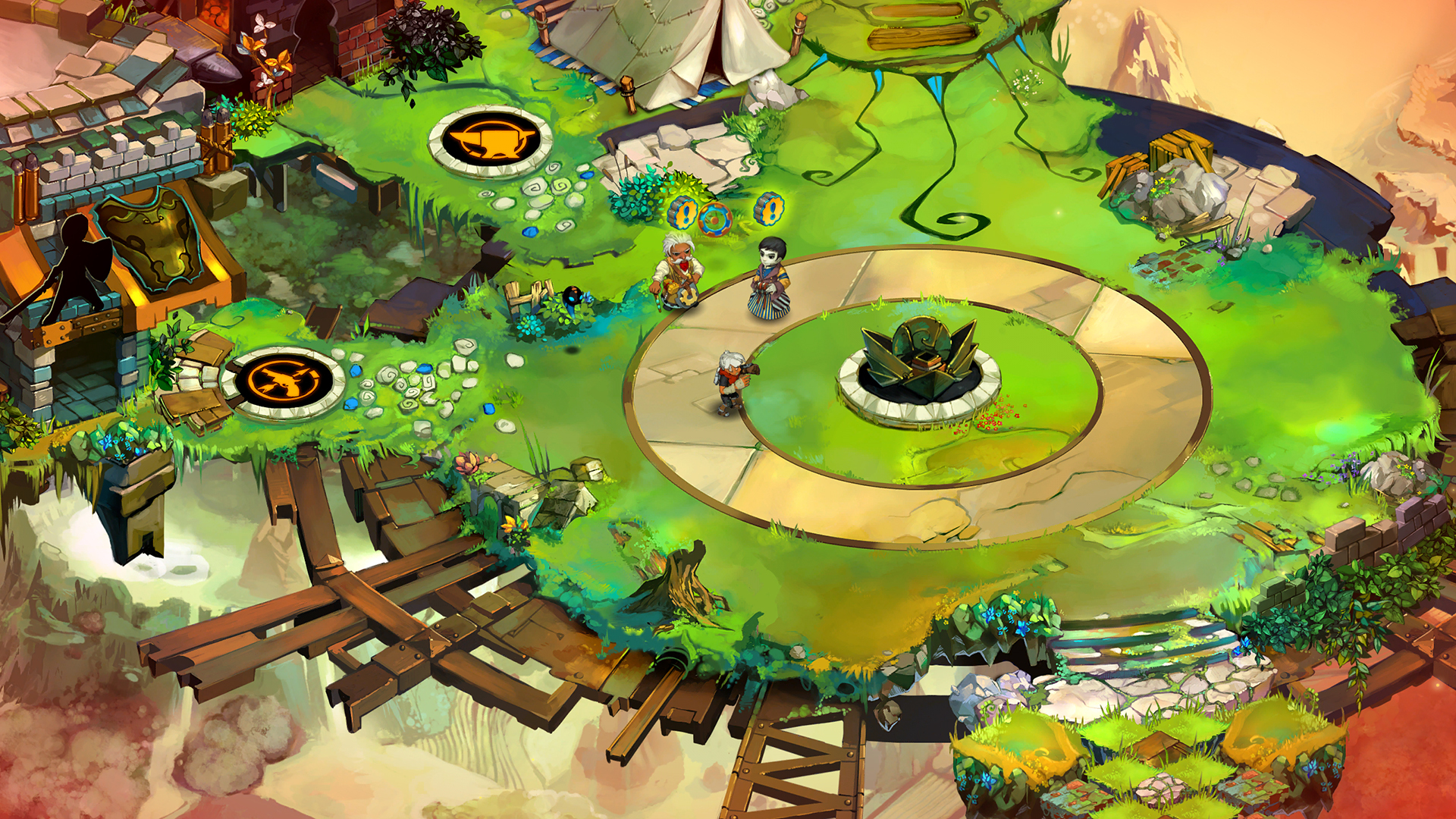
Damn, is that really what bastion looked like? I don't remember it like that at all but it looks so vibrant and bright.
