-
Hey Guest. Check out your NeoGAF Wrapped 2025 results here!
You are using an out of date browser. It may not display this or other websites correctly.
You should upgrade or use an alternative browser.
You should upgrade or use an alternative browser.
Arts & Farts
- Thread starter Dreweyes
- Start date

Love this.
Thanks
")

And for anyone here that doesn't visit polycount, Vertex was recently released. Might want to give it a read, it's quite fantastic.

I'm not sure how much it applies to any of you, but I'm kind of pissed about how I've been treated by ConceptArt.orf / TheArtDepartment.com / Massive Black.
If you're not familiar, they used to offer downloadable, educational art videos. Anyway, A few months ago I had a harddrive crash and emailed them several times, trying to get the videos I lost back. I just emailed them again a couple of days ago and just got an email back basically saying "We do not offer downloadable videos any longer, good luck trying to find them."
I've been a member at CA.org for years (probably close to 11-12 years. They've constantly been on a downward spiral as the owner has been trying to monetize the website and make money from "students". I've always gotten an "evil CEO" type of vibe from the way he presents himself and now I'm not surprised that I've been screwed over by them. It seems he has no regard for customer service as long as he is making money. Despite the fact that I've been trying to get them to reply for months, when the videos were available.
I'd caution anyone from visiting these sites and especially giving them money for any of their "services".
Raging Spaniard
If they are Dutch, upright and breathing they are more racist than your favorite player
Heres some character concept art for a basketball RPG Im working on

Prax, do you mind if I give you some painting crits? (or through PM?) Theres some stuff Id like to cover, I think it would help you out.
Prax, do you mind if I give you some painting crits? (or through PM?) Theres some stuff Id like to cover, I think it would help you out.
Prax
Member
Prax, do you mind if I give you some painting crits? (or through PM?) Theres some stuff Id like to cover, I think it would help you out.
Sure! I am at a point where I have a lot of fear about trying to be more professional or just aimless hobbyist forever. Ambivalent artist feelings!
Although, I have a feeling it's going to go something like...
Raging: Prax, why is it that every time you shade, all you use is purples?
Prax: Because I am soooo laaazzzzzyyyy.. D:
Raging: Do you consider doing more anatomy studies? Materials or lighting studies? Basic colour theory? For example.. *show something easy to incorporate*
Prax: SooOOOoo.. lazy.. ;___; *4 hours colouring something poorly anyway because that's how I roll*
BUT YEAH, GO AHEAD! I think critiques in general can be helpful for everyone to read. And provision of links/examples are always useful. Even if I don't learn or absorb everything right away, I think bits and pieces at least sink in over time.
Aaaaand.. something else I did a few days ago.. a greens palette instead~! (it may have benefited from adding purples or bright oranges as a compliment--and I feel like I should have used a nice saturated turquoise more liberally.. but oh well.. )

Raging Spaniard
If they are Dutch, upright and breathing they are more racist than your favorite player
Lol no its nothing like that. Your work would look a lot better with a consistent lightsource. I used to have the same problem because I was afraid of putting something in the shade and losing detail, but when I got over that it really enhanced the overall work.
I'll do some paintovers of your work so you see what I mean.
I'll do some paintovers of your work so you see what I mean.
Quote for size.
Something im working on now.

a character im making in 3d

Prax
Member
Lol no its nothing like that. Your work would look a lot better with a consistent lightsource. I used to have the same problem because I was afraid of putting something in the shade and losing detail, but when I got over that it really enhanced the overall work.
I'll do some paintovers of your work so you see what I mean.
Ooh, yeah, I know I have light source problems--or not really fiddling around with more dramatic or contrasting light/shadow. Same thing with poses I guess. I don't have a lot of confidence with where everything goes (what is lighting and what is foreshortening and what is perspective..!), so I tend to just pick poses and lighting that shows as much as possible in a grounded.. kind of static way?
I also feel that my default global lighting is just from the upper left corner, but also that I tend to think of my lightsource in "parallels" instead of radiating from one point. Does it make a difference? I assume it does, but only at close distances?

Looking forward to the paintovers!
The Take Out Bandit
Member
Making an honest run at being a commercial illustrator.
The most money I'll have made off of drawing.
The most volume I've had to produce.
First deadline is soon and I need to crank out 30 more B&W illustrations by the end of this weekend. D:
So long as I don't fuck this up, it could be the best part time job I've had.
The most money I'll have made off of drawing.
The most volume I've had to produce.
First deadline is soon and I need to crank out 30 more B&W illustrations by the end of this weekend. D:
So long as I don't fuck this up, it could be the best part time job I've had.
Raging Spaniard
If they are Dutch, upright and breathing they are more racist than your favorite player
Ooh, yeah, I know I have light source problems--or not really fiddling around with more dramatic or contrasting light/shadow. Same thing with poses I guess. I don't have a lot of confidence with where everything goes (what is lighting and what is foreshortening and what is perspective..!), so I tend to just pick poses and lighting that shows as much as possible in a grounded.. kind of static way?
I also feel that my default global lighting is just from the upper left corner, but also that I tend to think of my lightsource in "parallels" instead of radiating from one point. Does it make a difference? I assume it does, but only at close distances?
Looking forward to the paintovers!
Having one consistent lightsource makes a huuuge difference, even if the angle is "boring" you have inconsistencies in places you dont think you do and you should elongate the casted shadows, right now all the shadows are very small throughout your work. Ill get to the PO's sometime this weekend
Anyways, heres another basketball concept piece.

Raging Spaniard
If they are Dutch, upright and breathing they are more racist than your favorite player
Kay Prax, so this is kind of quick and sloppy, but I think the point is represented well enough
So lets look at this piece, its nice enough but eventhough most of the lighting is kind of on point on the left side, it starts moving in odd directions towards the bottom and then on the right side it goes wherever it wants
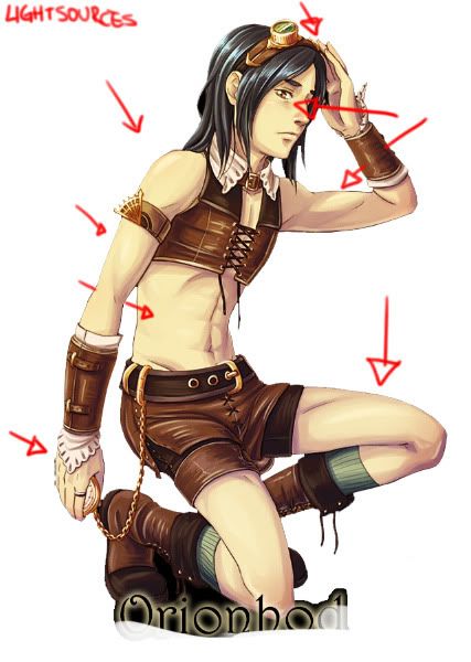
Another thing is that I would recommend you focus the lights on one specific area rather than the whole left side, so for instance, I think it looks kind of flat that you make the guys hand as bright as his upper arm. One good rule of thumb is to make the bottom of the character a little darker than the top.
So the colors youre picking for your shadows are actually great choices. I love using blues and purples for shadows, artists should avoid white and black for highlights and shadows as much as possible. What I did here was just extend the shadows a whole lot more, making the areas in shade have their own color palette almost, this way your art gains a lot more depth and you dont lose any detail really, if anything it makes you really appreciate the areas that you want people to look at.
For the hair, I added a couple strands that go off in the opposite direction of the hair, that usually helps a lot in making it feel more alive and lifelike, plus that way you can have them make a cast shadow somewhere else (like his face in his example) Always think of how one area of the body can make a dramatic cast shadow on another, here I made his arm cast a big one on the side of his body.
I made your highlights a little chunkier, brighter and added them in places where it would help (his arm brace, for instance) It looks like youre afraid to go with big, bold lines but its actually not something you should fear, go crazy and embrace it! Until you feel confident you can just do it on a separate layer
I hope this helps, I tried not to infuse it to much with my own style, but rather wanted to bring out more out of the art youve already done. You seem to keep super busy because your art dumps are pretty sizable, so you should be able to improve pretty fast if you take this advice to heart. Good luck and let me know if you need anything.
So lets look at this piece, its nice enough but eventhough most of the lighting is kind of on point on the left side, it starts moving in odd directions towards the bottom and then on the right side it goes wherever it wants
Another thing is that I would recommend you focus the lights on one specific area rather than the whole left side, so for instance, I think it looks kind of flat that you make the guys hand as bright as his upper arm. One good rule of thumb is to make the bottom of the character a little darker than the top.
So the colors youre picking for your shadows are actually great choices. I love using blues and purples for shadows, artists should avoid white and black for highlights and shadows as much as possible. What I did here was just extend the shadows a whole lot more, making the areas in shade have their own color palette almost, this way your art gains a lot more depth and you dont lose any detail really, if anything it makes you really appreciate the areas that you want people to look at.
For the hair, I added a couple strands that go off in the opposite direction of the hair, that usually helps a lot in making it feel more alive and lifelike, plus that way you can have them make a cast shadow somewhere else (like his face in his example) Always think of how one area of the body can make a dramatic cast shadow on another, here I made his arm cast a big one on the side of his body.
I made your highlights a little chunkier, brighter and added them in places where it would help (his arm brace, for instance) It looks like youre afraid to go with big, bold lines but its actually not something you should fear, go crazy and embrace it! Until you feel confident you can just do it on a separate layer
I hope this helps, I tried not to infuse it to much with my own style, but rather wanted to bring out more out of the art youve already done. You seem to keep super busy because your art dumps are pretty sizable, so you should be able to improve pretty fast if you take this advice to heart. Good luck and let me know if you need anything.
Prax
Member
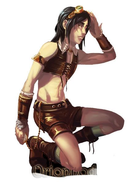
Ah, thanks!!Kay Prax, so this is kind of quick and sloppy, but I think the point is represented well enough
So lets look at this piece, its nice enough but eventhough most of the lighting is kind of on point on the left side, it starts moving in odd directions towards the bottom and then on the right side it goes wherever it wants
Heh, I get what you're saying!
Self-shadowing (I think that's what it's called in videogame stuff anyway) is really confusing to me. For example, it took extra brain power just for me to have the guy cast SOME shadow over his own left shoulder (even though it isn't even enough). And I think at the time, I realized that he should be self-shadowing his leg, but that seemed to require extra thinking or work too, so I didn't attempt to do it.
I usually just take the easy and inconsistent (or overly consistent) route for my work!
Maybe it doesn't help that I also start getting ansty around the 3-4 hour mark and then start shading things randomly with little thought as possible (as happened here). I still need to work on my patience with my stuff since it's rare for me to spend 4+ hours on one piece or going multiple days. I think a lot of my time is spent on fiddling with line art details or filling in holes in the flats that don't truly matter since I'm a tiny bit ocd in the beginning about that stuff, but then run out of steam at the end and stop caring.
Another thing is that I would recommend you focus the lights on one specific area rather than the whole left side, so for instance, I think it looks kind of flat that you make the guys hand as bright as his upper arm. One good rule of thumb is to make the bottom of the character a little darker than the top.
As for making my light source more specific instead of "parallel lighting"/general lighting like I usually do, that is a good point. It has kind of been recent (and by recent, I guess that means the last couple of years or so) that I've even been overlaying a coloured gradient over my stuff to subtly vary the colour from upper left to bottom right. I haven't done much drastic/dramatic darkening. I will have to try to be more ambitious/daring with that stuff.
Well, at least I am doing something right! Hrm.. yeah. I see what you mean. I think I need to get over the fear of having to expand my palette and actually put more work or thought into my stuff. o__o Just.. need the momentum and motivation to put work ethic into effect..So the colors youre picking for your shadows are actually great choices. I love using blues and purples for shadows, artists should avoid white and black for highlights and shadows as much as possible. What I did here was just extend the shadows a whole lot more, making the areas in shade have their own color palette almost, this way your art gains a lot more depth and you dont lose any detail really, if anything it makes you really appreciate the areas that you want people to look at.
I feel like I used to like bigger chunkier lines and stuff, but then I wondered if it was better to try something daintier?For the hair, I added a couple strands that go off in the opposite direction of the hair, that usually helps a lot in making it feel more alive and lifelike, plus that way you can have them make a cast shadow somewhere else (like his face in his example) Always think of how one area of the body can make a dramatic cast shadow on another, here I made his arm cast a big one on the side of his body.
I made your highlights a little chunkier, brighter and added them in places where it would help (his arm brace, for instance) It looks like youre afraid to go with big, bold lines but its actually not something you should fear, go crazy and embrace it! Until you feel confident you can just do it on a separate layer
I hope this helps, I tried not to infuse it to much with my own style, but rather wanted to bring out more out of the art youve already done. You seem to keep super busy because your art dumps are pretty sizable, so you should be able to improve pretty fast if you take this advice to heart. Good luck and let me know if you need anything.
I don't even exactly remember the reason, but I know for this image, the highlights were the last parts I put in, so that was like.. a time attack rush job and you pointed out that I forgot to highlight the top rims of his stupid bracer buckles and belt trim and right heel and hnnnnngh.. must.. not go back and fix! @___@
>___> It never feels like I am drawing enough. Otherwise I'd have a lot mote to show for it.. I'd probably be able to publish some kind of web comic at least if I were drawing at a pace I found acceptable. I just lack work ethic. I think I am one of those people with too many ideas with too little focus with which direction I want to take.
It seems like improving is something I am capable of doing in little time.. but I am also a huge procrastinator so I don't know how this will go, but I will try to get back to you on this exercise! I think I have an image I planned to do anyway that I could try this out on.
More 40k stuff; maybe I'll be able to add some official 40k RPG stuff to the thread at some point soon ")

Raging Spaniard
If they are Dutch, upright and breathing they are more racist than your favorite player
Another basketball image, last one for now 


~Devil Trigger~
In favor of setting Muslim women on fire


Wendel Clark
Member
jokkir, you're improving a lot. Every drawing looks better and better.
XANDER CAGE
Member


Werkin' some more on comic stuff.


Really liking the look of this. Good job!Scratched out a pair of eyes earlier tonight:

A Viking from me:


Agent Cooper
Member
jokkir i'm in love with your art
i have nothing to contribute but that
i have nothing to contribute but that

Figure I should ask here, and not the stupid questions thread... as none of my questions are stupid...
Gang, I really want to improve my lighting and shading, and implement color. Right now, I'm a pretty decent artist, but as always, the road to improvement never ends. My lighting is horrible, which usually ends me up in just having a lot of great black & white art, line art, with bad shading when I try.
What are some great resources to kind of get going in this direction? I'm doing this in my downtime after work, and I'm taking spanish classes in the evening. I'm hoping I'll be able to improve a lot on my own, and with the right information.
So far i've just been taking photos of people, and recreating them to get a feel for it, but I can't help but feel I'm just replicating what I see. Something I really don't want to do, I want to take my creations and liven them up a little. Well, thanks in advance.
Figure I should ask here, and not the stupid questions thread... as none of my questions are stupid...
Gang, I really want to improve my lighting and shading, and implement color. Right now, I'm a pretty decent artist, but as always, the road to improvement never ends. My lighting is horrible, which usually ends me up in just having a lot of great black & white art, line art, with bad shading when I try.
What are some great resources to kind of get going in this direction? I'm doing this in my downtime after work, and I'm taking spanish classes in the evening. I'm hoping I'll be able to improve a lot on my own, and with the right information.
So far i've just been taking photos of people, and recreating them to get a feel for it, but I can't help but feel I'm just replicating what I see. Something I really don't want to do, I want to take my creations and liven them up a little. Well, thanks in advance.
What does your work look like now? Those studies will help you understand how light works and are essential in applying interesting and believable lighting to your own art.
For digital work, I would suggest doing very small sketches, about half the size of a post it note, with relatively medium-large sized brushes. Focus on the macro details, this small size forces you to skip the small details and lets you focus on form/shadow and color (or just B&W value). Make use of the lasso tool and radial gradients as well for blocking out color quickly. You can pick colors initially from an interesting photo palette and then pick from the canvas once you have your few base colors that you can manually mix, or generate your own color palette before beginning.
ctrlpaint is a fantastic resource on many topics, and many of the Gnomon Master Class give really in depth looks at the thought processes behind how some artists solve color and lighting problems.
If you're working in traditional mediums I'd suggest wet brush watercolors, as it forces you to be less accurate as well and gives you plenty of control over colors.

Horse Detective
Why the long case?
Guys, what is the best way to turn lineart into a vector, or its own layer without drawing over it with photoshop brushes?
I have used image trace, and the lines are far to bold. I am trying to achieve a clean black and white effect. I really need help with this.
I have used image trace, and the lines are far to bold. I am trying to achieve a clean black and white effect. I really need help with this.
Guys, what is the best way to turn lineart into a vector, or its own layer without drawing over it with photoshop brushes?
I have used image trace, and the lines are far to bold. I am trying to achieve a clean black and white effect. I really need help with this.
May not be the most effective, but I usually start by;
Go to the Channels tab > ctrl+click RBG > Select menu > Inverse > new tab > Fill.
This will create a new layer with just the black lines that you can paint under. You will probably need to go in and erase some errant marks and such, but it's easier than drawing over it.
Vampire On Titus
Member
Haven't shared anything here in two forever's. Been forgetting to check my subs, everyone's killing it! Especially Raging Spaniard with the sport characters, color selection on that stuff is cray. I also really dig BigJiantRobut's comic art, old lady in the preview panels was choice.

Lil' warmup sketch I drew a few days ago before doing continuing work on a comic im trying to draw.

and the 8th in a series of doodle compilations, some fun little procrastination. liked the cartoon of me enough to avi it up.
Lil' warmup sketch I drew a few days ago before doing continuing work on a comic im trying to draw.
and the 8th in a series of doodle compilations, some fun little procrastination. liked the cartoon of me enough to avi it up.
DM_Uselink
Member
I hadn't posted in a while either(moved to a new place and other non-art related stuff getting in the way), but I do check out this thread all the time. It's really cool to see the post count over 3000.
I've been doing mostly figure drawing from models recently, but nothing worth posting. This is an environment piece I finished yesterday.

I've been doing mostly figure drawing from models recently, but nothing worth posting. This is an environment piece I finished yesterday.


Krauser Kat
Member
Got bored last week and started painting girls from R/gonewild
http://i.imgur.com/SXbVq.jpg
http://i.imgur.com/SXbVq.jpg
Heres some character concept art for a basketball RPG Im working on
Prax, do you mind if I give you some painting crits? (or through PM?) Theres some stuff Id like to cover, I think it would help you out.
I love your bee soft style.
Shut Up and Slam Gaiden?
Alex Connolly
Member
As always, best thread on GAF. Keep scribbling and scratching, folks.
It's always a battle to get some big pieces out, given work and family life, so this one has been slowly getting the treatment. Still working on the backgrounds/composite elements and fixing up linework/perspective, but my usual comfort food of heavy machinery gone bipedal continues to be consumed.

Glacially doing the first few passes of colour flatting and tones, will start blending and mixing, dirtying and all that jazz down the line. Coming along okay.
It's always a battle to get some big pieces out, given work and family life, so this one has been slowly getting the treatment. Still working on the backgrounds/composite elements and fixing up linework/perspective, but my usual comfort food of heavy machinery gone bipedal continues to be consumed.
Glacially doing the first few passes of colour flatting and tones, will start blending and mixing, dirtying and all that jazz down the line. Coming along okay.

Raging Spaniard
If they are Dutch, upright and breathing they are more racist than your favorite player
Here's some actual game art for a change, battle background for the basketball game

Vampire On Titus
Member
Love the soft rendering and color selection, very nice as always.
Just randomly found this in the back of a closet, I think I drew it back in high school.. 16 years ago?

I kinda like it, I think I may try and build a new series around it.
This reminds me of Yoshitaka Amano's work.

Fall really is the most beautiful season. When it's not bloody raining :/
Update to my PlayStation All-Stars Battle Royale design...
< And I'm making myself little pixel Toros in my spare time.
< And I'm making myself little pixel Toros in my spare time.

