• Hey, guest user. Hope you're enjoying NeoGAF! Have you considered registering for an account? Come join us and add your take to the daily discourse.

Avowed New Trailer Released | Xbox Showcase 2024 (releases November 12, 2024)

Draugoth

Gold Member
AVOWED RELEASES NOVEMBER 12, 2024


Coming in 2024. Explore the Living Lands, a mysterious island filled with adventure and danger. As an envoy of Aedyr, you are sent to investigate rumors of a spreading plague with a secret that threatens to destroy everything. Can you save the island and your soul from the forces threatening to tear them apart? Play Day One with Xbox Game Pass or Wishlist today. https://www.xbox.com/games/avowed
 
Last edited:

Laptop1991

Member
Still not clicking with me, i'm not even sure what type of game it's trying to be, i don't want to play it still, no Outer Worlds 2 news.
 
Last edited:

Bkdk

Member
Looks better than the last showcase, so far the layoffs are necessary in MS, their devs are now more motivated to make better stuff.
 
Visually it looks like a Denis Dyack go fund me effort. Such flat lighting.

I like Obsidian and liked Outer Worlds more than I thought I would, could be the case with this too.
 

Mister Wolf

Gold Member
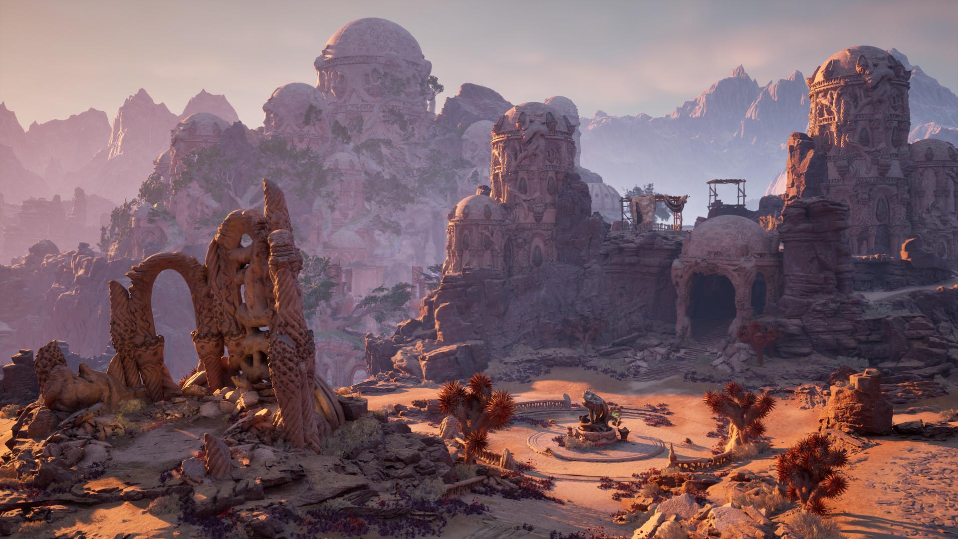
Screen_Environment_Plaza-22d3f7cfd80bc261ce16.jpg

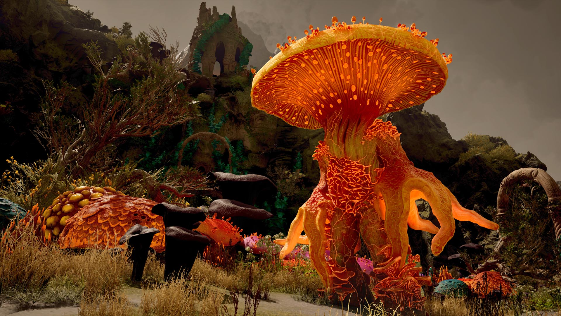
Screen_Environment_Shroom-fdbc0ec63f2becfd6950.jpg

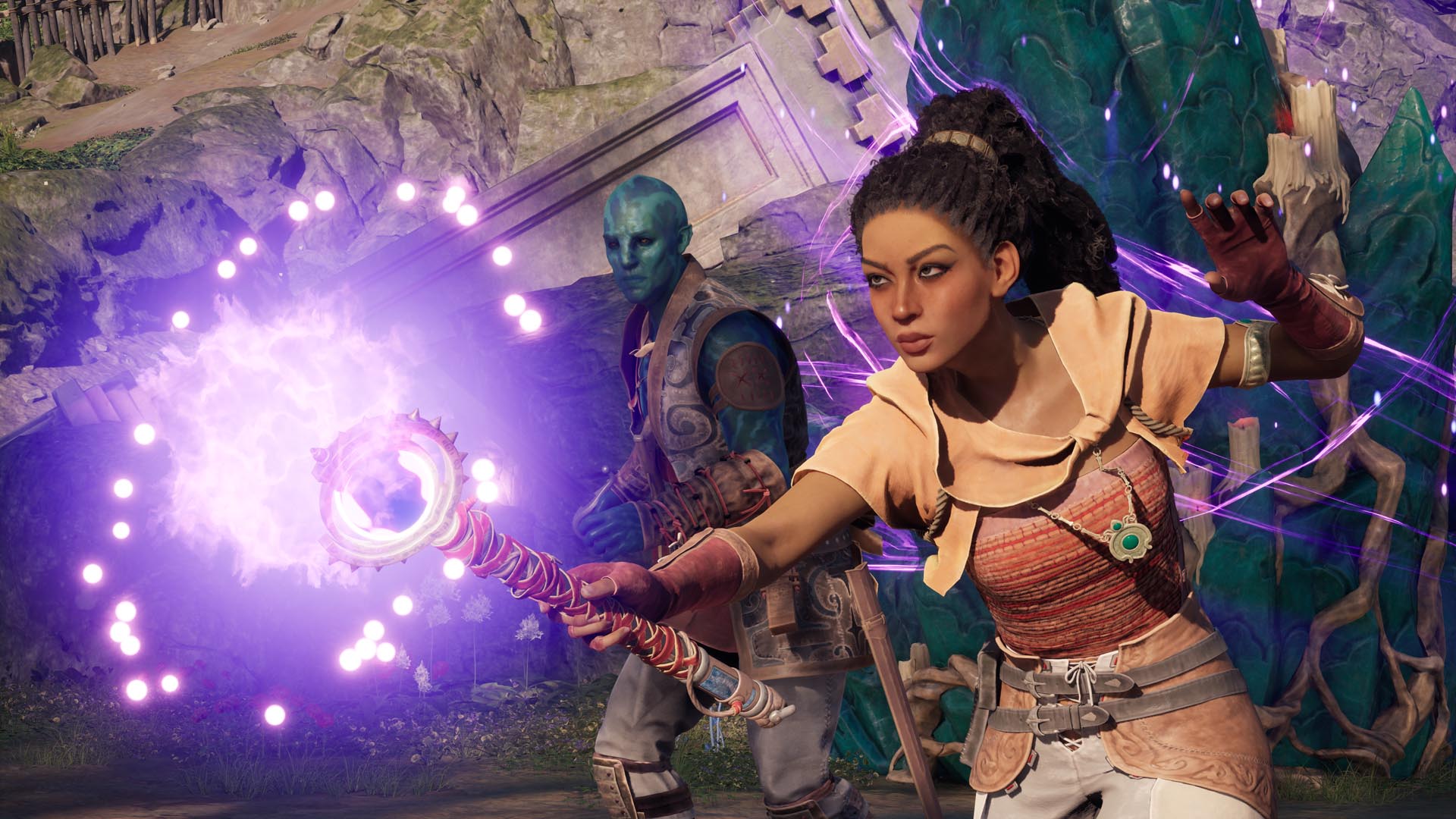
Screen_Companions-b0d48323b4b3d6dc9918.jpg
 

Robb

Gold Member
I have a very hard time trying to judge if this will be something I’ll enjoy or not. Can’t really put my finger on why.

Good thing it’ll be on GamePass.
 

clarky

Gold Member
Looked ok at best.

This will live or die on its systems and quests. Praise baby jesus for Gamepass.
 

Moochi

Member
The rainbow color scheme is good in theory. The logo is cool. But on screen, in the gameplay, it just looks like a bland mess. The character models are distinctly last gen. The very first walking animation they show looks so dated. The combat looks shallow. The story, with the dramatic narration...whooosh...who cares, sounds like any generic fantasy game, and the music too, is not special. Another product made by committee. In theory this is the kind of game I want more of, but they need to let some auteur make his/her dream and take chances. This will bomb.
 

simpatico

Member
Art direction still look generic as can be. RIP Obsidian. You'll always be remembered as one of my favs. Personally I'm counting Outer Worlds as the before and after point. I won't besmirch your memory with anything from the "after" years. Pour one out yall. If you played NWN2 at launch, have a toast with me to one of the GOATs.
 

SF Kosmo

Al Jazeera Special Reporter
This wins the most improved award, but I'm still not confident it'll get out of 7/10 territory.
 

Sacred

Member
Obsidian is know for their quest structure and attention to detail, alot of confidence in them as this gets closer to release.
 
Last edited:

MujkicHaris

Member
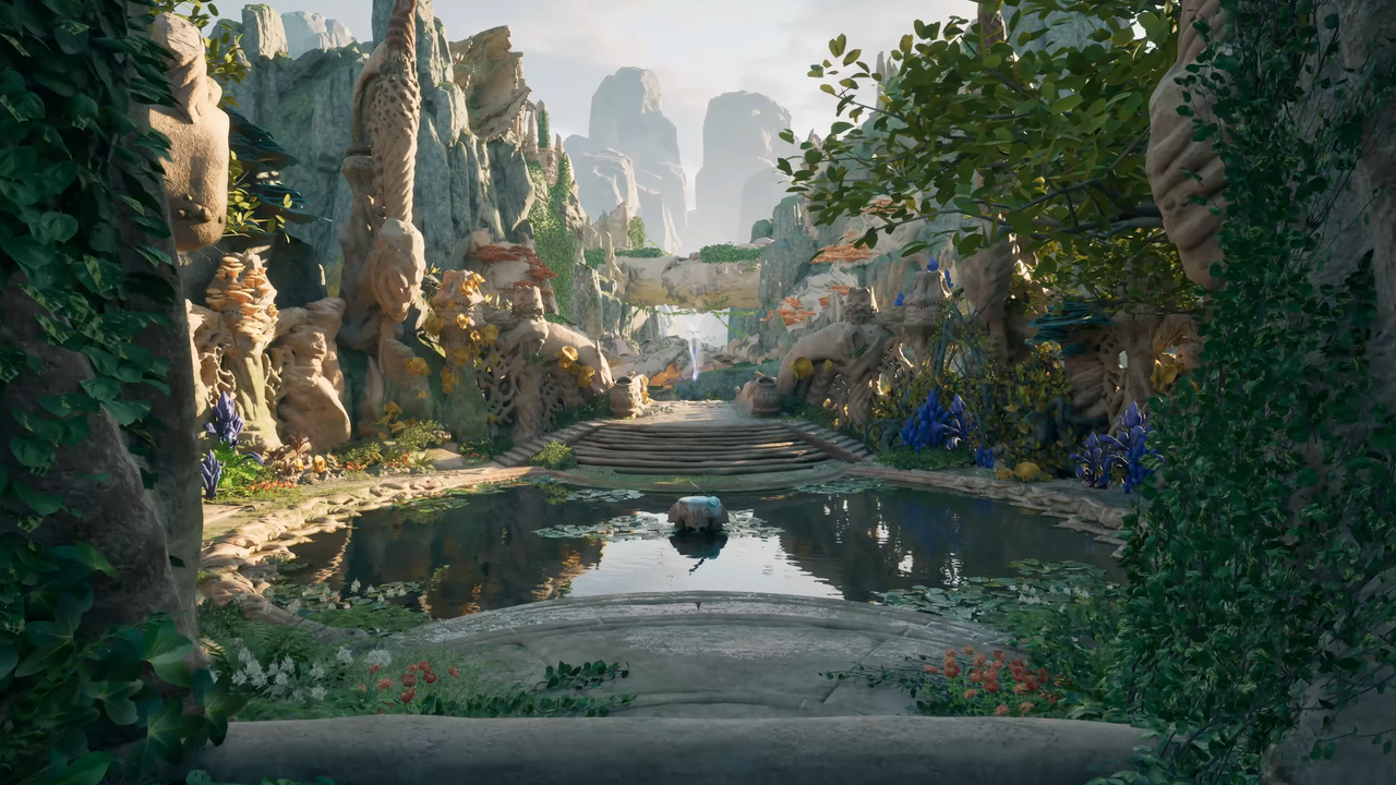
Looks quite unique and it's obvious the developers enjoyed while working on the environments. Tasty colors. Hopefully the gameplay/story parts will deliver.
 

Ozriel

M$FT
Interested in seeing impressions from the hands on later today.

I need to see more uncut gameplay, but it looks fine for now.

We’re also supposed to get a longer gameplay segment from the post showcase hands on, but we’ll see.

Mixed feelings so far. I still wish they’d gone with the reveal art style.
 
It still feels like a modded skyrim. Probably will be 50$ game.

I like the format with deep dives for separate games - rather than the extended showcase.
 

Raven117

Member
Alright, that gameplay trailer looks a little better than the original trailers.

I wish they didn't go for that artstyle though. (Why does Dragon Age and this look like it went through a Fortnight filter?)
 

Northeastmonk

Gold Member
It still feels like a modded skyrim. Probably will be 50$ game.

I like the format with deep dives for separate games - rather than the extended showcase.
It has combat that I wish TES had. It looks ok. The story stuff goes over my head. I’m all about the gameplay.
 
Last edited:

thief183

Member
Seriously what is the problem with those colours !! Why is everything purply (not a real word I know), it doesn't matter what the voiceover say, it will never be epic if the color choice makes it look like a Fornite wannabe.
 

Variahunter

Member
It's like in the beginning the game had a great art direction for their environments and suddenly blue haired people came to paint it all in weird flashy colors all over the place.
Thus effectively making the game attractive in some ways and completely ugly at the same time.
 

clarky

Gold Member
This looked just as bad as the last time we saw it.

I don't get Mattyplays take that everything looks massively improved.
It looks a lot better but still not great. Like other have said i think its the art style, nothing flows or seems to fit. Its like a high school fantasy art project.

But im keeping an open mind.

It certainly looks better than Dragon Age.
 
Last edited:
Top Bottom