You are using an out of date browser. It may not display this or other websites correctly.
You should upgrade or use an alternative browser.
You should upgrade or use an alternative browser.
Consoles screenshots thread (PS4/Xbone/WiiU) [Up: Thread rules in OP]
- Thread starter Peterthumpa
- Start date
xenogenesis
Member
psn
Member
Working for Saruman?
Working for Saruman?
Its the special jacket from the collector's edition.
2 more


megabytecr
Member
Playing Warriors Orochi Hyper 3 on the Wii U lately, not a graphical showcase in any way, but I'm having a descent bit of fun with it. It's pretty much my first time with the DW series and I'm having a better time with it than I what expected.
I guess I'm a sad sack.

Thanks for sharing, impressions are very useful too. Might pick it up, always wanted to get into the series.
Because Xbone shots are rare [where the fuck is screenshot function Microsoft?!], i've compiled many of Ryse screenshots from this thread into this collection.
http://kkrt.minus.com/mDxZTxmbWVH9J
Thanks to awesome GAF'ers who made them.
http://kkrt.minus.com/mDxZTxmbWVH9J
Thanks to awesome GAF'ers who made them.
NullPointer
Member
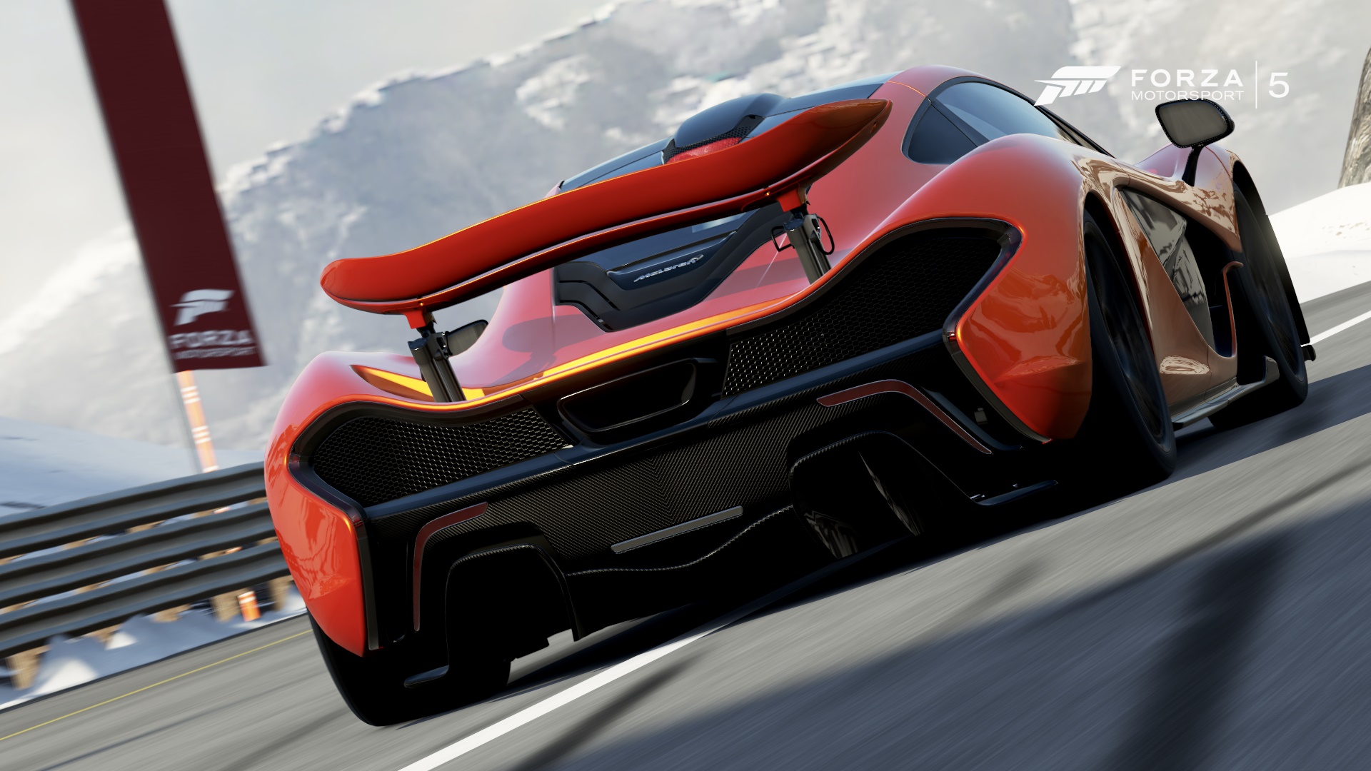
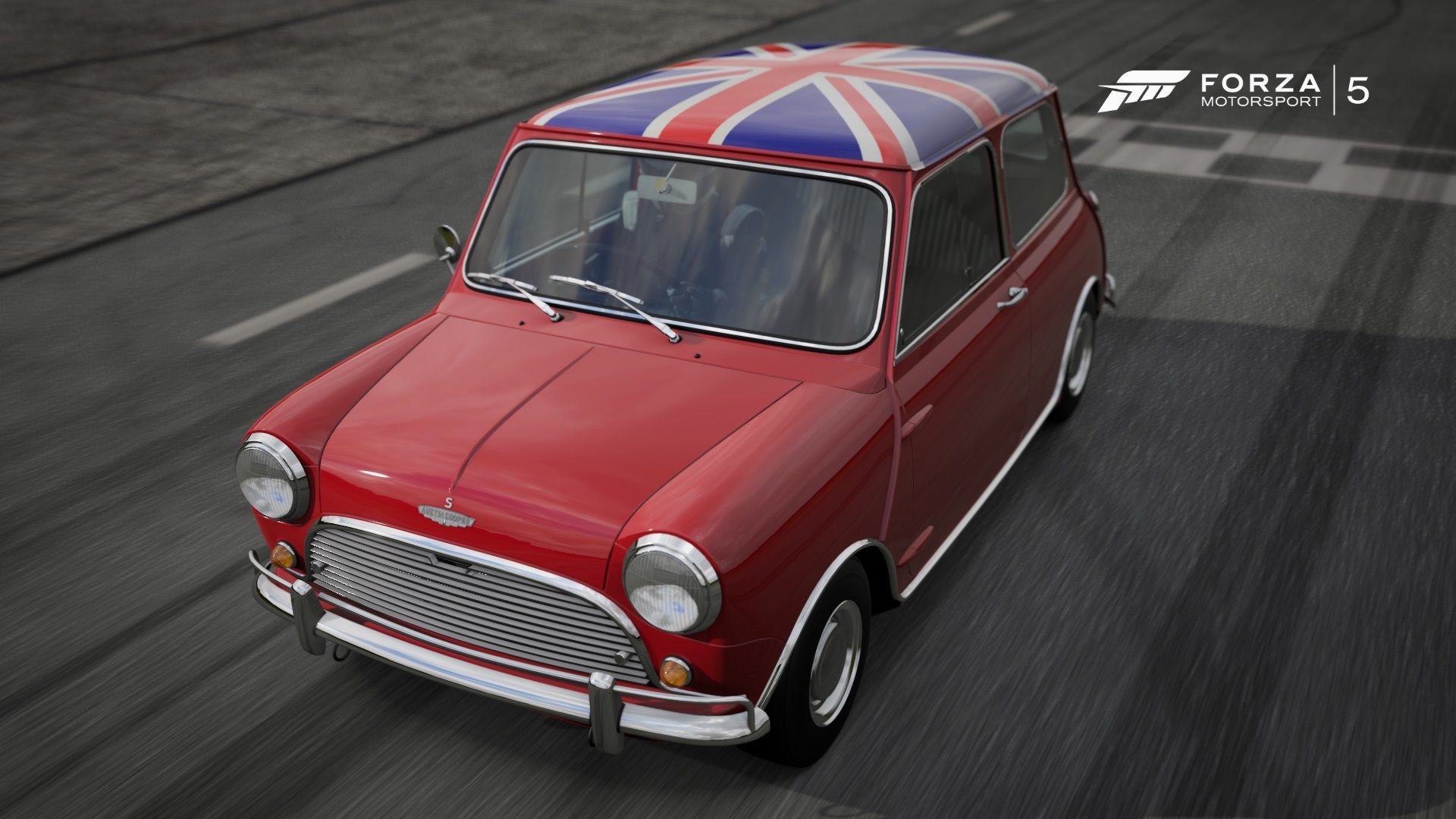
Yeah, it always seems like Forza's cheating a bit seeing as almost everything else here is direct gameplay. Then again the PC screenshot thread 'cheats' in a similar way since some of those shots are taken at completely unplayable framerates, even on the uber rigs.These are no screenshots, its photo mode
Awesome m3 btw.
Basically I'd like to see more representative in-game Forza shots - there have to be at least some beauties.
Edit: lol shinnn - I take it those are direct gameplay shots? Thanks.
Thanks for using many of my shots, I feel honored.Because Xbone shots are rare [where the fuck is screenshot function Microsoft?!], i've compiled many of Ryse screenshots from this thread into this collection.
http://kkrt.minus.com/mDxZTxmbWVH9J
Thanks to awesome GAF'ers who made them.
Yeah Microsoft should work on that screenshot function, probably much later though.
GavinUK86
Member
Tomb Raider is a great looking game but what the hell is up with her in this shot?!? Just look at that thumb.
Tomb Raider is a great looking game but what the hell is up with her in this shot?!? Just look at that thumb.
I don't know but I love the shot
Tomb Raider is a great looking game but what the hell is up with her in this shot?!? Just look at that thumb.
she looks hella "derp". like her neck has just caved in on itself. both thumbs seems a bit screwed, the one on the wall looks like a finger, and the one on the pipe looks like it has a hole in it.
i'm playing the game atm myself and i really wish they'd have simply teselated her entire model rather then re-make her face. becasue she's like botox lara now. all that fear and worry on here face just isn't there. wasn't worth the sacrifice imo.
WeAreStarStuff
Member
FFXIV Beta for PS4. I really like my new shield in the first shot. Wish I knew how the hell to get a pet - everyone seems to have one.


thedarknight87
Banned
Just got SM3DW, lighting is gorgeus
What do people mean when they say lighting is gorgeous in SM3DW? The last picture has quite inaccurate shadowing, clearly the sun is setting but still Mario's shadow is directly underneath him, like it would be at noon. Then there is the crazy and frankly speaking weird bloom effect that pervades most Nintendo first party games on WiiU (All of these characters look like Hakan in SFIV when he's oiled up). "In my opinion" unless the reflection and shadowing is not accurate the lighting is not gorgeous.
When it comes to shadows for entities like Mario, having a shadow below them is pretty much required in a 3D platformer.What do people mean when they say lighting is gorgeous in SM3DW? The last picture has quite inaccurate shadowing, clearly the sun is setting but still Mario's shadow is directly underneath him, like it would be at noon. Then there is the crazy and frankly speaking weird bloom effect that pervades most Nintendo first party games on WiiU (All of these characters look like Hakan in SFIV when he's oiled up). "In my opinion" unless the reflection and shadowing is not accurate the lighting is not gorgeous.
If people think the lighting makes the game look gorgeous, then maybe it just looks pretty?
What do people mean when they say lighting is gorgeous in SM3DW? The last picture has quite inaccurate shadowing, clearly the sun is setting but still Mario's shadow is directly underneath him, like it would be at noon. Then there is the crazy and frankly speaking weird bloom effect that pervades most Nintendo first party games on WiiU (All of these characters look like Hakan in SFIV when he's oiled up). "In my opinion" unless the reflection and shadowing is not accurate the lighting is not gorgeous.
As someone said the shadow is required to gauge where the character will land and the bloom on characters seems far from pronounced. I don't think I ever noticed it until you mentioned it. I don't know why it's there, but from the little I've played the game I think it's to make the character stand out more in the distance in large areas with a lot going on (especially four player Co-op). The bloom is more pronounced in natural light sources in games like nintendoland, WW HD, MK8 etc but they've implemented it well in those games imo.
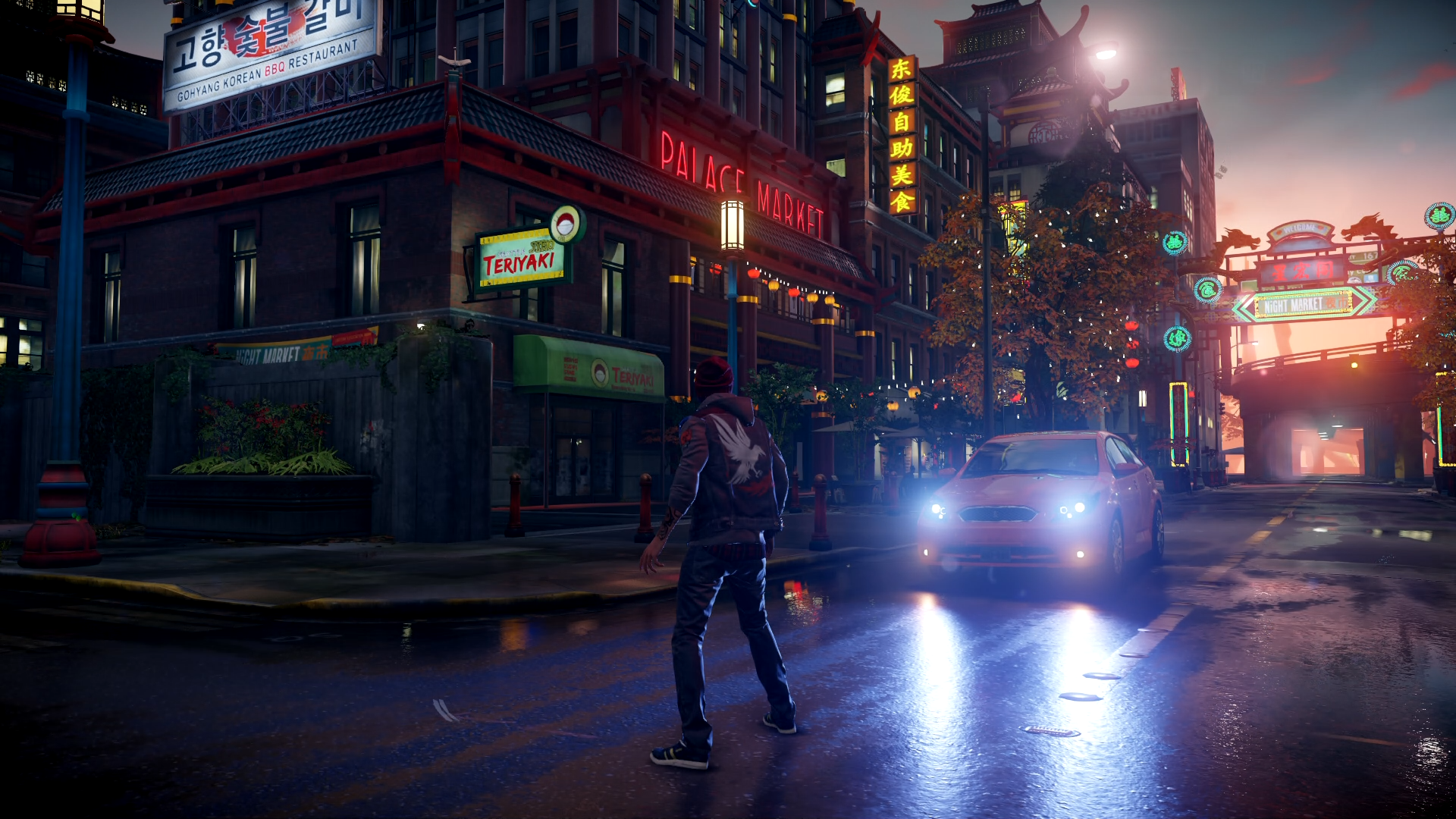
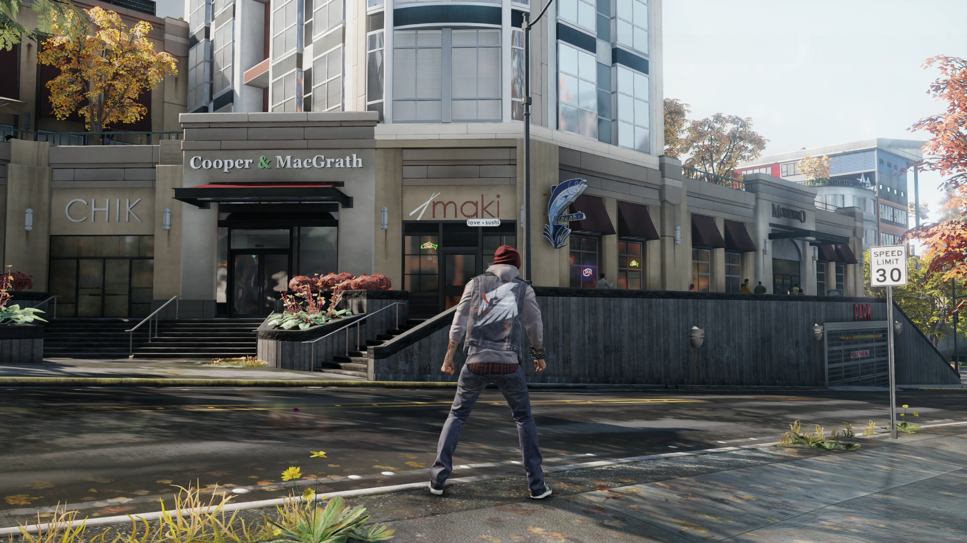
Technically speaking it's not the most impressive if you break it down like that, but cohesively it's very pretty and I'd still call it gorgeous even if there's one inaccurate shadow or a little bloom which seem like trivial complaints to me. I'd still call infamous gorgeous despite there being no nighttime character shadow or any other game that comes together well visually but still has a few flaws.
Deadceptor
Member
xenogenesis
Member
Jaded Alyx
Member
(All of these characters look like Hakan in SFIV when he's oiled up). .
Not even remotely close to looking the same. Not in screenshots, and certainly not in game.
StreetsAhead
Member
illmatic22
Banned

Me and the homies went for a lil drive.
Ok, that's funny as hell.Me and the homies went for a lil drive.
she looks hella "derp". like her neck has just caved in on itself. both thumbs seems a bit screwed, the one on the wall looks like a finger, and the one on the pipe looks like it has a hole in it.
i'm playing the game atm myself and i really wish they'd have simply teselated her entire model rather then re-make her face. becasue she's like botox lara now. all that fear and worry on here face just isn't there. wasn't worth the sacrifice imo.
If nixxes aimed for 30fps on PS4 in the first place they probably could have easily implemented tessellation.
ResidentDante
Member
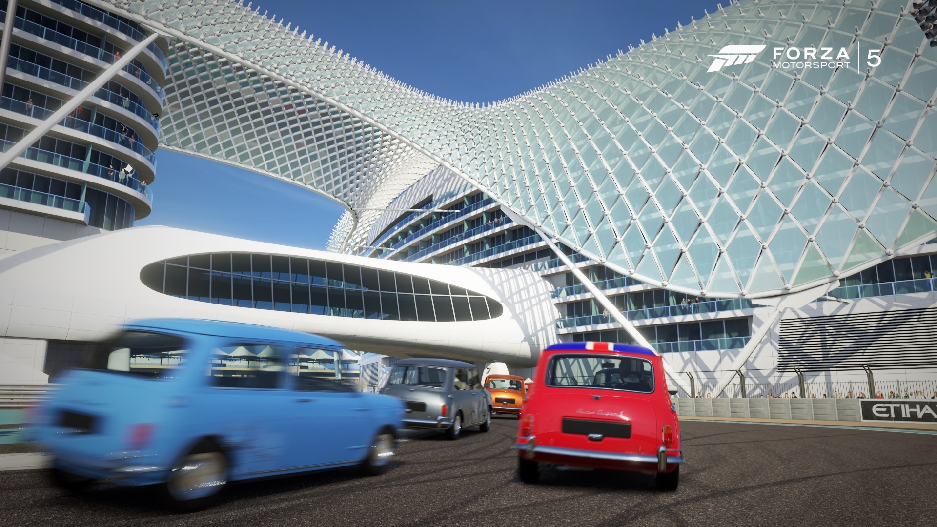
Really impressive level of fidelity on that building, even for photo mode. Does the game have night time races set on that track with the structure lit up?
Reign_Of_Rain
Member
ResidentDante
Member
Really impressive level of fidelity on that building, even for photo mode. Does the game have night time races set on that track with the structure lit up?
Sadly no, Grid 2 had it though, but that game doesn't have the same detail on the tracksides.
Dombrowski
is responsible for the well-being of this island.
Dombrowski
is responsible for the well-being of this island.
eddfromtheriver
Banned
Just got SM3DW, lighting is gorgeus


It looks pretty... that tiled water though...
Dombrowski
is responsible for the well-being of this island.
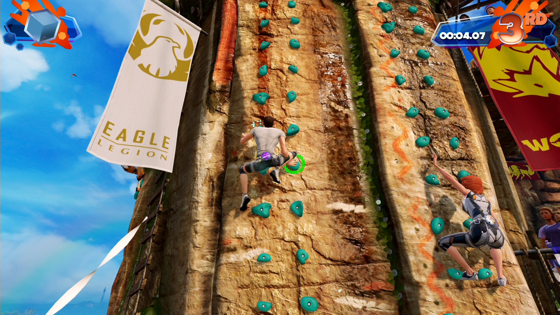
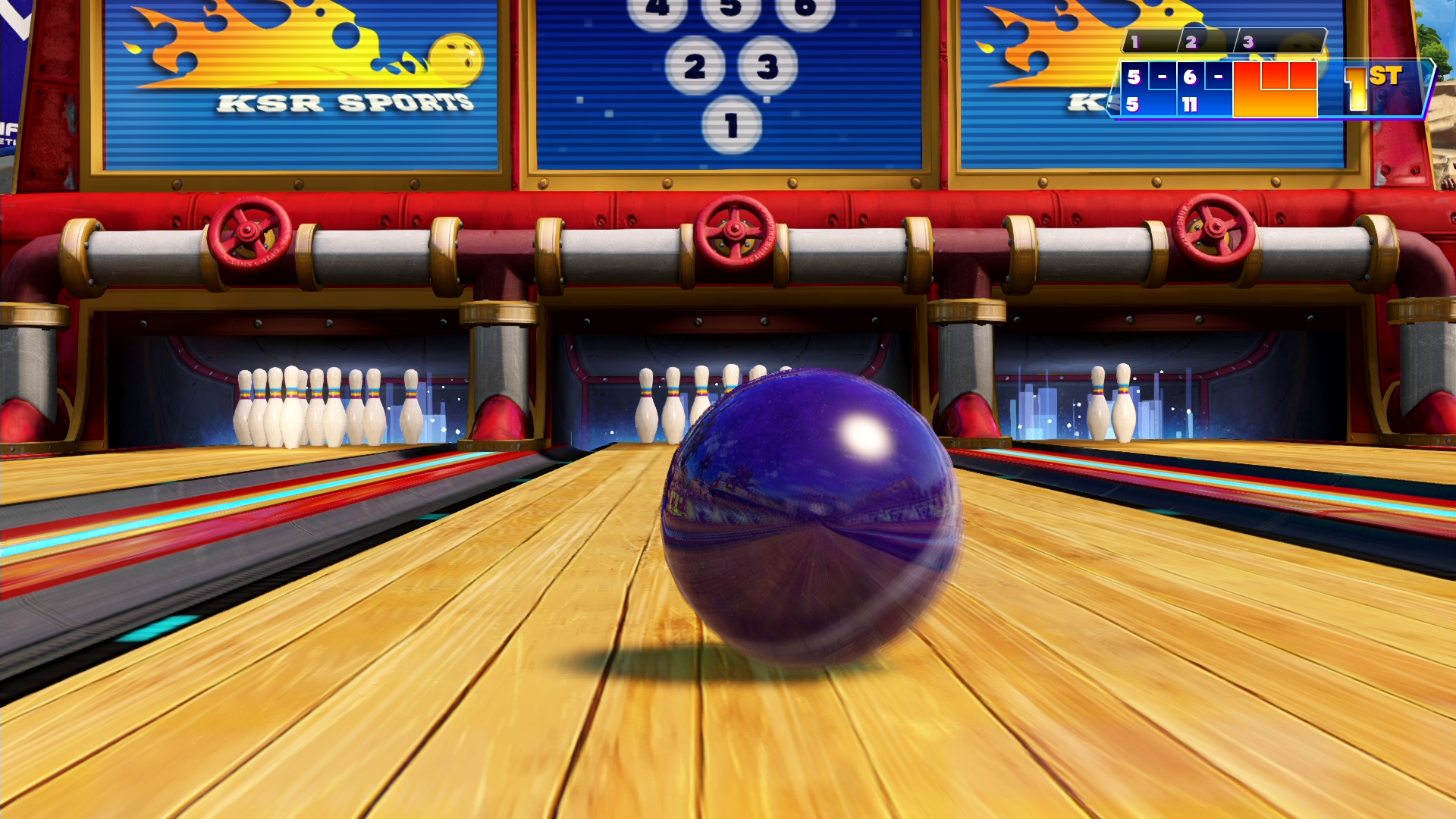
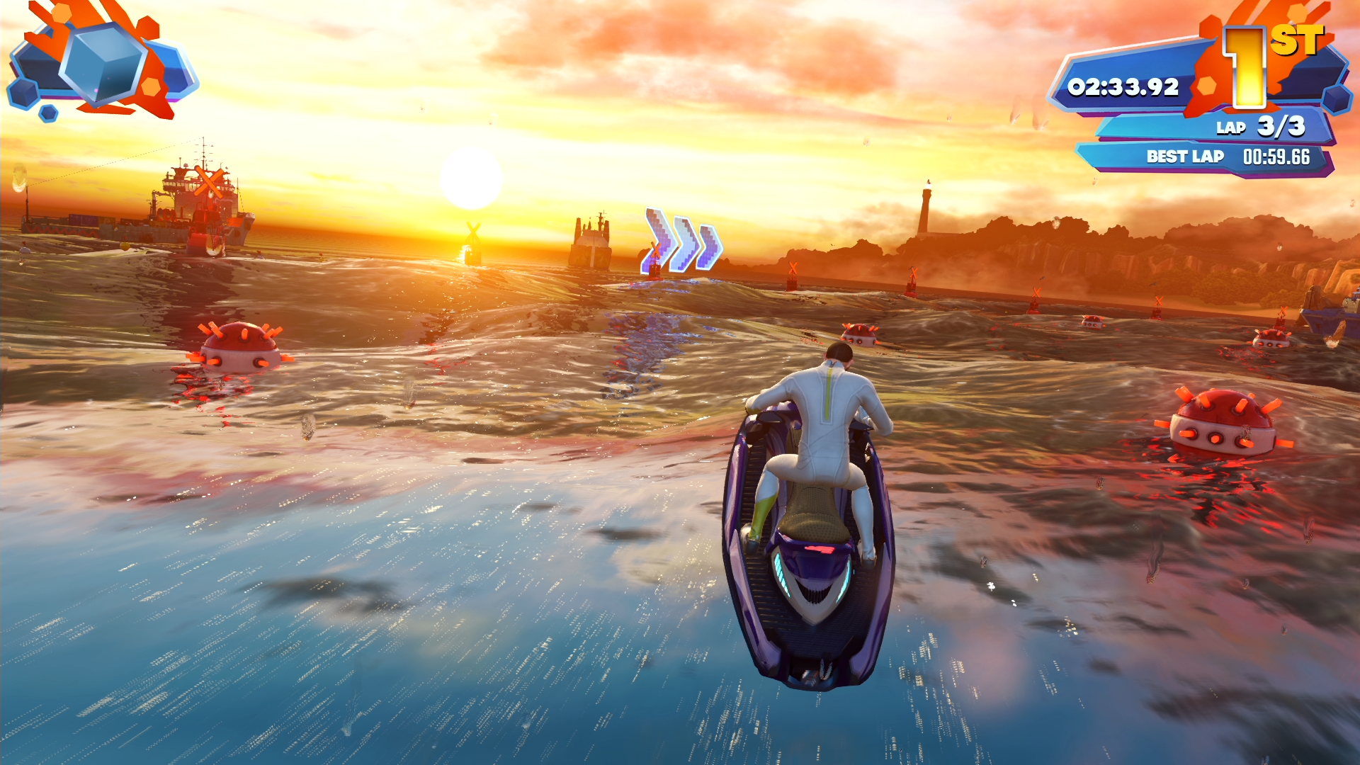
Yeah, thank you fraps.I'm guessing you're taking those Kinect Sports Rivals screens with auto capture on nbnt.


