• Hey, guest user. Hope you're enjoying NeoGAF! Have you considered registering for an account? Come join us and add your take to the daily discourse.

Consoles screenshots thread (PS4/Xbone/WiiU) [Up: Thread rules in OP]

Haha, that's exactly what I was thinking but I like my account too much to say it. I see beautiful shadowfall , knack and battlefield 4 shots and then a random, aliased, last-gen picture. Just ruins the mood but that's just me.

Wut.

I don't own a Wii U, nor do I have any intention of buying one in the forseeable future... but the Mario 3D screenshots are gorgeous. They deserve to be in this thread even if the console can't push the sheer numbers - art style matters.
 

phanphare

Banned
wiiu_screenshot_tv_01vrs6c.jpg


wiiu_screenshot_tv_01e4d3d.jpg


wiiu_screenshot_tv_01z6i37.jpg
 

nib95

Banned
That Mario game makes Knack look rather ugly =/

Really? Maybe you prefer the art, but graphically and technically speaking, Knack is making Mario look like a current gen game. Simplistic geometry, adequate lighting, rather basic texturing, bare bones shadowing, missing next gen graphical effects (AO etc). It's pretty only because of the art and cleanliness of the image, but graphically it's not really in the same ballpark as Knack.
 

EDarkness

Member
Really? Maybe you prefer the art, but graphically and technically speaking, Knack is making Mario look like a current gen game. Simplistic geometry, adequate lighting, rather basic texturing, bare bones shadowing, missing next gen graphical effects (AO etc). It's pretty only because of the art and cleanliness of the image, but graphically it's not really in the same ballpark as Knack.

Having played Knack, I still don't see it. Mario looks much more varied with more going on. Everyone has their opinion, but Knack just looks a little uninspired to me and not a looker technically.
 

Currygan

at last, for christ's sake
That Mario game makes Knack look rather ugly =/

there's simply no comparison between the two. Mario's artstyle is immediately charming, recognizable, full of life and energy. Knack...I don't even know what kind of graphical style that game's got. it really looks drab, dull, lifeless (imo)
 

EatChildren

Currently polling second in Australia's federal election (first in the Gold Coast), this feral may one day be your Bogan King.
It's pretty only because of the art and cleanliness of the image, but graphically it's not really in the same ballpark as Knack.

He didn't say "Mario's rendering technology makes Knack look ugly". He said he thinks it looks better, and Knack is ugly. Good technology =/= good art. Superior technology =/= objectively better looking, for everyone.
 

Tagg9

Member
He didn't say "Mario's rendering technology makes Knack look ugly". He said he thinks it looks better, and Knack is ugly. Good technology =/= good art. Superior technology =/= objectively better looking, for everyone.

Also, 3D World has some of the best anti-aliasing I've ever seen. You can't tell so much with screenshots, but in motion I see no jaggies at all.
 

Mory Dunz

Member
I kind of posted about Knack earlier but,

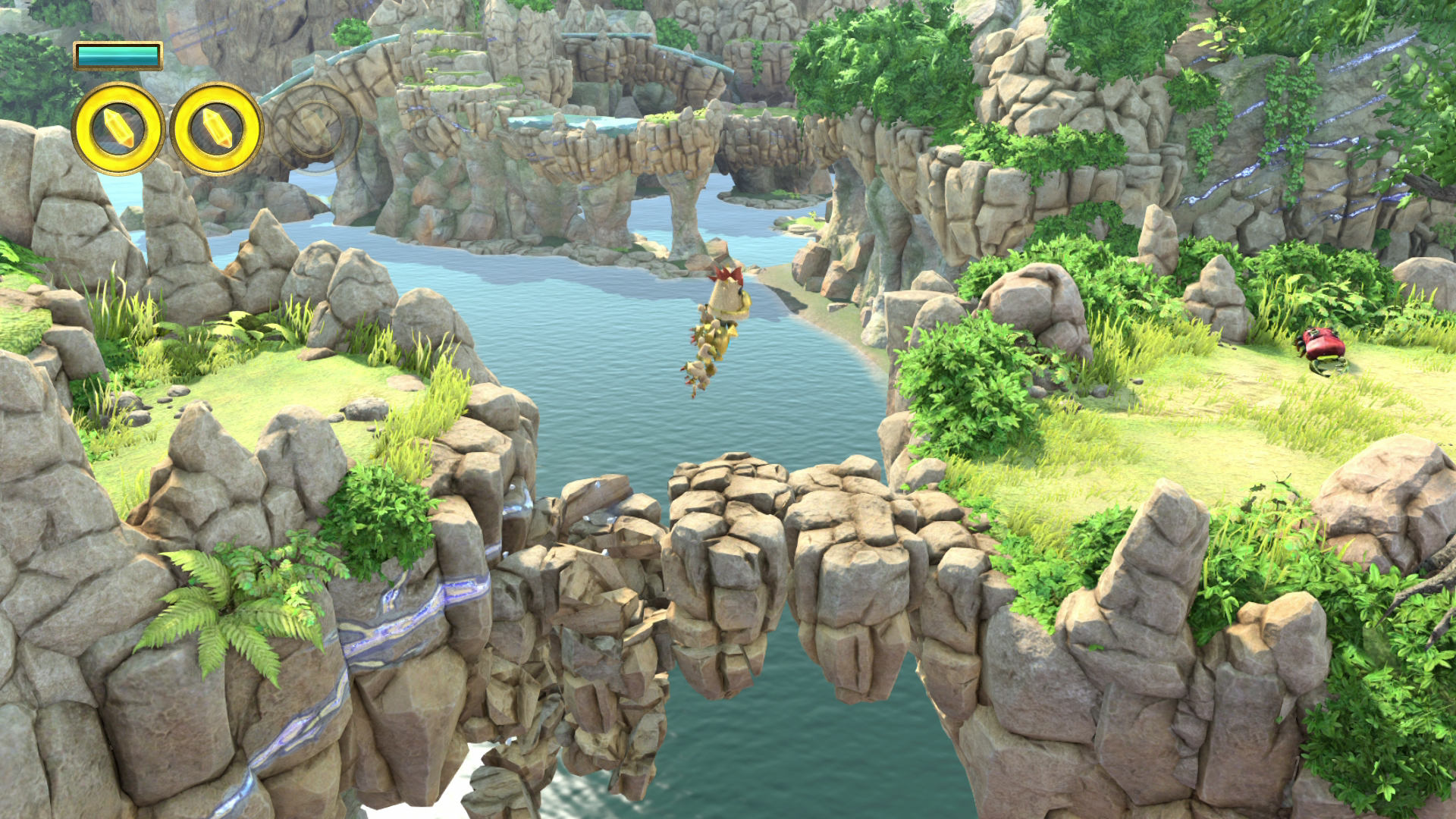
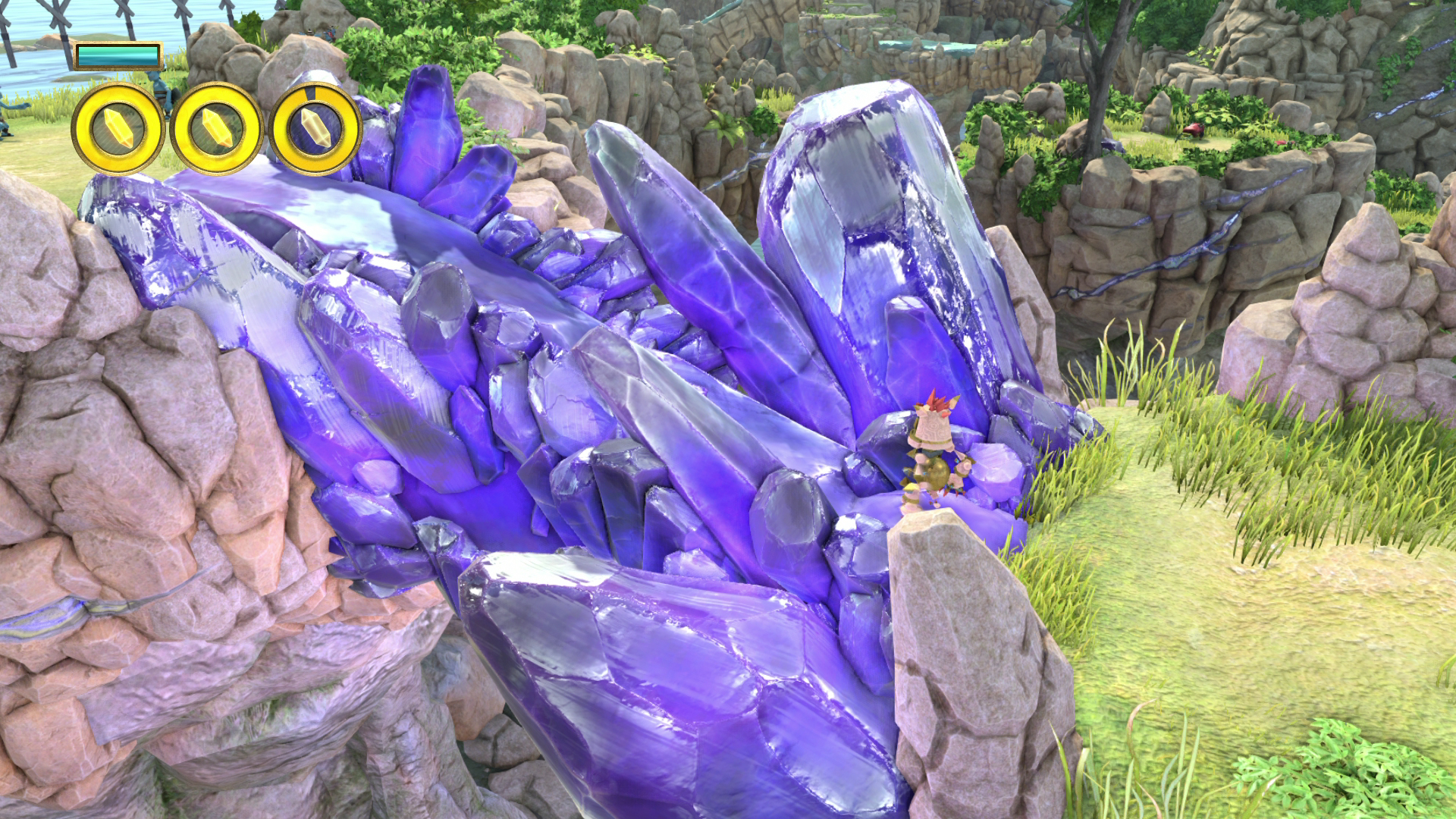
I think Knack looks really good technically speaking, but it also looks kinda of boring. The things it does, it does well. Rocks, grass, and caves. But from what I've seen, there doesn't seem to be much variety in the environments. It's just rocks, grass, caves, and the like.

Why did they confine themselves to realism without any vibrancy? I mean, it's not really a realistic game, so why didn't they try to get a little artistic in their backgrounds, lighting, shading, etc?

EDIT:
Like Here:

I dunno, it looks like an amazing rock texture with two clashing pixar-esque beings (with no shadows in this particular shot).
Why not try a little less literal background and more artistic for a game like this?
 

JordanN

Banned
Having played Knack, I still don't see it. Mario looks much more varied with more going on. Everyone has their opinion, but Knack just looks a little uninspired to me and not a looker technically.
No way, Mario is only 720p and that's the best it's doing.
Knack could be better but at least it got physics and better IQ.
 

Shiggie

Member
No way, Mario is only 720p and that's the best it's doing.
Knack could be better but at least it got physics and better IQ.

I dont think anyone is saying Knack is not a powerhouse. I looks hyper-real but nothing really stands out. Nothing catches my eye and wows me. Killzone looks better than knack art wise.
 

EDarkness

Member
No way, Mario is only 720p and that's the best it's doing.
Knack could be better but at least it got physics and better IQ.

My opinion, of course, but 720p or not, Mario looks more technically proficient than Knack. Everyone has their opinion, and this one is mine based on my playtime with both games. Can't tell physics in photos anyway. Nothing against Knack, but I feel like they should have gone for something more interesting than what they did.
 

nib95

Banned
He didn't say "Mario's rendering technology makes Knack look ugly". He said he thinks it looks better, and Knack is ugly. Good technology =/= good art. Superior technology =/= objectively better looking, for everyone.

Fair enough. I think I'd probably give the nod to Mario for overall appealing aesthetic (namely because of the art) too, but to the extent that I'd say it makes Knack look ugly? Crazy talk imo, and a terrible opinion.

Posted these earlier and I stand by it. Looks amazing imo. Actually reminds me of a Pixar movie, whereas Mario simply does not. Mario's like a vibrant psychedelic cartoon. Knack is like playing a Pixar movie.

amarectv2013-11-1613-2wdak.jpg


amarectv2013-11-1613-v2iw5.jpg


7999f846_MediaCaptureGame1X2013-11-1614-02-24-455.png


705f2b9a_MediaCaptureGame1X2013-11-1614-06-14-656.png


b0162bf9_MediaCaptureGame1X2013-11-1614-23-29-986.png
 

onilink88

Member
My opinion, of course, but 720p or not, Mario looks more technically proficient than Knack.

Artistically? Sure; Mario has Knack beat. But there's no question that Knack (or any other game on the other two consoles, for that matter) is a more technically proficient game than SM3DW. And I don't believe that's up for debate.
 

btrboyev

Member
Fair enough. I think I'd probably give the nod to Mario for overall appealing aesthetic (namely because of the art) too, but to the extent that I'd say it makes Knack look ugly? Crazy talk imo, and a terrible opinion.

Knack is ugly though. Not technically, but it just plain looks boring
 

btrboyev

Member
Artistically? Sure; Mario has Knack beat. But there's no question that Knack (or any other game on the other two consoles, for that matter) is a more technically proficient game than SM3DW. And I don't believe that's up for debate.

Maybe in resolution...Mario seems to be doing many more technical tricks than Knack is.
 

jet1911

Member
Fair enough. I think I'd probably give the nod to Mario for overall appealing aesthetic (namely because of the art) too, but to the extent that I'd say it makes Knack look ugly? Crazy talk imo, and a terrible opinion.

Posted this earlier and I stand by it. Looks amazing imo. Actually reminds me of a Pixar movie, whereas Mario simply does not.

amarectv2013-11-1613-2wdak.jpg


amarectv2013-11-1613-v2iw5.jpg


7999f846_MediaCaptureGame1X2013-11-1614-02-24-455.png


705f2b9a_MediaCaptureGame1X2013-11-1614-06-14-656.png


b0162bf9_MediaCaptureGame1X2013-11-1614-23-29-986.png

I like the art in Knack. Except for Knack himself. He's just badly designed. Also I find it strange that characters don't seems to cast shadows in some of those screens.
 

EatChildren

Currently polling second in Australia's federal election (first in the Gold Coast), this feral may one day be your Bogan King.
Fair enough. I think I'd probably give the nod to Mario for overall appealing aesthetic (namely because of the art) too, but to the extent that I'd say it makes Knack look ugly? Crazy talk imo, and a terrible opinion.

Well, you know, you're probably going to find a lot of those "terrible opinions" pop up when people really dislike certain game aesthetics :p. I just want to avoid this thread turning into an unnecessary "Ahh but the technology is better" debate, given we've got a pretty distant gap between Wii U and PS4/Xbone, when it's really totally, completely, utterly irrelevant in relation to art subjectivity. It just doesn't matter which game "looks better" from a technology standpoint if someone deep down prefers the art and aesthetics of another.
 

EDarkness

Member
Artistically? Sure; Mario has Knack beat. But there's no question that Knack (or any other game on the other two consoles, for that matter) is a more technically proficient game than SM3DW. And I don't believe that's up for debate.

We're always talking art, so it's always up for debate. All the technical hoopla in the world won't make games look good. Understanding HOW to make things look good is most important. Nothing against Knack, but they really didn't nail down their look very well. And as long as we're looking at screenshots, it will always come down to technical proficiency of the developer. I'm not saying that the PS4 isn't a powerful piece of hardware, but that the Knack guys didn't do such a good job of making that come across in screens. Again, it's always a matter of opinion.
 

onilink88

Member
We're always talking art, so it's always up for debate. All the technical hoopla in the world won't make games look good. Understanding HOW to make things look good is most important. Nothing against Knack, but they really didn't nail down their look very well. And as long as we're looking at screenshots, it will always come down to technical proficiency of the developer. I'm not saying that the PS4 isn't a powerful piece of hardware, but that the Knack guys didn't do such a good job of making that come across in screens. Again, it's always a matter of opinion.

Maybe I'm not making myself clear when I say "technically proficient". Or maybe I'm misunderstanding your meaning. But I use those terms to refer to things like polygonal complexity, lighting, image quality, shadows, etc- all of which are objectively superior in Knack. Don't get me wrong, though: a game could excel in all of those areas and not be visually pleasing; I agree with you there.
 

forrest

formerly nacire
I think Knack looks rather nice even if the art style does feel rather uninspired. Technically it looks very nice!

Holy shit at SMB 3d! Nintendo hires directly from Hogwarts so it seems!
 

EDarkness

Member
Maybe I'm not making myself clear when I say "technically proficient". Or maybe I'm misunderstanding your meaning. But I use those terms to refer to things like polygonal complexity, lighting, image quality, shadows, etc- all of which are objectively superior in Knack. Don't get me wrong, though: a game could excel in all of those areas and not be visually pleasing; I agree with you there.

I'm talking about developer technical proficiency. How well developers know how to use the technology at their disposal. I've seen people do stuff with the C64 that I didn't even know was possible. In the case of Knack vs. Mario, I think Nintendo is showing they know how to get done and I find that interesting considering the gap in hardware power.
 

Mashing

Member
I asked this on the last page, but didn't receive an answer. Can anyone say what kind of anti-aliasing Mario is using? It's really some of the best AA I've ever seen.
 

KU_

Member
Told myself I wouldn't purchase any more games until I finished my backlog, but these 3D World shots are tempting me.

Talk me down, GAF! I have bills to pay!
 
Fair enough. I think I'd probably give the nod to Mario for overall appealing aesthetic (namely because of the art) too, but to the extent that I'd say it makes Knack look ugly? Crazy talk imo, and a terrible opinion.

Posted these earlier and I stand by it. Looks amazing imo. Actually reminds me of a Pixar movie, whereas Mario simply does not. Mario's like a vibrant psychedelic cartoon. Knack is like playing a Pixar movie.

amarectv2013-11-1613-2wdak.jpg


amarectv2013-11-1613-v2iw5.jpg


7999f846_MediaCaptureGame1X2013-11-1614-02-24-455.png


705f2b9a_MediaCaptureGame1X2013-11-1614-06-14-656.png


b0162bf9_MediaCaptureGame1X2013-11-1614-23-29-986.png


I'm very impressed by this knack shots
 

jmls1121

Banned
the water effects in 3D Mario and the way nintendo's lighting engine reflects light off the water...especially at night.

MOTHER OR GOD.
 
Wut.

I don't own a Wii U, nor do I have any intention of buying one in the forseeable future... but the Mario 3D screenshots are gorgeous. They deserve to be in this thread even if the console can't push the sheer numbers - art style matters.
If they do then why not have journey screenshots here too? When I think of next gen screenshots I think this:
amarectv2013-11-1613-v2iw5.jpg


not this:
ibkYHBQ94ryuy0.jpg


The art style may be good, that's a subjective thing, but wii u is technologically last gen in terms of graphic performance so I find it somewhat not fitting in the next gen league. Just my opinion.
 
If they do then why not have journey screenshots here too? When I think of next gen screenshots I think this:

The art style may be good, that's a subjective thing, but wii u is technologically last gen in terms of graphic performance so I find it somewhat not fitting in the next gen league. Just my opinion.

Cherry picking shots. Try this shot I posted for size. Looks much better than that knack screenshot.

ibhntkEbaOl3Bs.jpg
 

slapnuts

Junior Member
Insane how much of a jump this is.

It truly is...from all the next gen games i have played. Killzone to me is definitely the best jump graphically out of all launch games.

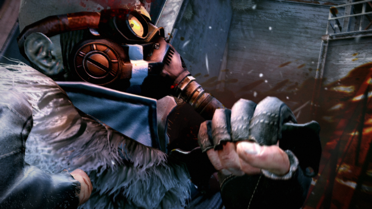
Just look at the detail difference below...i took the two comparison posted by the other posters for the comparison, they are not my images. Look at the ears and head gear..massive detail difference. I can only imagine what 2 or 3 year PS4 games will look like..especially the exclusives.

PS3
amarectv2013-10-1716-rkce0.jpg


PS4
ibw4yTPxxHQciC.png
 

EatChildren

Currently polling second in Australia's federal election (first in the Gold Coast), this feral may one day be your Bogan King.
If they do then why not have journey screenshots here too? When I think of next gen screenshots I think this:

The art style may be good, that's a subjective thing, but wii u is technologically last gen in terms of graphic performance so I find it somewhat not fitting in the next gen league. Just my opinion.

Your opinion of what constitutes as graphically "next generation" conflicts with the op's intentions, which clearly indicates this thread is for the listed three platforms, and thus has no place in this thread. Either deal with the combination of WiiU/PS4/Xbone screenshots collectively in this next generation screen shot thread, as intended by the op, or go elsewhere.
 

onilink88

Member
I'm talking about developer technical proficiency. How well developers know how to use the technology at their disposal. I've seen people do stuff with the C64 that I didn't even know was possible. In the case of Knack vs. Mario, I think Nintendo is showing they know how to get done and I find that interesting considering the gap in hardware power.

Once again, I agree with you; the folks at Nintendo know how to get the most out of the tools they use. I was, however, simply and strictly comparing the end products side by side.

If they do then why not have journey screenshots here too? When I think of next gen screenshots I think this:
amarectv2013-11-1613-v2iw5.jpg


not this:
ibkYHBQ94ryuy0.jpg


The art style may be good, that's a subjective thing, but wii u is technologically last gen in terms of graphic performance so I find it somewhat not fitting in the next gen league. Just my opinion.

Christ, give it a rest already. :/
 
Top Bottom