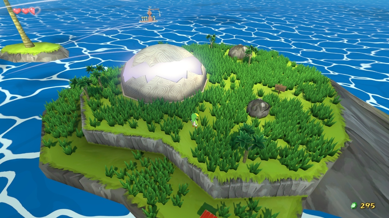
What settings do you use for it(and your console and TV as well)?Some snaps I took direct using my Live Gamer Portable. Not sure if it's me but the colours seem washed out whenever I take screenies from the device. Hmmm...
You are using an out of date browser. It may not display this or other websites correctly.
You should upgrade or use an alternative browser.
You should upgrade or use an alternative browser.
Consoles screenshots thread (PS4/Xbone/WiiU) [Up: Thread rules in OP]
- Thread starter Peterthumpa
- Start date
phosphor112
Banned
Some Zombi U: The amount of on-screen detail this game throws around, at times, is very impressive! Especially for a launch game with a modest budget.


Excessive chromatic aberration and dust filters makes the game look damn ugly, imo.
Killzone Shadow Fall


Great shots!
I really want to get better at taking shots. This is all new to me since I haven't played on PC in a long ass time.
What settings do you use for it(and your console and TV as well)?
PS4, Screen and LGP are all at default settings.
Try altering the LBP settings if that works.PS4, Screen and LGP are all at default settings.
Try altering the LBP settings if that works.
The only real setting I can change in the LGP is the Color Range, it's currently at Standard(16-235), changing it to Expanded(0-255) makes the colours REALLY washed out.
Omegabalmung9
Member
Wow, you might have to look this up.The only real setting I can change in the LGP is the Color Range, it's currently at Standard(16-235), changing it to Expanded(0-255) makes the colours REALLY washed out.

Best mission in the best looking launch game.
dafuq
*scrolls down to KZ shots, scrolls back up to this shot*
DAFUQ
illmatic22
Banned
Omegabalmung9
Member
Wishmaster92
Member
Thanks nbnt


Wishmaster92
Member
My own close-ups


Mentallyerect
Neo Member
I think I might be in the minority here but I'm finding all these new PS4 shots (particularly Killzone) to be immensely off putting. I think its an issue of having way too much detail now. Its like we went from too little detail last gen to an explosion of detail now. Sh*t, I don't even think real life looks that detailed lol. Killzone in particular just makes everything look so sterile and manufactured.
Personally, and I know I'll probably get called out on this, but I think I prefer the look of ZombiU over Killzone as I feel even though ZombiU isn't as technically savvy and up to date, it looks more natural to me as apposed to the extreme that is Killzone.
Either way, I'm sure with time, the developers and their artists will find a way of putting out amazing looking worlds that look a bit more natural without sacrificing detail.
Or......maybe I'm just crazy like that lol.
DemonCleaner
Member
dear developers,
thats how one does specular right. (esp looking at you dice)
DemonCleaner
Member
Looking at the cloth in the background, the wind is blowing pretty good. So naturally, it's moving his hair. Imagine that.
That's not how short hair moves when it's windy. That's the whole point. Imagine that.
I think you keep looking at the tech side. Joel's hair in TLoU looks more realistic than the Marius' hair in Ryse. Technically, Marius' hair is doing more, but he didn't say TLoU looked technically better. Hair often does not move. My hair is about the same length as Joel's, and in an indoor environment like he's in, it doesn't move unless I move it really hard and fast.
This man know's hair!
Excessive chromatic aberration and dust filters makes the game look damn ugly, imo.
The only ugly thing about ZombiU is all the character models. They all look terrible. The style they chose for the environments with lighting, camera filters and all looks fantastic to me.
You know that first one was taken from 3mbps 720p video? :>
Actually this shot shows that skin shader is identical in gameplay:
http://i.minus.com/ibt14ip4mr8iV6.png
Always-honest
Banned
Although that level looks nice, i can't help but feel you just posted this to get some response.
Best mission in the best looking launch game.
After having played a couple of Mario 3D World levels, yes. This game looks... Amazing. It kinda feels like an animation come to life. The little animations they added to the characters like Goomba's and koopa's really make the characters come to life. I'd recommend it to everyone. Just a lot of fun. Looks very crisp and clean.Dunno if it's just the screens but I think Killzone is probably the best looking console game now.
Wii U graphics are surprising me also.
Pjsprojects
Member

Best mission in the best looking launch game.
Yeah it's the best looking part of the game and overall I think it looks good but each to there own.
ZombiU looks gritty murky and spot on for it's style.
Killzone looks super detailed and clean so is also spot on for a future style tech look.
We have reached the point where game graphics are more about art style and personal taste.
ZealousMonkey
Banned
Excessive chromatic aberration and dust filters makes the game look damn ugly, imo.
Reminds me of a remastered PS2 title in some ways. Not bad for WiiU though.
Yeah it's the best looking part of the game and overall I think it looks good but each to there own.
ZombiU looks gritty murky and spot on for it's style.
Killzone looks super detailed and clean so is also spot on for a future style tech look.
We have reached the point where game graphics are more about art style and personal taste.
exactly! Its now all in the hands of Art Directors (Hurray!) Finally Art Direction gets center stage.
I think I might be in the minority here but I'm finding all these new PS4 shots (particularly Killzone) to be immensely off putting. I think its an issue of having way too much detail now. Its like we went from too little detail last gen to an explosion of detail now. Sh*t, I don't even think real life looks that detailed lol. Killzone in particular just makes everything look so sterile and manufactured.
Personally, and I know I'll probably get called out on this, but I think I prefer the look of ZombiU over Killzone as I feel even though ZombiU isn't as technically savvy and up to date, it looks more natural to me as apposed to the extreme that is Killzone.
Either way, I'm sure with time, the developers and their artists will find a way of putting out amazing looking worlds that look a bit more natural without sacrificing detail.
Or......maybe I'm just crazy like that lol.
The old "too good to be true" has turned to" too good to be good"
dgrdsv
Member
You can do a low detailed game on PS4 if you'd want.I think I might be in the minority here but I'm finding all these new PS4 shots (particularly Killzone) to be immensely off putting. I think its an issue of having way too much detail now. Its like we went from too little detail last gen to an explosion of detail now. Sh*t, I don't even think real life looks that detailed lol. Killzone in particular just makes everything look so sterile and manufactured.
Personally, and I know I'll probably get called out on this, but I think I prefer the look of ZombiU over Killzone as I feel even though ZombiU isn't as technically savvy and up to date, it looks more natural to me as apposed to the extreme that is Killzone.
Either way, I'm sure with time, the developers and their artists will find a way of putting out amazing looking worlds that look a bit more natural without sacrificing detail.
Or......maybe I'm just crazy like that lol.
You can't do a Killzone SF on Wii U.
Jaded Alyx
Member
You can do a low detailed game on PS4 if you'd want.
You can't do a Killzone SF on Wii U.
Not really getting your point in relation to his post...
dgrdsv
Member
The point is that the hardware has nothing to do with artistic choices of producing a game with a lot of details or small number of details - unless the hardware dictates the use of small number of details. Basically we're not constrained to using high res everything on a powerful platform, you can easily make a game that will look like Soundshapes for example.Not really getting your point in relation to his post...
Jaded Alyx
Member
The point is that the hardware has nothing to do with artistic choices of producing a game with a lot of details or small number of details - unless the hardware dictates the use of small number of details. Basically we're not constrained to using high res everything on a powerful platform, you can easily make a game that will look like Soundshapes for example.
Right, but he never said that. He even said:
Either way, I'm sure with time, the developers and their artists will find a way of putting out amazing looking worlds that look a bit more natural without sacrificing detail.
Bonus ACIV (PS4) shot I took yesterday:

That, is friggin sweet. Can't wait to get on this!
ColdBlooder
Banned
Just got 3D World today 


Wishmaster92
Member
It's the same...What you're seeing is different lighting conditions and a compressed image, but the detail is there.
Ouch
lol
Stop posting SM3DW and Wind Waker pics, please. I can't resist the urge to buy a Wii U anymore. I think Target will be getting my money today.
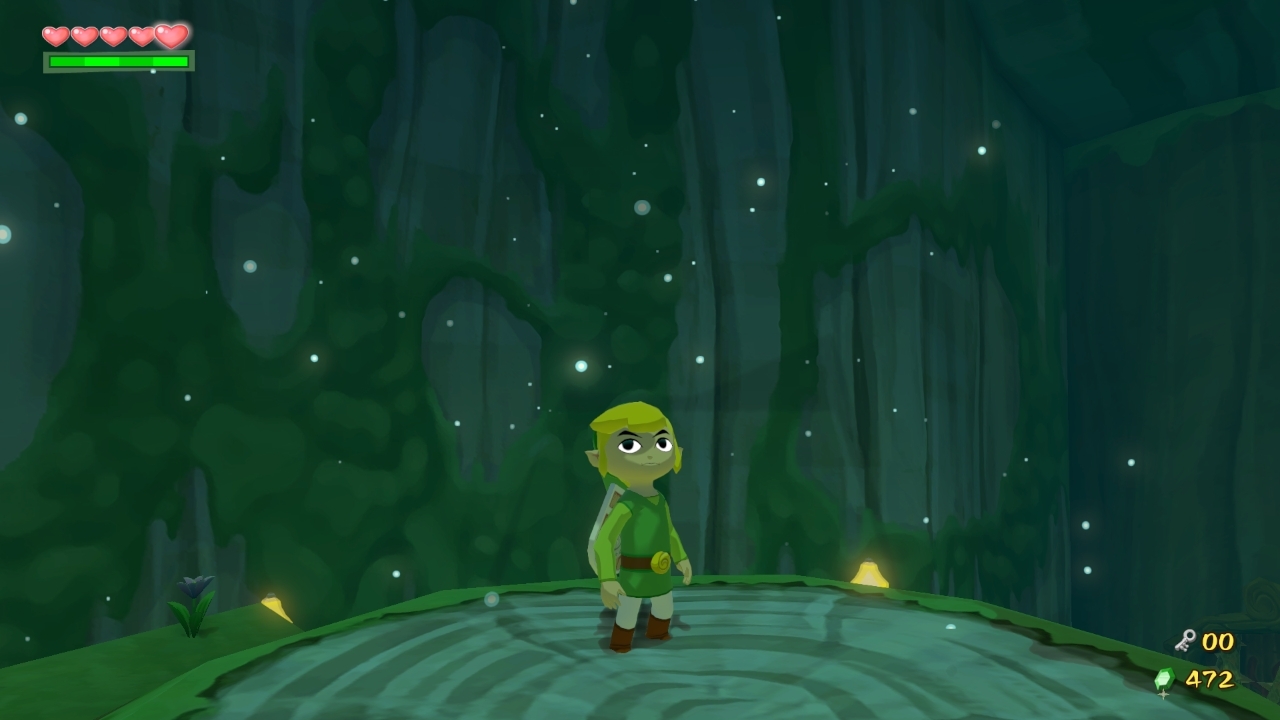
Here's a shot of you trying to resist:
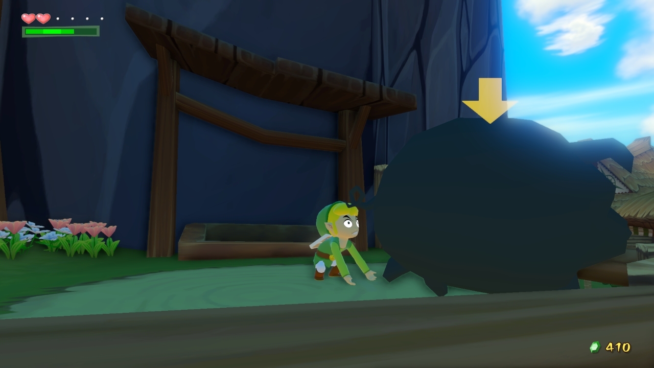
Imagine the grass being copies of WWHD and SM3DW

Dombrowski
is responsible for the well-being of this island.
JetSetRadio
Banned
Watching those resogun screens makes the lack of FantaVision 2 even more saddening.
Will try it out this evening though while enjoying a couple of beers.
Will try it out this evening though while enjoying a couple of beers.
I have you to thank for it, buying this was a great decision, and it's nice that I'm not the only one here who has Crimson Dragon, which I will also post soon.Congrats man
blu
Wants the largest console games publisher to avoid Nintendo's platforms.
If we took a model and rendered it in an off-line raytraced cinematic is the 'detail' the same as during gameplay? Just trying to figure out what you're referring to by 'detail'.It's the same...What you're seeing is different lighting conditions and a compressed image, but the detail is there.
WWHD's grass is glorious, even on screenshots. Someone needs to show Sakurai...
Here's a shot of you trying to resist:

Imagine the grass being copies of WWHD and SM3DW
