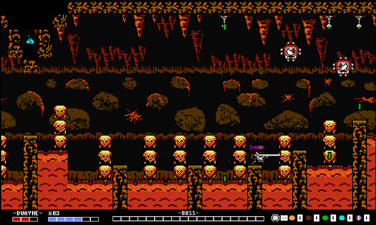
Way more than clouds, IMO. Even the spiky teal/green BG layer not only sports the same color but the same design. The only major difference are the trees - they are a different shape. This is definitely flying too close to the sun, if I'm being honest. I don't know who does your art when you say "in house" but whoever it is will get you in trouble. I don't like bagging on people's work but that's just flat out tracing and moving a few pixels for a majority of the composition. If it's the same guy that traced sprites for Glitch Warrior then I'd look elsewhere. The two-headed fire breathing duck was a copy/pasta of the dog from MM2. Even the eyes were the same. Animations on main character and other stuff.
I'd get to cracking down on that stuff because not only is it blatant - its just not right. Interpretation can be a powerful tool but this doesn't even begin to expand on someone else's ideas, it just shuffles them around a bit. Dangerous ground. I don't want to be a dick by speaking out but this is a bit much.
Pull from film, literature, music, theatre, but definitely not from other games like this. Use them as inspiration, not drawing boards.
Just my .02
The issues with some of our previous art have been addressed. We have a new artist, we can't have issues like people thinking we've ripped off or stolen assets, so you'll understand why I take this accusation so personally right now.
I've highlighted a couple of different portions of the two screenshots you used as comparisons, ignoring the clouds because I've already stated that it was unintentional but still going to be redrawn.
In the top comparison we see both the trees and horizon line that Shovel Knight's style uses. While the use of a dark teal with a lighter green highlight is similar, you'll notice that even within the very limited NES color palette we didn't even end up using the same colors, just a similar idea. You'll also notice we use more colors. You've already stated the trees are completely different but I'm still pointing that out, they're more than just "round", the texturing style and use of the dark colors for detailing/depth is
completely different in the two art styles.
The horizon lines used in Shovel Knight in this forested stage are straight, with horizontal accent lines to provide minor detail/depth. The way our horizon is drawn is only similar in the sense that it reuses the two colors we used for the first layer of trees (just as Shovel Knight did). I'd hardly say that using colors to display depth in this fashion is something Shovel Knight invented. Aside from the two-color depth, you'll see the horizons are not the same at all. Our horizon has jagged geometry and a completely different method of showcasing detail/depth in the floor. Although I sit here pretty upset to see them using a similar "spiky teal background" I'm still going to defend that it was something we drew on our own. Why is it the same teal? Because we both used the same color palette and there's really only one teal. Why even use teal? Probably the same reason they did, because the selection of colors pretty much forces you to. Why is it spiky? Because it's a hill with trees on it and using two-tone colors for that deep of depth just makes the screen busy. I'd be happy to export that background asset, you won't find any two pixels that are alike on the Shovel Knight background. Like the sky though, it's pretty similar, so it'll probably be redrawn.
I blew up the tiles used in Shovel Knight for grass and dirt to compare to the tiles used in GunWorld 2 for grass and dirt. Again, they both use a two-tone brown and green, but the texturing is completely different. Shovel Knight doesn't draw rocks in a similar texture to the way that we do (at least not in this shot you provided).
You're going to see similarities to other games in GunWorld 2. It's made to look like an exaggerated NES game, and we've used a lot of the same inspirations Shovel Knight did, so it's no surprise that some methods are similar (the use of two-tone colors for texturing), but they aren't identical, and they absolutely aren't altered or stolen assets.
I thought long and hard about whether or not I should take that comparison shot completely to heart, which is why I've analyzed their tiles and backgrounds against ours, and I stand by what we've produced and take offense to the accusation that any assets are being stolen. The sky is way too similar, and I'm thankful that was brought to my attention because it's being redrawn, but there was nothing malicious about its production.
If I'm absolutely crazy then I need to hear it now before it bites me in the ass later, but I strongly believe our assets are different enough that with that sky redrawn you wouldn't even fight to make this comparison again. I believe that even more so having double checked all of our artwork for other stages in the game specifically against Shovel Knight and find nothing else similar. It's this one scene that looks similar but it's not the same.


