My pro suggestion is to step away from the computer entirely. You're making it unnecessarily difficult for yourself, you can't translate ideas as quickly on a computer as you can on pen & paper (unless you've a graphics tablet of course). Take an hour a day for a few days to just sketch every idea that pops into your head. Don't hold anything back no matter how stupid it seems or if you think it has been done before. "But I can't draw" isn't an excuse, it's a freaking d-pad!
Haha, I was over complicating things. Usually happens when I have a bunch of ideas in my head that I want to try out. But anyways, I actually did draw them out before making them (I did one in black and white on my computer to match how I drew it out on paper and then try to mess with it from there).
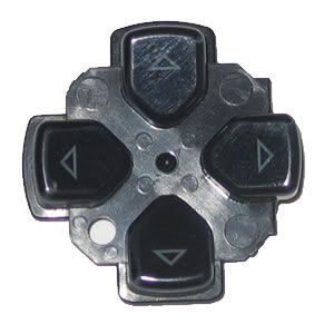
I agree that the d-pad isn't a traditional looking d-pad (e.g.: Nintendo's d-pads). I got the "D button" idea from looking at the d-pad on Playstation systems.:
I'm still new to graphic design and was given a chance to make a postcard (tri-fold) for Healthcare Data Management, a medical billing company. I'd really appreciate some feedback before I send it over for them to proof.
I've linked to it using dropbox. It might have compressed the image heavily so try downloading it if that's the case.
I'm still new to graphic design and was given a chance to make a postcard (tri-fold) for a medical billing company. I'd really appreciate some feedback before I send it over for them to proof.
I've linked to it using dropbox. It might have compressed the image heavily so try downloading it if that's the case.
I appreciate it. I've been looking at it for so long that I can't stand it.
I'm the type of person who is obsessed with neatness and organization (home, computer)... so much so that I think it hurts my designs. I think the postcard needs something to make it pop. It's just a little too straightforward to my eyes but I'm too close to the deadline to change things up drastically. I find the outside to be the weakest part but I've yet to improve upon it. I'm proud of it overall, though, since it's the first time I've done anything like it.
It'd just print 4/4 right? I don't think the outside would cost any more than the inside. Digital or offset, I think that level of detail shouldn't cause any kind of exsorbitant setup fees or anything. Spot UV over the white type might be cool, thoughand that'd bump it for sure.
I was just looking to use some online printing store like gotprint.net. I've used them before when I needed to print my last project and I was quite happy with how it turned out (and it was more than three times cheaper than using a business account with Office Depot). Printing 500 of these postcards on 80-100 glossy paper looks like it will be about $150ish through gotprint. What am I missing?
I'm still new to graphic design and was given a chance to make a postcard (tri-fold) for Healthcare Data Management, a medical billing company. I'd really appreciate some feedback before I send it over for them to proof.
I've linked to it using dropbox. It might have compressed the image heavily so try downloading it if that's the case.
Yeah cut down on the different fonts, and also on the styles/treatments.
The organization on the inside is just fine.
Outside needs work - you don't have to change the scale, use roman, kern closely and bold the "BECAME" to emphasize it - too much going on there. Just do one of those things.
It'd just print 4/4 right? I don't think the outside would cost any more than the inside. Digital or offset, I think that level of detail shouldn't cause any kind of exsorbitant setup fees or anything. Spot UV over the white type might be cool, though—and that'd bump it for sure.
Yep it shouldn't. I've had tons of brochures, banners, backdrops printed and they charge us the same regardless of how much ink is used (largely dependent on size and whether you're printing 4cx1c, 4cx0c, etc)
Yeah clean up your fonts, and choose one style for the inside. I see many different ways you are presenting your text, but no clear connection for them all.
I got rid of Lavandria (the cursive font) but I'm not sure how to proceed. What's the best practice for when you have to work with a logo that has two fonts in it, both of which you don't care for as a headline or in the body? Should I really just restrict myself to the two fonts in the logo?
Also what did you mean, ConvenientBox, when you said that I should choose one style for the inside? When you said that did you mean these styles: drop shadows behind text, drop shadows behind text with a slight white stroke, and subtle drop shadows behind a hard black drop shadow? I didn't know that these were bold enough to not mix. Is that what was meant?
Also, the outside is all Futura font, just different weights with no alterations to kerning.
I got rid of Lavandria (the cursive font) but I'm not sure how to proceed. What's the best practice for when you have to work with a logo that has two fonts in it, both of which you don't care for as a headline or in the body? Should I really just restrict myself to the two fonts in the logo?
I think the script was mostly okay, since it was so far outside the general type treatment. But typically I'd choose fonts that complement the logo fonts. What's that, Optima? Optima plays nice with lots of things. Like Futura, which you've already used here and there.
I'm guessing from the looks of the logo that there aren't guidelines to consult here. right?
But honestly man, I think you're done. That's a totally serviceable design. Though I'd suggest changing the razor blade to a pair of scissors—because using a shaving razor to 'cut' makes me immediately think of suicide. Since the accompanying copy refers indirectly to people losing their jobs, you might be getting into some accidental dark humor there.
Gotcha. Yeah, as I wrote a few posts up, after getting rid of the cursive font I'm only left with four. The two in the logo (Optima and Copperplate) and then everything else is Futura (for headings) and Georgia (for the body). So I'll just leave it there.
Good point about the razor, I'll change that before sending it over.
I wanted to update their logo but they didn't like what I came up with so they've stuck with the original version. There are no real guidelines.
Anyway, here's what I've got before I change I get rid of the razor (and the paint in the lower left corner of the inside). The only real noteworthy change is the reorganization of the four bullet points in the middle section of the inside. I've given it a sort of apple/smartphone box layout. Nothing special but the layout is cleaner. Anyway:
Though I'd suggest changing the razor blade to a pair of scissorsbecause using a shaving razor to 'cut' makes me immediately think of suicide. Since the accompanying copy refers indirectly to people losing their jobs, you might be getting into some accidental dark humor there.
I generally dislike grey text in dark (with gradient!) bgs, because it generally means I'll have to move closer to read depending on the size of the font/screen. Neither do I understand the thick buttons with a thin star in the middle there, but overall it definetely looks pleasant.
And I don't know what type of panel the cellphone uses, but I guess it would help save battery too?
Ahahaha just a ploy to make an android twitter client that doesn't suck!
Yeah I guess I gotta make that star thicker.
I will experiment with the font brightness, thanks for that.
I'm looking for places I can get a makeover for my site and perhaps a new logo. Unfortunately I don't quite have the budget of most companies, so I was looking at possibly trying out a few folks on Fiverr. I've used ScriptLance in the past and was met with OK results. I really want to have a design that doesn't look like it's a colored default WP theme.
I've also tried to do my own logos before, but even though I'm creative, I just can't hold a candle to anyone, let alone anyone in this thread.
I think a crummy logo is far worse than none at all. I also think that a lot more people THINK they need a logo than actually do. My advice would be to table the logo idea until you can afford it.
As for the site, the same mostly applies - but I will say there are some pretty solid-looking premium themes out there for Wordpress and the like. May be worth looking into, certainly before Fiverr.
Basically, your previous bad experiences with those sorts of sites aren't because those sites sucked, it's because the fundamental concept behind them sucks. Gotta make an investment in a designer that's gonna make an investment in you.
I've done that with ScriptLance before, I paid quite a bit. I also paid a designer a few hundred to redo my site from another through a few other avenues and all I got out of it was my current logo. Admittedly I wasn't happy with the revisions they showed me (had some near neon colors going on), but yeah.
I need a logo and need a clean looking site. Nintendo Gal is nearing 7 years and really deserves better than what I can do.
Fiverr is an option to me because quite frankly, I can test the waters with a $5 and see what happens. If it doesn't work out, it's only $5, if it does then I have myself something decent.
I suppose what I'm really asking is if there are other alternatives like that out there so I don't end up spending all my birthday money yet again on a website that doesn't make any money.
I hear you. But it really sounds like just the same thing over and over, you know? You are very likely to have the same frustrating experiences, because the new solutions aren't much different from the old ones. Know what I mean? It's like, if I offered to sell you a cardboard car for $5, would you even bother buying it? It's cheap, but it's a waste of time.
Gotta ask yourself hard questions, like: is my site not returning revenue because I haven't got a logo and my design is uninspiring? Lackluster design can and does affect these things, but are not the sole reason people choose to spend time or money in one place or another.
And also: what are you hoping for in a logo? Do you want the site to look 'slick'? Thing about 'Nintendo Gal' is it is obviously personal, it's obviously 'human'—that's actually a point of difference between you and some bigass gaming mag. The people drawn to you will not be looking for the slick, gaming mag experience. 'Nintendo Gal' is accessible, right? I'll put out the controversial viewpoint that a slightly crunchy design ethic actually works in your favor, in that case.
Edit: to actually answer the question, ha: I don't think there are any sites like that that you don't already know about, and they're all mostly alike. And yes, of course there's a chance to find a diamond in the rough on one of them—there are cool people everywhere. Best wishes for your site! I've subscribed to your feed.
Oh, and NintendoGalhave you considered finding a way to just use a photograph of yourself instead of a logo? I assume you yourself are the 'Nintendo Gal' after all, so that's a kind of obvious and free way to associate a visual with the name. I do something similar myself.
And again, it plays to the human thing. People will see you and make a human connectionyou're not a corporate vector art symbol, you're a human being saying stuff about stuff. That's assuming I've understood the focus of the site correctly, apologies if I haven't.
I hear you. But it really sounds like just the same thing over and over, you know? You are very likely to have the same frustrating experiences, because the new solutions aren't much different from the old ones. Know what I mean? It's like, if I offered to sell you a cardboard car for $5, would you even bother buying it? It's cheap, but it's a waste of time.
Gotta ask yourself hard questions, like: is my site not returning revenue because I haven't got a logo and my design is uninspiring? Lackluster design can and does affect these things, but are not the sole reason people choose to spend time or money in one place or another.
And also: what are you hoping for in a logo? Do you want the site to look 'slick'? Thing about 'Nintendo Gal' is it is obviously personal, it's obviously 'human'that's actually a point of difference between you and some bigass gaming mag. The people drawn to you will not be looking for the slick, gaming mag experience. 'Nintendo Gal' is accessible, right? I'll put out the controversial viewpoint that a slightly crunchy design ethic actually works in your favor, in that case.
Edit: to actually answer the question, ha: I don't think there are any sites like that that you don't already know about, and they're all mostly alike. And yes, of course there's a chance to find a diamond in the rough on one of themthere are cool people everywhere. Best wishes for your site! I've subscribed to your feed.
My site isn't meant to make money, I don't run ads ever. I do have an Amazon store link in case someone one day feels the need to help my $200 a year hosting costs. I might make $1 one day, it's a dream! XD
The design to me is supposed to reflect the content I put out there. If it's a ragtag type of site, then it just says the quality of the writing is poor. Whereas if it looks midrange "professional" without losing that "homely" feel, I think people can expect decent things from it. If that makes any sense.
You do make good points about other things though, but I guess I'll forever be limited by my means since I'm always at least a thousand dollars in the hole each year when running the site (travel costs, E3, CES, hosting, etc.). Thanks, though it is a bummer. Maybe something nice will happen with the other routes?
WHY THE FUCK WOULD ANYTHING NICE HAPPEN!?! /LouisCK
Who knows.
Thanks for subscribing though! I'm kind of on a hiatus at the moment while I change how the site will be presenting stuff.
You're awesome for doing something without trying to bank on it! Very cool.
So I'll just put one last thing out here, and then I will quit with the unsolicited advice, ha—well, and actually, this isn't 'advice', it's more like 'what I would do if I were you and I was at the beginning instead of seven years in'. You obviously can't be as 'slash and burn' as this, because you've got an existing readership to consider. But maybe there will be a pearl of wisdom here that will resonate and help you think of something even better! So here it is:
If I were starting all over with this, I'd suggest turning it into a blog. Like a blog blog. Right now it's basically a blog styled as a magazine, but I'd go straight blog with it. I'd include a small photo of myself, and I'd pick a paid theme that I thought looked solid. I wouldn't even geek out on the theme that much, I'd just let myself have fun with it, because I'm having fun. That's the theme of the site. Me having fun, and fuck it.
And with that in mind, I'd be playing that up throughout. Everything would feel super personal and approachable.
I'd host it using a blogging platform that has a built-in readership that allows other bloggers to find me. Ideally, this would have a readership that mostly matches the one I'm going for. I wouldn't geek out on this too much either, but every little bit helps. Plus, it'd probably host for free, and after all—I don't ever want to stop because money gets tight. This is for fun, and if I want to quit it'll be on my terms.
If said blogging platform allowed me to use my registered domain name, awesome! But I would worry more about getting my stuff in front of people that want to see it rather than the relatively minor credibility boost a blog gets by having a custom domain. Again, talking about blogs here—that's not true for everyone.
So in short, it'd be fun, me, and fun me, it'd be super personal and a little bit 'fuck it', and I'd rely upon charisma and human connection to get my words in front of the people that want to read them—in the hopes that it'll stick to em more. Incidentally, this is almost word-for-word what I do with my own site, so I'm not just spouting off bizarro daydreams at ya because I've got nothing to lose, ha—I genuinely believe it is a good approach.
So, hopefully something in that jumble of words will be somewhat relevant! None of it has all that much to do with your original question, of course, ha-
Edit: The key thing in our self-assessments is in identifying the GOOD things which set us apart. You simply can't compete with the bigger sites in some areas, because you haven't got those kinds of resources—but who cares? They can't compete with you either, because you're nimble, individual and relatable. The big sites kill themselves trying to give reporters 'personal brand', for you it is built right in. you have it easy in this regard, so play it way up. Don't sell the site, sell the Gal.
that's totally amazing, only thing I'd get rid of is the yellow logo on top of the video tape. Maybe feature the company name as the VHS brand instead.
Thanks! I think it's a tight contest between Wisdom Script and Las Vegas Fabulous. Wisdom Script is more legible with a higher X-height, whereas Fabulous has a nice flow. Tough one!
Small commentary on that d-pad logo.
Trying to excuse bad design as a call back to design that was bad when it came out, your going to have a bad logo in the end.
The sleeker looking one with a red background is the best looking one. Also, your logo should never be for just one medium. That shit has to work on print, in grayscale and in color and very small. If it cant past muster in anyone of those (become illegible, messy/muddy,) start by fixing those and you will be on your way. cheers.
")