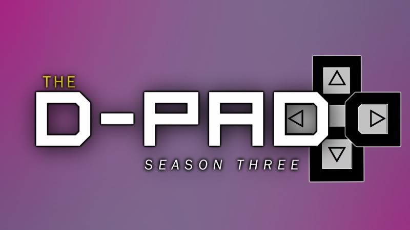
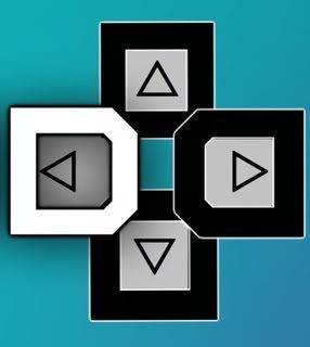
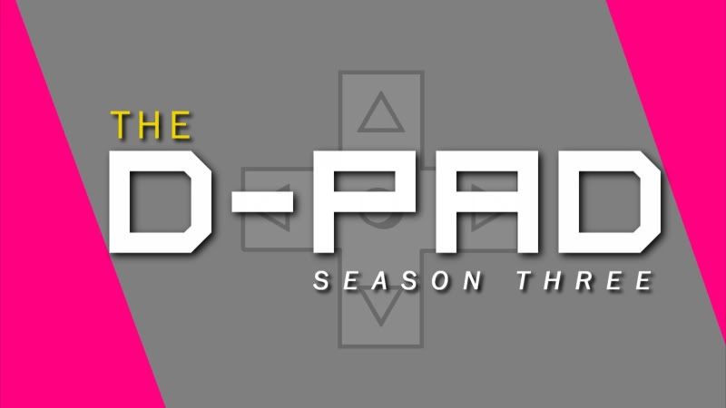
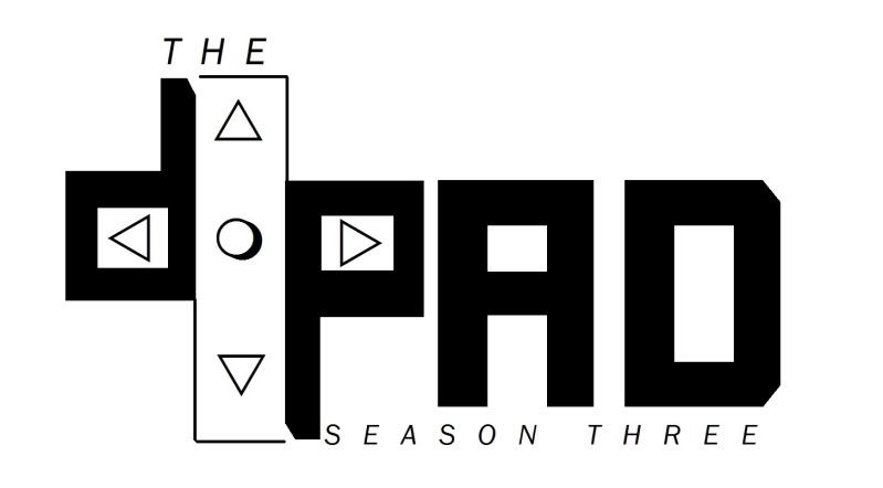
Simple typographic exploration with just the letterforms forming the D-PAD would work so much better. You already have 4 elements ("The", "D", "P", "A" and "D") to place in the top, down, left and right orientation.
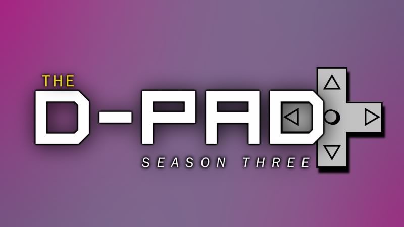
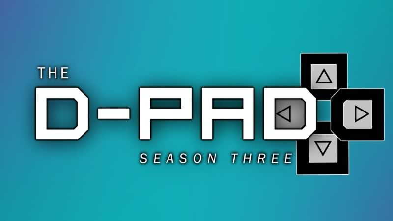
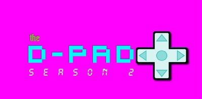
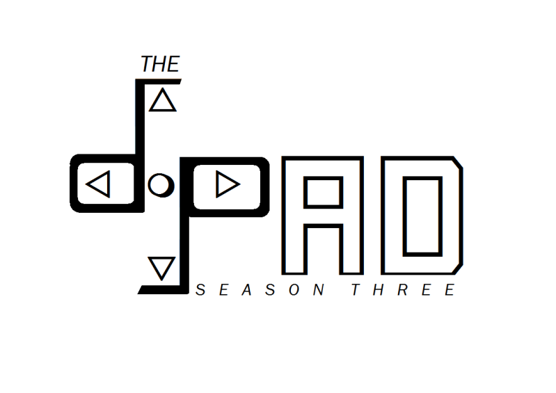
I made the logo really fast to more so test different fonts. I definitely want the d-pad itself to show more.
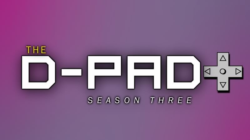
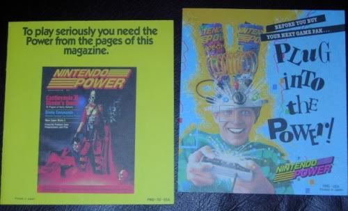
The current logo for the show is old school and pretty basic and straightforward. I made it as a throwback to video game magazines from the late '80s & early '90s that had neon-like colors.
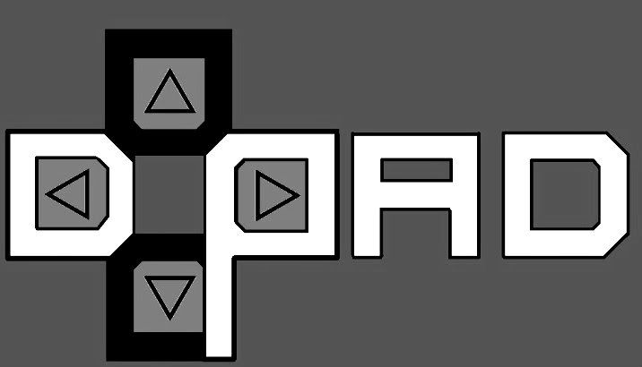
EDIT: The logo on the actual show is less blurry than this. It came out this way after uploading.
Want to change it up and make something more modern while at the same time still maintaining a bit of a 16-bit era style.
I have thought about your idea a few months back but I couldn't come up with a way in which the title would be easy to read with the letters forming a d-pad.
")


 on hover of the hero slider on the site, a transparent-png vignette lays on top with a tiny 'click to read more' on the lower right.