-
Hey Guest. Check out your NeoGAF Wrapped 2025 results here!
You are using an out of date browser. It may not display this or other websites correctly.
You should upgrade or use an alternative browser.
You should upgrade or use an alternative browser.
Hideous text fonts in games
- Thread starter Shizuka
- Start date

Pyrrhus
Member
It's monospaced... which is something that hasn't been particularly common in Japanese games since the GBA.
I thought monospacing was the preferred way with Japanese text. I heard it improved legibility or something along those lines? Not so?
Plague Doctor
Member
Does any game use the Bleeding Cowboys font? That would be my vote. I'd irrationally avoid that game at all cost no matter if it is GOAT.
I thought monospacing was the preferred way with Japanese text. I heard it improved legibility or something along those lines? Not so?
sure was way harder for me to read what was written there, but might just be because i'm a gaijin
Ludger Kresnik
Member
I can't post it right now but the original Etrian Odyssey DS font as abysmal.
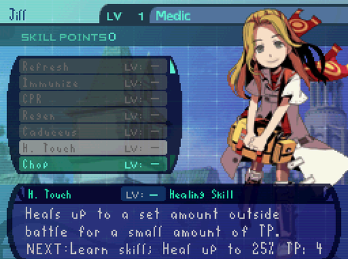
Fixed.Seriously, I love the game to death, but there's not a single thing I can call pretty in it.
That being said, Bannerlord seems to improve the visuals a lot.
The engine was developed by a guy with some help from his wife, I believe. Bannerlord has a dedicated team and a brand new engine. It's looking pretty good!
Lord Azrael
Member
The newest Pokémon games.

Why would they do this? Why would they change the iconic font from previous games? The new font looks cheap as hell.
Why would they do this? Why would they change the iconic font from previous games? The new font looks cheap as hell.
What games have you seen use it?Times New Roman is normally a perfectly fine and unobtrusive font. But whenever I see it in a game, I want to retch. It simply doesn't belong in games. Ever.
Yup, worse than I remember! The newer games all have great fonts, though.
Nocturnowl
Member
Not the worst but my first thought was Pokemon Ruby/Sapphire, fortunately they fixed that messy look when it came to the Emerald release.
I like to think HM: A Wonderful Life serves more as an example of hideous text noise in games.

While I'm at it, what was the name of this hellbeast of a font and why did second stringers like it so much in the early aughts?
I like to think HM: A Wonderful Life serves more as an example of hideous text noise in games.
Muffdraul
Member
What games have you seen use it?
The last example I can think of is probably the latest Thief. [EDIT: It was in Darksiders 2, don't remember if it was in 1] I want to say they often use it in WRPGs like Elder Scrolls. WoW. Maybe it's not actually Times New Roman, but whatever it is it's that same typical serif style.
Mental Atrophy
Banned
The newest Pokémon games.
Why would they do this? Why would they change the iconic font from previous games? The new font looks cheap as hell.
This font is terrific and highly legible. What criteria makes it hideous?
DISSESHOWEDO
Banned
The Witcher 3, before the patch! Was thinking my vision got worse, even though i wear glasses?!?
Backfoggen
Banned
I can't stand the MGS5 subtitle font

Robert at Zeboyd Games
Banned
Don't have any screenshots, but the font in FF4 Steam was straight-up broken on my computer. Lines and stuff between letters.
TechJunk
Member
The funny part is that this is not a font decision, this is a bug (that probably they didn't catch because they're not used to western characters).
Basically, the baseline of the font is not defined, so the game is using the bottom of the character image as the baseline of the font, creating weird effects when there is a character with descender.
Thanks for the logical explanation. That makes sense.
What games have you seen use it?
I recall To The Moon using rasterized Times New Roman for all text.
It's probably due to the game being made in RPG Maker, but I couldn't play it for more than an hour before that fast alone made me quit.
Shame. I wanted to like it, but in a game where the story is central, not having a passable font is detrimental, at least to me.
I hate that shit, how is anyone supposed to read that while sitting a decent amount of space from their TV. It's so god damn annoying to have to sit closer to my TV just so I can read what's happening.Not the look, but the size:

oh god, I forgot about this!

I love the fonts they have been using since EO4 though.
falconxcrunner09
Member
Halo 5's subtitles are pretty terrible. Game has such high production value but the font and color used does not match the overall quality of the game.
https://www.youtube.com/watch?v=4hpZ27ygKOA
https://www.youtube.com/watch?v=4hpZ27ygKOA
I... I actually liked this font and got sad when it was replaced in the HD port. Might just be a nostalgia thing though.Tales of Symphonia

I like that Japanese games often have weird fonts, makes them stand-out over the horribleness that is Arial or the blandness of Times New Roman. I mean, I can't even imagine something like Kingdom Hearts with bland-looking text, it needs the more cartoon-y text like it has now. I don't think it's exactly Comic Sans, but it's pretty close.
N
nan0
Unconfirmed Member
That weird smooted pixel-font that several DS games used:

The "m" is totally screwed and it also looks much worse on the DS screen.
The "m" is totally screwed and it also looks much worse on the DS screen.
Here's a video of the abysmal font Dragon Quest V that starts around 30 seconds in (final boss spoilers).
UnemployedVillain
Member
When I first started playing Xenoblade Chronicles X, I thought that my vision had gotten worse because I couldn't read the text without getting close to the TV. Seriously, the font size is terrible.
I think it's less the font and more the size
Sun Bather
Member
Now the game had many problems, but silent hill downpour just... No. Stop that. I know you got Korn and all as music, but please.


VE3TRO
Formerly Gizmowned


CarbonFire
Member
Not the worst font in the world, but I'm not a fan of some of the fonts they're using in DX:MD:

Fonts in HR were great, not sure why they decided to change them :/
Fonts in HR were great, not sure why they decided to change them :/
Perfect Cha0s
Member
*insert pic of FFXIII UI here*
BrendanSinclair
Member
The in-world font for Omikron: The Nomad Soul. Check out the sign for the hospital:

I played the game on the Dreamcast, so it was also standard-def blurry on top of this.
I played the game on the Dreamcast, so it was also standard-def blurry on top of this.
Tigersprite
Member
I thought it worked quite well in Harvest Moon, actually.
The newest Pokémon games.
Why would they do this? Why would they change the iconic font from previous games? The new font looks cheap as hell.
I agree with this. The font change was unnecessary.

Honestly the color choices here are the biggest issue, though obviously that font isn't too good.
Icyflamez96
Member
nah that font is hideous. which font? all of them.
looks like a f2p ios game with all of those fonts. awful awful stuff.
They look great to me.
Peterthumpa
Member
I'm almost sure that those were placeholders for the first gameplay reveal. I believe they're going to change it.Not the worst font in the world, but I'm not a fan of some of the fonts they're using in DX:MD:
Fonts in HR were great, not sure why they decided to change them :/

Not the worst font in the world, but I'm not a fan of some of the fonts they're using in DX:MD:
Fonts in HR were great, not sure why they decided to change them :/
Woah. The future has Sarif, not serifs.
Jesus, this hurts my eyes.