Streaming tonight again for Air Dash Online, this time I'm passing the torch to one of our animators, Nick!

(Click Here to Watch)

(Click Here to Watch)

Vector.I don't know if I should do pixel or vector based graphics...
That's great and sucks at the same time. You seem to have an almost finished product, I thought it would have been better to release that first then the refreshed version.
I'm curious to see what the art will be like redone, since a large part of the appeal may be the great sprite art. If it's changed, and/or if it switches to a 2.5D Unity approach I would expect it might look different. Jobbs, are you planning to use a 2D toolkit or similar for Unity?
Breakthrough day!
When I started working on Air Dash Online, I set a few technical goals for myself. Those included the following:
1. Create shaders that follow physically accurate rendering principles in Unity3d. ✔
2. Develop custom Spherical Harmonics ambient lighting suited for dynamic environments ✔
3. Approximate that ambient light based on the sky and sun direction. ✔
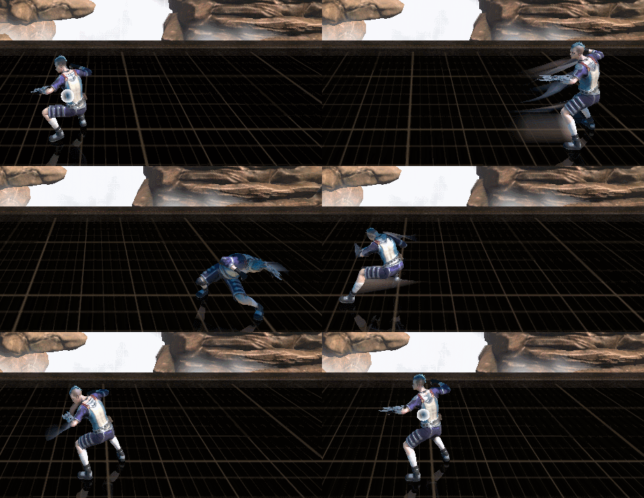
4. Create a unique motion effect that would enhance the sense of speed in the game.
I was able to work my way through the first 3, but #4 provided to be quite the challenge. Making matters more difficult I lack Unity Pro, so no screen effects or buffer access. I wasn't planning on using Unity's poor motion blur anyways, so it wasn't too bad of a loss.
My first attempt was to use the newly added BakedMesh (at the time) to gather vertex position data on my animated meshes. Using that I could calculate the velocity and deform the trailing vertices. It gave some pretty good results, only problem was the speed. After multi-threading what I could, it was adequate for maybe 2 characters on a fast machine. Decided to shelve it and come back to it later.
Finally this week I had the time to revisit it with the idea of using motion trails. Similar idea to this paper, only based on pre-defined joints instead of finding the actual mesh silhouette. After that was in place, I wrote a gradient shader with the intent of gathering pixels on screen to drive it the trails' colors. Thought getting a single pixel on the screen would be simple command in Unity, but unfortunately it turned into a pretty convoluted process. Here is the final result:

Playing the game with the effect on has made a pretty big difference. Aside from being visually interesting to look at, It serves the practical purpose of giving feedback for attack arcs. Anyways, I'm excited I was able to figure this all out. Really wanted to break away from the stiffness often found with 3D fighters compared to 2D animated sprites.
Also before I forget:
Congrats Jobbs on reaching your Kickstarter goal! Keep up the hard work!
Streaming tonight again for Air Dash Online, this time I'm passing the torch to one of our animators, Nick!

(Click Here to Watch)
Sold about 500 in the first 3 days.
Not bad actually!
enemy that I'm not sure you've all seen:


I feel like there should be some kind of ground animation there to show that it's burrowing (?), such as little rocks bouncing up.
The graphics is a lil too blurry for me. Anyone?......
The graphics is a lil too blurry for me. Anyone?

If I can get some good AI going in the game im working on now, it is going to be a blast. I'm already having fun just playing around with the basic mechanics.
Sounds like fun. Please stop teasing and show us some vids already!
Let me tell you that all the work you have put makes the game look more than amazing, the blur looks perfect and gives it a really unique style. Would love to see a fight between two characters using that technique when you have it ready.
EDIT:
Ahh, it seems I didn't arrive in time

Right now it's just circles and squares on the screen. I'll show you next year hehe.
I had to let my artist go, as she got too busy for the kind of workload I was looking at. So I'm back in the market for a new artist. In other news, I'm almost done fixing the damn column bugs. Man this thing has given me so much hell.
Anyway, this is what the game looks like currently:

A little bit of this, a little bit of that. = DLove your buildings! Is it 3D or 2D?
You can always alias them in.Feep, you should add difficult-to-pronounce names, or names that could go either way. And then you'll be yelling "Retreat Александрова, RETREEEEEEAT" and then they die because you were not good enough at pronouncing.
Why did you make Gleamer so tough ;_; (tough to get good times anyways)

Max zoomed-out view.

Love your buildings! Is it 3D or 2D?

Well done!... In the meantime, here's another Gif I put together to show our custom dynamic sky/ambient ligthing and physically based shaders I built earlier in development:

I don't like all the 3d-ish buttons. They do clutter the screen somehow, and itI had to let my artist go, as she got too busy for the kind of workload I was looking at. So I'm back in the market for a new artist. In other news, I'm almost done fixing the damn column bugs. Man this thing has given me so much hell.
Anyway, this is what the game looks like currently:

Pretty hard to tell what progress you did. Mind elaborating about someBack with some more progress of Steel Storm 2 / Storm Engine v2:
http://www.youtube.com/watch?v=qPEJM6SHOo4
Fuck jpeg-compression! My eyes! Give me a new one! Please!Max zoomed-out view.

Indeed, it is!... Edit: I thought this was cool. Someone playing my game connected up to a TV.

Yeah, but it's worth noting that they aren't really "textures" in the traditional sense...those buildings are simply 2-D illustrations. I did tell my artist to keep that hand-painted feel, though. = DFeep, are those your final textures? Because I love em! I've hardly seen any games that utilize the concept art technique for textures. I'd love to do something like that in the future.
It reminds me a ton of Shadowrun Returns, which is absolutely beautiful.Yeah, but it's worth noting that they aren't really "textures" in the traditional sense...those buildings are simply 2-D illustrations. I did tell my artist to keep that hand-painted feel, though. = D


You are the NICEST PERSONReally impressive looking Feep. It shows that you and your team are pros. If I hadn't seen this and somebody showed it to me I wouldn't have guessed it was indie.
I'm now messing around with Blender to build a character model. Much more complicated than expected, but still fun.
Unity on the other hand is really easy to use, especially taking into account all the free and amazing tutorials.
Max zoomed-out view.


Crispy75: Great idea and concept, good luck with the development!
So I just found out about this company recently: http://kamcord.com/
What it does is you can record your gameplay session and after the level is finished (or whenever you choose I guess) a video is constructed and you can share it on social networks. They have a Unity and Cocos2D plugin. It's iOS only. But I was messing with it last night and it seriously takes like 5 minutes to implement (in Unity). Performance on iPhone 5 was perfect but it did take a hit on older hardware.
Not affiliated with that company at all but thought a few here might be interested in it. Seems like a cool idea.
