-
Hey Guest. Check out your NeoGAF Wrapped 2025 results here!
You are using an out of date browser. It may not display this or other websites correctly.
You should upgrade or use an alternative browser.
You should upgrade or use an alternative browser.
Indie Game Development Discussion Thread | Of Being Professionally Poor
- Thread starter chubigans
- Start date
- Status
- Not open for further replies.
BlastProcessing
Member
Messing around with level editing.

Yeah, legibility hasn't proven to be an issue really, but I can't say that I'm happy with how the text works.Especially on cards, especially on cards that small, you want a nice clear serif font that is legible as much as possible. The curved nature of the font on your cards makes it a bit too much to read. A nice angular font should work.
Another things I actually wanted to ask it the color scheme of the cards as I think someone said to us that the single main color cards lose a lot of the detail in the fact that they only feature on main color. We'll definitely be properly separating the spell and summon cards, but the whole color scheme is something I think we need to re-evaluate properly.
Crossposting from the sadly a bit inactive Screenshot Saturday Thread:
Ancestory:
[/IMG]http://abload.de/img/ancestoryshot3_7206hrul.jpg[/IMG]
Do you agree that our font looks way too much like Comic Sans and doesn't really reflect the rest of the style that well? We still have a few 'yes' votes for the font even though the majority agrees that it doesn't work as well as feedback being against the font, but I'd love to hear your thoughts as well.
I'd use a more classic font. Something closer to the below (Google Fonts "Lustria").

spazchicken
Member
Animating the titan in engine for our game our game Red Cobra.

spazchicken
Member
Looks cool!Messing around with level editing.
")
Jacksinthe
Banned
A bit unrelated (kinda, sorta) - anyone mind glancing at my site to let me know what you all think of it? Worked on a quick redesign today. I really need to start updating this fucker more: http://www.absinthegames.com
UNACCEPTABLE. I WANT IT PERFECT FROM THE GET-GO, DAMN YOU!
Every new level I placeholder all the stuff in the level so you'll see unedited stuff like the clipping.
UNACCEPTABLE. I WANT IT PERFECT FROM THE GET-GO, DAMN YOU!
Animating the titan in engine for our game our game Red Cobra.


A bit unrelated (kinda, sorta) - anyone mind glancing at my site to let me know what you all think of it? Worked on a quick redesign today. I really need to start updating this fucker more: http://www.absinthegames.com
I don't have much of an eye for web design so I can only say I like it, it looks minimalistic but very user-friendliness oriented, and I think less works better as far as webpages are concerned!
However, one remark I'd raise is not about the site itself, but the name of one of your projects - Infinite Space is already the name of a sci-fi game on DS. Not sure if that can be a problem, but I thought I'd mention it in case you didn't know!
A bit unrelated (kinda, sorta) - anyone mind glancing at my site to let me know what you all think of it? Worked on a quick redesign today. I really need to start updating this fucker more: http://www.absinthegames.com
The body looks good, I don't like the top. Looks dull and unbalanced. How about a black stripe all the way across the top of the site that contains the logo and stuff, and then the body of the site basically as it is now? You already have a white stripe across the top. Try making it black instead.
Even just adding the nav buttons into the stripe and coloring it black would create a divide between the header and the body that is needed.
Otherwise It looks nice and simple. Like a dev blog should look. (Unless you're in the web design/dev business)
Otherwise It looks nice and simple. Like a dev blog should look. (Unless you're in the web design/dev business)

finally redid the background here a bit, particularly the furthest mountains, making them crisper.

click for big
it's one of the first things you see, so it should look crisp.
This looks phenomenal!
electroflame
Member
A bit unrelated (kinda, sorta) - anyone mind glancing at my site to let me know what you all think of it? Worked on a quick redesign today. I really need to start updating this fucker more: http://www.absinthegames.com[/url[/..."] [IMG]http://i.imgur.com/7N3YzGcl.jpg[/IMG]
I whipped that up in less than five minutes so it's not ideal (personally I would make the main content area wider so you can fit a bit more info on screen, and I'm also not sold on the gradient), but it should give you an idea about what I mean. That does not take into account the nav issue, etc.
Alternatively, if you want to keep the free-floating buttons, I would add slightly rounded corners to them. In general, free-floating square buttons that close together don't look super-great.
Anyway, that's my two cents. Otherwise, I think it looks pretty good.
SeanNoonan
Member
Didn't have time or energy to do much this Saturday - just started on the October update for Jack B. Nimble...


Animating the titan in engine for our game our game Red Cobra.
Epic
The game is getting more amazing by the minute, great work.
Great to see that more and more people are using Construct2. Have been using it for quite a while now and happy with what you can do with it. But wished there were more/better export options though. Think that Gamemaker is a bit better in that department. But it gets the job done for sure.
Bit late for screenshot saturday but here some gifs from the project im working. Working on a proper trailer now and hopefully that helps a bit with getting the word out there for Greenlight. Showcasing the game at events is doing its job but nearly not enough It is a local multiplayer action game and you could compare it to bomberman but faster


And some of the music that plays during what you see in the last gif. Soundcloud
Bit late for screenshot saturday but here some gifs from the project im working. Working on a proper trailer now and hopefully that helps a bit with getting the word out there for Greenlight. Showcasing the game at events is doing its job but nearly not enough
It is a local multiplayer action game and you could compare it to bomberman but faster
And some of the music that plays during what you see in the last gif. Soundcloud
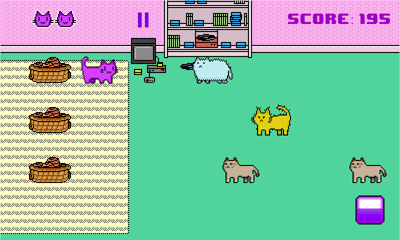
Well, I finally released the mobile game I was working on with a friend! It's a simple arcade game that we did just to learn a few things and finish a project but I'm happy with the result. It's nothing mind blowing but it's fun and it works.
It was made in Unity and it was the first time I used the engine. It's really great and overall had a great time with it.
It's free so if anyone wants to check it out and leave some feed back you can do so here:
https://play.google.com/store/apps/details?id=com.featherBottom.ThrowThatYarn
Thanks and here's a screenshot:
Oh nice, congrats!Well, I finally released the mobile game I was working on with a friend! It's a simple arcade game that we did just to learn a few things and finish a project but I'm happy with the result. It's nothing mind blowing but it's fun and it works.
It was made in Unity and it was the first time I used the engine. It's really great and overall had a great time with it.
It's free so if anyone wants to check it out and leave some feed back you can do so here:
https://play.google.com/store/apps/details?id=com.featherBottom.ThrowThatYarn
I really like how it reminds me of when I was kid and was drawing with KidPix on our Macintosh laptop and a lot of the graphics in the games and the OS had that kind of style.
I still don't have much time to rest, but I've been taking today a bit less seriously even though we just captured an hour's worth of footage for the trailer. I still have to learn the whole After Effects and put everything to making it as good as I can, but we're lucky there's such a great community of developers here and help is always available. I'll definitely be posting snippets here as well and hopefully you can learn from the mistakes I will make in the whole trailer editing process.
andtucholski
Neo Member
Animating the titan in engine for our game our game Red Cobra.
So great!
Oh nice, congrats!
I really like how it reminds me of when I was kid and was drawing with KidPix on our Macintosh laptop and a lot of the graphics in the games and the OS had that kind of style.
I still don't have much time to rest, but I've been taking today a bit less seriously even though we just captured an hour's worth of footage for the trailer. I still have to learn the whole After Effects and put everything to making it as good as I can, but we're lucky there's such a great community of developers here and help is always available. I'll definitely be posting snippets here as well and hopefully you can learn from the mistakes I will make in the whole trailer editing process.
Thanks! I think the color pallet my friend used really gives it that old school look.
And good luck with the trailer!
That looks like a perfect game for the game nights we have every now and then.Bit late for screenshot saturday but here some gifs from the project im working. Working on a proper trailer now and hopefully that helps a bit with getting the word out there for Greenlight. Showcasing the game at events is doing its job but nearly not enough
How's your Greenlight going at the moment and do you have any tips for that? I have to go vote for it now and tell my friends as we have quite a few local mp enthusiasts here.
That looks like a perfect game for the game nights we have every now and then.
How's your Greenlight going at the moment and do you have any tips for that? I have to go vote for it now and tell my friends as we have quite a few local mp enthusiasts here.
Greenlight is not going so hot at the moment but that is mostly my faulth. I placed it on Greenlight way to early in development. Things have changed drasticly since then and might have missed some extra votes because of that since now the game is harder to find on greenlight and people that voted no then, might vote differently now.
Graphics have changed, all the stages are improved, story is more present in the game, it just looks different now and in the coming months i'm implementing the powerups/weapon systems. That is why i'm now working on a trailer first to showcase all that.
But all the comments have been very positive on Greenlight so thats awesome. Some requests for singleplayer but for now that is not a priority, but it's something that I want to do. It's now sitting at 36% with a 1890 yes votes. Sometimes it even drops and that can be a bit demotivating
Still a long way to go..My only advice for Greenlight is don't post the game to early in development and have everything ready, proper footage, screenshots, social stuff and a proper greenlight page with all the info. Building a small community before hand on something like IndieDB won't hurt either I guess.
Being a local multiplayer only game isn't helping much to in the end
Small audience for that on Greenlight, but that is something I knew from the beginning.OldmanAndroid
Member
Greenlight is not going so hot at the moment but that is mostly my faulth. I placed it on Greenlight way to early in development. Things have changed drasticly since then and might have missed some extra votes because of that since now the game is harder to find on greenlight and people that voted no then, might vote differently now.
My only advice for Greenlight is don't post the game to early in development and have everything ready, proper footage, screenshots, social stuff and a proper greenlight page with all the info. Building a small community before hand on something like IndieDB won't hurt either I guess.
Thanks for sharing all this, that's a real bummer. I think your game looks really slick, and has a ton of style . Have you tried contacting any websites to try to get exposure, like RockPaperShotgun? I think a new trailer and push to get some exposure could really help. I'm surprised, I thought these local multiplayer games were really hot right now.
I think I'm going to wait until my game is finished (hopefully before christmas), then just sit on it for like a month, and focus all my energy on marketing and greenlight. I find it difficult to find that balance between marketing and developing.
Jacksinthe
Banned
I don't have much of an eye for web design so I can only say I like it, it looks minimalistic but very user-friendliness oriented, and I think less works better as far as webpages are concerned!
However, one remark I'd raise is not about the site itself, but the name of one of your projects - Infinite Space is already the name of a sci-fi game on DS. Not sure if that can be a problem, but I thought I'd mention it in case you didn't know!
Dammit. I swear I found nothing. Thanks for the heads-up on that, lol.
The body looks good, I don't like the top. Looks dull and unbalanced. How about a black stripe all the way across the top of the site that contains the logo and stuff, and then the body of the site basically as it is now? You already have a white stripe across the top. Try making it black instead.
Even just adding the nav buttons into the stripe and coloring it black would create a divide between the header and the body that is needed.
Otherwise It looks nice and simple. Like a dev blog should look. (Unless you're in the web design/dev business)
Separating the nav is a good idea. I'm also not a huge fan of the top being solid white (since it's so large).
You also went a little crazy with margins on things, so it chews up a lot of valuable screen space. Here's a quick job I did of removing the margins, while making the header less white (click for full-size):
I whipped that up in less than five minutes so it's not ideal (personally I would make the main content area wider so you can fit a bit more info on screen, and I'm also not sold on the gradient), but it should give you an idea about what I mean. That does not take into account the nav issue, etc.
Alternatively, if you want to keep the free-floating buttons, I would add slightly rounded corners to them. In general, free-floating square buttons that close together don't look super-great.
Anyway, that's my two cents. Otherwise, I think it looks pretty good.

Thanks for the ideas, guys. I will look into creating more of a separation from the top nav to bottom nav. I'm having my art maker person guy work on a logo for us. One isn't up yet. Will choose final design before deciding how to compartmentalize the header.
Thanks for the critique, folks. Much appreciated! I suck at web design so this is what happens hahaha!
Thanks for sharing all this, that's a real bummer. I think your game looks really slick, and has a ton of style . Have you tried contacting any websites to try to get exposure, like RockPaperShotgun? I think a new trailer and push to get some exposure could really help. I'm surprised, I thought these local multiplayer games were really hot right now.
I think I'm going to wait until my game is finished (hopefully before christmas), then just sit on it for like a month, and focus all my energy on marketing and greenlight. I find it difficult to find that balance between marketing and developing.
In some way it is a bit of a bummer but it has been such a learning experience so far. I work alone on the game and part time so i'm already happy with how far I have gotten and i'm sure greenlight will work out someday. It's my first game and i'm not in a real hurry to release it so if it takes a bit longer, then so be it. Just hope its not going to end up like a neverending story
And Desura is always an option. Have not contacted any website yet. Kinda hesistant with that right now, certainly after how Greenlight has gone with showing it to early. There is still some work left to do that will improve the game a lot more and I plan to contact websites when the game is almost done or finished (end of nov hopefully).
Cool to hear you like the style! Thanks
And I agree that the balance between marketing and developing is a difficult one.kingPenguin
Neo Member

Hi, this is what I've been working on the last 2 days, a prototype of a twin stick shooter where you can switch your gravity in 4 directions. (not sure why the camera's so shakey here. It does that sometimes)
Short gameplay video: https://www.youtube.com/watch?v=FoPyTSzdKj0
At first it was a little nauseating, but I've added a quickly drawn background to it hoping that some more visual stuff would make it a little less confusing to your eyes/brain/balance-organ-thingies.
I think it's beter now, or maybe I'm just getting used to it. Here's the "old" version by the way: https://www.youtube.com/watch?v=LEtwDikLRwQ
OldmanAndroid
Member
In some way it is a bit of a bummer but it has been such a learning experience so far. I work alone on the game and part time so i'm already happy with how far I have gotten and i'm sure greenlight will work out someday. It's my first game and i'm not in a real hurry to release it so if it takes a bit longer, then so be it. Just hope its not going to end up like a neverending story
Have not contacted any website yet. Kinda hesistant with that right now, certainly after how Greenlight has gone with showing it to early. There is still some work left to do that will improve the game a lot more and I plan to contact websites when the game is almost done or finished (end of nov hopefully).
Cool to hear you like the style! Thanks
That's a really great attitude to have my friend. That's how I went into my game too: just wanted to learn how to program and become comfortable with Unity. I gave myself a 2 year window (that was 2.5 years ago). I'm really not expecting to make any money, hopefully just enough to get a new computer and a Oculus devkit. I was also working part-time, but had to quit recently as they just kept increasing my hours. Now I'm living of savings, and just taking a few months to put my best effort into my game. Cannot wait to get started on a new game after this.
By the way, I love the name of your game, Horizon Danger.
Lord_Balkan
Member
Got a new Gun Model. Still not completely done.

Lord_Balkan
Member
Yep, that's a gun.
Looks pretty darn good.
Thanks!!
I took a better screenshot. I am currently working on getting weapons working right.

Lord_Balkan
Member
The bump mapping on that revolver is glorious.
Thanks! A lot of the bump maps work really well. I give credit to the Horizon Mapping. It allows bumps to self shadow. It gives a really awesome effect.
http://youtu.be/87EQQlz9X5w
EDIT:
I changed the shader a bit for the gun. I think it looks better now


OccamsBlender
Member
If you really want to add animation to the background only thing I can think of is dripping water and/or mist
Seconded. Mist in the background would be great! If there are any cobwebs or something, light glinting off them could be nice too.
Lord_Balkan
Member
I am not an artist, but I was able to get this done. I want it to look like a 'molten' magma revolver. I think this will do for now!

This is technically an assignment, rather than the actual game I'm working on, but I've been enjoying it so far:
Just a pretty simple pathfinding and collision avoidance system, topped with some balls out flat colours and crazy spinning shit for some reason.
I'm real bad at following assignment spec sometimes.


Just a pretty simple pathfinding and collision avoidance system, topped with some balls out flat colours and crazy spinning shit for some reason.
I'm real bad at following assignment spec sometimes.
This is technically an assignment, rather than the actual game I'm working on, but I've been enjoying it so far:
Just a pretty simple pathfinding and collision avoidance system, topped with some balls out flat colours and crazy spinning shit for some reason.
I'm real bad at following assignment spec sometimes.
Still neat as hell though
OccamsBlender
Member
If you say so... that wasn't my point at all.
And that game was a very nice Beat'em Up.
Back in the day, games based in movies/cartoons didn't always suck.
Just think about the brilliant Aladdin for genesis/mega drive.
Licensed games have always been hit or miss from ET on Atari to Batman Arkham Asylum(if that doesn't cover the extremities, IDK what does!) Yes I know they don't all suck. I thought that Power Rangers game was a bit rushed to market. That rush to meet the hype window of a product release is what tends to shoot most licensed stuff in the foot hard.
Urgh. I still need to get my animation list together and get some estimates from animators. -_-
Game creating can be fun but sometimes the fear of messing stuff up is so paralyzing.
Demo for my game is all done! Will be submitting it tonight (If I can get the demo icons from Nintendo today..). Now that I'm in the coding mood again, will be getting back into it and finishing off some other games I've been working on.
I love that his expressions basically says "Are we there yet?"

Getting there!
I love that his expressions basically says "Are we there yet?"
I made some initial attempts at blood particles by using a little red ball graphic. thoughts?
http://gfycat.com/ImaginarySecondhandAbyssiniangroundhornbill
nice colors, did you record those in your home studio + how did you fit a home studio inside a shoebox?
also what am I looking at? a map?
http://gfycat.com/ImaginarySecondhandAbyssiniangroundhornbill
The colors, Duke
The colorssssssssss
nice colors, did you record those in your home studio + how did you fit a home studio inside a shoebox?
also what am I looking at? a map?
Lord_Balkan
Member
I made some initial attempts at blood particles by using a little red ball graphic. thoughts?
http://gfycat.com/ImaginarySecondhandAbyssiniangroundhornbill
nice colors, did you record those in your home studio + how did you fit a home studio inside a shoebox?
also what am I looking at? a map?
It looks good, but I couldn't initially tell that was blood. You may want to look into Mortal Kombat https://www.youtube.com/watch?v=s7KyC3NfNxY if you make them not 'balls' and instead make them more elongated and a stronger color to differentiate between the 'gun' particles I think that may help.

OldmanAndroid
Member
I made some initial attempts at blood particles by using a little red ball graphic. thoughts?
http://gfycat.com/ImaginarySecondhandAbyssiniangroundhornbill
It looks a bit like sparks flying out of a robot; wouldn't have known it was blood. Perhaps because they disappear instead of staying on the ground? Its a great effect though. I think big blood splatters would seem a bit out of place in your game.
It looks like the shots to the first enemy are sort of "pew pew pew", while the shot to the second enemy is more of a shotgun blast. How did you switch weapons so fast? Is there like a dedicated "shotgun" button? Man, i cant wait to get my hands on this game.
I made some initial attempts at blood particles by using a little red ball graphic. thoughts?
http://gfycat.com/ImaginarySecondhandAbyssiniangroundhornbill
I think the effect is very good looking, though I initially couldn't tell it was blood either - but somehow, I find what I identify as blood particles to be almost cartoonish (for instance, the last little sputter after the second enemy is killed) compared to the rest, and I'm not sure it fits with all the other effects/the overall atmosphere? It works, mind you, I'm just not sure it's needed!
- Status
- Not open for further replies.