So Valve flipped the switch the other day to make DotA 2 Reborn the new official client, thus introducing the wild world of Custom Games to the rest of the enormous DotA 2 playerbase that never hopped on the beta bandwagon. For fans of the olden days of Brood War and Warcraft 3 custom maps, this should be great news. After all, this initiative is being spearheaded and developed by a team that has a deep understanding of the importance of supporting this custom maps scene. DotA was birthed from it!
Valve is somewhat receptive to criticism in their own secretive, draconian way. People complain a lot, and despite Valve's silence they more often than not end up implementing fixes and features based on suggestions from the players. That in mind, I thought it'd be fruitful for us to discuss the interface design powering custom game discovery in DotA 2 as compared to similar services. While this is something that we once took for granted, we need only be reminded of Blizzard's mishandling of the SC2 Arcade upon launch and to see how much interface design can impact the scene in its early days.
To start off, let's look at the landing pages for custom games:
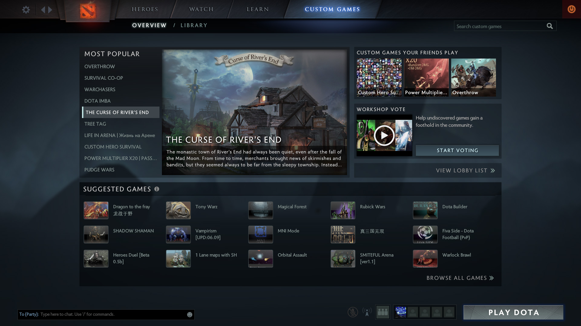
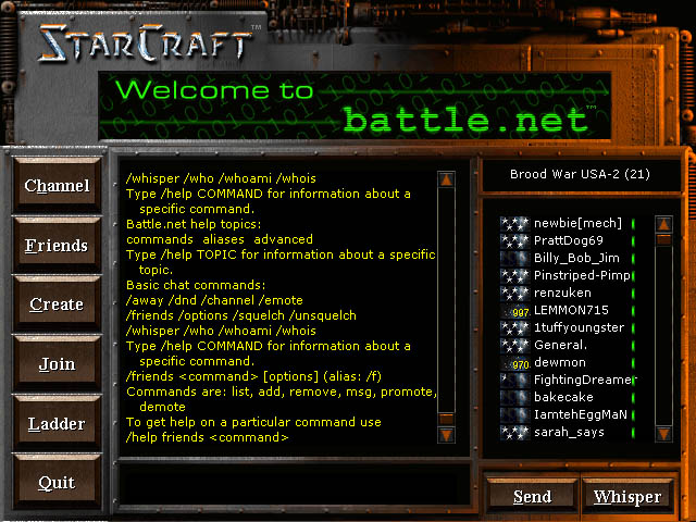
So here we have two modern examples of custom games interface design next to the old standard, Battle.net 1.0. One major criticism that the SC2 Arcade faced from day one was how it minimized the communal aspects of Bnet 1.0. Notice how you're dumped right into a giant chat room from the start in Brood War. From there, you can easily create other custom chat rooms, create a new game session, or start browsing the list of lobbies. It was a dead-simple interface, but it worked and was great for fostering a sense of online community.
Looking at DotA 2 and the SC2 Arcade, however, it's clear that they're taking a more popularity-driven approach to game discovery. The first thing that players see when hopping in is a list of the most popular maps in both games. On one hand, this is a good thing. It allows players to cut out the fat and get right to games that are vouched for as being fun and worthwhile. On the other, it sets up a "rich get richer" effect where failing to crack that Top 10 showcase means your map might not ever gain traction. It's a similar problem facing games and apps on digital storefronts like the iOS App Store, Google Play... etc. This is the modern approach to user-generated content discovery, for better or worse.
Comparing the two, they each do some things better than the other IMO. DotA 2's Suggested Games section at the bottom cycles through a set of 15 maps (not based on popularity) that are the same for everyone playing at any given time. In theory, this is good for giving less popular maps a chance to be played, but one downside of this approach is that it often suggest broken or incomplete maps, souring the experience for people taking a chance on potentially overlooked games.
SC2's Arcade offers a helpful Browse section alongside its popularity-driven frontpage, and it allows players to filter by genre and other variables when looking for new maps to play. There is also an Open Games lobby list of sorts, but the problem is that very few people ever use it. This results in people having a very hard time getting games to fill up without inviting friends or playing the most popular maps. It's a problem that essentially killed all motivation for mapmakers who felt that all of their hard work would go unplayed. All problems aside, it's still a very slick interface, and the ability to browse by genre is something that the Arcade has over DotA 2's interface at the moment.
Next let's look at examples of Custom Game pages for both DotA 2 and the SC2 Arcade, respectively. This is a case where the Arcade is clearly a more mature platform with years of iteration and polish behind it, while the DotA 2 custom games interface is just exiting beta. The SC2 Arcade page is nicely represented with clear buttons for play instructions, patch notes, and reviews. It's all very intuitive and I think it works quite well in terms of showcasing a map before you hop into it.
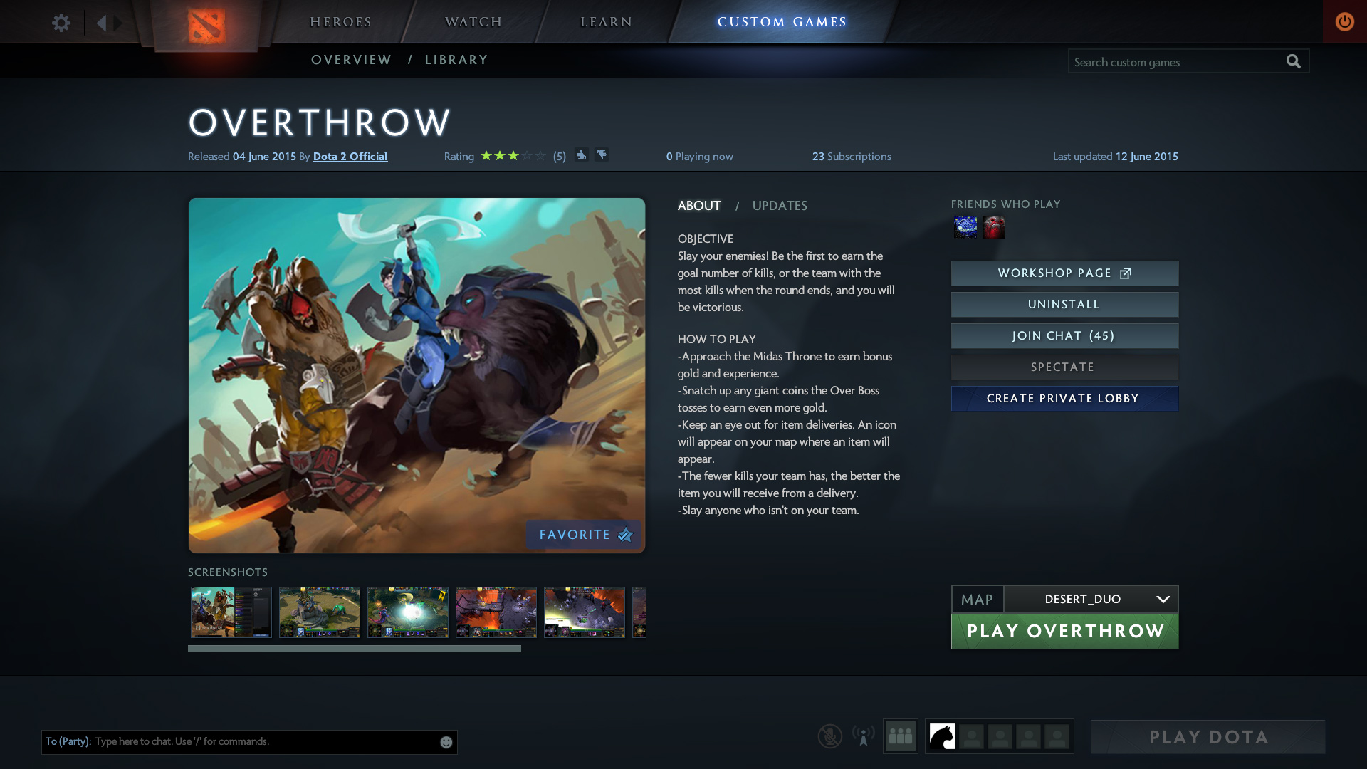
DotA 2's page is a little more barebones and essentially reflects the game's listing on the Steam workshop page. You can see a star review score at the top, but there are no real written reviews anywhere. At best you can click the Steam Workshop page button and sift through the garbage heap of a comment section to try and find constructive criticism. Otherwise niceties like joining a chat room for that specific game and quickly installing the game and hopping right into an open lobby are both there. Joining games is simple and easy from this page, which I think is good design. You can also easily choose different map variations from a dropdown in cases where games have multiple variants.
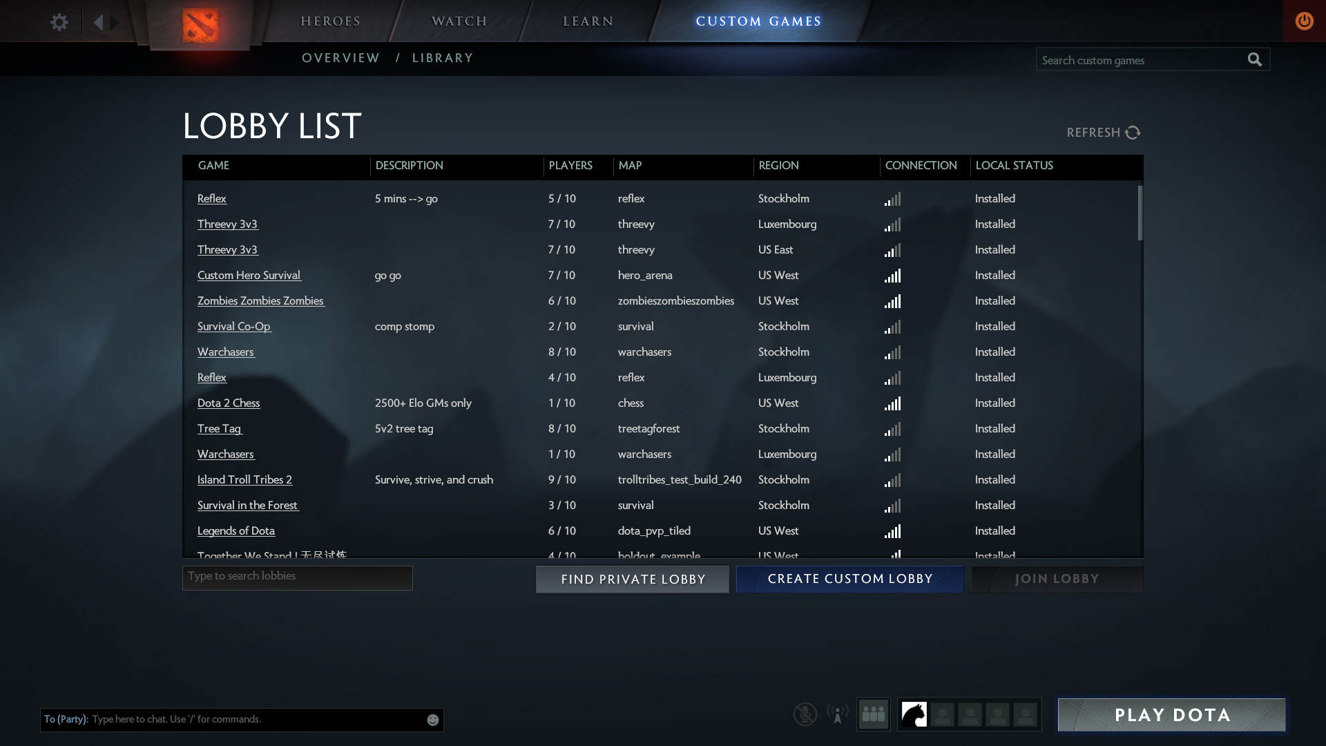
Last but certainly not least, we have the lobby lists. This, in my opinion, represents the biggest difference between the old approach to game discovery and the new one. While the screenshot I found for Open Games in the SC2 Arcade is old, it still communicates the main problem with it: there's hardly anyone ever looking at this list. Most people are drawn to that initial "most played" list on the frontpage, and that's the extent of their custom map discovery. DotA 2 gives the player access to a full, traditional lobby list complete with filters, search, and sorting by fields, but it's hidden behind a link on the frontpage. How often people use this link is not know to me at the moment.
The beauty of Brood War's simple lobby list was that it continuously updated without intervention from the player, and it listed every lobby by recency and the user-created lobby name. It's a small, subtle thing, but I think that showing lobbies by lobby name -- rather than having the same map name represented all the way down the list with nothing to differentiate one lobby from another -- made for a much better map discovery experience. Simply put: it encouraged experimentation and exploration. Mapmakers could start a lobby with their new map and quickly have the lobby filled within seconds and start playing. There was no popularity system guiding discovery, so everyone was on equal footing. If games were good and became popular, the only consequence was seeing them show up on the lobby list more often. This allowed popular maps to shine while not taking away all of the attention from up-and-coming maps or old favorites. It worked beautifully, if almost by accident.
I think that Valve is on the right track with their lobby list, and hopefully with a few tweaks they can brings its functionality closer to what we had with Bnet 1.0.
Valve is somewhat receptive to criticism in their own secretive, draconian way. People complain a lot, and despite Valve's silence they more often than not end up implementing fixes and features based on suggestions from the players. That in mind, I thought it'd be fruitful for us to discuss the interface design powering custom game discovery in DotA 2 as compared to similar services. While this is something that we once took for granted, we need only be reminded of Blizzard's mishandling of the SC2 Arcade upon launch and to see how much interface design can impact the scene in its early days.
To start off, let's look at the landing pages for custom games:


From left to right: DotA 2 Custom Games frontpage, SC2 Arcade frontpage, Brood War (Bnet 1.0) frontpage.
So here we have two modern examples of custom games interface design next to the old standard, Battle.net 1.0. One major criticism that the SC2 Arcade faced from day one was how it minimized the communal aspects of Bnet 1.0. Notice how you're dumped right into a giant chat room from the start in Brood War. From there, you can easily create other custom chat rooms, create a new game session, or start browsing the list of lobbies. It was a dead-simple interface, but it worked and was great for fostering a sense of online community.
Looking at DotA 2 and the SC2 Arcade, however, it's clear that they're taking a more popularity-driven approach to game discovery. The first thing that players see when hopping in is a list of the most popular maps in both games. On one hand, this is a good thing. It allows players to cut out the fat and get right to games that are vouched for as being fun and worthwhile. On the other, it sets up a "rich get richer" effect where failing to crack that Top 10 showcase means your map might not ever gain traction. It's a similar problem facing games and apps on digital storefronts like the iOS App Store, Google Play... etc. This is the modern approach to user-generated content discovery, for better or worse.
Comparing the two, they each do some things better than the other IMO. DotA 2's Suggested Games section at the bottom cycles through a set of 15 maps (not based on popularity) that are the same for everyone playing at any given time. In theory, this is good for giving less popular maps a chance to be played, but one downside of this approach is that it often suggest broken or incomplete maps, souring the experience for people taking a chance on potentially overlooked games.
SC2's Arcade offers a helpful Browse section alongside its popularity-driven frontpage, and it allows players to filter by genre and other variables when looking for new maps to play. There is also an Open Games lobby list of sorts, but the problem is that very few people ever use it. This results in people having a very hard time getting games to fill up without inviting friends or playing the most popular maps. It's a problem that essentially killed all motivation for mapmakers who felt that all of their hard work would go unplayed. All problems aside, it's still a very slick interface, and the ability to browse by genre is something that the Arcade has over DotA 2's interface at the moment.


From left to right: DotA 2 Custom Game listing, SC2 Arcade custom game listing.
Next let's look at examples of Custom Game pages for both DotA 2 and the SC2 Arcade, respectively. This is a case where the Arcade is clearly a more mature platform with years of iteration and polish behind it, while the DotA 2 custom games interface is just exiting beta. The SC2 Arcade page is nicely represented with clear buttons for play instructions, patch notes, and reviews. It's all very intuitive and I think it works quite well in terms of showcasing a map before you hop into it.
DotA 2's page is a little more barebones and essentially reflects the game's listing on the Steam workshop page. You can see a star review score at the top, but there are no real written reviews anywhere. At best you can click the Steam Workshop page button and sift through the garbage heap of a comment section to try and find constructive criticism. Otherwise niceties like joining a chat room for that specific game and quickly installing the game and hopping right into an open lobby are both there. Joining games is simple and easy from this page, which I think is good design. You can also easily choose different map variations from a dropdown in cases where games have multiple variants.


From left to right: DotA 2 lobby list, SC2 Arcade open games list, Brood War lobby list.
Last but certainly not least, we have the lobby lists. This, in my opinion, represents the biggest difference between the old approach to game discovery and the new one. While the screenshot I found for Open Games in the SC2 Arcade is old, it still communicates the main problem with it: there's hardly anyone ever looking at this list. Most people are drawn to that initial "most played" list on the frontpage, and that's the extent of their custom map discovery. DotA 2 gives the player access to a full, traditional lobby list complete with filters, search, and sorting by fields, but it's hidden behind a link on the frontpage. How often people use this link is not know to me at the moment.
The beauty of Brood War's simple lobby list was that it continuously updated without intervention from the player, and it listed every lobby by recency and the user-created lobby name. It's a small, subtle thing, but I think that showing lobbies by lobby name -- rather than having the same map name represented all the way down the list with nothing to differentiate one lobby from another -- made for a much better map discovery experience. Simply put: it encouraged experimentation and exploration. Mapmakers could start a lobby with their new map and quickly have the lobby filled within seconds and start playing. There was no popularity system guiding discovery, so everyone was on equal footing. If games were good and became popular, the only consequence was seeing them show up on the lobby list more often. This allowed popular maps to shine while not taking away all of the attention from up-and-coming maps or old favorites. It worked beautifully, if almost by accident.
I think that Valve is on the right track with their lobby list, and hopefully with a few tweaks they can brings its functionality closer to what we had with Bnet 1.0.
