KOF XI -- first scans

Lyte Edge said:
Eh? I thought they were cel shaded? :)

The game looks pretty damn good to me, but tends to have some strange animation here and there. I didn't really go for the arcade version, but have really enjoyed the PS2 version.

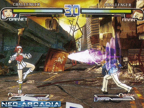
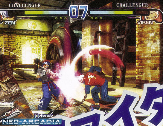
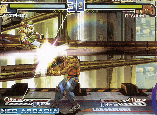
Here's some old pics of the game. Note that characters show damaged clothing, something not seen in years:
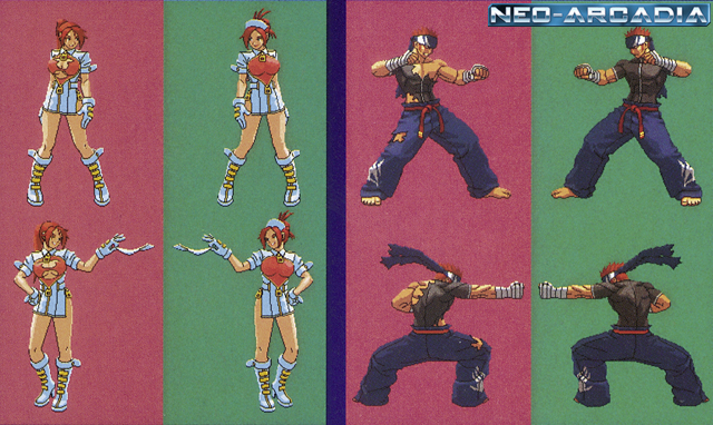
rf1.jpg
rf2.jpg

rf7.jpg

rf6.jpg

god I hope SNK never uses the rumblefish dev technique... they move like paper dolls... just... just wierd and shit.

I hope that next gen SNK makes widescreen 2D fighters with touched up high res sprites, 3D backgrounds, and use 3D effects for fireballs, motion trails, etc.

plus new sound effects... those old neo geo sound effects need to go.
 
yeah i recall seeing rumblefish in motion.. not pretty, wonder why its so choppy I bet this technique of animation could be improved on since its cheaper then pixel art used in most of the 2D fighters.
 
Some of the animations in The Rumblefish are very smooth, and others aren't. It's mostly the walking animations that need major improvement, but the look of the game shows promise.
 
Himuro said:
Holy shit?! A KOF with new sprites? When did this start to happen?!

It didn't. The new characters are the only new sprites, as usual. I *think* Athena got redrawn again, too. B. Jenet is apparently taken straight out of Garou: Mark of The Wolves. Not sure about Duck King, who I didn't even see listed in the scan!
 
mint said:
Rumblefish is also very very slow, heard the sequel is much faster.

Depends on the character you play as, too. Part of the reason I thought the game sucked at first was because I picked slow, floaty Garnet; other characters don't move the way she does.

The sequel definitely looks like a good improvement; the PS2 version has two of the characters from TRF2 and they are very fun to play with. Hazama is a bit too cheap though.
 
Himuro said:
That makes no fucking sense. If they have the oldschool KOF sprites in there along with the new sprites that look like THAT, the new characters will look out of place because they have a completely different graphics style. I am sure you are shitting me.

Oh, nevermind that shit is from Rumblefish. nvm

:lol Okay, now I see where your confusion came from. :)
 
Himuro said:
the new characters will look out of place because they have a completely different graphics style. I am sure you are shitting me.
That's never stopped them before.

To their credit though, the KOF art has always blended together better than what you see in Capcom's verus series.

Thought they did a good job on the re-draws for the Capcom characters in SVC.
 
Goodness seems like no one has played KOF2003..Gato and Tizoc were in there and the game still went alright.
 
Just like Chun-Li and Yun in CvS2 (and Hugo in SvC), all the Garou characters have been slightly redrawn and generally lost a BUNCH of frames for King of Fighters. Still, the new characters here look okay.
 
Yeah they lost those frames in order to feel similar to the other chars..yeah w/e.

I personally think the new chars are really awesome..and feedback by testplayers like beezebubble gave them great critiques.
 
mint said:
Goodness seems like no one has played KOF2003..Gato and Tizoc were in there and the game still went alright.

Gato and Tizoc were redrawn as far as I can tell, however beta test reports said that it looked like B. Jenet was just taken from Garou.
 
They did a pretty good job with Tizoc; I was very happy to see that they made him huge, far bigger than his Garou sprite. Gato looked a little grainy and washed out to me, though.
 
ArcadeStickMonk said:
That's never stopped them before.

To their credit though, the KOF art has always blended together better than what you see in Capcom's verus series.

Thought they did a good job on the re-draws for the Capcom characters in SVC.
err.. I beg to differ some of the characters are hideous.. (bison)

I think Chun Li for CvS was a complete redraw (like the shotos) because it looks very different from the 3S chun. Its also not likely that A3 art was by Hiroaki since he's always been an SNK artist (now freelance).

I'm not really surprised they used more Garou characters, its like tried and true.. I hope snkp would atleast animate their characters like Garou if they aren't going to update KOF into high res, atleast give us the animation.
 
anotheriori said:
I think Chun Li for CvS was a complete redraw (like the shotos) because it looks very different from the 3S chun.
CvS did have a lot of redraws. For the shotos it was like they re-drew them based heavily off the original SF2 animation. Unfortunately, we had all seen the SF3 art by then and it was not an appreciatted effort.

However, some of the MvC2 sprites clash and do we even have to talk about Morrigan.

BTW, I've never even seen Fighting Jam, and I never want to. I reckon there's some lumps in that blend.
 
CFE clashes pretty bad. The Darkstalkers characters are especially pixelated. Lyte doesn't believe me that they touched up Demitri though. He really is drawn taller (I have the sprite taken from that PS2 emu, before the engine resizes it), it's not just vertical stretching. If it was, he'd be insanely distorted. His hair and face is slightly different too.
 
Top Bottom