• Hey, guest user. Hope you're enjoying NeoGAF! Have you considered registering for an account? Come join us and add your take to the daily discourse.

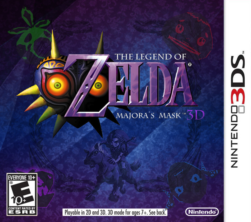
Majora's Mask 3DS announced!

Peagles

Member
Thats a really crappy comparison. Half the shots are wrong (clock town laundry pool moon view vs outside clock town) and half the footage is from thumbnail size N64 footage from bloody n64.com back in 1999.

Here's hoping someone does a decent one, hopefully via the real hardware N64 or retroarch

Absolutely. Seems it's all we have for now though.

Even a comparison to Wii VC would be nice.
 

zeldablue

Member
Hope they don't over do it with the lighting and coloring. The dark areas in the original game work perfectly with the overall eerie mood of the game, there's really no need to change that atmosphere of the game for the sake of lighting up areas.

Also disappointing to see that they just used the Hyrule Warriors Moon model. Original one looks better.

Isn't the cutesy, happy lighting there to prevent "ghosting" effects with the 3D on?

I prefer the dank and dark look of the original N64 titles myself.
 

Randomizer

Member
Been itching to play Majora's Mask this last while, glad I held out for this. Will do a run through of OOT3D sometime before release to get me hyped.
 
Yay, I'm so excited to pay 40$ for a game I can buy on the VC for 10!

I didn´t know N64 VC is already on the 3DS and that they retroactively enhanced the framerate and visuals .

I´m actually surprised you´ve even heard of Majoras Mask before. It is quite the obscure game compared to Smash Bros. .
 
Hope they don't over do it with the lighting and coloring. The dark areas in the original game work perfectly with the overall eerie mood of the game, there's really no need to change that atmosphere of the game for the sake of lighting up areas.

Also disappointing to see that they just used the Hyrule Warriors Moon model. Original one looks better.

Yeah some areas look brighter. But on the other hand the purple light makes it sometimes really creepy.
 

Hermii

Member
I like that they want to retain the same level of challenge while making it accessible.

Easy Mode, maybe? Or a more prominent Super Guide? Revamped Save System?

I think revamped save system is a guarantee. The save system put a lot of people of the original game.
 
Can't wait for that Fierce Deity mask!! If Nintendo wanted to go a step above with this game, they should let some of the masks be used by Miis in Streetpass
 
Yeah some areas look brighter. But on the other hand the purple light makes it sometimes really creepy.

The purple lighting is fine but the change they made to the choking scene is odd. Went from being a creepy scene to a scene where it looks like he's about to bring him in for a hug. Did a little edit to it to show the difference that it makes. Hope they don't do this for other areas of the game because it was pretty dark for the most part and worked just fine for the game.

IUiq9Bw.png

XTXzEvs.png

2xQ9tIx.jpg
 

SegaShack

Member
Sure, I guess that makes sense. I'll de-attitude my original post.

It's all good, sorry for giving you a hard time :).

I agree with this guy.

But the argument is entirely pedantic. Who cares if you call it a remake or port? We all know the differences and enhancements.

What it's called isn't an issue but just wanted to show what me and the other poster meant by port vs enchanced port vs remake.
 

ugoo18

Member
Time to play and actually finish this for once, this has been that one 3D Zelda that no matter how many times i start or how determined i am to complete it the age of the game ends up putting me off to the point of stopping.
 

Yarbskoo

Member
Call me a casual or whatever, but I would be perfectly happy if they added the ability to save anywhere anytime, and took out the part where it removes all of your items (except masks and equipment because reasons, not counting the Razor Sword, because more reasons) when you go back in time. Letting you save at any time would fit better with the portable gameplay, and letting you keep all of your ammo and supply items (bombs, arrows) would remove some of the tedium of time traveling without really affecting the difficulty or challenge.

The purple lighting is fine but the change they made to the choking scene is odd. Went from being a creepy scene to a scene where it looks like he's about to bring him in for a hug. Did a little edit to it to show the difference that it makes. Hope they don't do this for other areas of the game because it was pretty dark for the most part and worked just fine for the game.

The brightness of the light doesn't bother me as much as the direction. In the original, the light came from below to enhance the creepy. In the 3D version, the light source is above like it normally is, like they didn't bother to change it for the scene.
 

Rich!

Member
This is a day one buy for me. One of my favorite games of all time. Any US release date on the new 3DS yet?

NoA wont acknowledge the new 3DS exists until after the christmas season is over.

Regarding the colours, a lot of people seem to forget just how bright and garish most of Majoras Mask actually was.
 

Madness

Member
Wow, at least so many will finally get to play this underrated gem of a Zelda game. Great news for 3DS owners and Zelda fans.
 

Rich!

Member
Call me a casual or whatever, but I would be perfectly happy if they added the ability to save anywhere anytime, and took out the part where it removes all of your items (except masks and equipment because reasons, not counting the Razor Sword, because more reasons) when you go back in time. Letting you save at any time would fit better with the portable gameplay, and letting you keep all of your ammo and supply items (bombs, arrows) would remove some of the tedium of time traveling without really affecting the difficulty or challenge.

Hell no. It would ruin the three day system. Please, no.

Just have a "casual mode" for those who want to play a watered down version of what makes Majoras Mask so great.
 

Mistle

Member
The purple lighting is fine but the change they made to the choking scene is odd. Went from being a creepy scene to a scene where it looks like he's about to bring him in for a hug. Did a little edit to it to show the difference that it makes. Hope they don't do this for other areas of the game because it was pretty dark for the most part and worked just fine for the game.

[IMG.]http://i.imgur.com/IUiq9Bw.png[/IMG]
[IMG.]http://i.imgur.com/XTXzEvs.png[/IMG]
[IMG.]http://i.imgur.com/2xQ9tIx.jpg[/IMG]

Yeah, the lighting is way too bright here. I guess it's a 3D issue? Shame, as it really ruins the atmosphere. even the camera angle doesn't seem to be as dramatic (which is odd as I didn't think they adjusting things like that). But, not everything they've shown is bad, most of it looks good.

That is except for the moon.. looks terrible. Really goofy. The original proportions are much better, don't know what they were thinking.
 

Kevin

Member
NoA wont acknowledge the new 3DS exists until after the christmas season is over.

Regarding the colours, a lot of people seem to forget just how bright and garish most of Majoras Mask actually was.

Out in Japan and yet Nintendo is still trying to pawn off the old crap on the US market (Smash brothers bundles, etc) until sometime next year. Completely lame. I bet it will release the new model in the US along side Majora's Mask release. Probably a bundle version too.
 

Papercuts

fired zero bullets in the orphanage.
Yeah, the lighting is way too bright here. I guess it's a 3D issue? Shame, as it really ruins the atmosphere. even the camera angle doesn't seem to be as dramatic (which is odd as I didn't think they adjusting things like that). But, not everything they've shown is bad, most of it looks good.

That is except for the moon.. looks terrible. Really goofy. The original proportions are much better, don't know what they were thinking.

It really is straight out of Hyrule Warriors.

LoZMM_Nov052014_10.bmp


carOPMV.jpg
 
I love this game so much but It needs the big screen and a proper controller. If this was a hd remake I would go and but a wii u today. I need to play this game again though...
 

Persona7

Banned
Call me a casual or whatever, but I would be perfectly happy if they added the ability to save anywhere anytime, and took out the part where it removes all of your items (except masks and equipment because reasons, not counting the Razor Sword, because more reasons) when you go back in time. Letting you save at any time would fit better with the portable gameplay, and letting you keep all of your ammo and supply items (bombs, arrows) would remove some of the tedium of time traveling without really affecting the difficulty or challenge.

that would ruin the game and destroy the way it was designed in the first place.
 

Anth0ny

Member
The purple lighting is fine but the change they made to the choking scene is odd. Went from being a creepy scene to a scene where it looks like he's about to bring him in for a hug. Did a little edit to it to show the difference that it makes. Hope they don't do this for other areas of the game because it was pretty dark for the most part and worked just fine for the game.

IUiq9Bw.png

XTXzEvs.png

2xQ9tIx.jpg

Yeah this kind of stuff worries me. OOT 3D ruined the mood of a few scenes, too:

upxkWCL.png


Moon also looks derpy as fuck.
 

Mistle

Member
Hell no. It would ruin the three day system. Please, no.

Just have a "casual mode" for those who want to play a watered down version of what makes Majoras Mask so great.

I really hope they don't make any big adjustments for accessibility. Hell, even the save system in the English release wasn't in the Japanese version! Technically what we got was already somewhat of an easier version.

If they add a casual mode, I won't be looking forward to all the people who play it and then not understand why so many people loved the game.

Sadly, I can definitely see Nintendo adding an easier mode, or even just making the whole game easier (in terms of time management). Nintendo seem to have a strong portable philosophy and admittedly MM isn't the best game for that.
 

zeldablue

Member
Ocarina is pretty bullet-proof and I'd argue Majora has more flaws in it's design, but Ocarina is also far less ambitious.

From my perspective, it's comparing the best game ever made to it's top-10 sequel.

Woah woah woah. OoT is the epitome of ambition and revolutionary game design.
 

Mistle

Member
It really is straight out of Hyrule Warriors.

[img.]http://s3-us-west-2.amazonaws.com/rpgsite/images/images/000/031/375/original/LoZMM_Nov052014_10.bmp[/img]

[im.g]http://i.imgur.com/carOPMV.jpg[/img]
Makes sense, as Hyrule Warriors has terrible design all over.

Sucks it's creeped into a proper Zelda game. Here's hoping it's just placeholder (reeeeally doubt it though).
 

Yarbskoo

Member
Hell no. It would ruin the three day system. Please, no.

Just have a "casual mode" for those who want to play a watered down version of what makes Majoras Mask so great.

that would ruin the game and destroy the way it was designed in the first place.

But what would actually change? How would it actually change the way you play the game, other than removing some grass cutting and the potential for lost progress due to battery death or what have you.
 
Incredible news. Majora is my 2nd favourite Zelda game right after Twilight Princess. I played it via an emulator not that long ago and it literally BLEW MY FUCKING MIND.

<3 <3 Stone Tower Temple <3 <3

Some pics I have taken from the playthru of this magnificent game. Originally in 1920x1080, no texture mods installed.

majorasmask-greatbaythmsyg.png


majorasmask-snowfield2ispb.png


majorasmask-stonetowe86stx.png


majorasmask-stonetowe6psye.png


SPOILER I guess:

http://abload.de/img/spoilerkis0n.png

The best 3DS news this year!
 
Makes sense, as Hyrule Warriors has terrible design all over.

Sucks it's creeped into a proper Zelda game. Here's hoping it's just placeholder (reeeeally doubt it though).

What's more likely - that Namco gave Nintendo their version of the moon to use? Or Nintendo gave Namco a version of the moon to use?

Hint: It's the 2nd one.
 

Rich!

Member
...am I the only one who thinks the moon looks creepier in the 3DS version?

I prefer it. It looks absolutely more deranged on the 3DS.

N64 moon is all like "grrr wtf is goin on lol"

3DS moon is all like "IM GONNA FUCKING KILL YOU ALL"
 

Mistle

Member
...am I the only one who thinks the moon looks creepier in the 3DS version?

The new one is just way too over the top. MM is creepy in it's subtlety. The new moon is just so "look at me i'm an angry moon grrrrr!".

And the face takes up way too much of the moons surface..
 

ibyea

Banned
I am so excited. This is pretty much my favorite Zelda game, and it is the only story telling in videogame that has worked for me so far.
 

mantidor

Member
Christ. Looks like it's taking a shit.

8KpWMTM.jpg


The expression on the N64 moon's face is a bit more subtle. More creepy that way, I think.

It's just the nose really, but that simple thing turns something creepy into something goofy.

Not that you look at the moon that much in-game, but it's still offputting.
 

Molemitts

Member
Oh God, all the artwork released for this is beautiful. I'm ready to replay this game and beat it this time. My first playthrough was an unforgettable experience.

I played Majora's Mask shortly after Ocarina of Time, and found MM improved my most of my complaints about OoT. I love this game so much.
 
N64 moon all the way. It is not in-your-face angry and furious like the 3DS one (which invokes fear in you). The N64 one makes you very unweary and sweating. Like Twin Peaks.
 
Top Bottom