Instant_Classic
Junior Member
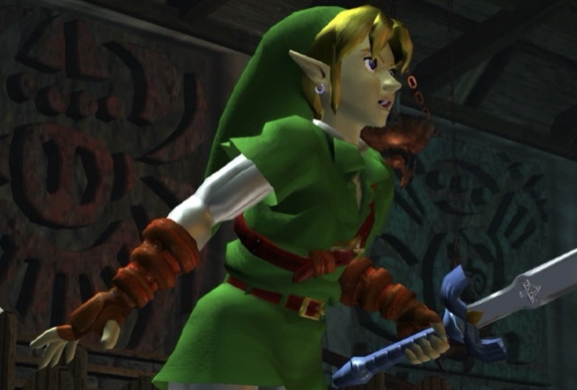
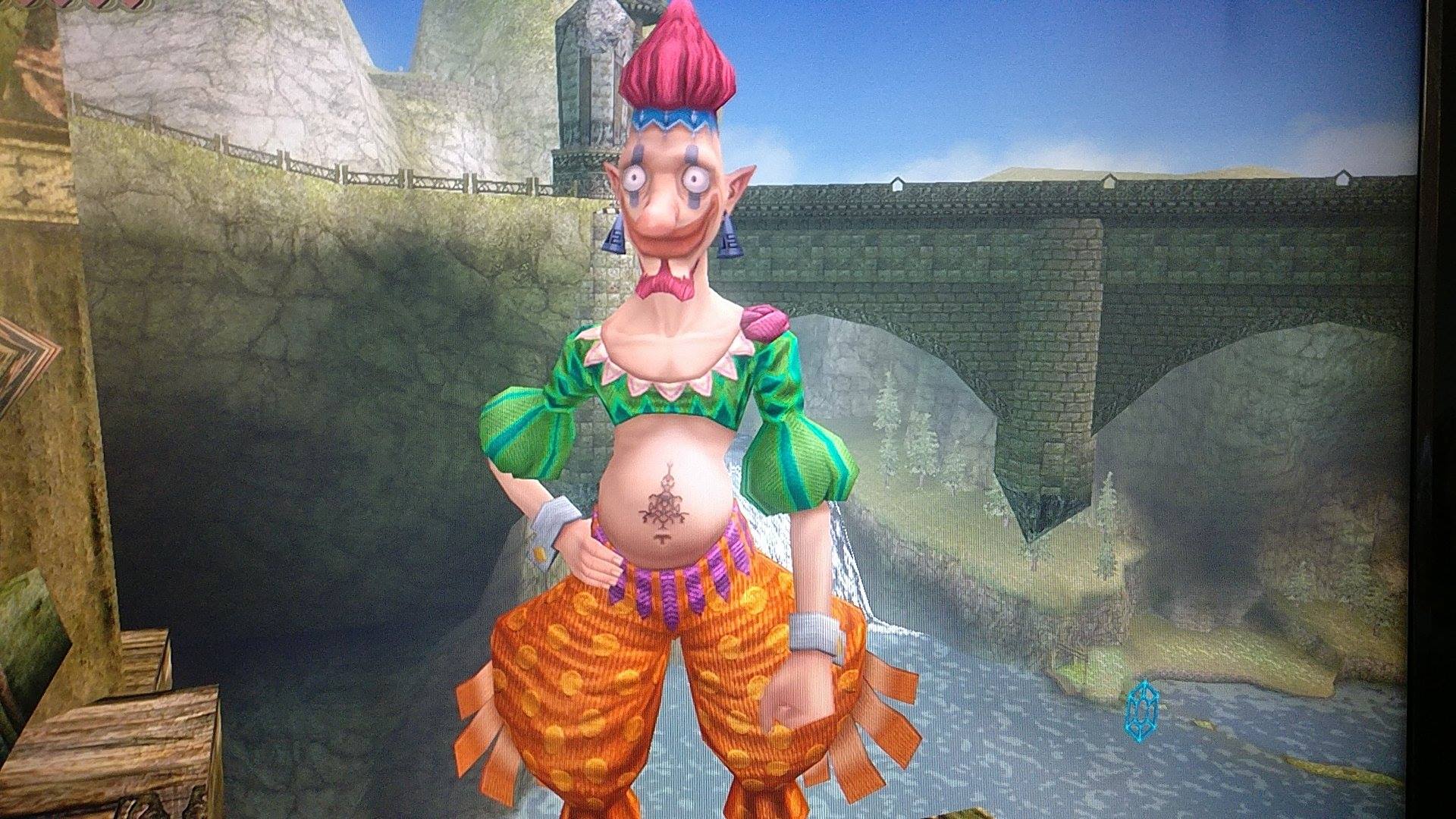
Should look like this...
Twilight Princess is the natural progression of the style Orcarina of Time was aiming for on the N64.


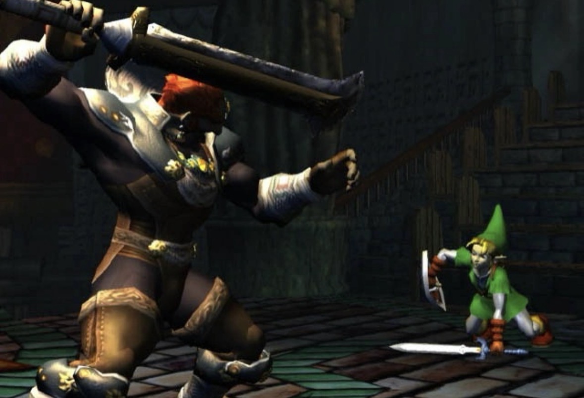
THIS is the style WE want Zelda games to return to, with modern graphics utilized obviously.
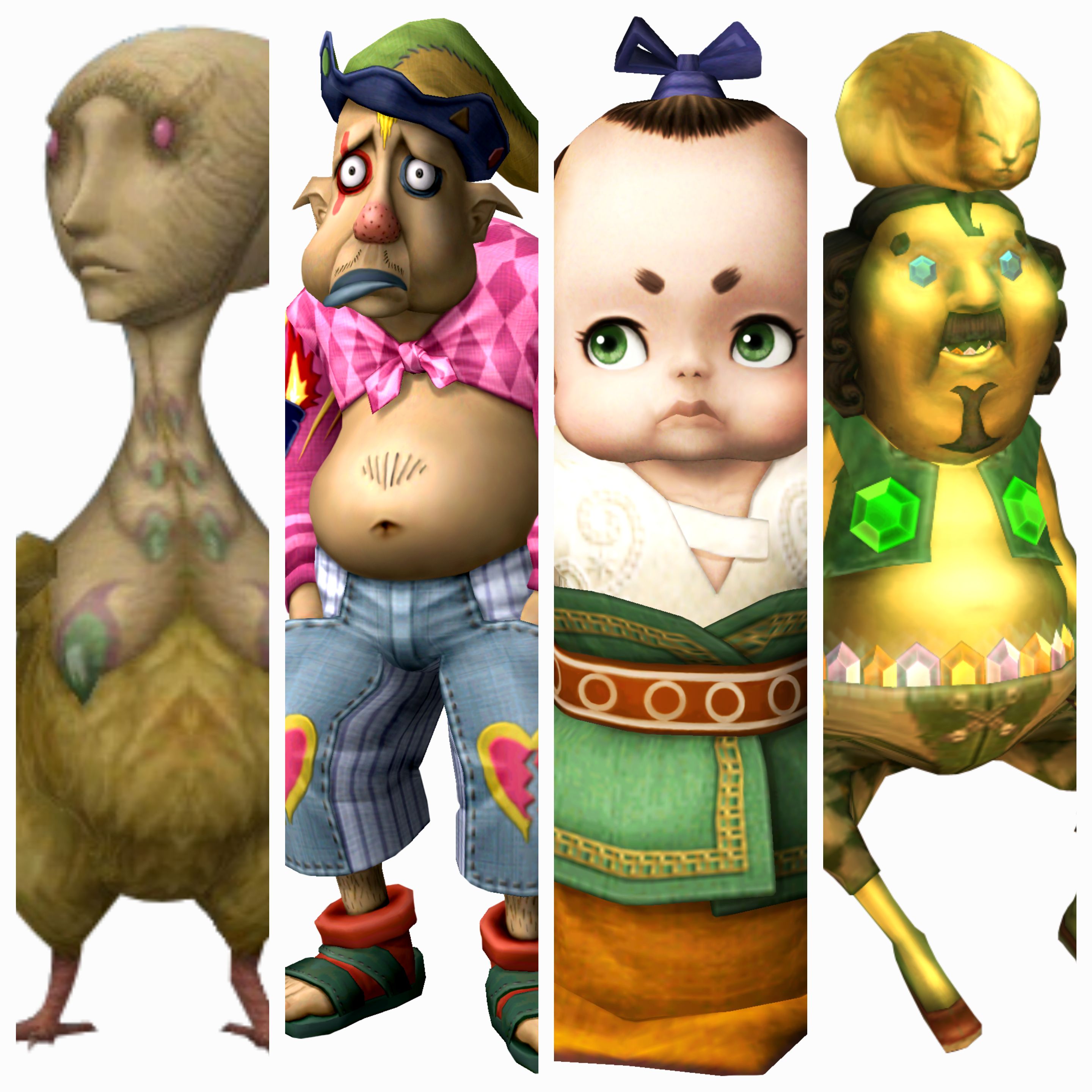
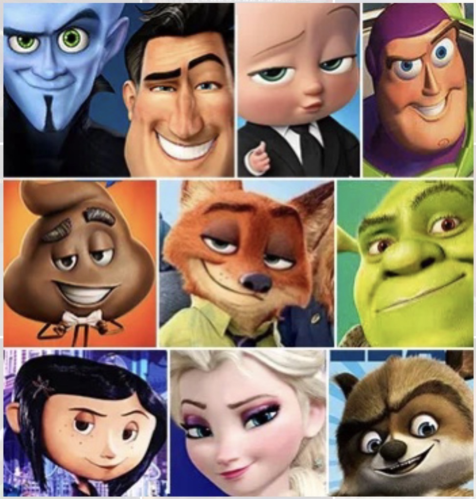
NOT THIS...
Low effort style found in BoTW and ToTk because Nintendo didn't want to invest the resources required in, HD development.

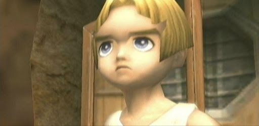
Imagine a modern Zelda game looking like this...
Nintendo tech demo from almost 15-years years ago, this is where modern Zelda games need to return to and build on.

Agreed?

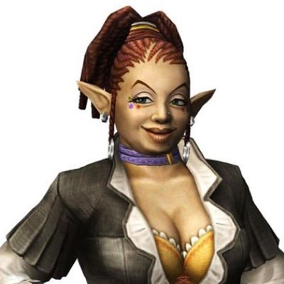
Twilight Princess is the natural progression of the style Orcarina of Time was aiming for on the N64.
THIS is the style WE want Zelda games to return to, with modern graphics utilized obviously.
NOT THIS...
Low effort style found in BoTW and ToTk because Nintendo didn't want to invest the resources required in, HD development.
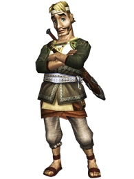
Imagine a modern Zelda game looking like this...
Nintendo tech demo from almost 15-years years ago, this is where modern Zelda games need to return to and build on.
Agreed?
Last edited: