The Bookerman
Member
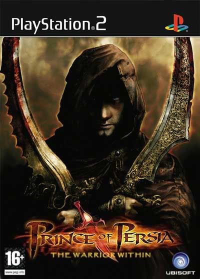
chocoholic said:This image could make a good box cover too:

Is it just me or does anyone else think that the Prince is a really cool looking character?
I love those photoshops effects displayed as they are.
Goin back to Ubi Next week, I hope I can give the art director some hindsight.

")


