You are using an out of date browser. It may not display this or other websites correctly.
You should upgrade or use an alternative browser.
You should upgrade or use an alternative browser.
Resident Evil HD Remaster |OT| Rediscover the evil.
- Thread starter Love Deterrence
- Start date
Diablohead
Member
I was watching a guy streaming the 360 version on Twitch last night and he kept saying that he couldn't use the same strategy as he did before (he said he had already played through the first REmake like 15 times) because they changed the location of some enemies? Is that true?
That'd be a great way to shake up the game a little!
It's possible that either they did something minor to a lot of AI and enemy placements or that the port process made the AI slightly different, it happens sometimes.
What carcinogen was talking about was that the hunters were more aggressive, it could have been bad luck on his part of they did fix an error in their AI, who knows other then capcom.
adamsapple
Or is it just one of Phil's balls in my throat?
My copy from PlayAsia shipped. How long does it usually take for something like this to arrive? (first time ordering from them).
Regular shipping takes between 7 to 20 days, courier takes 2-4 days.
It's possible that either they did something minor to a lot of AI and enemy placements or that the port process made the AI slightly different, it happens sometimes.
What carcinogen was talking about was that the hunters were more aggressive, it could have been bad luck on his part of they did fix an error in their AI, who knows other then capcom.
Alright thanks for the info! Yeah that was Carcinogen's stream.
Hunters are already pretty damn dangerous as they are, bumping their aggressiveness even more should result in a lot of fun!
Nemesis_
Member
Cleared the Mansion so far.
It's a pretty faithful remaster. I am not too bothered by the changes, but there are definitely some areas that received more attention than others leading to a rather uneven look in the restoration. But still a very good effort considering the what the team had to work with originally. This is a remaster that I am surprised Capcom even bothered to attempt considering how much work was involved (and one I don't think we've had of this "nature" just yet either).
Pan and scan is fine, makes game feel a bit more dynamic. But one problem is that new controls really break the game and most boss encounters. It is WAY too easy to evade enemies now and removes a bit of tension. I know I _shouldnt_ be doing this but in any long or circular room it's easy to run, knife a zombie once, and run again to abuse the mechanic until you defeat them.
A minor gripe is they changed the name of the "Chemical" item to "Chemical to be used on plants". Just seemed like a really dumb change and makes me wonder just how dumb Capcom assumes its audience is.
I really can't wait to play on though. I've read that the Aqua Ring is one of the worst areas in the remaster but it was one of my favourites in the original so I am interested to see how it stacks up.
I don't think I ever actually played REmake on hard either, because this game is MUCH harder than I remember it being, lol.
A minor gripe is they changed the name of the "Chemical" item to "Chemical to be used on plants".
Thanks for your review so far, this part got a good laugh outta me!
Nemesis_
Member
Thanks for your review so far, this part got a good laugh outta me!
It was so dumb I really wish you could've seen my face it would've been the most authentic "REALLY?" face I've ever done ._.
One thing I will add is that I really appreciate just how open this game is, and it's something I never really realised when I was playing it when I was younger. You can really approach most of the objectives (that aren't gated) at whatever pace you want. Collecting all the Death Masks at once is rarely something that will happen when playing naturally and you'll find yourself finding other items or other sets of items before completing the set of them. I really like that aspect.
But damn, this game is just really tight. Capcom did so well with this one - RE Zero by comparison was just missing the magic that REmake managed to capture.
The Praiseworthy
Member
Nice OT, I've been counting the days since the 5th of August to get my hands on this PS4 version.... the wait is too painful.
Please be January.
Please be January.
It was so dumb I really wish you could've seen my face it would've been the most authentic "REALLY?" face I've ever done ._.
One thing I will add is that I really appreciate just how open this game is, and it's something I never really realised when I was playing it when I was younger. You can really approach most of the objectives (that aren't gated) at whatever pace you want. Collecting all the Death Masks at once is rarely something that will happen when playing naturally and you'll find yourself finding other items or other sets of items before completing the set of them. I really like that aspect.
But damn, this game is just really tight. Capcom did so well with this one - RE Zero by comparison was just missing the magic that REmake managed to capture.
Stop it, I want to wait for my copy to play again!!! D:
About Zero, I guess I'm in the minority that really liked it, of course it's not on par with REmake, but I can definitely go back and enjoy it just as much as REmake.
Melchiah
Member
Cleared the Mansion so far.
It's a pretty faithful remaster. I am not too bothered by the changes, but there are definitely some areas that received more attention than others leading to a rather uneven look in the restoration. But still a very good effort considering the what the team had to work with originally. This is a remaster that I am surprised Capcom even bothered to attempt considering how much work was involved (and one I don't think we've had of this "nature" just yet either).
Pan and scan is fine, makes game feel a bit more dynamic. But one problem is that new controls really break the game and most boss encounters. It is WAY too easy to evade enemies now and removes a bit of tension. I know I _shouldnt_ be doing this but in any long or circular room it's easy to run, knife a zombie once, and run again to abuse the mechanic until you defeat them.
A minor gripe is they changed the name of the "Chemical" item to "Chemical to be used on plants". Just seemed like a really dumb change and makes me wonder just how dumb Capcom assumes its audience is.
I really can't wait to play on though. I've read that the Aqua Ring is one of the worst areas in the remaster but it was one of my favourites in the original so I am interested to see how it stacks up.
I don't think I ever actually played REmake on hard either, because this game is MUCH harder than I remember it being, lol.
Sounds great. Can't wait to finally play the game, especially as the Director's Cut was my first console game. Hopefully the western release isn't too far away.
Nemesis_
Member
Stop it, I want to wait for my copy to play again!!! D:
About Zero, I guess I'm in the minority that really liked it, of course it's not on par with REmake, but I can definitely go back and enjoy it just as much as REmake.
I was like that but I recently revisited the game and if it weren't for my memory of it I really hated the way it threw you in the deep end with some of the encounters. Especially the leech zombies.
RE Zero actually reminds me a lot more of Sweet Home than REmake did, which is weird considering where Resident Evil and REmake came from and how long down the line Zero took to be made and come to fruition. I just think it is, from a gameplay and story perspective, just one of the most stale of the series.
I'm definitely enjoying REmake more this year. I played Zero earlier in the year and I really had to push myself. I've just put down REmake after a good three hours with it and I can't wait to get back.
Sounds great. Can't wait to finally play the game, especially as the Director's Cut was my first console game. Hopefully the western release isn't too far away.
It is so ridiculous it's not out yet - the game is more or less done and it's not like they have physical retail copies to prepare either :/ I'd wager some people would happily double dip (as I plan to do once an XBO version is released) if they used the same release strategy in the west as they are doing in Japan.
God damn I can't wait for this game to be released over here, I hope they target like early January or something. This was one of my favorite Gamecube games, and I pretty much had the whole game memorized as I played through the game over 5-6 times, with the final 2 plays aiming for that really short completion to get the unlimited rocket launcher (I did get it too! Forgot the time you had to beat the game in to get it, I think it was like 3 hours?)
Melchiah
Member
It is so ridiculous it's not out yet - the game is more or less done and it's not like they have physical retail copies to prepare either :/ I'd wager some people would happily double dip (as I plan to do once an XBO version is released) if they used the same release strategy in the west as they are doing in Japan.
Yeah, it sounds odd, if the Asian version already includes English. It's a minor gripe, but I wish it would have a physical release over here as well. Kinda want to add it to my horror game collection.
Nemesis_
Member
Yeah, it sounds odd, if the Asian version already includes English. It's a minor gripe, but I wish it would have a physical release over here as well. Kinda want to add it to my horror game collection.
I do wonder if Capcom have done what they used to do with Ace Attorney and have used a rudimentary localisation for the Asian release and will put more effort in for the international ones.
I've noticed that weird "Chemical" change but I've also noticed in the menu when using an item you've got your usual verbs like "Examine" and "Use" but you've also got "Equipment" instead of "Equip". Seems like a bit of a weird oversight or change of word.
How About No
Member
Cleared the Mansion so far.
A minor gripe is they changed the name of the "Chemical" item to "Chemical to be used on plants". Just seemed like a really dumb change and makes me wonder just how dumb Capcom assumes its audience is.
Why not just call it Herbicide or Weed Killer by that point lol
Why not just call it Herbicide or Weed Killer by that point lol
Watch the V-Jolt become ''Anti-Plant42''
BumblebeeCody
Member
JAPAN GETS THIS NOW?! And North Americans have to wait for a couple or few months?

I feel dat European pain now, I understand it.
Seeing as how Europe doesn't even have a release date, we're pretty much dead. That being said, why doesn't PlayAsia have the XBox ONe version? instant buy if they had it. Laaaame.
Nemesis_
Member
Seeing as how Europe doesn't even have a release date, we're pretty much dead. That being said, why doesn't PlayAsia have the XBox ONe version? instant buy if they had it. Laaaame.
The only physical versions are Playstation 3 and they're Japan exclusive. I hear Capcom did the same thing with Strider.
Neff
Member
Only the PS3 has a CP right? I can't find a PS4 CP anywhere.
PS3 is the only format getting a physical release, and only in Japan at that. I'll be buying the PS4 digital version too though.
BumblebeeCody
Member
The only physical versions are Playstation 3 and they're Japan exclusive. I hear Capcom did the same thing with Strider.
Oh OK. I was expecting the Xbox One version to also get a physical release. That being said I have a Japanese Xbox account for my 360 so I could activate it on my Xbox One.
Thanks...though it sucks.
Death Metalist
Member
Anxiously waiting for the next gen NA version yo!
No retail release?
Yes, in Japan, PS3 only.
It's in english and region-free.
Oh nice it has Eng. Language option, will ask my brother if he wants me to get it from JP PSN.
EDIT: Uh just to confirm the JP digital ver. DOES have Eng. language option right?
You may have taken the plunge already, but I can confirm that the JP DISC version has English audio and text (menu, subtitle, etc.) options. You can set them via options in the game and menu text will default to your system language. I assume it will be the same for the digital version.
Speaking of the disc version though, man it spins a LOT. I've never heard a game constantly whiz and whir like this... I won it in a work raffle and apparently it was a sample copy which might have something to do with it. Still, no install option that I can see, and it's really jarring for a game where subtle sound and atmosphere are so important. I recommend people go digital where possible, just in case it's a universal fault.
How much of a graphical difference it's going to be between PS3 and 4?
Xbox 360: http://abload.de/img/ptbi2014-11-2813-18-081a08.png
PS4: http://image.noelshack.com/fichiers/2014/47/1416328640-re-nextgen-nov18-19.jpg
So putting aside the 360's black crush, the only difference is res ?.. Im still picking this up for the PS4 aswell, gotta reward Capcom for doing this.
ubersticky
Member
That is some photoshop Smart Blur realness.
alice_kiss_lara
Banned
cant wait for the PS4 version, imported the jp PS3 collector's edition and the EMS is on the way!!!!!!
Melchiah
Member
The PS4 version looks very good, which just increases my anticipation for the game.
The Praiseworthy
Member
That's a huge difference between the two version.
adamsapple
Or is it just one of Phil's balls in my throat?
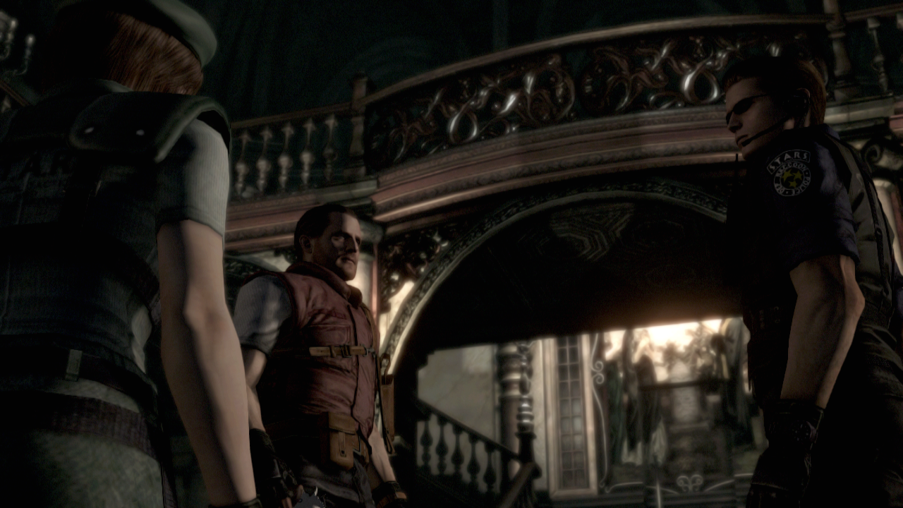
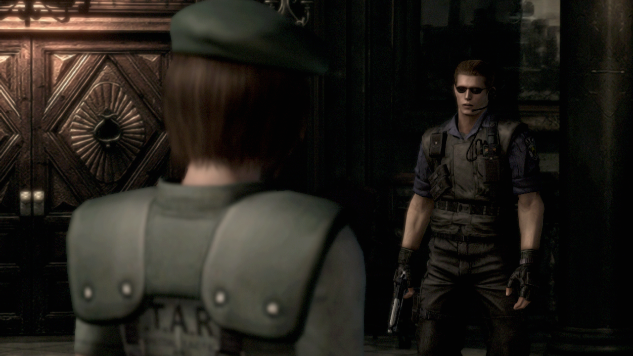
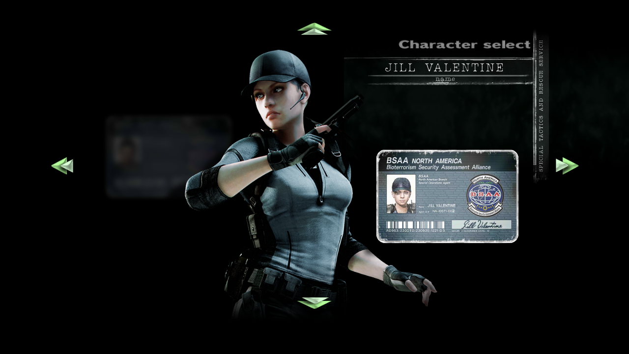
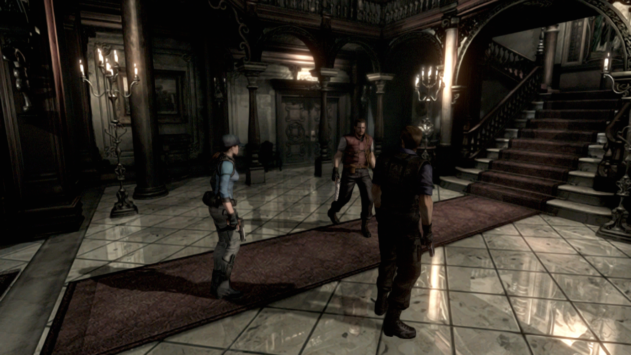
Here's some direct captures of the PS3 version. Game looks very good. Love the BSAA outfit, its higher detailed than the default model, looks that way to me at least, and doesn't feel out of place .. hell that outfit looks more what an operative would wear in a mission instead of the beret and the huge shoulder padded default one.
Bonus comparison shot 360 - PS3 - PS4
360: http://abload.de/img/ptbi2014-11-2813-18-081a08.png
PS3: http://abload.de/img/biohazardhdremaster_631u1x.png
PS4: http://image.noelshack.com/fichiers/2014/47/1416328640-re-nextgen-nov18-19.jpg
360 has very crushed blacks, and lighting looks extra dim. PS3 and PS4 look like they have the same color levels and lighting exposure.
Nemesis_
Member
I've played much more - basically from the Guardhouse / Dormitory all the way through the the Underground / Black Tiger areas. I previously left my impressions off at the end of the Mansion.
The game is generally pretty good looking, I'm impressed with how the team have taken these sub 480p renders and managed to make them look largely good in high definition, but as cvxfreak mentioned in another thread there is definitely some wild inconsistencies throughout the game. It's kind of obvious more areas got more attention than others.
The areas outside the mansion - including the lead up to Lisa Trevor's cabin and the Graveyard look absolutely fantastic now. They're easily the stand outs of the game so far for me. The lighting is just so good and it really gives the area a moody atmosphere that, let's face it, it already had before the improvements. It's a legitimate upgrade in my eyes.
But there are some areas that look pretty grainy or woody and I think cvxfreak said this himself but it definitely looks like an oil painting. The best way I can describe it is as if you were playing a very old PC game with pre-rendered backgrounds and your PC has upressed the character model but just stretched the background - so your model really stands out on top of a weirdly grainy and static background. There's only three or four rooms total I've noticed this to be a problem so far but otherwise it's something I think needs to be mentioned.
But easily the absolute worst of the areas is the Aqua Ring which looks so fucking awful. I have no idea how the guys decided to approach this area but most of the atmosphere from this area has been drained from it, which is disappointing since it's easily one of my favourite and one of the tensest moments for me in the game!

Essentially they've upgraded the lighting but somehow it's made the entire room look much brighter and really washed out. Above is an original screenshot of the game and while it's not the best looking you can see how much more restrained the lighting is. The new lighting in this area is so bright that it almost comes off as a bright green colour and it just looks fucking awful. I can't stress this enough how disappointing this area is. I'd be willing to bet it's one of the worst in the whole game.
Everything else has been pretty good thus far though. The Guardhouse / Dormitory look great as does the underground area and Lisa Trevor's cabin.
I was killed during the Lisa Trevor encounter underground so I had to cut my time short, but yeah, looking forward to jumping back into it again and tackling the underground crypt / laboratory too.
The game is generally pretty good looking, I'm impressed with how the team have taken these sub 480p renders and managed to make them look largely good in high definition, but as cvxfreak mentioned in another thread there is definitely some wild inconsistencies throughout the game. It's kind of obvious more areas got more attention than others.
The areas outside the mansion - including the lead up to Lisa Trevor's cabin and the Graveyard look absolutely fantastic now. They're easily the stand outs of the game so far for me. The lighting is just so good and it really gives the area a moody atmosphere that, let's face it, it already had before the improvements. It's a legitimate upgrade in my eyes.
But there are some areas that look pretty grainy or woody and I think cvxfreak said this himself but it definitely looks like an oil painting. The best way I can describe it is as if you were playing a very old PC game with pre-rendered backgrounds and your PC has upressed the character model but just stretched the background - so your model really stands out on top of a weirdly grainy and static background. There's only three or four rooms total I've noticed this to be a problem so far but otherwise it's something I think needs to be mentioned.
But easily the absolute worst of the areas is the Aqua Ring which looks so fucking awful. I have no idea how the guys decided to approach this area but most of the atmosphere from this area has been drained from it, which is disappointing since it's easily one of my favourite and one of the tensest moments for me in the game!

Essentially they've upgraded the lighting but somehow it's made the entire room look much brighter and really washed out. Above is an original screenshot of the game and while it's not the best looking you can see how much more restrained the lighting is. The new lighting in this area is so bright that it almost comes off as a bright green colour and it just looks fucking awful. I can't stress this enough how disappointing this area is. I'd be willing to bet it's one of the worst in the whole game.
Everything else has been pretty good thus far though. The Guardhouse / Dormitory look great as does the underground area and Lisa Trevor's cabin.
I was killed during the Lisa Trevor encounter underground so I had to cut my time short, but yeah, looking forward to jumping back into it again and tackling the underground crypt / laboratory too.
Is the PS4 version released in japan?
No.
I've played much more - basically from the Guardhouse / Dormitory all the way through the the Underground / Black Tiger areas. I previously left my impressions off at the end of the Mansion.
The game is generally pretty good looking, I'm impressed with how the team have taken these sub 480p renders and managed to make them look largely good in high definition, but as cvxfreak mentioned in another thread there is definitely some wild inconsistencies throughout the game. It's kind of obvious more areas got more attention than others.
The areas outside the mansion - including the lead up to Lisa Trevor's cabin and the Graveyard look absolutely fantastic now. They're easily the stand outs of the game so far for me. The lighting is just so good and it really gives the area a moody atmosphere that, let's face it, it already had before the improvements. It's a legitimate upgrade in my eyes.
But there are some areas that look pretty grainy or woody and I think cvxfreak said this himself but it definitely looks like an oil painting. The best way I can describe it is as if you were playing a very old PC game with pre-rendered backgrounds and your PC has upressed the character model but just stretched the background - so your model really stands out on top of a weirdly grainy and static background. There's only three or four rooms total I've noticed this to be a problem so far but otherwise it's something I think needs to be mentioned.
But easily the absolute worst of the areas is the Aqua Ring which looks so fucking awful. I have no idea how the guys decided to approach this area but most of the atmosphere from this area has been drained from it, which is disappointing since it's easily one of my favourite and one of the tensest moments for me in the game!

Essentially they've upgraded the lighting but somehow it's made the entire room look much brighter and really washed out. Above is an original screenshot of the game and while it's not the best looking you can see how much more restrained the lighting is. The new lighting in this area is so bright that it almost comes off as a bright green colour and it just looks fucking awful. I can't stress this enough how disappointing this area is. I'd be willing to bet it's one of the worst in the whole game.
Everything else has been pretty good thus far though. The Guardhouse / Dormitory look great as does the underground area and Lisa Trevor's cabin.
I was killed during the Lisa Trevor encounter underground so I had to cut my time short, but yeah, looking forward to jumping back into it again and tackling the underground crypt / laboratory too.
The outside areas are mostly "video" backgrounds and based on their interviews those are the ones they spent the most time working on. Which makes it surprising that the shark room looks so awful (by several peoples descriptions) since I believe that is also an animated room.
Nemesis_
Member
The outside areas are mostly "video" backgrounds and based on their interviews those are the ones they spent the most time working on. Which makes it surprising that the shark room looks so awful (by several peoples descriptions) since I believe that is also an animated room.
I don't know if they just tried to somehow overcompensate for the lighting because as you can see in the original there's five or so lights around the outside of the room. Maybe when they moved that level over to the new engine something went wrong and they didn't quite understand how those lights on the edge of the room were meant to behave.
It's super disappointing though
Also, if you sync the game to Resident Evil.net then you can see your weapons you've found, creatures you've encountered and overall progress towards completion. I'm up to the Underground with Jill and I'm at 34% completion apparently.
Chance Hale
Member
Actually prefer the softer shadows on the last gen console versions, looks fake in the PS4 version. Think I've gotten used to Nvidia's soft shadow tech on the PC.360 has very crushed blacks, and lighting looks extra dim. PS3 and PS4 look like they have the same color levels and lighting exposure.
matty2Dfraud
Banned
I've purchased this game so many times already... Would have much rather had RE2.
The outside areas are mostly "video" backgrounds and based on their interviews those are the ones they spent the most time working on. Which makes it surprising that the shark room looks so awful (by several peoples descriptions) since I believe that is also an animated room.
I'm thinking they just didn't bother with certain rooms. The quality varies so much. The outdoor area with Forest, the one leading up to Lisa's cabin, and the one with the dog all looks great. The outdoor area with the cemetery looks like crap.
I don't know if they didn't have time to do deal with certain rooms, or if they decided they were too hard to fix.
The whole aqua ring area is definitely the worst in the game. And it isn't only the part with the sharks, the control room area is equally bad. It's jpeg compression artifact city down there.
But well, thankfully those are exceptions. For the most part, I think the game looks great.
Here's an example of that area. This is easily one of the worst looking backgrounds in the game:

On the flipside, while there's a couple of bad looking rooms like that, there's other areas which I expected would be difficult to update but turned out really good:
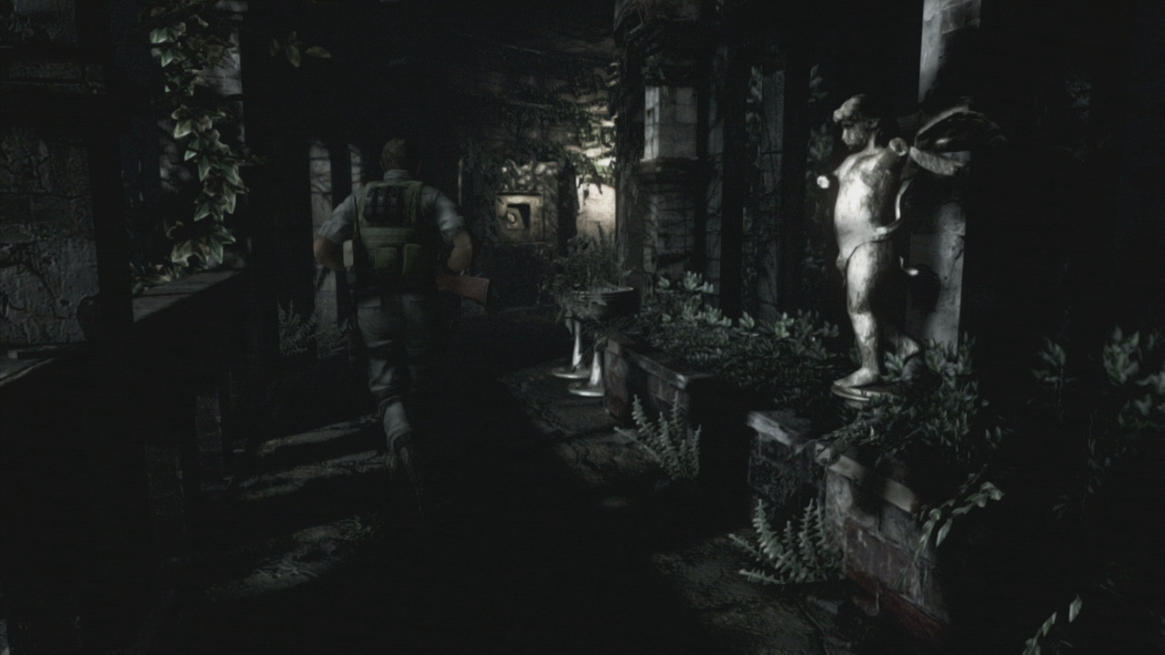
Nemesis_
Member
There was only one moment where I had to switch back to the standard aspect ratio and that was the underground encounter with Lisa Trevor. The way that area is made is to have heaps of quick cuts and different angles, so by the time you pan up and your brain processes what has happened you change angles again.
Then you've got Lisa herself chasing you and it gets pretty hard to keep track. That's the only time I think, outright, the new camera angles don't help the game.
Finished it though. Really enjoyed it still which was nice. Now that I'm more familiar I'd love to try to get into the rest of the achievements and dust off some of my skills
Oh and

