You are using an out of date browser. It may not display this or other websites correctly.
You should upgrade or use an alternative browser.
You should upgrade or use an alternative browser.
SF Kosmo
Banned
I don't think it looks amateur. The remakes looked amateur. This is just very, very stylized. I actually think it's a pretty good match for the backgrounds of the first game, and that's especially apparent when you get to see some of those same locations again.It's animated worse than an old flash idle game I used to play on my phone.
Yeah, the music is great, but I could have told you that without hearing a single note, seen who's involved.
Art direction and animation? Disgusting. Giving something so big to a complete amateur.
But it's obviously polarizing with regard to the characters. It's a very very different style. I understand if it's not to everyone's taste.
I just don't understand why it's the only fucking thing we can talk about. Like this game is such an improbable happening and is doing so much right and all we can talk about is the character design.
FWIW, Monkey Island 3's art was pretty polarizing at the time too.
Fuz
Banned
Look at arms and legs movement in relation to the body.I don't think it looks amateur.
It's the cheapest mobile animation style in existance, it's how the first pioneers of flash games used to animate their works.
Because it looks, its ambience, its tone... are very fucking important on many aspects.I just don't understand why it's the only fucking thing we can talk about.
As I said countless times, Monkey Island is as much a creature of Steve Purcell as of Ron Gilbert.
It went from a Errol Flynn movie (or Treasure Island, if you prefer) to a silly sunday morning cartoon.
And rightfully so.FWIW, Monkey Island 3's art was pretty polarizing at the time too.
Last edited:
SF Kosmo
Banned
And cel animation is what they used to make animated film reels in the 1910s, it doesn't mean it's not a perfectly viable technique. The criticism needs to extend beyond "It's using puppet animation."Look at arms and legs movement in relation to the body.
It's the cheapest mobile animation style in existance, it's how the first pioneers of flash games used to animate their works.
This isn't to say that I don't think budget was a consideration in designing the art style, or that they would have made the same decisions if they had an unlimited budget.
But the game has the budget it has. And as developers it's their job to make the most of the resources they're working with. Just because you would have preferred something that looks like an Aleksandr Petrov film doesn't mean that was ever an option.
Fuz
Banned
It's not simply about "what I like". It's historically the look and feel and atmosphere of Ron Gilbert's (and Purcell's) Monkey Islands.And cel animation is what they used to make animated film reels in the 1910s, it doesn't mean it's not a perfectly viable technique. The criticism needs to extend beyond "It's using puppet animation."
This isn't to say that I don't think budget was a consideration in designing the art style, or that they would have made the same decisions if they had an unlimited budget.
But the game has the budget it has. And as developers it's their job to make the most of the resources they're working with. Just because you would have preferred something that looks like an Aleksandr Petrov film doesn't mean that was ever an option.
What would you think if the new God of War looked like a Terrance & Phillip cartoon?
And budget is not an excuse either. There are tons of low budget indie adventures that looks fantastic. But let's take an example in the same style: Jenny LeClue. Go and look at it. While the style is similar (and I still don't like the flash look and animations, mind you) the care in the details is miles ahead of this travesty. Just look at the walk cycle, for example.
SF Kosmo
Banned
I think you're way overstating that. The background art style matches the first game perfectly. They were never going for realism. It was zany, angular Looney Tunes backgrounds and big bright pixel art dprites. The box art and the handful of close ups are not the whole game.It's not simply about "what I like". It's historically the look and feel and atmosphere of Ron Gilbert's (and Purcell's) Monkey Islands.
People didn't complain that Thimbleweed Park looked cheap, even though it did and it was, because it was nostalgic. This feels less nostalgic in its presentation, so people are upset.
But I get not liking the character designs. But I don't get is how you can pretend to be a Money Island fan and act like that is the main thing about the game that matters.
Last edited:
Fuz
Banned
Holy shit NO. That's just blatantly false.The background art style matches the first game perfectly
Wildebeest
Member
I'm currently going through an existential crisis due to over analysing how people from the US say Caribbean. The pronunciation is like an insidious evil which gnaws away at the soul, revealing the horror of what people can accept as normal or acceptable behaviour.
SlimeGooGoo
Banned
.
Last edited:
amigastar
Member
Disgusting is a rather heavy word. I would say unappealing but the more i see of the game the more i get acclimated with the looks.It's animated worse than an old flash idle game I used to play on my phone.
Yeah, the music is great, but I could have told you that without hearing a single note, seen who's involved.
Art direction and animation? Disgusting. Giving something so big to a complete amateur.
Wildebeest
Member
I don't want to think about it any more, but the important thing is that "Carib" is one word denoting the name of the native people."Car" as in "car"
"rib" as in "rib"
"be" as in "to be"
"ann" as in "Ann"
Did I get that right?
SlimeGooGoo
Banned
.
Last edited:
Wildebeest
Member
The ean ending is latin. Like, this area belongs to the Caribs.Hmm, didn't knew about that.
"Carib" +
"bean" as in "been"
SF Kosmo
Banned
Cool. Good point. Except let's use our eyes instead.Holy shit NO. That's just blatantly false.


And now the new game...


You can't in good faith tell me that these are radically different art style or that they don't match the tone and mood. The character designs are very different, sure, but the idea that MI was ever "realistic" or romantic art style is bullshit. It had these really detailed close ups that were contrasted with the rest of the art for comedic effect, but the main style of the game was cartoony, man.
Last edited:
Fuz
Banned
They absolutely are. MI1 was aiming for pseudo realism, with a small hint of wacky. The houses are much more detailed and believable.You can't in good faith tell me that these are radically different art style or that they don't match the tone and mood.
Return is straight up a nickelodeon cartoon.
derrickchase
Member
Presentation matters, and this new game's presentation is obviously butt. Major pass.
Really, these click hunt games don't have a lot going for them other than the presentation.
Really, these click hunt games don't have a lot going for them other than the presentation.
SF Kosmo
Banned
Lol, no. It's total fun house proportions, with houses at all kinds of crazy angles. There's nothing psuedo real about it. Also not detailed at all, filled with lots of flat spaces and gradients.They absolutely are. MI1 was aiming for pseudo realism, with a small hint of wacky.
Those realistic close ups were meant to be funny and to contrast the rest of the style of the game. You just missed the joke for 30 years.
Last edited:
LazyParrot
Member
Would you even have played the game if the art style was different? You don't exactly sound like a fan of the genre. I mean, you didn't even get the name right.Presentation matters, and this new game's presentation is obviously butt. Major pass.
Really, these click hunt games don't have a lot going for them other than the presentation.
Last edited:
Majormaxxx
Member
Ron Gilbert's weakness is his need to subvert expectations. This is evidenced by the endings of mi2, thimbleweed Park and Delores. This artstyle is another, successful, attempt to do this. Lame.
derrickchase
Member
Would you even have played the game if the art style was different? You don't exactly sound like a fan of the genre. I mean, you didn't even get the name right.
What name did I not get right?
lakitu1982
Member
I 100% agreeLook at arms and legs movement in relation to the body.
It's the cheapest mobile animation style in existance, it's how the first pioneers of flash games used to animate their works.
Because it looks, its ambience, its tone... are very fucking important on many aspects.
As I said countless times, Monkey Island is as much a creature of Steve Purcell as of Ron Gilbert.
It went from a Errol Flynn movie (or Treasure Island, if you prefer) to a silly sunday morning cartoon.
And rightfully so.
LazyParrot
Member
That of the genre, obviously. "Click hunt" doesn't adequately describe what you actually do in Monkey Island and makes it sound like you're confusing it with one of those hidden object games that are essentially Where's Waldo for boomer women.What name did I not get right?
I'm hardly a fan of the new art style myself, but it always comes off as ridiculous when someone latches on to some sort of controversy to loudly proclaim that the developers just lost themselves a customer when it's pretty clear that they were never interested in the game to begin with.
Last edited:
Well, my biggest complain so far is the art-design of Guybrush. Most of the other characters look "ok" IMHO. But Guybrush, who is "always" on the screen looks especially bad.Cool. Good point. Except let's use our eyes instead.
And now the new game...
You can't in good faith tell me that these are radically different art style or that they don't match the tone and mood. The character designs are very different, sure, but the idea that MI was ever "realistic" or romantic art style is bullshit. It had these really detailed close ups that were contrasted with the rest of the art for comedic effect, but the main style of the game was cartoony, man.
The geometry of the buildings is totally fine. This is more or less the same art-design like in the other games. Goes it bit more in the direction of Day of the Tentacle.
... but at least the main character ....
derrickchase
Member
That of the genre, obviously. "Click hunt" doesn't adequately describe what you actually do in Monkey Island and makes it sound like you're confusing it with one of those hidden object games that are essentially Where's Waldo for boomer women.
I'm hardly a fan of the new art style myself, but it always comes off as ridiculous when someone latches on to some sort of controversy to loudly proclaim that the developers just lost themselves a customer when it's pretty clear that they were never interested in the game to begin with.
Any of the Sierra/Lucasarts VGA games or later are basically just click hunting, but I guess you're right insofar as my interest fell off a cliff once they dumped the typing interface.
LazyParrot
Member
Just because you... click on things?Any of the Sierra/Lucasarts VGA games or later are basically just click hunting
In that case, why even bother? I mean, everyone has games and genres they're not interested in. Personally, I think racing and sports games are boring as hell, but you won't find me in a Gran Turismo or FIFA thread informing the world of my decision not to purchase the latest game that is part of a series I don't like in a genre I don't care about. It just seems so... pointless.I guess you're right insofar as my interest fell off a cliff once they dumped the typing interface.
derrickchase
Member
Just because you... click on things?
In that case, why even bother? I mean, everyone has games and genres they're not interested in. Personally, I think racing and sports games are boring as hell, but you won't find me in a Gran Turismo or FIFA thread informing the world of my decision not to purchase the latest game that is part of a series I don't like in a genre I don't care about. It just seems so... pointless.
It might have been interesting if the presentation/art had been good.
SF Kosmo
Banned
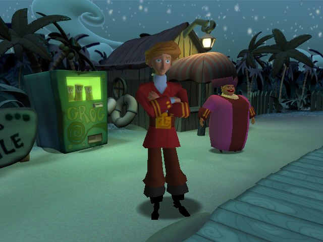
That's valid. I still don't think it's the only thing we should be talking about though.Well, my biggest complain so far is the art-design of Guybrush. Most of the other characters look "ok" IMHO. But Guybrush, who is "always" on the screen looks especially bad.
The geometry of the buildings is totally fine. This is more or less the same art-design like in the other games. Goes it bit more in the direction of Day of the Tentacle.
... but at least the main character ....
lostinblue
Banned
I don't love the new style as it didn't click for me yet, but I don't get the complaints either.
I mean people didn't throw a fit when this was unveiled:
They were probably just happy they were getting new content. So why complain now that a classic Monkey Island is being done with the original creators and bitch about an art style that doesn't even look bad?
EDIT: Or this:
Nobody complained either.
Last edited:
Currently replaying part two and really love the remaster but boy, are some puzzles hard! Winning that spit contest and doing everything related to that? Technically you get all the hints you need but they're so subtle and easy to miss, especially if you do some dialogues in the 'wrong' order you're locked out of a dialogue line that's giving you a hint.
But I so love the humor, characters and goofyness and lack of real life conflicts and issues, it's such a world of its own and perfect for escapism!
Really looking forward to the new game and don't mind the visuals at all, except for some animations.
But I so love the humor, characters and goofyness and lack of real life conflicts and issues, it's such a world of its own and perfect for escapism!
Really looking forward to the new game and don't mind the visuals at all, except for some animations.
SF Kosmo
Banned
Man Telltale engine really was shit. It's not necessarily the art, the way that engine handled lighting was godawful. Look at the new re-releases of the Sam and Max games with improved lighting. It's night and day.I don't love the new style as it didn't click for me yet, but I don't get the complaints either.
I mean people didn't throw a fit when this was unveiled:
lostinblue
Banned
Yes, if I remember correctly the engine was heavily based on LUA, LUA being high-level like say... Java, Python and BASIC. Plenty games use languages such as these for scripting game systems, but the engine was quite barebones so heavy scripting was what held it together.Man Telltale engine really was shit. It's not necessarily the art, the way that engine handled lighting was godawful. Look at the new re-releases of the Sam and Max games with improved lighting. It's night and day.
Also don't forget that these Tales of the Monkey island games, came out as episodes on Wiiware who had a 40 MB limit on top of all that, probably where the N64 textures and so much untextured stuff came from.
Anyway, I would have preferred 2D on everything Monkey Island.
Last edited:
SF Kosmo
Banned
That said, I did enjoy Tales of Monkey Island, and I wouldn't mind seeing Skunkape give them the same treatment they gave Sam and Max.Yes, if I remember correctly the engine was heavily based on LUA, LUA being high-level like say... Java, Python and BASIC. Plenty games use languages such as these for scripting game systems, but the engine was quite barebones so heavy scripting was what held it together.
Also don't forget that these Tales of the Monkey island games, came out as episodes on Wiiware who had a 40 MB limit on top of all that, probably where the N64 textures and so much untextured stuff came from.
Anyway, I would have preferred 2D on everything Monkey Island.
lostinblue
Banned
Me too. I've looked at the Sam and Max remaster (didn't know it existed) and the new lightning and cel shading help a lot in cleaning it up. It would look good on Tales of the Monkey Island.That said, I did enjoy Tales of Monkey Island, and I wouldn't mind seeing Skunkape give them the same treatment they gave Sam and Max.
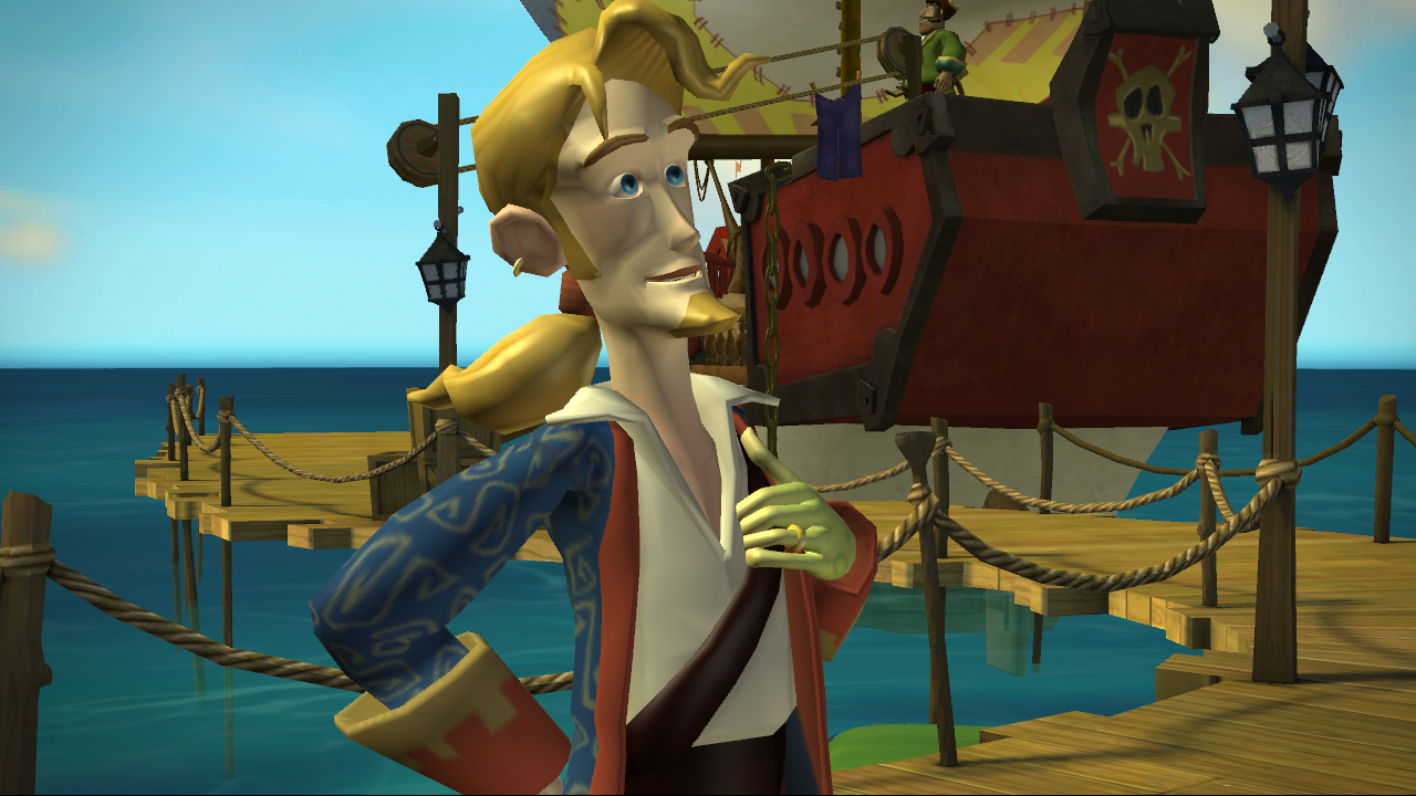
I think they just "went crazy" with the digitizer/wacom. They are using a additive style (detail is not "draw in" as in carved, it's drawn on top). So they basically finished the nose with a color brush rather than drawing nostrils and defining it as it might have looked out of place otherwise. Doesn't help that on the concept artwork they are taking a Banjo Kazooie Nuts and Bolts approach to the 3D representation of the characters squaring everything as much as possible. I don't know which came to be first.I just don't get the idea of giving him a pink nose, what is it some sort of important gameplay feature for the character you are playing or something, so that it has to be highlighted?
Doesn't shock me, but it's not my favourite way to draw or model. That said, I think the game looks good for the style they picked. I have no real complaints.
Might even look super nice in motion.
Last edited:
RAIDEN1
Member
Personally I prefer the Full Throttle lookMe too. I've looked at the Sam and Max remaster (didn't know it existed) and the new lightning and cel shading help a lot in cleaning it up. It would look good on Tales of the Monkey Island.
I think they just "went crazy" with the digitizer/wacom. They are using a additive style (detail is not "draw in" as in carved, it's drawn on top). So they basically finished the nose with a color brush rather than drawing nostrils and defining it as it might have looked out of place otherwise.
Doesn't shock me, but it's not my favourite way to draw. That said, I think the game looks good for the style they picked.
LazyParrot
Member
I don't really understand how you can be so focused on art and presentation when you claim to have lost interest in adventure games right around the time they moved to VGA, which was probably the biggest visual upgrade in the genre's history (unless you count the move from text-only to any graphics at all).It might have been interesting if the presentation/art had been good.
But hey, you do you.
Fuz
Banned
You need a good oculist. Those slanted walls are just a little slanted, like... you know... old wood houses on the sea tend to be due to the salty air. Yeah, they're a little slanted, totally not "total fun house" which is a really stupid statement (Day of the Tentacle was "total fun house", and Ron Gilbert stated that he never liked its look, by the way). Return is WAAAAAAAAAAAAAAAAAAAY over that, with completely unrealistic angles and proportions, flat and monotone, glued together like cardboard pieces.Lol, no. It's total fun house proportions, with houses at all kinds of crazy angles. There's nothing psuedo real about it. Also not detailed at all, filled with lots of flat spaces and gradients.
Those realistic close ups were meant to be funny and to contrast the rest of the style of the game. You just missed the joke for 30 years.
You're also conveniently forgetting the rest of the game.
Fuz
Banned
ARE YOU OUT OF YOUR MIND?
Nobody complained either.
People went fucking apeshit about it.
SF Kosmo
Banned
You need a good oculist. Those slanted walls are just a little slanted, like... you know... old wood houses on the sea tend to be due to the salty air.
Staaaaaahp. You are just trolling now.
Fuz
Banned
It's time to stop with this shit.People think the original game was going for a realistic look? Really? It's far from a realistic look.
Ok, that was a little joke a bit far fetched. Still less stupid than calling that design "total fun house", though.Staaaaaahp. You are just trolling now.
lostinblue
Banned
Hahaha, I don't remember any fuzz about it.ARE YOU OUT OF YOUR MIND?
People went fucking apeshit about it.
This was after Grim Fandango, and everyone loved Grim Fandango. People in my area were happy that it was 3D, perhaps it even sold better because it was. I remember it being more in the forefront than previous games in the series in regards to media coverage and such.
Personally, I like Grim Fandango, but I never liked the graphics. With Monkey Island I found it a pointless change of style.
Guybrush looks like Billy from Stranger Things there.
Last edited:
SlimeGooGoo
Banned
.
Last edited:
SlimeGooGoo
Banned
.
Last edited:
SappYoda
Member
Monkey Island never looked retro to me. I played them when their graphics were cutting edge. It looked like a playable tv cartoon it was amazing. I am a bit dissapointed about how the game looks but I will still looking fowrard to play the game as I really liked thumbleweed park gameplay and writing.
Wildebeest
Member
Well, that ends in a sort of silent e anyway, which I think is why it is -ean instead of -an.So saying "Carib" only would be the correct way?
SlimeGooGoo
Banned
.
Last edited:
Wildebeest
Member
Maybe. Be a bit lazy around the middle.So in other words, just pronounce it as a South American would.
Fuz
Banned
Record it for us.Maybe. Be a bit lazy around the middle.