Snake Pass, and how a bad home menu icon drags down my enjoyment of a game

Status
Not open for further replies.
I know I struggle mightily to load Sonic because I get confused to where it is on the UI.

The fact you think design is just catered for you is frankly embarrassing. Then again you seem to wear ignorance like a badge of pride so not sure what you're really aiming for here. You're not willing to understand anything about what's being discussed here and seem to think design isn't an important practice. If you're genuinely interested I don't mind taking the time to explain as I and others have done throughout the post, but it doesn't seem that way.
 
We may very well have multiple Sonic titles on the Switch within a year of Mania's release. In fact, Sonic Forces is also out this year. It's going to look pretty messy if you have multiple Sonic heads floating around your Switch home menu with no name to distinguish them.

There's a simple way to solve this, of course, which is by following Nintendo's own recommendation that icons have a key visual and the title.
Nintendo should have made it mandatory then.
More than a "recommendation" as it's not being taken seriously.
 
I've done my research and the complete list of icons without logo is:

humanresourcemachineq3spf.jpg
littleinfernoe7sjo.jpg
snakepassnewgqsv8.jpg
voezshshy.jpg


thejackboxpartypack328s2a.jpg
planteradxgks97.jpg
bulbboykzshf.jpg
demamborwsz6.jpg


implosion-neverlosehobgs51.jpg
retrocityrampagedx5yso6.jpg
severedirsjj.jpg
sonicmaniapzs6y.jpg


legoworldsf2sr4.jpg


- Human Resource Machine
- Little Inferno
- Snake Pass
- Voez
- The Jackbox Party Pack 3
- Plantera DX
- Bulb Boy
- De Mambo
- Implosion
- Retro City Rampage DX
- Severed
- Sonic Mania
- LEGO Worlds (It will be updated)

Of course, this is the list while developers don't update icons like the Snake Pass way.

Snake Pass sticks out even when compared to other icons with no logos. It's that ugly white border and the fact that it's not a flat design like the others.
 
Haven't been following this thread too closely, but let me just say I guess I'm one of the odd ones. How dare we have Video game nitpicks on a video game forum lol.

While we're at it, can we also talk about the huge dropoff in quality off the boxart in mario and luigi?

In the US for the first two games, they had great boxart that made the games look like epic adventures.

absol81jujruz82lhbsk.png


Then starting with Bowser's inside story, they started using the boring, lame japanese boxart that makes the games look generic.
erlfuhdptrm8x6vowzkp.jpg
mario-luigi-superstar-saga-bowsers-minions-boxart.jpg

Fits the drop-off in the games themselves.
 
I wonder if there's a age gap between the people who say they prefer it without the logos and ones that do? Maybe they grew up with tablets and smartphones.
 
Man that's great news regarding the Lego logo!
Surely feedback has reached the Sonic devs by now...? In a game whose purpose is catering to fans it would be weird if they didn't even acknowledge the response to the icon.
 
Are you guys for real? It's literally an icon. I can understand how it might put you off trying the game in the first place, but you know what the game is - the icon makes zero difference.


Yeah, Im pretty picky about visual stuff but this doesnt bother me at all.
 
While we're at it, can we also talk about the huge dropoff in quality off the boxart in mario and luigi?

In the US for the first two games, they had great boxart that made the games look like epic adventures.

absol81jujruz82lhbsk.png


Then starting with Bowser's inside story, they started using the boring, lame japanese boxart that makes the games look generic.
erlfuhdptrm8x6vowzkp.jpg
mario-luigi-superstar-saga-bowsers-minions-boxart.jpg
It's funny to see how hard people have turned on this

I remember when the US art for BiS was revealed to be the same as the Japanese one, tons of people loved it and were happy they were finally adopting the Japanese cover style

Now everyone wants the SS/PiT covers back
 
It's funny to see how hard people have turned on this

I remember when the US art for BiS was revealed to be the same as the Japanese one, tons of people loved it and were happy they were finally adopting the Japanese cover style

Now everyone wants the SS/PiT covers back
There was a time when people celebrated the sparse art-pasted-on-white-backdrop look?
 
At least the Japanese art is nicely consistent for M&L.

But yeah the western ones are fun. The art isn't amazing, but ironically they look like a typical Japanese GBA/DS game cover in many ways.

Anyway cool news for Lego Worlds. I know that I'll be waiting to see the icon on any future Sumo game before purchase now, which is bad for them. They have had so much negative feedback on twitter, and have still not resounded with ANY explanation.
 
It's funny to see how hard people have turned on this

I remember when the US art for BiS was revealed to be the same as the Japanese one, tons of people loved it and were happy they were finally adopting the Japanese cover style

Now everyone wants the SS/PiT covers back

To be fair, the Western boxes kinda miss the point of the JP ones, with Mario appearing behind the red マリオ and Luigi behind the green ルイージ.
 
It's funny to see how hard people have turned on this

I remember when the US art for BiS was revealed to be the same as the Japanese one, tons of people loved it and were happy they were finally adopting the Japanese cover style

Now everyone wants the SS/PiT covers back
Both are great, but I liked how they kind of kept riffing on that basic cover of the original game (and I'm kind of a purity nut at times.) Suikoden 1 they were not.
 
Some people forget the logo is an art picture too. Designers don't choose a font, a size and write the title, there is much work and many tries until to get the correct one.
 
Well done Lego World devs

On a side note, anyone actually tried it yet? Got that £5 off £20 spend through Paypal and it seems the ideal game to use it on
 
While we're at it, can we also talk about the huge dropoff in quality off the boxart in mario and luigi?

In the US for the first two games, they had great boxart that made the games look like epic adventures.

absol81jujruz82lhbsk.png


Then starting with Bowser's inside story, they started using the boring, lame japanese boxart that makes the games look generic.
erlfuhdptrm8x6vowzkp.jpg
mario-luigi-superstar-saga-bowsers-minions-boxart.jpg
Interesting.. outside of the eyes from the first game, Mario's art is literally the same across all 3 covers.

Luigi seems to have the same issue in all of them as well. Just the arms and his eyes are in different positions.
 
I did my part. This was a Snake Pass survey. If you find any typos and grammatic stuff I don't care. Typing is hard yo.

Sumo Digital already answered the petitions and said they aren't going to change it, want same icon on all the platformers.

It's a pity that they can't satisfies to their users, being probably best-selling version with an incomplete launch (no time trials) already patched.
 
I don't understand why a good mobile icon makes a bad switch icon

As mentioned above, it's mostly the size. Switch icons are HUGE, so the devs have a lot to work with there.

And secondly, mobile icons display the name under them. Switch doesn't until you highlight it, so a logo is more important here.
 
It's doubly annoying because their game has a lovely logo, and really nice pixel art ingame graphics, so they could have done something like this which took me less than 2 minutes to make.

tHsXc7t.png
 
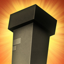
Same. Not every minimalist icon is bad

I don't understand why a good mobile icon makes a bad switch icon

As you're asking in earnest and not belittling people here, I'll take the time to try and break it down a little. Remember we are discussing an element of design, not a piece of art or illustration. It has a purpose, and should be evaluated against that.

The Library on the Switch is a place that is designed to house all of your games in a single space, as well as populating a 'most recent' list of titles that have been launched. It is meant to be scalable, so that it caters for anyone from a person that only has two games, to someone that has two-hundred. It is designed to account for a lifetime's use of the system, and the growing library of games most users will have over the course of that time.

So, in order to achieve the above we ideally want to aim toward the following:

  • Accessibility - Users of any age or ability should be able to navigate through the list of all of their games, regardless of the amount held.
  • Ease of use - As this is the primary location to find a game you wish to play, this system must be easy to use and allow for the user to find the game they're looking for with as little difficulty or frustration as possible.
  • Elegance - The design should maintain and support the standard of design kept elsewhere in the System UI. It should be clear, uncluttered and simple to navigate.

So, when it comes to the icon tiles, what are their main purpose? They sit within the library and aim to offer a visual representation of the game they're from, allowing the user to easily find and select said game among potentially hundreds of others without issue.

As above, this boils down to:

  • Accessibility - Ensuring that it is clear at a glance, by users of any age or ability, what the game the tile related to, so that it can be identified when sat among numerous others.
  • Ease of use - It should be obvious while skimming (which is how people digest information in digital spaces) what the game is, so that the user doesn't have to spend more time than necessary finding what they're looking for.
  • Consistency - To bolster the above, and also present a tidy screen to the user that's easy to navigate through and upholds the strong design sensibility of the Switch. The game has been sold, standing out at this stage is about arrogance and ego at the expense of consistency.
So, for the above to be true we can imagine the minimum an icon should require is:
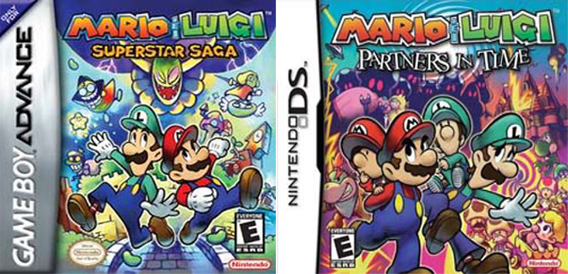
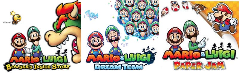
  • The title of the game
  • Recognisable artwork that is specific to the game, and distinct from others

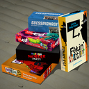
So when people fail to meet that bare minimum it's frustrating as they're compromising the function of the tile for the sake of 'looking pretty', when it's entirely possible for both to be achieved. It's akin to having a bookcase of books, but there's only icons on the spine. It's fine if you have four books but once you start to have many it becomes harder to find the one you're looking for.

Design is about fulfilling a purpose, and looking for improvement toward that purpose, not simply looking nice. It's objective and has a purpose, which is what sets it aside from standard art and illustration.
 
As mentioned above, it's mostly the size. Switch icons are HUGE, so the devs have a lot to work with there.

And secondly, mobile icons display the name under them. Switch doesn't until you highlight it, so a logo is more important here.

Yeah, I get it. I just don't think that should immediatelt disqualify *all* minimalist icons. I think the Kingdom and Sonic Mania ones are pretty good, while stuff like Snake Pass and Bulb Boy and Lego Worlds are pretty terrible.

It's all personal taste though, so I understand why people might not like them. Having an a logo on all icons should probably be a requirement, but I do like the Sonic Mania one and awful lot

e: I don't mean to sound dismissive, I understand the use cases for not having minimalist icons at all. I just personally enjoy minimalist icons when done well
 
The ๖ۜBronx;248814686 said:
It's not though - unless you're just saying "that looks nice" as opposed to "that's a good library tile". Please see my reply to you above as to why, I think I posted it as you were writing this one.

Sure, but I don't think minimalist designs are totally antithetical to what you detailed in your post. I think it *is* a matter of personal taste as, even if the tile was completely blank, it is still just a matter of highlighting it to see what the game is. Logos on the tiles are obviously the ideal, but in the case of the Sonic Mania icon I think it works perfectly fine without a logo at all.
 
Sure, but I don't think minimalist designs are totally antithetical to what you detailed in your post. I think it *is* a matter of personal taste as, even if the tile was completely blank, it is still just a matter of highlighting it to see what the game is. Logos on the tiles are obviously the ideal, but in the case of the Sonic Mania icon I think it works perfectly fine without a logo at all.

Despite the examples of what sonic icons end up looking like on mobile devices once you have multiple?
 
Sure, but I don't think minimalist designs are totally antithetical to what you detailed in your post. I think it *is* a matter of personal taste as, even if the tile was completely blank, it is still just a matter of highlighting it to see what the game is. Logos on the tiles are obviously the ideal, but in the case of the Sonic Mania icon I think it works perfectly fine without a logo at all.
If you're arguing that design is just a matter of personal taste then i genuinely have no idea how to respond. It simply isn't.
 
Status
Not open for further replies.
Top Bottom