nkarafo
Member
Sometimes i really can't decide which one is the worst. It started with the piss filters in racing games. Then the overexposed bloom that made every white surface look like the sun. Then all the motion blur, which thankfully allows you to turn it off most of the time. After that, the chromatic aberration put some strain in my eyes while playing some games. Then there is the dreaded exposure auto-adjusting between light and dark, which makes daylight look like an atomic bomb blast froze in time and doesn't let you see anything outside a window or tunnel (by the way, this is a camera defect, it's not your eyes). But lately, vignette is starting to piss me off.
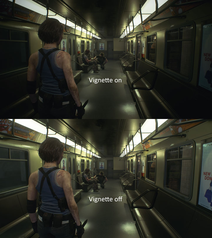
All modern Resident Evil games have it for some reason. The worst case is in Robocop. And unlike other effects like chromatic aberration, even on PC it's rare to find an option to turn it off. You usually need a mod to get rid of it.
I just, don't get this particular effect. I get the others but not this one? I can find a point with the others and sometimes they can be implemented in a way that makes them look good. But this one never looks good. It never adds anything, except maybe in certain parts where you are supposed to have limited visibility. All it does is limit your visibility at all times.
All these stupid visual effects make me cherish of the older days when developers had to work with limited hardware and couldn't just add useless shit just for the sake of adding shit. I'm playing older games with all the benefits like higher resolutions and frame rates, and they often look much better than the post-effect heavy modern games IMO, just because of how clean and sharp they are.
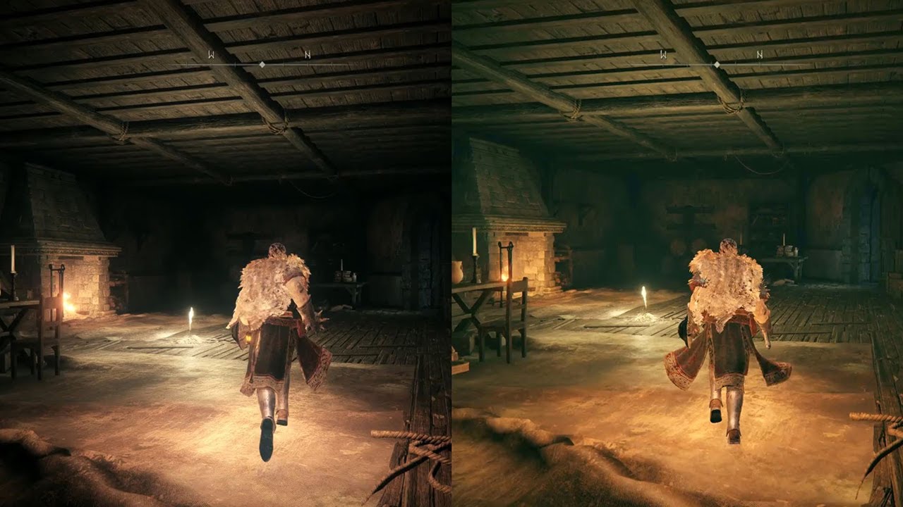
Edit: Example picture by request:

It doesn't look too bad in a still image but it does look distractingly bad in motion.
All modern Resident Evil games have it for some reason. The worst case is in Robocop. And unlike other effects like chromatic aberration, even on PC it's rare to find an option to turn it off. You usually need a mod to get rid of it.
I just, don't get this particular effect. I get the others but not this one? I can find a point with the others and sometimes they can be implemented in a way that makes them look good. But this one never looks good. It never adds anything, except maybe in certain parts where you are supposed to have limited visibility. All it does is limit your visibility at all times.
All these stupid visual effects make me cherish of the older days when developers had to work with limited hardware and couldn't just add useless shit just for the sake of adding shit. I'm playing older games with all the benefits like higher resolutions and frame rates, and they often look much better than the post-effect heavy modern games IMO, just because of how clean and sharp they are.
Edit: Example picture by request:

It doesn't look too bad in a still image but it does look distractingly bad in motion.
Last edited:


