What color theme do you want Xbox 2 to be?

doncale

Banned
most people are saying silver & green.


I want Microsoft to drop the green. I never liked it,


I want Xenon to be silver or platinum with Microsoft's butteryfly colors & theme.
the butteryfly thing reminds me of Nintendo's Super Famicom logo.

ms_butterfly.jpg


sfc.gif


This might go over well in Japan where some might be reminded of the Super Famicom logo.


I hope Microsoft drops all the green, all together. I seriously fukin' hate the green theme
 
doncale said:
I hope Microsoft drops all the green, all together. I seriously fukin' hate the green theme
Ditto. They should move to blue for the logo.

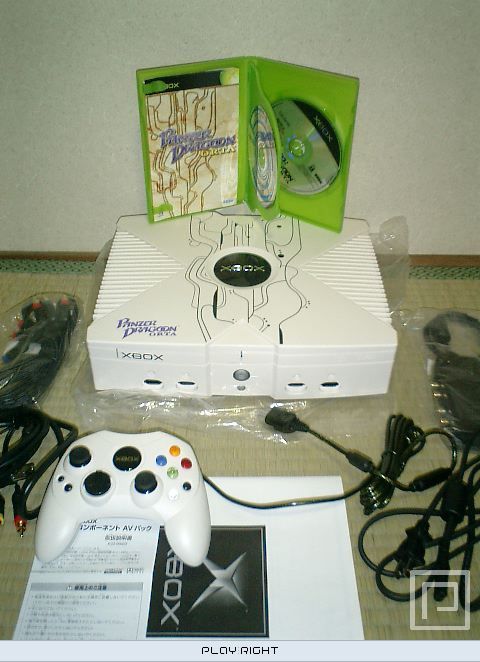
In a perfect world we'd get a sleek 'Panzer Orta' white Xenon with cobalt highlights. Unfortunately we'll have to settle for a black Xbox 360 with 'Incredible Hulk' green everywhere. :(
 
I don't think the cute butterfly logo is going to appeal to the jock/frat boy gamers that MS has catered to so much this gen.

Anyway the green theme is fine to me. Maybe they could have something mostly silver/platinum with a hint of green here and there.
 
jarrod said:
Ditto. They should move to blue for the logo.

In a perfect world we'd get a sleek 'Panzer Orta' white Xenon with cobalt highlights. Unfortunately we'll have to settle for a black Xbox 360 with 'Incredible Hulk' green everywhere. :(


I feel the same way man.
 
I always thought that the Panzer Dragoon Orta Xbox was gorgeous. Much better looking than the standard xbox or the halo special edition. Quite frankly, I would like the next xbox to have a similar color scheme.
 
They should use pink. It should help them land some of the female and/or younger audience. The Xbox 2 won't stand a chance against the PS3 without better representation in these audiences. The Xbox brand too strong and powerful with the "mature" gamer to be hurt by something as pointless as the color scheme.
 
JJConrad said:
They should use pink. It should help them land some of the female and/or younger audience. The Xbox 2 won't stand a chance against the PS3 without better representation in these audiences. The Xbox brand too strong and powerful with the "mature" gamer to be hurt by something as pointless as the color scheme.
Actually you're right. They could even launch with a special "Strawberry Shortcake" collector's edition.
 
i just want it to be small. the xbox green is ugly, and the "x" design on the top of the xbox is ugly, but what makes it truly ugly is that it's so indecently large. i hope the rumor that it can stand on its end like the ps2 is true. saves space.
 
They can't really deviate too far from the black & green theme since they've invested so heavily into it for brand recognition. Or they'd be smart not to, at least.

My money's on silver and green. They already have a step in that direction with the Platinum Hits packaging.
 
Step 1 - get rid of the green.
Step 2 - find a reasonable color (ie not pink, purple, brown etc)
Step 3 - if all else fails, go with blue. Blue rocks.
 
I seriously hate the Xbox's green theme. Seriously, I even prefer Dreamcast orange or GameCube 'indigo' to that shit. Total turn off.
 
The only thing I don't like the Xbox's green theme are the game cases. They're just plain nasty.

Now, pink game cases... those would be awesome :)
 
There's not really very much green on the X-Box itself to begin with is there? I just think it's ugly b/c of the size and just the general design, not the 2 inch green logo in the center which you can't even see if you have your x-box in an entertainment center usually, or the little green light when it's on. The green boxes are pretty fugly though. I agree that it's a stupid color, but I think the color green is a very small part of the console design's ugliness.
 
AstroLad said:
There's not really very much green on the X-Box itself to begin with is there? I just think it's ugly b/c of the size and just the general design, not the 2 inch green logo in the center which you can't even see if you have your x-box in an entertainment center usually, or the little green light when it's on. The green boxes are pretty fugly though. I agree that it's a stupid color, but I think the color green is a very small part of the console design's ugliness.

The whole system is dark green. And I'd like a better modeled 360 and non-fugly DVD cases as well
 
belgurdo said:
The whole system is dark green. And I'd like a better modeled 360 and non-fugly DVD cases as well

It is? I figured someone might say that. Shit looks black to me, but I guess the light dash of green is enough to profoundly offend the sensibilities of some of the interior decorators in here. Wow.
 
missAran said:
Note to Microsoft (and everyone listening): DISCOVER MINAMALISM. It works. Less is more! Learn from Apple.

Well the GC is pretty fugly too, and if people wanna talk about color issues, let's talk about the purple. Thankfully Ninty is smart enough to release multiple colors, though the box itself is still ugh, though the Panasonic box certainly is nice of course. As much as I hate to say this, since I didn't like the look of the PS2 that much when it came out (nor do I now), it is the only console that looks even remotely non-retarded this gen. GC and XB just look stupid, though GC of course takes up less than 1/3 of the space doing so.
 
It's really funny I've always thought of it as black. Still thought it was ugly. Even looking at it now it seems much more black than green. Maybe I am teh color blind. Oh noe.
 
Sysgen said:
I hope it's customizable (skins) out of the box.

There's a ton here- http://xbo.cx (not that it's "out of the box" customizability, though I don't know exactly what that means, but there are some nice ones there, and some funny looking ones too. To each his own.
 
Society said:
Anything but green.

%5B2910%5Dscreenshot021.jpg


That looks good to me.


What's that skin called and where can I get it? Looks awesome. I tried searching for it on allxboxskins.com but can't find it.
 
I agree with the people wanting rid of the green theme. There's nothing particularly wrong with green as a colour, but the shade they're using is gaudy and brash, and frankly, the Xbox GUI hurts my eyes when projected onto 100+" of wall. They should go with a simple white/grey/black GUI with color where appropriate.
 
AstroLad said:
Well the GC is pretty fugly too, and if people wanna talk about color issues, let's talk about the purple. Thankfully Ninty is smart enough to release multiple colors, though the box itself is still ugh, though the Panasonic box certainly is nice of course. As much as I hate to say this, since I didn't like the look of the PS2 that much when it came out (nor do I now), it is the only console that looks even remotely non-retarded this gen. GC and XB just look stupid, though GC of course takes up less than 1/3 of the space doing so.
I don't think GCN is that ugly. I have a black one and it's pretty tight.
 
I'd kind of like to see a system that uses a small amount of light green with black an silver. I want it to be half the physical dimensions of the current xbox , however they pull this off I don't really care. Atleast make the system half its current height, or a taller more condensed box, like the dreamcast was.
 
missAran said:
I don't think GCN is that ugly. I have a black one and it's pretty tight.

I have a black one too. I just think the cube design, just everything about it is goofy-looking. Of course, I don't really care unlike apparently a lot of people, but imo neither the GC or the XB is anything to write home about. The big pitfall of the XB compared to the GC is its hugeness. I dunno why they made it so big, if they just needed the size to fit all the parts or what (I'm sure someone here knows), but if it came to a trade-off between say having more features or having a smaller system, I'll live with the big system esp. since this is one of the big selling points of the X-Box over its competitors.
 
I like the GC design, too. Small, simple, and efficient. The front/grill of the regular PS2 is kinda ugly, but the slim PS2s are drop dead sexy.
 
Silver and Lime Green. Silver is the new black, it matches most electronics and anything in silver will look sleek.

Just look at the GameCube controller. It's cosmetically ugly but the silver makes it look good.
 
Just a simple Black with Silver trim or Silver with Black trim like every other electronic device known to man would be nice.
 
Teddman said:
They can't really deviate too far from the black & green theme since they've invested so heavily into it for brand recognition. Or they'd be smart not to, at least.

My money's on silver and green. They already have a step in that direction with the Platinum Hits packaging.

yeah but Xbox HAS NO BRAND REGCOGNITION in Japan. And Microsoft has to have at least a decent showing in Japan. even if they're still in third place. something like like Megadrive's marketshare, which was behind SFC and PCE.

fuck the green. it doesnt matter. it won't hurt Microsoft to start totally fresh.
 
Top Bottom