pancakesandsex
Member
Oh cool, a new rise of the robots game.
I kinda agree with this. I miss the silly expressive faces.Yoboman said:I miss the expressiveness of SFIV characters, I think the physiques of the Capcom characters look a little off after playing SFIV so long too.
pancakesandsex said:Oh cool, a new rise of the robots game.
Chemo said:God, the art style looks like complete shit. Sigh.
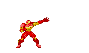
I think Ironman looks like shit. Wolverine is alright. Chris probably has the best model, personally.mr_nothin said:Wolverine's and Ironman's models looks pretty awesome. They have the best models so far.

Stabby McSter said:I think Ironman looks like shit. Wolverine is alright. Chris probably has the best model, personally.
Too bad I think the art style sucks.
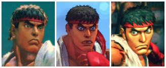
I agree. They are going for an American comic style, but it looks like they took some random, unknown, artist of middling talent and told him to do some character designs. Why didn't they get a current badass comic artist to do the designs? I wouldn't mind more Jim Lee based stuff either. Hey, even if they didn't get him to do original stuff and just used old work that wasn't tailored for this project - like they did with the old Capcom fighters - that would probably be an improvement. What they have now is just so "meh" and generic. You know something is wrong when Ryu looks like his American SF cartoon incarnation.Bebpo said:I think the art style looks kind of bad and ryu looks dumb, but the graphics are pretty decent. Nice models, nice backgrounds.
request it as DLCMoxManiac said:I miss the old Capcom Hulk, he had the best hairstyle :/
Stabby McSter said:I think Ironman looks like shit. Wolverine is alright. Chris probably has the best model, personally.
Too bad I think the art style sucks.
°°ToMmY°° said:
akilshohen said:the art style looks too clean.
dankir said:Proton Canon confirmed!!!!!!!!!!!!!
This game wins over everything, all developers stop what you're doing now.
Segata Sanshiro said:Teasel in the background = awesome. Tron Bonne in the background = sadness, cuz it means she's probably not in the game as a fighter.
better that than playableDegen said:I wouldn't mind it if the servbots in the background became a running gag in every Capcom VS game from now on.
God's Beard said:
If Sentinel is in the game and he's a giant I can't wait to hear all the rage from MvC2 diehards :lolArpharmd B said:Also people expecting a total Marvel Vs. Capcom 2 feel/vibe are going to come away disappointed. It's going to have a TvC feel and vibe. It might even be 3 button. Just like SF4 felt nothing like 3rd Strike or even ST/Alpha, yet it still turned out brilliant. Expect the same here.
Very clearly this game is going to be an evolution of TvC and not MvC2, and that's not a bad thing at all, TvC is great. Honestly I'd be surprised if the final game is in fact 3 v 3 and not 2 v 2.
Real talk and none of this is a bad thing at all. Hell I'd even like to see LARGE characters ala TvC make a return. Could you imagine a team of Silver Surfer and Dr. Strange going up against a giant Galactus? How about Wolverine and Cyclops against one huge Sentinal. Tell me that shit wouldn't be epic.
Arpharmd B said:Now comments on the awesome backgrounds? The new york with the spidey balloon is awesome, as is the Tron Bonne stage.
Obviously these shots are early because Iron Man/Hulk/Chris do not have the proper shaders on yet. It's pretty obvious that these are just the plain models, and that shaders will be added later.
They are probably right now in the stage of creating/refining character animation, shaders is something that comes with polish towards the end of the cycle and we are more than a year away.
I'm not making excuses for the game, but I can tell even at this early stage it's looking great and really coming together. Don't even have me google pre-alpha SF4 screens because the early Ryu/Ken looked pretty terrible.
_dementia said:If Sentinel is in the game and he's a giant I can't wait to hear all the rage from MvC2 diehards :lol
Arpharmd B said:I mean that's the thing that gets me, like I hate the diehards because all they ever want is more of the same same same. Like, if it were up to the diehards Street Fighter 3 would have been Ryu, Ken, Guile, Blanka, E.Honda, M.Bison etc. , no parry system, same old tired gameplay concepts as 2. Yawn.
I mean why do people want the same regurgitated crap over and over again. Capcom has proven it can do a 3d vs. fighter with TvC. That was the test for this and it's probably a similar team carrying over much of the talent here. Let this proven team give us something fresh and new, and let's play the game with an open mind.
Chemo said:God, the art style looks like complete shit. Sigh.
Degen said:sf4
newest older oldest


