venne said:
Anandtech said:
One issue that Ive always had with the Focus is that it takes a ridiculous amount of time to fully charge. Over 7 hours. A quick Google search reveals that other Focus owners have had this problem, but not all. Microsoft indicated that the problem might appear with certain USB cables or wall charger combinations, but regardless of what I tried I had the problem. Buyer beware.
0_o that's the reason why I was trying to recalibrate the battery by draining it. The phone arrived with a dead battery and it took so long to charge that I assumed I had been swindled. Then the battery depleted in 4 hours (probably because I had 4 email accounts syncing as fast as possible :lol ). But it's better now; charging seems to take a shorter amount of time and the battery depletes slower...
Anandtech said:
Battery life is pretty straightforward. While the Focus has a very contrasty Super AMOLED screen, it comes at the expense of power consumption, especially when displaying white. Our web browsing test wreaks havoc on Super AMOLED devices as there are a lot of white pixels in the web pages we use to test. As a result the Focus delivers the worst battery life of any Windows Phone we've tested thus far.
Thankfully WP7's default theme is predominantly black. Other than the email and IE mobile apps, the majority of the OS is mostly displaying black pixels. So while the Focus doesn't do well in our web browsing battery life test, in general usage the phone lasts longer than you'd expect. I'd say you can plan on charging the phone at least once a day for moderate usage.
I've been switching between the dark and light backgrounds (my accent color remains blue) and haven't yet decided which one to stick with. I've been fine with black
borders on lcd screens but black
backgrounds have been problematic. Scientific evidence suggests that black-on-white is better than white-on-black (see
this example, some
discussion and more
here). However blacks look really good on the Super AMOLED display, the Metro UI uses such large fonts, and it blends beautifully into the black panel around the Samsung Focus' screen, that the overall effect is nice on the homescreen. So for those reasons, combined with the positive effect on battery life, I'm sticking with the dark background.
However the dark background becomes a pain when using apps that take their design cue from your theme settings. The WP7 team was wise enough to enforce a light background, whatever the theme, on text heavy apps like Mail and Office. Even the messaging app, despite sticking with the default background, uses the accent color as a backdrop for each individual text message. Many third party apps fail miserably in taking this usability problem into account. GReadie and Wonder Reader are very tiring on the eyes and even GReadie's low contrast mode (i.e. gray text) isn't that helpful. Flux figured this out by using a user configurable wallpaper instead of a dark background on the first screen (more apps should offer this... twitter apps could use your homepage backgrounds from the web browser). Flux also offers the option of skipping the text heavy white-on-dark preview mode to opening each rss post with 'full' in-app browser. This would make one of my favorite rss reading experiences on any mobile platform if IE didn't suck so much.
I've complained about IE before but now I'm going to let it all out now. First you have to realize that 95% of my web browsing (i.e. not using apps for web services like twitter or netflix) on mobile phones consists of sneaking a few minutes here and there for GAF, Hacker News, Reddit, Guardian/Football and then sending interesting links and articles to Instapaper for later perusal. IE fails on each one of those functions. It doesn't display
Mobile GAF properly (some trouble with the gradients) and there are little glitches like the page selector button not working. IE doesn't display
iCombinator properly either; the 'save to instapaper' button is no where to be seen' and the comments pages are a clusterfuck. Reddit is halfway usable but suffers from the *different font sizes on same page* problem that I've seen a few times. Guardian/Football always defaults to the mobile version of a page, even after I set the cookie with the full desktop mode option. To top if off, bookmarklets can't be easily saved (they don't even work, mind you) so I can't set up my Instapaper bookmarklet nor can I copy and paste links directly to the Instapaper website. IE is thus practically useless to me.
I'm very tempted to pick up an iPod Touch for proper mobile browsing yet... my enthusiasm for the iPod Touch is dampened by the fact that after using the Metro UI (and webOS), iOS feels boring and limiting in comparison. iOS still has the best apps for each task on any platform (and many apps for tasks that are not served on other platforms) but the Metro UI is so much more pleasing to use. On the
Tested podcast Will Smith (or Gary Witta, I forget who) had a great insight about how WP7 is about (at-a-glance) data while iOS is about apps and I find this telling in figuring out why despite WP7 apps not being as beautifully crafted as iOS apps they somehow display my data betterwhich is ultimately more important. webOS might end up being my go to productivity platform (I think the cards metaphor still has the best shot of replacing the desktop metaphor for advanced users) but WP7 is very nice on the mobile...
Anyway, enough rambling, more from the
DesignDare series (an actual expert) on Windows Phone 7:
The Windows Phone 7 Mail Experience
FB and WP7: Chocolate and Peanut Butter
and
Back Buttons Are Hard to Get Right (shame he doesn't consider webOS which shits on all the other platforms by getting the back gestureand forward gesture and advanced 'switching apps' gestureright)
")
 The marketplace is approaching 4,000 apps now and it hasn't been out a month, so it's going to be growing fast!
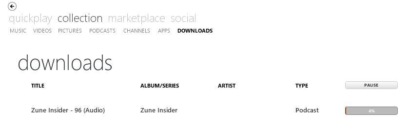
 Is it just me or does everything seem a little bit unorganized? Maybe it's just because I'm used to iTunes, which shows me that nice list on the left site (Music, Video, Books, Podcasts, etc.), while this shows nothing like this, right? I'm kind of a Podcast-guy and while iTunes seems perfect for all this, I really did not want to purchase an iPhone again. I am still pretty pissed that iOS 4 basically killed my 3G and Apple just did not care about it.


 )!
)!
