-
Hey Guest. Check out your NeoGAF Wrapped 2025 results here!
You are using an out of date browser. It may not display this or other websites correctly.
You should upgrade or use an alternative browser.
You should upgrade or use an alternative browser.
Xbox Has The Best Controller Designs
- Thread starter FalconPunch
- Start date
SyberWolf
Member
i prefer the feeling of the dpad and sticks on sony controller, dpad and sticks on xbox feel/sound so cheap.
for some games the xbox stick layout is better for some games the playstation controller is better.
but for first person shooters or anything that requires aiming and shooting competitively i will always prefer mouse and keyboard.
the triangle square circle x button layout is also more burned into my memory.
Last edited:
Dr. Wilkinson
Member
It's close for me between Series controller and Switch Pro. But I have to give it to Series because of the headset jack, and the clicky buttons and the grippy underside. I just wish it had the gyro of the Switch Pro controller.
Switch Pro would be near-perfection if it had a headset jack, clickier face buttons and analog triggers. You know, all the stuff Nintendo won't do.
Switch Pro would be near-perfection if it had a headset jack, clickier face buttons and analog triggers. You know, all the stuff Nintendo won't do.
Last edited:
TrebleShot
Member
This looks like some fischer price bastardisation of utter cheap plastic shite.The official xbox controllers are not my favourite controllers, but the design and layout definitly is.
My current fave is the turtle beach stealth controller.

Hohenheim
Member
Ok.This looks like some fischer price bastardisation of utter cheap plastic shite.
It feels great though. Been using it a lot since it was released, and it feels solid and good.
Has every feature I want in a controller, including "mouse click-like" face buttons and great back paddle buttons. And hall effect.
It's a bit expensive, but definitly worth it for me.
Bring on the fischer price bastardisation of utter cheap plastic shite I'd say.
IAmRei
Member
Yeah, some of them is not fine tbh. I only like this one.I don't really like how all of the special edition Switch Pro controller have colored handles while the rest of the unit is black.. Hope they change that for the 'Switch 2 Pro controller'.
YCoCg
Member
The Xbox 360 controller is perfect.
It had its day but honestly the Xbox One controller improved on it in every way. The Xbox Series controller isn't bad but the dpad felt like a step back and is too clicky.
The GOAT
Shakka43
Member
DS4 definitely had the perfect shape, at least for my hands.Nah

Their last best controller was the Xbox 360 controller which I'm still using (and I have numerous brand new original for spare) and everything after from them is TOO FUCKING BIG.
Now, I vastly prefer the DualShock 4, my favorite controller ever.
PurePlatinum
Member
If you are taking a broader definition of the word "design" I gotta give it to Nintendo. The Switch Pro battery life is absolutely bonkers, and the controller is just overall wonderful.
When you take in ALL elements, I think they come out on top. Dualsense is cool but the battery life is absolutely horrendous, the drift is a problem, the rubber grips on the Edge keep peeling up for me...not good! If the QA issues were solved, the DualSense would be great, but that's not the reality we live in.
Xbox ehh who cares.
I agree with this until the PS5 came out. My hands are really liking the DualSense controller for PS5. The earlier DualShock controllers were a bit too light and too small.
DualSense has only 1 flaw: the "select" button and Triangle are too close to each other in a way that sometimes I accidentally push that button, so maybe it would be better to make the touchpad a bit smaller and move that button a bit more to the right.
DualSense has only 1 flaw: the "select" button and Triangle are too close to each other in a way that sometimes I accidentally push that button, so maybe it would be better to make the touchpad a bit smaller and move that button a bit more to the right.
Little Chicken
Banned
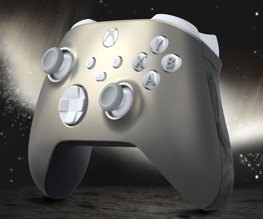
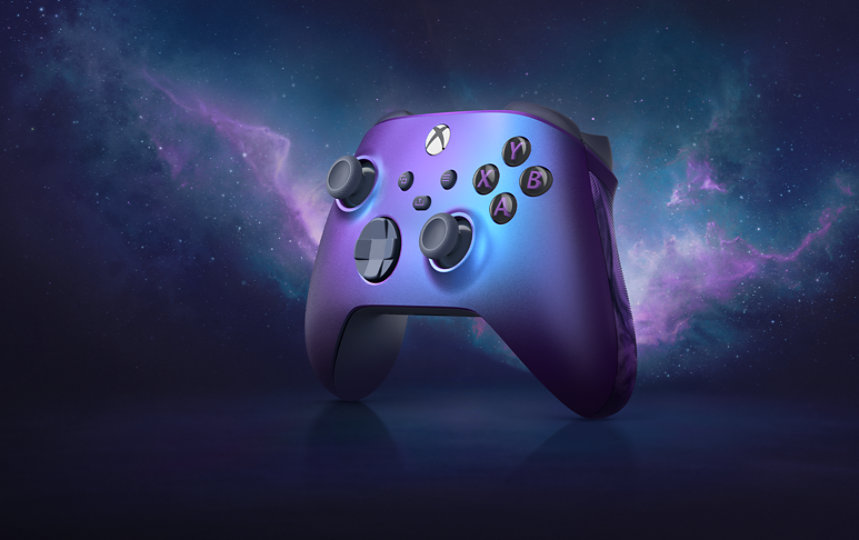
The Lunar Shift and Stellar Shift controllers look neat.


Bernardougf
Member
The 30th anniversary controller from Sony is just perfection.
In general Xbox has better ideas.. I just find the shape of the controller fcking horrendous
In general Xbox has better ideas.. I just find the shape of the controller fcking horrendous
FalconPunch
Member
Strict parameters were provided at the start of the thread to manage the scope of the discussion. Hilariously and expectedly, we've arrived at an outcome that is far out of scope.
After seeing how badly people struggled in this thread with reading comprehension, objective discussion, acknowledging and managing bias for productive conversation, there are lots of learnings to be had.
Things we can take away from this thread:
1) Some gaffers struggle badly with reading comprehension. I'd argue that this is one of the main sources of disagreement.
2) People struggle a lot with scope and staying within the parameters of discussion. We can see this in the numerous references to feel, build quality, ergonomics in an art aesthetics thread.
3) Productive and constructive discussion is difficult to achieve due to the inability of the average gaffer to manage and acknowledge their biases. The failure to do so allows it to inadvertently creep into the conversation often leading to contention/unnecessary disagreements.
4) More importantly, serious improvement is needed from many users.
To those who stayed within the scope of discussion, thank you. To the rest, you seriously need to improve. Like badly.
Last edited:
I'll grant you that about the d-pad. But everything else about the 360 controller was perfect. It's slightly smaller so it easily fits in your hands and the angles of the shoulder/trigger buttons just feel better.It had its day but honestly the Xbox One controller improved on it in every way. The Xbox Series controller isn't bad but the dpad felt like a step back and is too clicky.
LastBattle
Member
Xbox are the Nike shoes of controllers.
Humdinger
Gold Member
Strict parameters were provided at the start of the thread to manage the scope of the discussion. Hilariously and expectedly, we've arrived at an outcome that is far out of scope.
After seeing how badly people struggled in this thread with reading comprehension, objective discussion, acknowledging and managing bias for productive conversation, there are lots of learnings to be had.
Things we can take away from this thread:
1) Some gaffers struggle badly with reading comprehension. I'd argue that this is one of the main sources of disagreement.
2) People struggle a lot with scope and staying within the parameters of discussion. We can see this in the numerous references to feel, build quality, ergonomics in an art aesthetics thread.
3) Productive and constructive discussion is difficult to achieve due to the inability of the average gaffer to manage and acknowledge their biases. The failure to do so allows it to inadvertently creep into the conversation often leading to contention/unnecessary disagreements.
4) More importantly, serious improvement is needed from many users.
To those who stayed within the scope of discussion, thank you. To the rest, you seriously need to improve. Like badly.
Probably should have made your headline clear that you were only talking about the aesthetic features of the controllers, rather than the factors that normally, automatically spring to mind when asked who designs the best controllers. It's not about reading comprehension, because most people will not bother to read your OP, especially when the subject seems obvious enough from the headline (even when the headline is easily misconstrued, as here).
It's best to learn to anticipate common misunderstandings and try to head them off - starting with your headline. Misunderstandings based on the thread title were easy to anticipate here. Phrase your headlines more carefully, and you'll get better outcomes.
Last edited:
Guerilla Munch
Member
xbox controllers have always felt meaty and heavy in a good way (no diddy)
srerwws
Banned
YesStrict parameters were provided at the start of the thread to manage the scope of the discussion. Hilariously and expectedly, we've arrived at an outcome that is far out of scope.
After seeing how badly people struggled in this thread with reading comprehension, objective discussion, acknowledging and managing bias for productive conversation, there are lots of learnings to be had.
Things we can take away from this thread:
1) Some gaffers struggle badly with reading comprehension. I'd argue that this is one of the main sources of disagreement.
2) People struggle a lot with scope and staying within the parameters of discussion. We can see this in the numerous references to feel, build quality, ergonomics in an art aesthetics thread.
3) Productive and constructive discussion is difficult to achieve due to the inability of the average gaffer to manage and acknowledge their biases. The failure to do so allows it to inadvertently creep into the conversation often leading to contention/unnecessary disagreements.
4) More importantly, serious improvement is needed from many users.
To those who stayed within the scope Breathable Running Shoes of discussion , thank you. To the rest, you seriously need to improve. Like badly.
Paasei
Member
In terms of pure looks like OP says: I'd most likely agree. I only really like the 30th anniversary and the Astrobot controller for the DualSense. Xbox one has so many options available there's always something cool around.
Reminds me I actually want one for PC, but I need a cable to hook it up. Do they come with them?
Reminds me I actually want one for PC, but I need a cable to hook it up. Do they come with them?
Panajev2001a
GAF's Pleasant Genius
I do not think so, I think they bank on you having a USB-C cable or using the USB-C cable provided with the PS5 itself (packed in).Reminds me I actually want one for PC, but I need a cable to hook it up. Do they come with them?

Paasei
Member
I was talking about the Xbox controller in the case of PC usage. And I actually decided to not be lazy and look it up myself:I do not think so, I think they bank on you having a USB-C cable or using the USB-C cable provided with the PS5 itself (packed in).
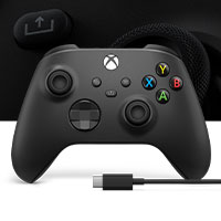
Xbox draadloze controller + USB-C®-kabel | Xbox
Ervaar de gemoderniseerde Xbox draadloze controller, ontworpen voor ondersteunde consoles, pc's en mobiele telefoons of tablets.
www.xbox.com
But thank you anyway!
Codes 208
Member
Can confirm. Even the ds4 would sell without a cable.I do not think so, I think they bank on you having a USB-C cable or using the USB-C cable provided with the PS5 itself (packed in).

Sony's been skipping the cable for awhile now
(Even their dvd/bluray players come without a hdmi cable)
VectorVictor
Member
Xbox controllers all the way.
Gyro in controllers sucks something fierce, and the touchpad in the DualSense is great and worth emulating (ahem, Microsoft, Nintendo).
Sony's controllers have always been cramped and uncomfortable, and the non-offset analog sticks contribute to this—my hands cramp after playing with DualSense/shocks for too long, whereas I can game all day with Microsoft and the Nintendo pro controllers.
It's too bad there isn't a good wireless offset PS5 controller that isn't $150…if there is one, I'd love to know about it.
Sintoid
Member
I have 2 Dualsenses and 2 Xbox Series controllers... They're both great and flawless.
Xbox controller is a solid tank
Dualsense haptic feedback is awesome when fully utilized and I would love a better touchpad support (mouse navigation)
The only thing I hate about both of them is the Share Button, mine are all new XD
Xbox controller is a solid tank
Dualsense haptic feedback is awesome when fully utilized and I would love a better touchpad support (mouse navigation)
The only thing I hate about both of them is the Share Button, mine are all new XD
Shifty1897
Member
The Switch Pro controller is best, don't @ me
Edit: Oh, aesthetics only. Who TF cares, I'm a grown ass man, I don't need my controllers bedazzled like a teenage girl.
Edit: Oh, aesthetics only. Who TF cares, I'm a grown ass man, I don't need my controllers bedazzled like a teenage girl.
Last edited:
hollams
Gold Member
I really do like the Elite controllers, but the build quality is horrible as all 5 of them I've bought have had one or more issues with the sticks or buttons.
Currently I switched to the Vader 4 Pro so hopefully no more stick drift. I do like the extra face buttons and the gyro works well. The only issue with it is the 2nd set of back buttons aren't the best, they work though just not as easy to press as the elite paddles. I can use Rewasd with it to easily remap my controls which I love.
Currently I switched to the Vader 4 Pro so hopefully no more stick drift. I do like the extra face buttons and the gyro works well. The only issue with it is the 2nd set of back buttons aren't the best, they work though just not as easy to press as the elite paddles. I can use Rewasd with it to easily remap my controls which I love.
hououinkyouma00
Member
The speaker for me is one of those things that sounds nice to have but I don't really ever actually care about it in real use.I don't know about the best design (haven't touched the other gamepads since Xbox 360),
but I wish it had a speaker for more immersive gameplay.
Dualsense would be perfect for me if it was just a little smaller. Almost like a blend of the Dualsense and the DualShock 4.
Pro Controller is pretty trash. Somehow has one of the worst Dpads despite being Nintendo, and it's completely unusable in stuff like racing games because of the non-analog triggers. Buttons are also mediocre IMO.The Switch Pro controller is best, don't @ me
Edit: Oh, aesthetics only. Who TF cares, I'm a grown ass man, I don't need my controllers bedazzled like a teenage girl.
TheGodfather07
Member
Xbox controllers all the way.
Gyro in controllers sucks something fierce, and the touchpad in the DualSense is great and worth emulating (ahem, Microsoft, Nintendo).
Sony's controllers have always been cramped and uncomfortable, and the non-offset analog sticks contribute to this—my hands cramp after playing with DualSense/shocks for too long, whereas I can game all day with Microsoft and the Nintendo pro controllers.
It's too bad there isn't a good wireless offset PS5 controller that isn't $150…if there is one, I'd love to know about it.
Xbox controller is flawless when it comes to comfort in actually holding and using the controller. Dualsense feels awkward in comparison and makes my hands ache after a little while. I just wish Microsoft used haptic feedback though because its so good. New standard going forward.
Roberts
Banned
I've been going back and forth by playing on both xbox and ps5 this week and it's super clear that xbox elite core controller just sits in your hands so much better than DS and DSE. Also doesn't feel like it is going to break any second from just holding it. Now only thing xbox is lacking are the new features that are hit and miss on DS
AndrewRyan
Member
Always liked the designs of these two specialty xbox controllers:


The Edge took over the crown due to its functionality and good-enough feel:


The Edge took over the crown due to its functionality and good-enough feel:

adamsapple
Or is it just one of Phil's balls in my throat?
Xbox controller is flawless when it comes to comfort in actually holding and using the controller. Dualsense feels awkward in comparison and makes my hands ache after a little while. I just wish Microsoft used haptic feedback though because its so good. New standard going forward.
Agree with the ergonomics part 100%.
I don't recall DS4 being like that but Dualsense is definitely not comfortable in the hand for longer stretches. The Xbox pad feels a lot more snug in the grip.
I guess the analog stick placement plays some part in that, for me personally.
reinking
Gold Member
I like controllers on each of this generation's consoles with the exception of the Switch. Those feel a little flimsy when attached to the console and weird when not. It is the only console I use third-party controllers. I feel like that is part of being a multiple console owner. The PS5 feels like I am playing the PS5. The XBSX feels like I am playing on the XBSX. If I used one standard controller for all of them, it would not feel the same for me.
Padded grips are the best.I don't like the embossed plastic on the grips. Wish it was just plain/flat like on the older Xbox controllers.
I'll take the superior battery life over trigger vibration.Now only thing xbox is lacking are the new features that are hit and miss on DS
Panajev2001a
GAF's Pleasant Genius
The XSX (did they get smaller in the Xbox One generation or with the XSX|S?) one is not really a better fit for larger hands than the Dual Sense. I think what you say was true before the Dual Sense and the latest Xbox controllers.The Xbox controllers are a game hanger for those of us with larger hands
So, I say Xbox.
Panajev2001a
GAF's Pleasant Genius
For all intents and purposes DualSense's battery life is fine between gaming sessions. Triggers are one of the improvements in the DualSense, haptics are a lot more immersive than the old school Rumble motors, and the high quality gyro they added is a godsend for many games fine adjusting the aim.I'll take the superior battery life over trigger vibration.
A very very well implemented DualSense integration can be a game changer.
Xbox is rumored to add the same basic features as DualSense soon, not long before you can admit how all these features can really improve game immersion too
The Xbox controller is stuck, mostly, a decade ago features wise (XSX|S's controller did improve the D-Pad by quite a bit though). It does not make it shut, but it misses out on some features.
Last edited:


:format(webp)/cdn.vox-cdn.com/uploads/chorus_asset/file/25211579/DuchesS___Black.jpg)