You are using an out of date browser. It may not display this or other websites correctly.
You should upgrade or use an alternative browser.
You should upgrade or use an alternative browser.
Are you happy with Smash Bros 4's graphics?
- Thread starter MYE
- Start date
Twilightzoney
Member
Uh ... ?
Yeah? Not the subtle animations (hair/expressions). But that's a re-textured model, pretty much.
But the model has different types of eyes in general modeled in. Hair is even different has more polygons whether its alpha mapped or modeled normally. I'd more so say Mario looks like a re-textured model but then again they changed the hand models up on them. I always notice these details from my Brawl Character Modding days.
3ds version looks good for the hardware. Wii shots look bullshotty.
Which says a lot, because Nintendo doesn't do bullshots and the game looks much better in movement.
NeonZ
Member
Ok. Someone (not necessarily you) needs to back up this way too common accusation. As far as I can tell, I'd say that Smash 4 and Brawl are as close as Brawl was to Melee.
Characters like Link, Fox, Olimar and Pit show that pretty clearly, but even some of the ones that supposedly underwent bigger changes actually are rather lazily made. Look at Peach, all the patterns on her dress are the same as Brawl's, just with different colors. Brawl's patterns weren't based on any Mario game, but created for Brawl, and yet they're outright reusing them in this new game. Aside from something like Kirby and Mr.Game and Watch, all characters were completely redesigned between Melee and Brawl, even if they weren't based on different games. A bit more work was given to changing Mario's and Luigi's models and textures in Smash 4 though, but even so they kept the exact proportions of the Brawl designs.
For a comparison of the previous transition, look at Melee Marth vs Brawl Marth. It's the same outfit, based on the same game, and yet the model is completely different, not just in polygon count, the design itself clearly was redone from ground up, not just tweaked.
The only characters who have heavily changed so far in Smash 4 are the ones based on different games, like Other M Samus compared to Brawl's Zero Mission Samus and Shadow Dragon/New Mystery Marth compared to Brawl's Mystery of the Emblem Marth, and, even in that case, Marth's face still remained similar to the one from Brawl, in spite of a completely different outfit, and it's not even based on the remake's artwork.
QuantumZebra
Member
I don't see how anyone could be unhappy with them... looks amazing... isn't it 1080p60fps?
PadWarrior
Member
Looks good to me.
Does every Nintendo game need to be hyped as "best in graphics?"
It's really looking that way, haha.
First there was a "is 3D World on par with PS4/Xbone games" (lol). Then the one for MK8 a day ago. And now Smash. I think there was one Tropical Freeze as well.
Smash visuals are solid, but nothing special. Not as bad as 3D World, but not as good as Mario Kart 8.
Every previous Smash had completely different art styles, while Smash 4 is basically just a brighter Brawl, to make it line up with Nintendo's other games.
First, I think Nintendo's decision to go for closer art styles in most of their first party games was stupid in the first place. Mario Galaxy was clearly a Mario game in spite of the different lightning and background details from other titles. They didn't need to make them look even closer.
Second, Smash's adaptation to that artstyle was lazy like previously mentioned. Even Melee and Brawl, in spite of being in very close hardware, looked vastly different, so there's no reason they needed to stick with Brawl's art style, but more colorful. Unless this brings some advantage in the end (like a much higher number of characters since they didn't need to be completely redesigned), it's a fairly disappointing look.
Now, obviously, the 3d models were improved and such, but looking at them up close still shows a bunch of imperfections and visible polygons, and, from far away, the difference won't be big anyway. It just seems like a bad choice.
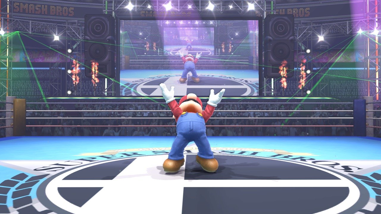
If anything 4 is a brighter Melee. That huge screenshot makes it apparent. If 4 was really following Brawl we would have seen more emphasis on details like Mario's jeans. Instead they totally abandon that and go for something much more stylized, bright and happy.
It's really looking that way, haha.
First there was a "is 3D World on par with PS4/Xbone games" (lol). Then the one for MK8 a day ago. And now Smash. I think there was one Tropical Freeze as well.
Smash visuals are solid, but nothing special. Not as bad as 3D World, but not as good as Mario Kart 8.
"Are you happy with it" is not the same as "Do you think this is the best looking game ever". This thread doesn't even begin to approach the hyperbole of those other threads.
megabytecr
Member
watch the e3 dev direct for smash on the Wii U eshop.Is there any 60FPS footage of the game out yet?
BigBadShamoo
Banned
Smash bros is going to be so awesome lol I can't wait xD
They've chosen to lower the graphics somewhat in order to get it to 1080p. Makes sense to me as Smash would benefit more from a higher resolution. The camera is mostly zoomed out a considerable distance. As a result, it does seem a little odd to judge it on zoomed in graphics from the camera mode. Still, it looks decent regardless, and with Nintendo's animation it will look great in motion.
Unspeakable Evil
Member
Nope. Too bright and colorful for me.
")
Dr. Black Jack
Member
Which says a lot, because Nintendo doesn't do bullshots and the game looks much better in movement.
This. Graphics aren't just about how nice they look in a still shot.
Stop projecting your anti-agenda agenda on a thread that has none.It's really looking that way, haha.
First there was a "is 3D World on par with PS4/Xbone games" (lol). Then the one for MK8 a day ago. And now Smash. I think there was one Tropical Freeze as well.
Smash visuals are solid, but nothing special. Not as bad as 3D World, but not as good as Mario Kart 8.
theprodigy
Member
Not literally, but coming from the Mario Kart thread and the DK one not too long ago it's kind of annoying that it seems like there's a need to talk the games up.
what else would Nintendo fans do to distract themselves from shitty sales?
(ignoring the fact that said threads backfire anyway)
Speedwagon
Michelangelo painted the Sistine Chapel. Yabuki turned off voice chat in Mario Kart races. True artists of their time.
I am in love with the graphics. So, yeah, I'm happy.
I only dislike the new Battlefield design. Looks uninspired.
I only dislike the new Battlefield design. Looks uninspired.
Daphnes Nohansen Hyrule
Member
In-game images looks impressive
In-engine not so much
In-engine not so much
I'm totally happy with it. Love the facial expressions on the characters, love the way stages look... general stylized version and they also did a really good job with the 3DS style too. It's already shaping up to be my favorite Smash Bros ever. WIth those reasons among others. =)
CoffeeJanitor
Member
It looks okay. It doesn't wow me though.
Vangu Vegro
Member
I'm happy with the 3DS graphics.
However, Smash U looks just as irredeemably awful as every other Hideous Definition game out there, though. Kill it with fire!
However, Smash U looks just as irredeemably awful as every other Hideous Definition game out there, though. Kill it with fire!

I'm sorry. Next time I'l do a Sedond Son, Titan Fall or a MGS thread. Those somehow dont seem to bother people simply by existing.Not literally, but coming from the Mario Kart thread and the DK one not too long ago it's kind of annoying that it seems like there's a need to talk the games up.
Considering that all of the screens are probably shot in the usual pause-mode by putting the camera up close to objects you usually see from quite far away and in motion - yes, I think it looks great. I expect it to look A LOT better than the washed out, low-res, glimmering looking Brawl.
MannyToons
Member
More than Mario Kart 8's? No freakin' way. But it's very good for Smash Bros..
It does feel like Brawl upscaled in some various shots - but then everyone ogled how nice Brawl looked through Dolphin's HD. The graphics still don't have the wow factor Melee had however.
the 3DS is genuinely impressive given the system though. I won't be surprised if the framerate drops in some instances.
the 3DS is genuinely impressive given the system though. I won't be surprised if the framerate drops in some instances.
NeonZ
Member
If anything 4 is a brighter Melee. That huge screenshot makes it apparent. If 4 was really following Brawl we would have seen more emphasis on details like Mario's jeans. Instead they totally abandon that and go for something much more stylized, bright and happy.
Like I've said, Mario and Luigi are pretty much exceptions - and, even in their case, they're reusing the proportions of the Brawl model. Look at Peach though, like I pointed out there. All the patterns on her dress are straight out of Brawl, just with different colors. Most characters fit the Peach model, not the Mario one.
TheCongressman1
Member
Looks amazing except for certain stages, like skyloft, which are just Wii assets. Textures and geometry there looks terrible.
Other than that, the style is awesome. Much more visually interesting than brawl. Looking at comparison screenshots shows how lifeless brawl was.
Other than that, the style is awesome. Much more visually interesting than brawl. Looking at comparison screenshots shows how lifeless brawl was.
Piercedveil
Member
Doesn't look all that incredible to me, but definitely not bad. Probably about on par with what I expected it to look like on the Wii U.
The 3DS version looks pretty good to me, considering what it's running on.
The 3DS version looks pretty good to me, considering what it's running on.
AstroNut325
Member
I have to admit that Smash and MK look great. Just wish they were 1080p with OGSSAA!
You really can't judge a game like this based on screenshots. The other 3 all looked infinitely better in motion. That said, with most Nintendo characters, there's only so much you can do without it looking off because they are inherently cartoony. It's thus probably a good idea to go with a colourful art style rather than a realistic one, simply to make everything fit together better.
Mario Kart looks better.
Honestly, this looks like a Wii game running in HD + AA. Sure looks better than a game would on the Wii, but I've just been playing Mario Galaxy through an emulator rendering in HD with AA, and it doesn't look far off from this.
Mario Kart on the other hand, does not look like a Wii game running in HD, looks like a game properly made for the system. But yeah, maybe in motion, running on the actual system, by the time it releases, this game won't look like that anymore.
Mihael Mello Keehl
Banned
Every other game can have a graphics thread but when it come to this and MK something is wrong. I dont understand at all.
Every other game can have a graphics thread but when it come to this and MK something is wrong. I dont understand at all.
Nintendo games can have good graphics, too, can they not?

Astral/H3X
Member
My only proBlem with it is that these threads aren't about how nice a game looks, but how absolutely god awful it is that a developer have a single bad texture stuck in a corner that most people won't ever look at or notice.Every other game can have a graphics thread but when it come to this and MK something is wrong. I dont understand at all.
I'd much rather these threads be about the real meat and potatoes of what matters, which is how clean and beautiful this art style is, and holy cow they squeezed it into 1080p 60fps.
PunjabiPlaya
Member
I'm sure it's been said before, but the pictures don't do the game's graphics justice, it looks even better in motion. I just wish there was better quality vids of the game right now.
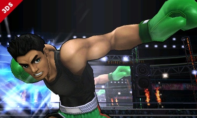
In all honesty, if you have a quick glance, this shot can put you into a state of thinking it is a Wii U shot, I mean because of the detail on Little Mac, the stage is the exact same as the Wii U stage and backing board is rendering the match on it.
It's a simple mistake, but it does look it at first glance..
thing is though, all the 3ds shots are in that small ass resolution.
it's pretty easy for me to tell the difference- but thar's me. that said, both games look absolutely stunning. and i think they are going to use every bit of these machines they can to get the best outcome possible.
i think they look far better than brawl, and once the game comes out these "hd brawl" knocks can stop.


Father_Brain
Banned
Wii U version looks good for 1080p/60fps, but I wish that it were doing more with lighting and shaders than it is (see: SM3DW, MK8).
Looks good in motion. So does Brawl.
I'll have to wait for some 1080p footage to see if the improvement to expressions make much of a visual improvement outside of screenshots.