Watch_Dogs downgradeaton confirmed

Status
Not open for further replies.
WTF have you done GAF?

2014-03-0713_25_18-twulsnl.png

I would like for them to address this:

(2012)

FPUSUyn.png

ichVDuzMhmDt0.png

6Ac3R9Q.jpg

ibnvjDhfPZIGNZ.png


(2014)

XcqNxpl.jpg

iUMEQfUPCzaRx.png

ibiFZob6cKXR1u.png

ifgLzmrfEA1vn.png

ibtREM2mrB4eO7.png


"What we showed at E3 2012 in a lot of respects was less good."

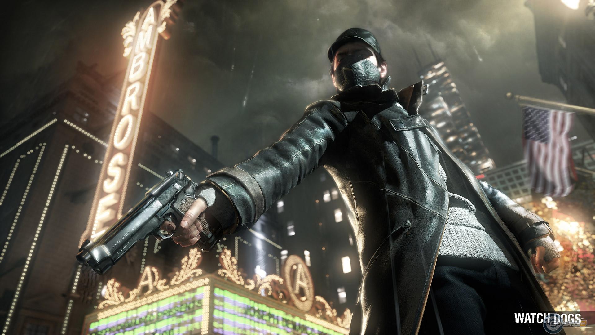
Also just for fun Ubisoft bullshot vs bullshot:
WatchDogs_02.jpg

image_watch_dogs-22912-2527_0007.jpg


Guess which one is inferior bullshot.
 
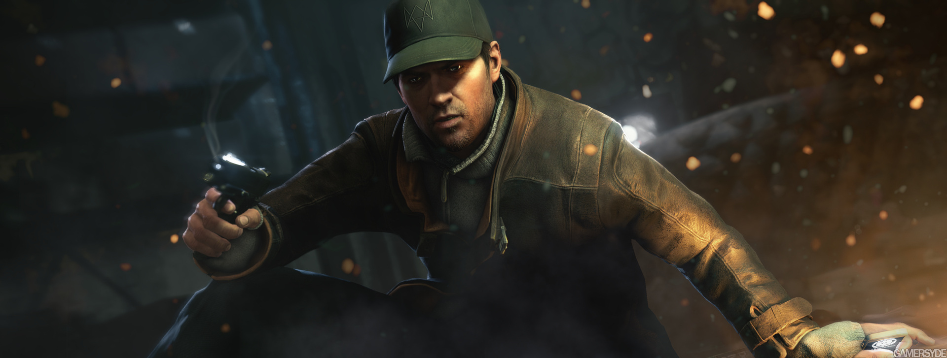
Okay, looking at these screens, the cutscene models do hold up well. Detail is good, and geomtery in this faces does look at least as good. They look good for sure.

Personally, I think in motion the lighting looks nicer in the Infamous cutscenes and also fabric looks at least as good when you can see them in decent clarity. You could have picked other scenes from the trailer of course where things don't come together quite as opportunely. For instance, when he is walking beneath the sky scrapers with his hands in his pockets. Maybe it is a lower LoD face or the lighting is poor, but it didn' t look particularly impressive. I don't think WD looks as good as the cutscenes at all in gameplay. Personally, I think Infamous gets much closer.

People are in a state where automatically will take a path to bury "Watch Dogs" and another one to justify "Second Son". It's not a bad way, but is not the objective way.
 
What exactly doesn't look good in that gif?

I think people are just piling on now.

The game can look good at times, don't get me wrong:

mszsww.gif


But if you compare the gif I quoted earlier to the original reveal, it's apparent how static the world looks. Nothing's moving. The lighting is flat.

Compare it to:

watch_dog-50uu0c.gif


and the game looks practically current-gen now by comparison. The graphics are only disappointing relative to what there were shown to be. It looks like an average looking next-gen title now.
 
True. To be honest I only enjoyed 1 AC title myself. The previews atleast seem like the delay was atleast good for the gameplay of the game. Time will tell.

I just didn't see this being that big of a deal. 50 pages usually get thrown to betrayltons not downgradeatons. :P

Watch_Dogs had a lot of clout and hype back when it was revealed. I'm not surprised that a downgrade would get this level of response. As for me, I sort of expected this after the delay was announced. Ubisoft and all.
 
Still looks at least average to me. If you were interested in the game play in the first place, I see no reason why the graphics would deter you. Not like any of the other cross Gen games look any better.
 
Main differences are lighting, weather effects and textures as well as general detail.

The Xbox One version is going to be a right looker, running at sub full hd.
 
Wait a second... is this the trailer everyone is ragging on?
https://www.youtube.com/watch?v=NuAbH8Z8iwk
Because this looks pretty fantastic to me, maybe just slightly worse than new Infamous, a game which everyone is fawning over. Yes, Infamous has spectacular lighting effects and reflections, but this game has nice natural look about it. It just looks different but not necessarily worse. Maybe flaws show up more in a high def video, I watched this on the phone.
 
The gamespot video is pretty cool.

It's less impressive thant the older videos because it's not rainning and not at dawn but I don't think there is a real downgrade from E3 2013 at the ps4 conf
 
The game can look good at times, don't get me wrong:

mszsww.gif


But if you compare the gif I quoted earlier to the original reveal, it's apparent how static the world looks. Nothing's moving. The lighting is flat.

Compare it to:

watch_dog-50uu0c.gif


and the game looks practically current-gen now by comparison. The graphics are only disappointing relative to what there were shown to be. It looks like an average looking next-gen title now.

I get your point, but one image is filled with trees, signs, and background details, and the other buildings and a pole.

-

Personally, I'm more annoyed by how the protagonist is doing the Batman voice in 2014. That ship has sailed.
 
Some people in this thread is just way over the top.
Judging a game from a small gif from unknown origin and then hating on a lady answering questions and making a joke on twitter.

T2MBdru.gif
 
This thread makes me pretty ashamed of being a gaming-fan.
The stupidity and brazenness. Hey, UbiSoft why does this h264-screen look worse than a direct-feed screenshot? Dat scandal.
 
The game can look good at times, don't get me wrong:

mszsww.gif


But if you compare the gif I quoted earlier to the original reveal, it's apparent how static the world looks. Nothings moving. The lighting is flat.

Compare it to:

watch_dog-50uu0c.gif


and the game looks practically current-gen now by comparison. The graphics are only disappointing relative to what there were shown to be. It looks like an average looking next-gen title now.
The second gif looks better because:

There is wind.
There is a bokeh effect to introduce the trailer (you wouldn't see it if you were normally walking down the street).
The sun is lower, so the colours are warmer, the shadows are longer.
 
right, saying a game by another developer looks like crap is not slamming at all...


:/

Ffs. She called it a great game - I love it and wouldn't go that far! Good yeah, maybe even very, but great? I think she was too kind if anything, surely even the devs have to admit it's a rough diamond at the very best.

Anyway I don't want to be some kind of PR Girl defense force but I'll never understand how anyone gets offended by shit like this. Maybe if they worked on the game in question but even then in this case I'd think they were over reacting to the truth.
 
Still looks at least average to me. If you were interested in the game play in the first place, I see no reason why the graphics would deter you. Not like any of the other cross Gen games look any better.
I feel the same. If it looks as good as AC4 then im okay with it.

Cross gen is really holding some of these titles back.
 
She handled that very well. You kind of have to in order to deal with this community, but have to say kudos.

Is she almost flirting with the guy lol - good comeback though.

Would prefer we don't go overboard on this so she gets highlighted. Ubisoft themselves should explain themselves though...
 
Brazil is a poster on NeoGAF, it's fine for him to be critical of other posters and not at all comparable to a games journalist talking down to his audience.

He's being critical of the wrong part of things as I see it. Being on the side of a multi-million dollar company over the consumer is absolutely foolish behavior, especially when no one is being unreasonable in their disappointment (aside from a few ridiculous people on Twitter).
 
The game can look good at times, don't get me wrong:

mszsww.gif


But if you compare the gif I quoted earlier to the original reveal, it's apparent how static the world looks. Nothing's moving. The lighting is flat.

Compare it to:

http://www.abload.de/img/watch_dog-50uu0c.gif[/IMG

and the game looks practically current-gen now by comparison. The graphics are only disappointing relative to what there were shown to be. It looks like an average looking next-gen title now.[/QUOTE]

so what should be moving in that first gif? The bricks of the walls?

But sure, the reveal was a bit optimistic, i agree.
 
This thread and situation proves why publishers are afraid to try anything different/new.

On the whole, the gaming community today is a big mess. Full of entitled people who don't know shit about what goes on in terms of developing a game. There are people out there who have slaved away on this product for the last few years only to end up with a reaction like this, and the game isn't even out yet. It's unfair on them to say the least.

This is why we can't have nice things.
 
I get your point, but one image is filled with trees, signs, and background details, and the other buildings and a pole.

so what should be moving in that first gif? The bricks of the walls?

But sure, the reveal was a bit optimistic, i agree.

I was quoted regarding this gif:

iAHxbvGbhY0Mz.gif


which is what I'm describing as static in comparison to the reveal.

It just takes a little bit of comprehension. My bad.
 
The second gif looks better because:

There is wind.
There is a bokeh effect to introduce the trailer (you wouldn't see it if you were normally walking down the street).
The sun is lower, so the colours are warmer, the shadows are longer.
I'd just wish they'd actually show comparable footage then.

So far is the bridge scene the only scene that's really 1:1, and there the new version looks quite bad
 
Some people in this thread is just way over the top.
Judging a game from a small gif from unknown origin and then hating on a lady answering questions and making a joke on twitter.

T2MBdru.gif

Endless made a gif just for you Kitty :)

watch_dogs_e3_2012_vs_march_2014_by_endless_1-d795oxr.gif


Don't worry, there is not much difference between the two.
 
I get your point, but one image is filled with trees, signs, and background details, and the other buildings and a pole.

-

Personally, I'm more annoyed by how the protagonist is doing the Batman voice in 2014. That ship has sailed.

Every shot in the 2012 reveal whether it's day/night/raining or not is filled with detail and life in the environment like in that gif. Every shot in the story trailer does not have any such details. Other games are stuffed full of the kind of atmospheric effects the original reveal had in spades. It's what blew me away at the reveal.

Shadow Fall and Tomb Raider are full of such things. Footage of Infamous is full of such things. I'm sure other next gen games have such touches. AC4 has more (though not many) of that type of thing.

Even just footage of someone walking down an alley in the first reveal had more life in the environment than ANY of the footage in the story trailer.

Other things look great in the footage. I presume lighting is dynamic (because hacking). The environment is nicely detailed. Characters and textures are good. Particle effects while maybe a step down, are still decent on explosions, tire smoke, car crashes and that type of thing.

But all the environmental effects that brought the world to life in the 2012 footage are missing completely from this footage.

If that's not a clear and apparent downgrade, I don't know what is.
 
I was quoted regarding this gif:

iAHxbvGbhY0Mz.gif


which is what I'm describing as static in comparison to the reveal.

It just takes a little bit of comprehension. My bad.

Static aside, it's also a 1080p image downscaled to 693x355 pixels. And three seconds long. I wonder if that's how DF makes their face-offs these days...
jk
maybe
 
I'd just wish they'd actually show comparable footage then.
Me too. Until then, I think is a huge amount of overreaction going on. Plenty of people are still coming into this thread and taking one look at the very misleading gif in the OP and making up their minds there and then.

There are even elements of the recent footage that look like an upgrade rather than a downgrade.

This thread is ridiculous.
 
Status
Not open for further replies.
Top Bottom