
I get genuinely annoyed when people post this. It's obviously his hand, unless you think guns just levitate in front of people's faces.
You are using an out of date browser. It may not display this or other websites correctly.
You should upgrade or use an alternative browser.
You should upgrade or use an alternative browser.
Worst cover/poster fails
- Thread starter ricardo_sousa11
- Start date
cyberheater
PS4 PS4 PS4 PS4 PS4 PS4 PS4 PS4 PS4 PS4 PS4 PS4 PS4 PS4 PS4 PS4 PS4 Xbone PS4 PS4
I get genuinely annoyed when people post this. It's obviously his hand, unless you think guns just levitate in front of people's faces.
Indeed. The cover is just fine.
Jzero
Member
What am I supposed to be seeing here?
6 fingers


cyberheater
PS4 PS4 PS4 PS4 PS4 PS4 PS4 PS4 PS4 PS4 PS4 PS4 PS4 PS4 PS4 PS4 PS4 Xbone PS4 PS4
6 fingers
Well in fairness. Most blokes wouldn't be concentrating on the fingers
")

Is that Geoff Keighley?
That's his hand.
KiteGr
Member
That's his hand.

It's obviously his hand, but once you see something this bizare it can not be unseen. Whenever you watch this cover, Bonds stretched cheek will always come to mind.
Rather than posting the usual Megaman box art and beat that dead horse to a pulp,
I'll rather cheat a little by showing a non-game cover. This one is a real Fail that I can't put out of my mind whenever I watch it...
As I said... Once you see something, it can not be unseen
Infernal Monkey
Member
Rather than posting the usual Megaman box art and beat that dead horse to a pulp,
I'll rather cheat a little by showing a non-game cover. This one is a real Fail that I can't put out of my mind whenever I watch it...
As I said... Once you see something, it can not be unseen
Haha, oh shit. Ouch.
ThunderReign
Neo Member

Fucking EU covers...
Is there a story behind this one like the one I posted?
Mihos
Gold Member
Howard Wolowitz is rocking that shit.
Zomba13
Member
wasn't this a winner of a fanart contest on GAF? I haven't thought of that in so long
The original one voted was of Ragna but they wanted to push Noel instead because lady girls sell fighting games or something.
sixteen-bit
Member
Inversion has some shit box art

What were they even thinking?
Lmao
nkarafo
Member
I don't get the developer's joke.Anyway, my obvious contribution:

Time to roll out this chestnut again:

Yeah, most localized games during that era had awful box art. Which was frustrating, considering how awesome the actual Japanese art was at the time.
I don't know if companies were too cheap to license the better art, or they thought Japanese art wouldn't appeal to westerners, or what.
Nothing beats early Atari, I still see myself like this when I code. (I bet he isn't wearing pants either)
That Pac-man art is awful, but the programming one is pure awesome.
nkarafo
Member
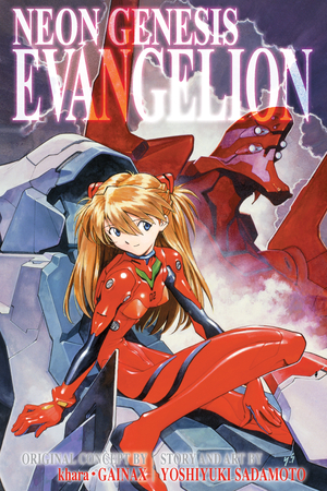
Is it that Asuka's body and legs look like they also belong to the Eva? Or is it that she is holding something huge between her legs?This one is a real Fail that I can't put out of my mind whenever I watch it...
[IMG]http://s3.amazonaws.com/wsl-viz/thumb-6697-NGEOB_03_web.jpg
As I said... Once you see something, it can not be unseen
Fine Ham Abounds
Member
I've asked this before too! We want answers!
I just always assumed since the game was called Phalanx, they picked a cover with a dude using his fingers.
what the story behind Phalanx anyway?
does the banjo playing old man have any significance?
They did an article about it in EGM (I think?) way back when, the idea behind the cover was that he was supposed to be looking into space and seeing the ship, but they didn't get the exact shot they wanted (Not to mention the model wasn't in great condition and he suffered a stroke before the shoot)
spookyfish
Gold Member
Is it that Asuka's body and legs look like they also belong to the Eva? Or is it that she is holding something huge between her legs?
I think it's that she's not really bending at the waist, but somewhere in the middle of her back.
Violence Jack
Member

Looks like Van Damme got knocked off a building by Patrick Swayze.
Is it that Asuka's body and legs look like they also belong to the Eva? Or is it that she is holding something huge between her legs?
Look at her waist... it shouldn't bend like that, and it's so fucking skinny, you wonder if there is anything but a skeleton underneath that suit.
Look at her waist... it shouldn't bend like that, and it's so fucking skinny, you wonder if there is anything but a skeleton underneath that suit.
She's not that skinny, part of her body is supposed to be hidden/inside the mech. But the bend doesn't look natural...
The Albatross
Member
Time to roll out this chestnut again:
I remember seeing that as a kid ... and ... I just didn't get it

The Albatross
Member
I get genuinely annoyed when people post this. It's obviously his hand, unless you think guns just levitate in front of people's faces.
Holy shit I had never seen it like that before (that his mouth is extended and it isn't his hand)... Cannot unsee now
Fine Ham Abounds
Member
Look at her waist... it shouldn't bend like that, and it's so fucking skinny, you wonder if there is anything but a skeleton underneath that suit.
This pretty much sums up 80% of every anime I've ever seen
They did an article about it in EGM (I think?) way back when, the idea behind the cover was that he was supposed to be looking into space and seeing the ship, but they didn't get the exact shot they wanted (Not to mention the model wasn't in great condition and he suffered a stroke before the shoot)
Wait, what? ;\
Darkangel
Member
What photoshop flops have you seen in game covers/posters ?!
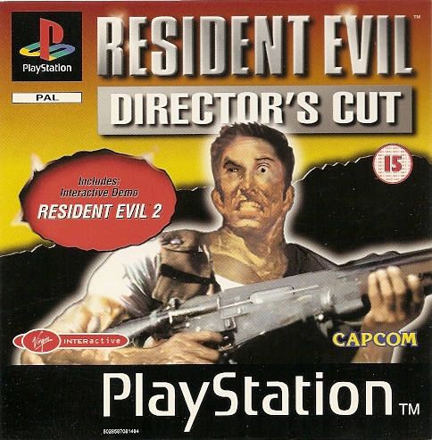
I just saw this image on another thread, and holy s*hit....what is wrong with his face ?! Also is he holding an M4 shotgun ?! And those ears /neck...
Some detectives on /vr/ were able to figure out the origins of the classic RE1 boxart:

I think they also found where they got part of his face, but it's not included in the picture.

Oh god. This terrible cover. The most confusing thing to me is that the creature in the lower right is just some random encounter enemy that has no significance whatsoever. Whatever made the artist decide to latch onto that monster and decide it was worthy of inclusion on the cover is beyond me.

nkarafo
Member
Yeah but i think the skinny Eva behind that tree is a funnier "can't unsee" moment.Look at her waist... it shouldn't bend like that, and it's so fucking skinny, you wonder if there is anything but a skeleton underneath that suit.

The art wasn't terrible itself per se, issue is that it sets the wrong tone for what kind of game it is. That art makes it look like an FPS or TPS.

Also if I remember correctly that was drawn by a GAFfer since they had a contest on GAF for the BB EU box art.
Like I said, the artwork was good, but doesn't fit what the box art should be.
atomic moth
Member
Looks like Van Damme got knocked off a building by Patrick Swayze.
It's not really a building though, which makes it better. The Swayze is standing on a park bench.
I also like the fact that they put a circus tent in there.
Calavera520
Member

Nothing beats early Atari, I still see myself like this when I code. (I bet he isn't wearing pants either)

Those are both incredible..
Is it that Asuka's body and legs look like they also belong to the Eva? Or is it that she is holding something huge between her legs?
I think it is the fact that Asuka's body is broken in the middle, because the curve is on her belly, not on her legs
Wait, what? ;\
Found this with a google search:
Okay, here's the lowdown from EGM Sept. 2001:
THE PHALANX FACTOR
Q: What was the deal with that old dude on the cover of the SNES shooter Phalanx?
Ahalanx was just another Super NES sidescrolling shooter that we all probably would have forgotten by now - if not for the inexplicable shot of the bearded geezer strummin' a banjo on the game's box cover. Why the old guy? The problem is that all the game art looked alike at the time - monsters or spaceships or something," explains Matt Guss, head of the advertising company behind the Phalanx campaign. "We wanted to create shock value so somone would have to pick the game up. We called it the 'Heavy Huh?!' factor." Art director Keith Campbell says they did the photo shoot themselves, hiring a model for the role of the 80-something hayseed. "I'd used him before as Santa Claus on an album-cover shoot," Guss adds. "I remember him coming into the studio, and I though the poor guy was gonna die right there on the stage. I think he'd had a stroke earlier - not earlier that day, but in the past . . . We stuck a banjo in his hands, and I think we stuck a spaceship behind his head that he was supposed to be staring at in wonder, sort of a Star Wars-come-to-the-Ozarks kind of thing." You gotta admit Guss' cover concept was mighty effective. After all, we're still talking about the game 10 years after its release. Heavy, huh? If you're too young to remember this game, don't worry Kemco's rereleasing it for the Game Boy Advance.
shysaursoft
Member

Lionheart1827
Member
I bought Phalanx back in the day. It's actually a pretty awesome and challenging game, great music as well. I like it better than R type imo.


Oh god. This terrible cover. The most confusing thing to me is that the creature in the lower right is just some random encounter enemy that has no significance whatsoever. Whatever made the artist decide to latch onto that monster and decide it was worthy of inclusion on the cover is beyond me.
I have to admit, at the time I kept passing this up at the store cuz box Art and screen shots on the back of the case didn't do this game any justice...and when my brother bought it a month later I was beating myself up for not grabbing it (bro was busy with his play through and all I could do was watch)
Charles Bronson in Donkey Kong: No diceWell, if you guys are going to do Atari box art....

PetriP-TNT
Member
Some detectives on /vr/ were able to figure out the origins of the classic RE1 boxart:
I think they also found where they got part of his face, but it's not included in the picture.
Hey cool, I think I have never seen that promo cover
DavionStriker
Member
Ok fine...you asked for it.

This is amazingly bad yes, but I think the real question is how can you have a Final Zone 2 when the first title was called Final Zone? Was it not really final???