velociraptor
Junior Member
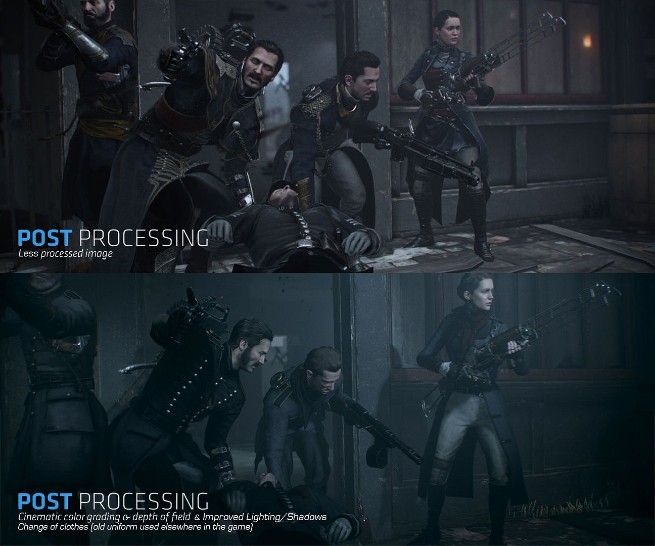
Hold on a second. Do people think Infamous and KZSF were downgraded? lolwutTo be fair, there have been a few high profile games that have received downgrades from their initial showings (Watchdogs, Dead Rising 3 and Forza 5), so the term is not altogether amiss. The annoying thing is when it gets lauded around too freely, often by those who have very little understanding or comprehension of graphical features or tech.
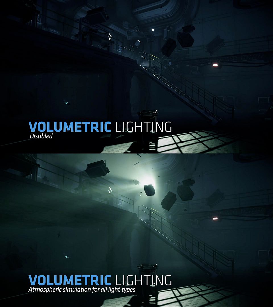
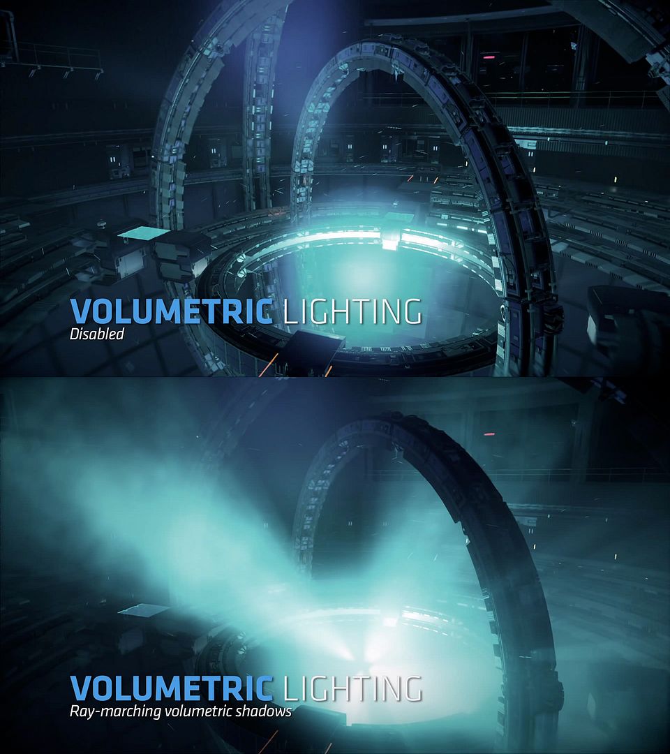
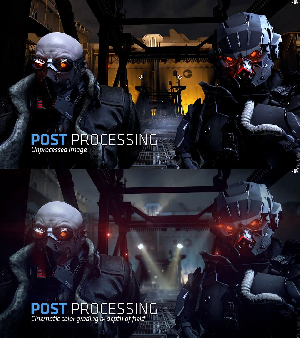
A large number of the downgrade complaints for many games (InFamous, Ryse, The Order, Shadow Fall etc) have either been from people confusing a preference in art direction for an actual downgrade, letting lower quality footage dictate and distort their opinions, or people just outright trolling.
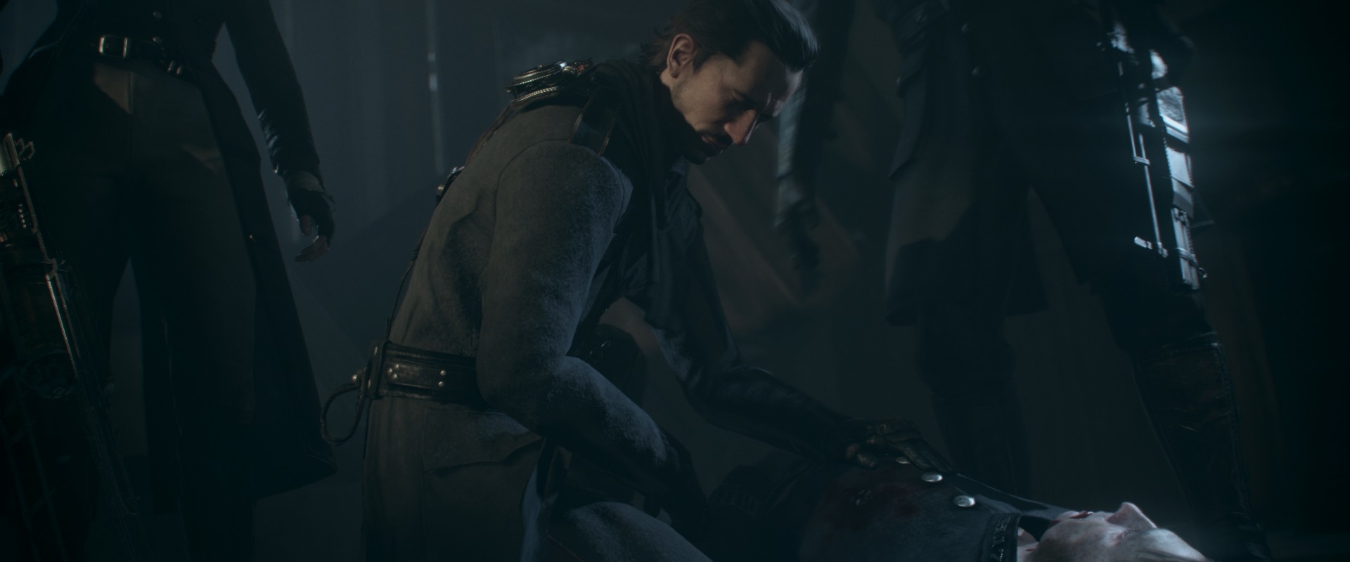
Infamous is easily one of the best looking games period.