Yeah, it's just Jotaro in Araki's new style.is that supposed to be jotaro
do not want
You are using an out of date browser. It may not display this or other websites correctly.
You should upgrade or use an alternative browser.
You should upgrade or use an alternative browser.
JoJo's Bizarre Adventure: Stardust Crusaders |OT| ATTEMPT NO MANGA SPOILERS HERE
- Thread starter Tizoc
- Start date
- Status
- Not open for further replies.
Araki's artstyle has just changed considerably between part 3 to now.is that supposed to be jotaro
do not want
EmCeeGramr
Member
is that supposed to be jotaro
do not want
in the middle of part 4 araki suddenly decides that he should stop drawing roided out giants with shoulders as wide as a small car and slims down the characters, with existing characters part 3 and part 4 depicted as way skinnier versions of themselves (part 1 and part 2 characters drawn by araki for whatever reason become nearly unrecognizable once de-Liefelded, and even moreso once he adopts his current style)
from there, things get really funky and ~*fabulous*~ for a while until a certain point in Part 7 where Araki moved from ~20 pages in weekly jump to ~40 pages in a monthly book and his art got a massive boost in realism and detail. unfortunately, it also resulted in his existing sameface getting worse for a good while (there's a notorious Part 7 volume cover where a 19 year old boy, a 24 year old man, and a 14 year old girl have literally the same facial features)
araki's art evolution is really interesting. the first few chapters of phantom blood look like something out of a shoujo manga, with Dio and Jonathan having this fluffy hair and big sparkly eyes and tiny heads on huge ass bodies
human onion
Banned
These images make me want to read the manga
Do it, it's amazing. Or don't if you want to see Part 3 animated to the end. I've never been one to care about spoilers, knowing the twists ahead of time doesn't take away the impact for me if the twist is well-written and believable.
I feel like Araki's sameface is only really bad on the covers, where everyone's doing model poses. The manga itself has pretty varied expressions.
(part 1 and part 2 characters drawn by araki for whatever reason become nearly unrecognizable once de-Liefelded, and even moreso once he adopts his current style)
Yeah, part 2 joseph is pretty unrecognizable in the new style

Meanwhile, part 3 joseph looks pretty recognizable

Permanently A
Junior Member
Araki's artstyle has just changed considerably between part 3 to now.
Star Platinum really let himself go. All those gains lost...
Star Platinum really let himself go. All those gains lost...
I bet he can't even ORAORAORA anymore.
Werewolf Jones
Member
(there's a notorious Part 7 volume cover where a 19 year old boy, a 24 year old man, and a 14 year old girl have literally the same facial features)
I dunno how he drew this and didn't realize they all look the same. lol
human onion
Banned
I dunno how he drew this and didn't realize they all look the same. lol
Yeah that one was really bad, but probably the worst of it.
WOWYeah, part 2 joseph is pretty unrecognizable in the new style
I'd already seen Clint Eastwood Jotaro before, but this had me like
Jigolo
Member
Yeah, part 2 joseph is pretty unrecognizable in the new style
Meanwhile, part 3 joseph looks pretty recognizable
Whoa. so did this guy completely redraw the whole thing? Do we have his original style to compare this to? I'm scared to look it up as I am afraid of spoilers.
Yeah, I'll probably pick up the manga after Stardust Crusaders is done. JoJo is too fucking awesome.
Nah, he is just drawing new covers for the rereleases.Whoa. so did this guy completely redraw the whole thing?
For referenceDo we have his original style to compare this to?
Old Part 2 Joseph

Old Part 3 Old Joseph

Jigolo
Member
Nah, he is just drawing new covers for the rereleases.
For reference
Old Part 2 Joseph
Old Part 3 Old Joseph
Got damn. I dig both styles. The current anime is doing a fantastic job with replicating the style shown here. I wonder what made him change it up.
SolarKnight
Member
Nah, he is just drawing new covers for the rereleases.
Which btw are the ones that will start to come out at the end of next month and that you guys should totally buy to support the series in the west if you didn't buy the digital release.
JadedWriter
Member
I can't unsee that Star Platinum chest hair.Araki's artstyle has just changed considerably between part 3 to now.
I've had the Phantom Blood ones preordered for what seems like forever.Which btw are the ones that will start to come out at the end of next month and that you guys should totally buy to support the series in the west if you didn't buy the digital release.
Watch Da Birdie
I buy cakes for myself on my birthday it's not weird lots of people do it I bet
Got damn. I dig both styles. The current anime is doing a fantastic job with replicating the style shown here. I wonder what made him change it up.
Artists evolve, I guess. I don't think it was necessarily purposeful.
I think Araki's said there's no way he can draw in the old style anymore even if he wanted to.
SolarKnight
Member
The problem is that they're omnibuses, making them impossible to read.
You sure you're not thinking of this one?

EmCeeGramr
Member
There was also a transitory period at the beginning of Part 3, where he was still basically using the Fist of the North Star-like style of Part 1/2 with heavy shading:


The style shifts to the more familiar one associated with Stardust Crusaders (that David replicates) around the time of Yellow Temperance/Hanged Man + Emperor, and the faces and characters become more... expressive and almost a bit cartoony at times in term of facial expressions, though still detailed enough that Araki can just put it a little more effort and detail into them for Serious Splash Pages and whatnot.
The style shifts to the more familiar one associated with Stardust Crusaders (that David replicates) around the time of Yellow Temperance/Hanged Man + Emperor, and the faces and characters become more... expressive and almost a bit cartoony at times in term of facial expressions, though still detailed enough that Araki can just put it a little more effort and detail into them for Serious Splash Pages and whatnot.
JadedWriter
Member
I definitely prefer the current Kakyoin. I wonder what redrawn Jonathan looks like. That new Joseph looks weird.There was also a transitory period at the beginning of Part 3, where he was still basically using the Fist of the North Star-like style of Part 1/2 with heavy shading:
The style shifts to the more familiar one associated with Stardust Crusaders (that David replicates) around the time of Yellow Temperance/Hanged Man + Emperor, and the faces and characters become more... expressive and almost a bit cartoony at times in term of facial expressions, though still detailed enough that Araki can just put it a little more effort and detail into them for Serious Splash Pages and whatnot.
Sibersk Esto
Banned
I definitely prefer the current Kakyoin. I wonder what redrawn Jonathan looks like. That new Joseph looks weird.
EmCeeGramr
Member
Yes, Jonathan is just completely unrecognizable because A) Araki likes to draw him with Caeser/Joseph's headband for some reason, and B) he has really no other defining features, so he's always the "wait who is that guy" every time post-Battle Tendency that Araki draws an illustration of all the past JoJos.
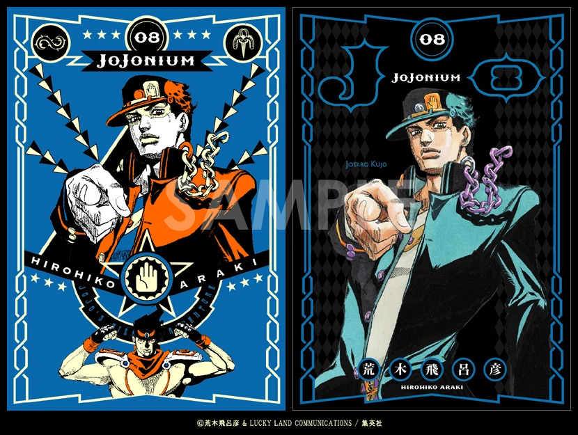
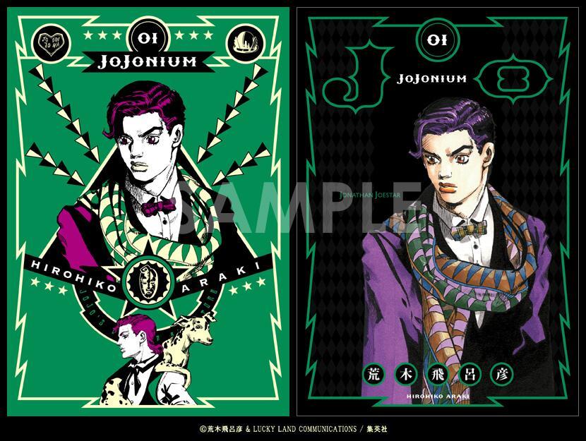
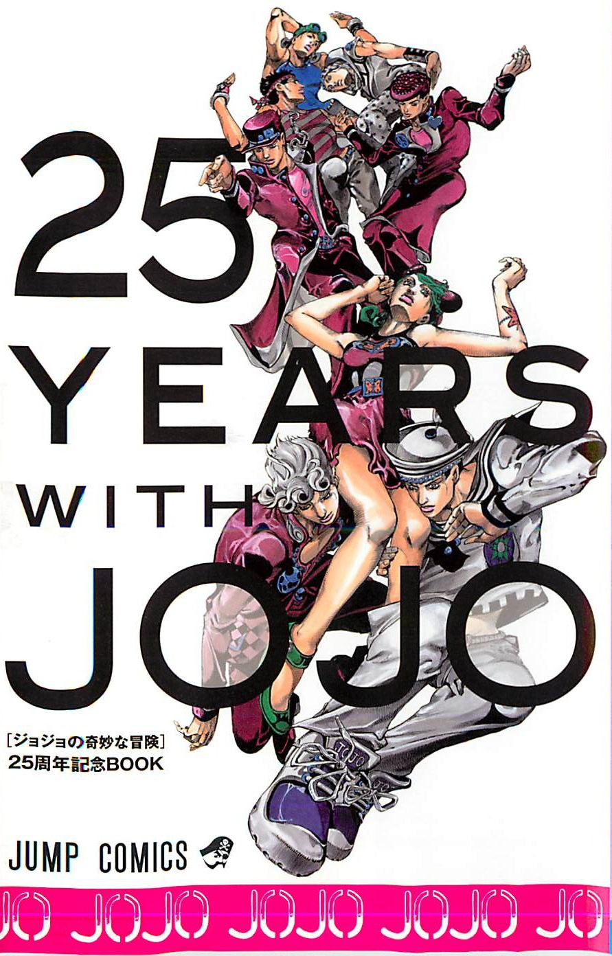
For reference, here are all of the current Jojonium covers (with the exception of one from Part 3, as it depicts a character not yet seen in the anime):
Phantom Blood:
Battle Tendency:
Stardust Crusaders:
For reference, here are all of the current Jojonium covers (with the exception of one from Part 3, as it depicts a character not yet seen in the anime):
Phantom Blood:


Battle Tendency:


Stardust Crusaders:


SolarKnight
Member
I definitely prefer the current Kakyoin. I wonder what redrawn Jonathan looks like. That new Joseph looks weird.
Uh...

(above Jotaro)
You sure you're not thinking of this one?
Oh, looks like the volumes differ in page length.
Volume 1 is 255 pages, but volume 2 is 648 pages (was looking at this), but then volume 3 drops down to 352 pages.
Watch Da Birdie
I buy cakes for myself on my birthday it's not weird lots of people do it I bet

Okay, I've never seen this one...
This...this makes me angry. Why Araki, why?
MetroidPrimeRib
Banned
The only ones that really bother me are Jonathan (because you can hardly tell him apart from Joseph) and Enya.
No worries because his style will evolve again and in 5 years he won't be able to draw the current sameface style
No worries because his style will evolve again and in 5 years he won't be able to draw the current sameface style
zedreamcast
Member
Dont forget Jotaros belts are Ceasers Bandanna as well.The main problem with Jonathan is that Araki always gives him Caesar's bandanna for some reason. Now the goggles are young Joseph's identifier.
maybe Araki just really likes that bandanna
Jojo Sono Chi no Kyoku full opening, youtube mirror, give it a listen!
https://www.youtube.com/watch?v=56BCLxAFttI
https://www.youtube.com/watch?v=56BCLxAFttI
fengshuifever
Member
I've heard so much about this show and after finally getting Crunchyroll a couple of days ago, this was the first show I put on queue.
Oh my god. JoJo!!!!
I haven't stopped watching it, I'm up to Part 2 : Ep 3.
The BIGGEST grin spread across my face when I heard Yes in the ending credits.
I must say, I ALREADY miss the 1st intro. There's a part of me that wishes they kept it over into the 2nd season.
Oh my god. JoJo!!!!
I haven't stopped watching it, I'm up to Part 2 : Ep 3.
The BIGGEST grin spread across my face when I heard Yes in the ending credits.
I must say, I ALREADY miss the 1st intro. There's a part of me that wishes they kept it over into the 2nd season.
Out of the new style redesigns of old characters, I only like Jotaro. I was never fond of Jotaro looking as an ultra buff guy at 17 y/o, and when rereading part 3 I tell myself he is using huge shoulder pads in his uniform because he is a stupid adolescent kid.
Wonder why Jonathan got Cesar's scarf.
Checking, Jotaro's belt was always Cesar's bandanna.
Wonder why Jonathan got Cesar's scarf.
Dont forget Jotaros belts are Ceasers Bandanna as well.
maybe Araki just really likes that bandanna
Checking, Jotaro's belt was always Cesar's bandanna.
Eric the Red
Member
I've heard so much about this show and after finally getting Crunchyroll a couple of days ago, this was the first show I put on queue.
Oh my god. JoJo!!!!
I haven't stopped watching it, I'm up to Part 2 : Ep 3.
The BIGGEST grin spread across my face when I heard Yes in the ending credits.
I must say, I ALREADY miss the 1st intro. There's a part of me that wishes they kept it over into the 2nd season.
Welcome to the crazy train. Keep us updated on your impressions
")
ElFly said:Out of the new style redesigns of old characters, I only like Jotaro. I was never fond of Jotaro looking as an ultra buff guy at 17 y/o, and when rereading part 3 I tell myself he is using huge shoulder pads in his uniform because he is a stupid adolescent kid.
I kinda get that, except he's also written that way. Super stoic tough guy delinquent. Most of the enemies are legit intimidated once he gets his hands on them.
Welcome to the crazy train. Keep us updated on your impressions
I kinda get that, except he's also written that way. Super stoic tough guy delinquent. Most of the enemies are legit intimidated once he gets his hands on them.
He is fit and strong, just not a bodybuilder.
New Jotaro looks more of an athlete and that would be intimidating once he actually grabs someone.
It's not as bad within the context of the manga. I like it a lot more than the original art.What a strange art style shift. Not a fan of the sameface.
The Omega Man
Member
what happened with the no spoilers rule?serious question, I put a youtube video once where an action figure from a future season could be seen and a mod removed the link then we have all these pictures from future characters shown here like nothing.
Shouldn't we discuss Araki's art style in the other Jojo topic and stick to the current anime talk here?
Shouldn't we discuss Araki's art style in the other Jojo topic and stick to the current anime talk here?
Feel like Araki's evolving art style doesn't really spoil anything, and all that's really been demonstrated is what it means for characters that we've seen in the anime.what happened with the no spoilers rule?serious question, I put a youtube video once where an action figure from a future season could be seen and a mod removed the link then we have all these pictures from future characters shown here like nothing.
Shouldn't we discuss Araki's art style in the other Jojo topic and stick to the current anime talk here?
The Omega Man
Member
one picture is clearly showing characters from part 6, that's clearly out of place in the anime discussion thread, this thread was created to discuss the anime show until current events, for all things Jojo there is the other thread.Feel like Araki's evolving art style doesn't really spoil anything, and all that's really been demonstrated is what it means for characters that we've seen in the anime.
Yep, this song is fucking sweet.Jojo Sono Chi no Kyoku full opening, youtube mirror, give it a listen!
https://www.youtube.com/watch?v=56BCLxAFttI
JadedWriter
Member
Jonathan looks really weird without his steroids abuse.
Jojo Sono Chi no Kyoku full opening, youtube mirror, give it a listen!
https://www.youtube.com/watch?v=56BCLxAFttI
The full version is more epic than the edited one used for the show. Still don't like it more than Bloody Stream, but I don't hate it as much as I used to. Good guitar riffs in the song.
JadedWriter
Member
He was a big Rugby player. Took like 3 to 4 people to tackle him. Dio was big too, but he wasn't on Jonathan's level, but you do make a good point.Jonathan being buff is ok because he was a rugby player.
Oh, yeah, that one should probably get edited out.one picture is clearly showing characters from part 6, that's clearly out of place in the anime discussion thread, this thread was created to discuss the anime show until current events, for all things Jojo there is the other thread.
Others are fine, give we had a mod post a bunch with care to not include characters not seen in the show yet.
It's not as bad within the context of the manga. I like it a lot more than the original art.
Aesthetically it's cool but the characters really look way too much like each other. I wonder how will they end up looking in the tv show.
Jojo Sono Chi no Kyoku full opening, youtube mirror, give it a listen!
https://www.youtube.com/watch?v=56BCLxAFttI
This is really much better than the OP edit.
JadedWriter
Member
Yes, Jonathan is just completely unrecognizable because A) Araki likes to draw him with Caeser/Joseph's headband for some reason, and B) he has really no other defining features, so he's always the "wait who is that guy" every time post-Battle Tendency that Araki draws an illustration of all the past JoJos.
For reference, here are all of the current Jojonium covers (with the exception of one from Part 3, as it depicts a character not yet seen in the anime):
Phantom Blood:
Battle Tendency:
Stardust Crusaders:
I actually don't mind most of the new art style. I just find Jonathan, Joseph and Enya kind of weird looking. LIsa Lisa was never drawn to be hot by Araki so I'm glad the anime did their own thing with her face. Dio looks foppish as fuck in the new art style. It's fitting though.
- Status
- Not open for further replies.