NightShift
Member
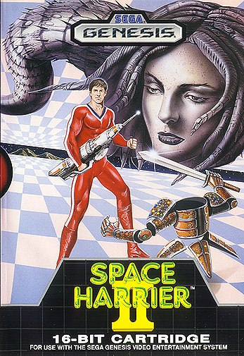
This one always struck me as goofy because the guy's reacting to the title. Looks more like a poster for a sketch comedy show.surprised at the lack of..
This one always struck me as goofy because the guy's reacting to the title. Looks more like a poster for a sketch comedy show.surprised at the lack of..

"It certainly looks impressive" lol what kind of quote is that.
HALO 6
"It has good graphics"
This one always struck me as goofy because the guy's reacting to the title. Looks more like a poster for a sketch comedy show.
Dementium 2
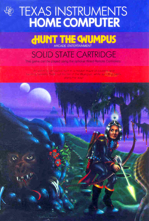
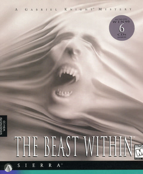
I'm 32 and this creeps me out

Generally speaking eu box art for the old silent hill games has always being a tier above the us cover(and sometimes the japanese as well).Just compare this:The PAL cover for Silent Hill. My dad had this game and seeing the cover fucked me up. Didn't stop me from wanting to and playing the game though.


Lastly...
Heart of Darkness always creeped the fuck out of me.

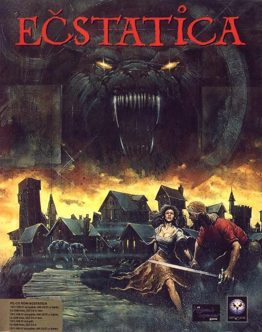
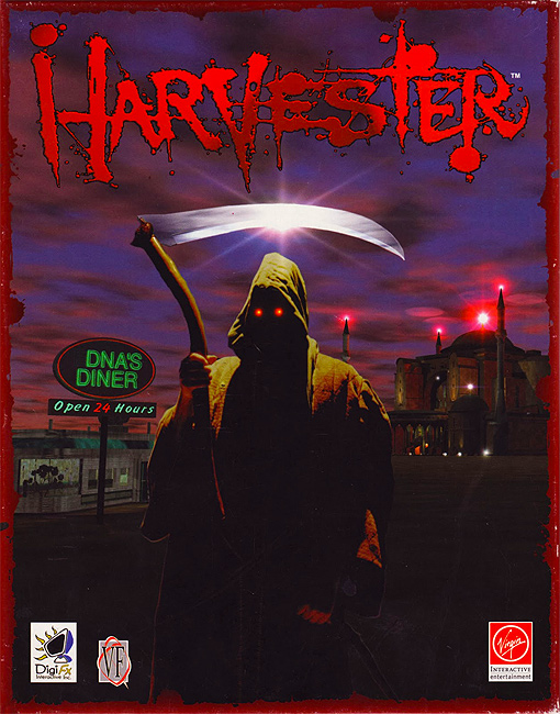
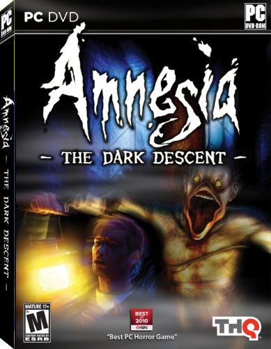
Greatest cover ever made imo
Konami!
Let me guess, was it shit?Reminds me of this gem.

This! :|
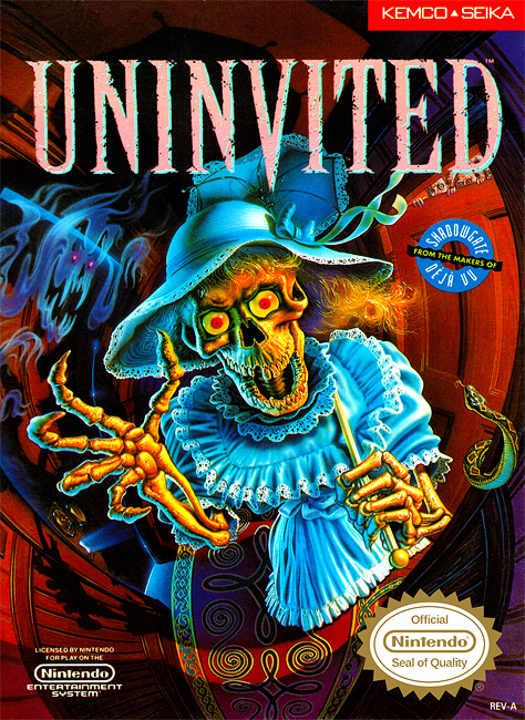
This fucked me up as a kid.
This cover is the whole reason why I'm a fan of the series. It's so different with the pile of dead bodies that while looking through the games I kept coming back because of how freaky it is. Outright scary in context.
This one always struck me as goofy because the guy's reacting to the title. Looks more like a poster for a sketch comedy show.


MY EYES! KILL IT WITH FIRE!
This fucked me up as a kid.


I personally find this more disturbing than Megaman's box art!


Speaking of PC, the Darkseed box art was always pretty freaky too. Never thought the same of the second game's box though. Despite it being a safety pin through the face, it just looked like a girl wearing sun glasses.

This fucked me up as a kid.

Let me guess, was it shit?
This fucked me up as a kid.
As a kid this creeped me out.
As a kid, this one kinda creeped me out. Loved the game tough!

surprised at the lack of..
This one is really eerie.The whole game fucked me up as a kid.

That is probably some ecchi/borderline hentai game*, so being creeped out is a natural feeling.I don't know what it is about this one but it creeps me out on the same level as that ghost girl from Pokemon XY. Very unsettling.
Fantastic game that deserves a re-release or sequel.
However, the box art is pretty tame, like Perfect Dark if you look in Joanna's right eye (on the left) tame.
")