
Too soon?
-
Hey Guest. Check out your NeoGAF Wrapped 2025 results here!
You are using an out of date browser. It may not display this or other websites correctly.
You should upgrade or use an alternative browser.
You should upgrade or use an alternative browser.
Amazon.ca: THESE are real Wii U boxes
- Thread starter Hero of Legend
- Start date
Mihael Mello Keehl
Banned
If never means too soon...yes.Too soon?
jeremy1456
Junior Member
Only on Wii U box art:
The market leader traditionally does not use any 'only on/for' logo.
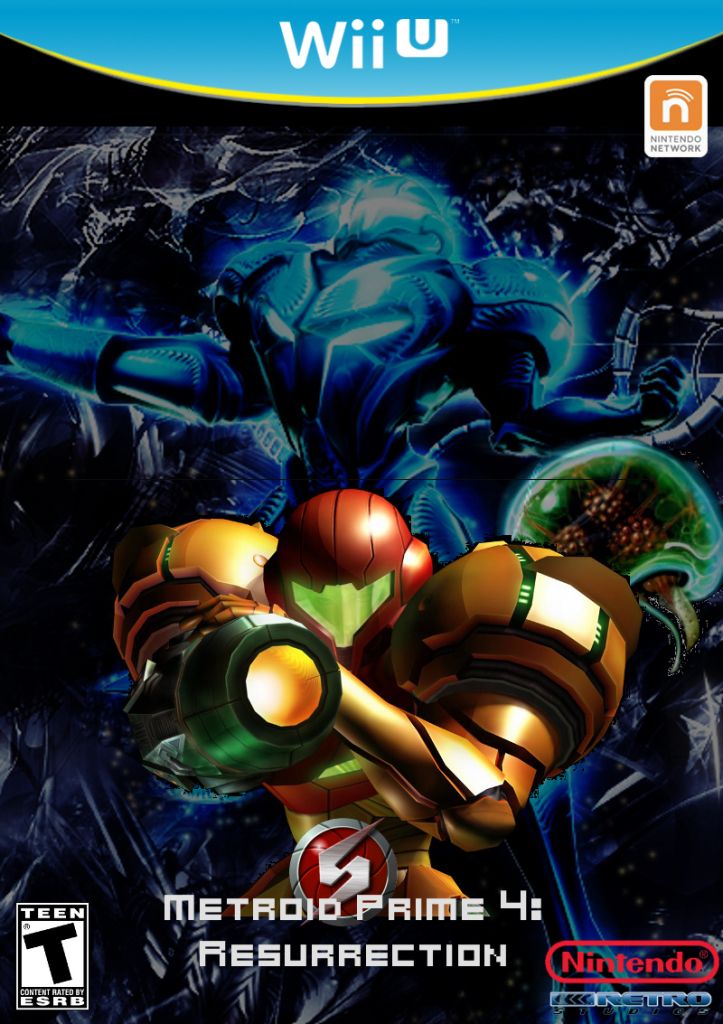
Ok guys, I suck at Gimp but I want to learn. I tried to make a Metroid Prime 4 mock-up cover art. I'm sure the photoshop experts will see the errors right away. I tried to find the proper Metroid Prime font, as it is thicker and more silver but I had to deal with Metroid Prime Hunters font instead. Bear with me here and let me know what you think.
(Also posted in Wii U information thread)
(Also posted in Wii U information thread)
GoofsterStud
Member
So I tried to make a mock up for New Super Mario Bros. U.
Regular box art:

Only on Wii U box art:
This is going to look more fun than the official artwork. >.>
terrdactycalsrock
Member
I like it, even the yellow
fredrancour
Member
Ok guys, I suck at Gimp but I want to learn. I tried to make a Metroid Prime 4 mock-up cover art. I'm sure the photoshop experts will see the errors right away. I tried to find the proper Metroid Prime font, as it is thicker and more silver but I had to deal with Metroid Prime Hunters font instead. Bear with me here and let me know what you think.
(Also posted in Wii U information thread)
Not enough pictures of samus to be a believeable metroid box art.
not bad not great , but its just boxart so who really gives a shit? =P
Sure, but we'll have to get used to staring it at for at least the next 5 years.
Other than the awkward water on the left, this is great, and exactly what I'd expect the real thing to look like. The banner really looks good in examples like this too, it's just that there are so many other games it'd look terribly out of place on. Would've been nice to go with something a little safer that would work more universally, but really I just can't hate it too much.So I tried to make a mock up for New Super Mario Bros. U.
Regular box art:
TheCongressman1
Member
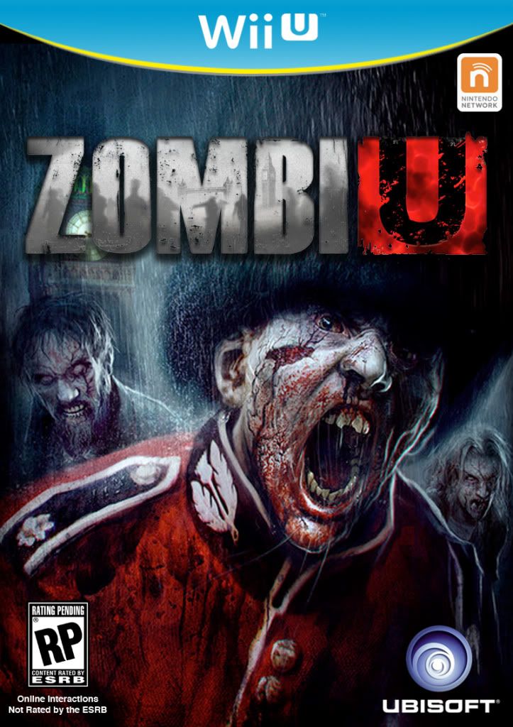
They're real? Welp, we're gonna have a lot more activity in the custom cover thread come this fall.
Metroid Hunter
Banned
Banner doesn't connect at all with "mature" games...

Metroid Hunter
Banned
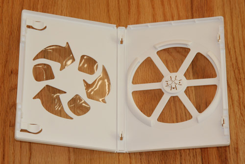
Guys the real issue is that these cases will be those stupid recycle cases (who the hell recycles cases anyways, it's probably just an excuse to cheap out on plastic).
Jaded Alyx
Member
Guys the real issue is that these cases will be those stupid recycle cases (who the hell recycles cases anyways, it's probably just an excuse to cheap out on plastic).
...They're done to satisfy Greenpeace and the like.
evilromero
Member
I wish Nintendo would have saved metroid trilogy for Wii U.
JordanLMiller
Member
Guys the real issue is that these cases will be those stupid recycle cases (who the hell recycles cases anyways, it's probably just an excuse to cheap out on plastic).
That's exactly what it is and I hate it.
I'm starting to like it less when used on more games.
I think some of the mockups that fans did back in 2006 would have been better choices for the Wii U instead of that:
That one is from July 2006.
too busy. beveled wii logo, chrome/metallic look for no reason. shadow on the white part, shadow on the blue part. nintendo logo is an afterthought.
the simpler wii u on blue works better. not sold on the yellow, but i don't outright dislike it.

MisterHero
Super Member
If they're gonna do that they might as well have custom cutouts like the 3DS boxesGuys the real issue is that these cases will be those stupid recycle cases (who the hell recycles cases anyways, it's probably just an excuse to cheap out on plastic).
A revision!
You should remove Retro's logo. They don't have their logo on their games. Also, replace the Nintendo logo with the new grey logo. Try centering the "Ressurection" part a little more by moving it to the right a bit. Just some constructive criticism
")
The rest is great.

MasterShotgun
brazen editing lynx
It's real? Well I hope the yellow looks better in person. It's starting to grow on me, but I still don't think it goes well with mature games.
Banner doesn't connect at all with "mature" games...
I think the point of that color is to standout, not try and "connect" with any game. They picked a color that is rarely if ever, used in box art. The same with xbox360's bright neon green color.
Metroid Hunter
Banned
I think the point of that color is to standout, not try and "connect" with any game. They picked a color that is rarely if ever, used in box art. The same with xbox360's bright neon green color.
I was talking about the yellow "swoosh." The teal banner is fine.
Banner doesn't connect at all with "mature" games...
Well if someone looking for say Metroid Prime 4, sees the box art and goes "Naaaa, box is too kiddy, I'm not buying!" then I think they are the ones with a mixed up perception of "mature".
Infernal Monkey
Member
Wonder if the cases will also be blue, like the Vita and PAL PS2 games.
Wonder if the cases will also be blue, like the Vita and PAL PS2 games.
It is.


Banner doesn't connect at all with "mature" games...
I think it works, I personally don't agree with the yellow just under the banner.
You should remove Retro's logo. They don't have their logo on their games. Also, replace the Nintendo logo with the new grey logo. Try centering the "Ressurection" part a little more by moving it to the right a bit. Just some constructive criticism
The rest is great.
Will do! Just need some sleep first. I like the retro logo they are my fav but I will try it tour way too. I just noticed the resurrection is a little of
ShockingAlberto
Member

fantastic
DeviousAngel
Member
Bravo, sir.
i'll wait for the sequel
ShockingAlberto
Member
i'll wait for the sequel
In my day, we called them Make-Ups.
This is a test, this is only a test. BlahWait, what am I supposed to understand ? (Something with Capcpom ? Okami watermark ? Please !)

Mihael Mello Keehl
Banned
I see that misc. box..prolly on disc dlc.i'll wait for the sequel
Wait, what am I supposed to understand ? (Something with Capcpom ? Okami watermark ? Please !)
Come on! What does one use a scantron for?
skullflame
Neo Member
Starting to like the yellow actually :3
Come on! What does one use a scantron for?
fake edit: nevermind. "Testing", bla bla bla...
I'm OK with this, I guess.
First comment in that link
"If Shiguru Miyamoto got highlights in his hair, do you think that would be a news article too?"
Fucking Shiguru...
case closed
waiting for WiiU boxart to surface now!

sakipon
Member
I realize it's a joke, with a typo no less, but actually that would be big news... dying his hair would raise speculation whether it's a hint about his next game idea. It's his fault for giving out hints anyway.First comment in that link
"If Shiguru Miyamoto got highlights in his hair, do you think that would be a news article too?"
Fucking Shiguru...
As for the topic, I still don't appreciate the yellow. Guess I'll have learn to live with it.
Smiles and Cries
Member
so its official I can like the yellow now?