Looks way better than that Nazi era one that came out a while ago.
-
Hey Guest. Check out your NeoGAF Wrapped 2025 results here!
You are using an out of date browser. It may not display this or other websites correctly.
You should upgrade or use an alternative browser.
You should upgrade or use an alternative browser.
The Giant Bomb Quick Look Thread 2
- Thread starter Gowans
- Start date
This actually looks pretty awesome. The world needs more dinosaur themed games.
chickdigger802
Banned
i won't lie, i kinda squeed a bit when the guy loaded in as a t rex.
seriously holy fuck.
seriously holy fuck.
Typographenia
Member
Quick Look: Unmechanical (Ryan/Vinny) (28:08)
Oh nice! I really loved both of these QLs.Kerbal is up: http://www.giantbomb.com/quick-look-kerbal-space-program/17-6420/
1:02:36, Dave, Vinny, Drew.
UnMechanical looks like a very charming little platformer/puzzle game. Digging the art direction and the way they handle the puzzle stuff. I'm always down with rather simple input stuff, haha. I think I'll probably end up picking that up in the future.
Kerbal was quite a surprise. I was not expecting much from it at all when it first started up, but it seemed really accessible when it comes to building, launching, and controlling the ships. I think they convinced me to pick this one up as well. If nothing else, it would be a ton of fun to load up for a couple of minutes now and again just to fiddle around with things. Also, how did Dave never make it into NASA? The man knows what's up when it comes to assembling a spacecraft. Laughed so much during the QL, and the little faces in the corner of the pilots was a great touch.
razgriz417
Member
Amazing quick look, sad that Patrick wasn't there to add more dino puns :/ Hope they do a quick look of Natural Selection as well. We need more games with asymmetrical game play
Man I feel bad for Dino D-Day, it didn't get a fair shake from the Giant Bomb guys. Ryan, that thing had a T-rex.
I should be doing hw
Member
I remember when Primal Carnage was a Uniengine game and looked glorious. Now it looks like Turok.
firehawk12
Subete no aware
I seem to remember them QLing it or something...Man I feel bad for Dino D-Day, it didn't get a fair shake from the Giant Bomb guys. Ryan, that thing had a T-rex.
Currently watching the Kerbel Space Program quick look, I love Vinny quick looks with Dave and Drew pushing him to do stupid, terrible things. Vinny sounds like a very responsible adult, but he's super immature and irresponsible while playing games and that just slays me. Ejecting kerbals to their deaths (or having them accidentally fall off their car-rocket-platform), my god.
I wonder how/if the puzzles in Papo & Yo evolve as the game goes on, because from that quick look, it seems pretty mindless, just "pull this lever and push this button". Hopefully it's just taking it slow for the early stages.
Thought this game looked alot cooler when I saw some shit before (trailer, e3 gameplay). Looked really trippy and creepy. Now that ive seen it in action it seems alot more ordinary than I expected
Thought this game looked alot cooler when I saw some shit before (trailer, e3 gameplay). Looked really trippy and creepy. Now that ive seen it in action it seems alot more ordinary than I expected
A lot of it has to do with Ryan already having played the sections and make it look really easy I guess. But it does look really linear and straight forwrad indeed. Love the idea and setting, though.
Dust: An Elysian Tail [27:21] - Brad/Jeff
jediyoshi
Member
Dust: An Elysian Tail [27:21] - Brad/Jeff
The discourse in the comments look to be exactly where I was imagining they'd be at there.
Dust: An Elysian Tail [27:21] - Brad/Jeff
Is it possible for something to look super slick and polished and at the same time really amateur? Like, everything is well produced, it's high res and the animations and effects are great, but something about the underlining art just screams amateur to me from its core. It's not a bad thing, necessarily, it just gives off a weird tone. I don't know what to make of it.
Sweet quick look. Dying to play this, hopefully it goes up on Live soon here.Dust: An Elysian Tail [27:21] - Brad/Jeff
The discourse in the comments look to be exactly where I was imagining they'd be at there.
I have now learn't now the internet exists, cartoon talking animals didn't exist in our kids cartoons/films but are all fury's.
That quicklook is fantastic, amazing this was all done by one man (Gaffer Noogy)
That looked kind of fun. Bonus gif:
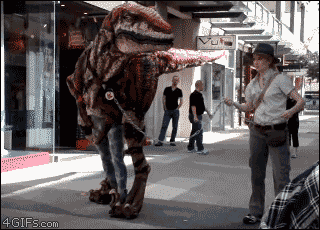
Where is that from?
Cannon Goose
Member
Is it possible for something to look super slick and polished and at the same time really amateur? Like, everything is well produced, it's high res and the animations and effects are great, but something about the underlining art just screams amateur to me from its core. It's not a bad thing, necessarily, it just gives off a weird tone. I don't know what to make of it.
I got the same feeling. I think it's the colour palette.
jediyoshi
Member
Where is that from?
http://www.youtube.com/watch?v=C4cS-eEhuVM
Seemingly randomly linked on the Valve Store FB
I should be doing hw
Member
I dunno the background art looks really solid, and if there are unique environments for every level then that is pretty great, but nothing that would make me audibly impressed like Brad was. More to the point on what's making it appear 'amaturish' to me is the characters look like the kind of dogshit furry crap you find in droves on deviantART. The quality of the detail in their design, particularly their faces, doesn't gel well at all with the backgrounds either; it's altogether inconsistent.Is it possible for something to look super slick and polished and at the same time really amateur? Like, everything is well produced, it's high res and the animations and effects are great, but something about the underlining art just screams amateur to me from its core. It's not a bad thing, necessarily, it just gives off a weird tone. I don't know what to make of it.
The game itself looks really fun and well designed though.
My thoughts as well. The game sounded/looked amazing until I saw all the character design and was entirely put off.I dunno the background art looks really solid, and if there are unique environments for every level then that is pretty great, but nothing that would make me audibly impressed like Brad was. More to the point on what's making it appear 'amaturish' to me is the characters look like the kind of dogshit furry crap you find in droves on deviantART. The quality of the detail in their design, particularly their faces, doesn't gel well at all with the backgrounds either; it's altogether inconsistent.
The game itself looks really fun and well designed though.
http://www.youtube.com/watch?v=C4cS-eEhuVM
Seemingly randomly linked on the Valve Store FB
That is awesome. I'm smiling like a 5 year old right now
http://www.youtube.com/watch?v=C4cS-eEhuVM
Seemingly randomly linked on the Valve Store FB
That is so incredible, I didn't even notice how it worked from that gif.

Ironically, I see the same kind of comments on this board.The discourse in the comments look to be exactly where I was imagining they'd be at there.
And I agree with them: the artwork does have an amateurish look to it.
It's good enough for me though and the gameplay seems tight so I'm probably gonna buy it.
http://www.youtube.com/watch?v=C4cS-eEhuVM
Seemingly randomly linked on the Valve Store FB
Wow, the movement of it is fucking amazing!
Is it possible for something to look super slick and polished and at the same time really amateur? Like, everything is well produced, it's high res and the animations and effects are great, but something about the underlining art just screams amateur to me from its core. It's not a bad thing, necessarily, it just gives off a weird tone. I don't know what to make of it.
It's the weird 'faded' shading (i.e. color gradients) on every thing, especially the colored part of characters' eyes, it looks like utter shit and I cannot for the life of me understand why anybody would do that.
Edit: Also the insanely neony unsaturated colors that for the most part seems to have been picked out at random from a hat and assigned to different parts of a character.
http://www.youtube.com/watch?v=C4cS-eEhuVM
Seemingly randomly linked on the Valve Store FB
I didn't even notice the guys legs in the gif. I figured it was CG.
SebastianAlexander
Member
http://www.youtube.com/watch?v=C4cS-eEhuVM
Seemingly randomly linked on the Valve Store FB
oh WOW its WONDERBOOK: Waling With Dinosaurs

The guys on that 3/4 server they joined were totally sexually role playing, weren't they?
Ninja Scooter
Member
http://www.youtube.com/watch?v=C4cS-eEhuVM
Seemingly randomly linked on the Valve Store FB
if they could figure out a way to cover the legs that would freak people the fuck out.
Typographenia
Member
Just now getting around to this, but it looks really intriguing. Something about the presentation and the simplicity of it really appeals to me. Think I might have to pick that up at some point. I was sort of glad Ryan was still in the dark on a lot of the story stuff, since Vinny kept asking for answers, haha.
Primal Carnage looks fantastic. Dino D-Day was extremely disappointing to me, but this looks like it really understands more of what I was wanting out of the concept in the first place. Loving the looks, animation, and chaos of the dinosaur side. Also, really glad they approached it with the mindset of "people are going to all want to play dinosaur, let's mix it up for them."
Quick Look EX: Mark of the Ninja (Brad/Jeff) (21:29)
This looks really good. Microsoft is killin it this year on XBLA.Quick Look EX: Mark of the Ninja (Brad/Jeff) (21:29)
This looks really good. Microsoft is killin it this year on XBLA.
They are? I thought this year has been pretty lackluster compared to other years.
Typographenia
Member
Shoot, Dust is so nice looking in motion. I'm simultaneously angry and relieved Brad didn't show more. Definitely going to have to get that at some point. Glad the guy (he's a Gaffer, right?) managed to execute such an impressive looking title.
Mysterious Wall Chicken might also be one of the best item names of all time.
Mysterious Wall Chicken might also be one of the best item names of all time.
Dust: An Elysian Tail [27:21] - Brad/Jeff
ick
damn furries runing my metroidvania
looks like something out of the awesome fan art thread
Ventilaator
Banned
Quick Look EX: Mark of the Ninja (Brad/Jeff) (21:29)
I would probably enjoy this if it didn't remind me so heavily of Shank that I turn and run.
Yeah, Noogy is a gaffer. He's answering a ton of stuff in the official thread.Shoot, Dust is so nice looking in motion. I'm simultaneously angry and relieved Brad didn't show more. Definitely going to have to get that at some point. Glad the guy (he's a Gaffer, right?) managed to execute such an impressive looking title.
Mysterious Wall Chicken might also be one of the best item names of all time.
I think the wall chicken is a reference to Castlevania and it's wall chickens. I haven't watched the GB QL yet.
The Wizard
Member
Yeah I was a little put off by Dusts character design and art direction but in motion the game is super impressive. Plays really well too, if you're on the fence try out the free trial.
pseudomyxoma
Member
They are? I thought this year has been pretty lackluster compared to other years.
Summer of Arcade certainly was but
Fez, Spelunky, Minecraft 360, Trials: Evolution, Dust
Those are all pretty solid titles
John Rabbit
Banned
dust looks like an HD-remake of a playstation game. the UI, art style, character design, everything screams "1996".
looks like a blast though, can't wait to play it.
looks like a blast though, can't wait to play it.
randomlyrossy
Member
They are? I thought this year has been pretty lackluster compared to other years.
If you're looking solely at Summer of Arcade maybe. This year has seen some pretty amazing games though, Fez, Spelunky, Alan Wake's American Nightmare not to mention Trials Evo.