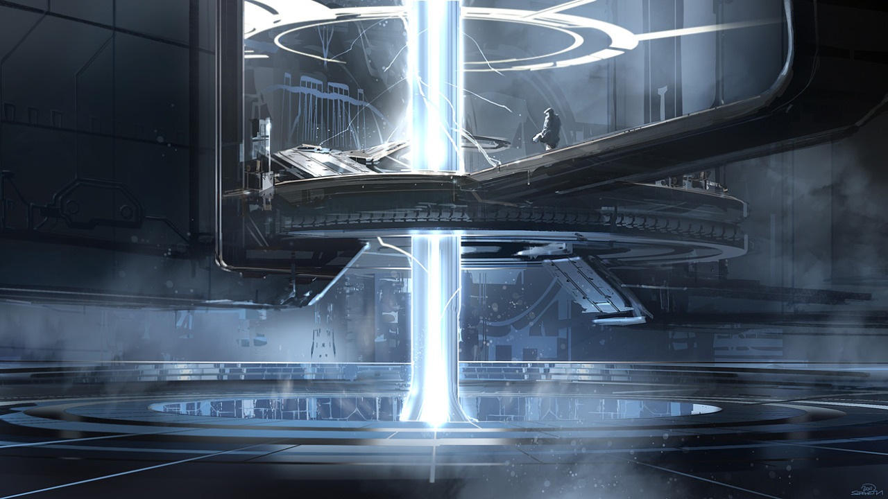
As a nitpick, I don't know why the Infinity is hiding off to the side of the screen on Halo 4's main menu. You only see it when you select one of the non-Campaign options before it zooms into the room with.. a hologram of the Infinity.
http://i.imgur.com/nt8zAl.jpg[IMG]
Selecting campaign immediately pops you into it's UI but the scene in the background only shifts downwards.
Would have made more sense to either have it entirely be the holo-room (and add another spot in the infinity hologram for Campaign) or always have the Infinity on-screen and put all the menu items on one screen. The screen transition almost feels like a vestigial holdover, and a waste of time/RAM to load up that entire ship to only use it for a quick transition animation. Versus Bungie's design for Reach which I felt was an intentional attempt to optimize their mainmenu and give it a lower memory footprint.
It also had all the feature selections on one screen.
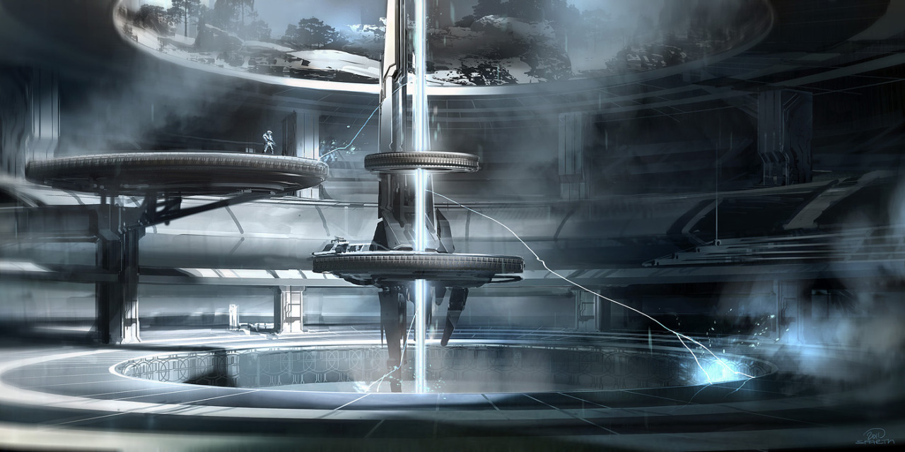
[IMG]http://i.imgur.com/kOM04l.jpg[IMG]
edit: i can't spel[/QUOTE]
It's all about immersion. 343 wants the War Games to feel like a simulation (part of the story) so in order to do anything for the War Games simulation, you have to enter the Infinity and begin your experience of Forge, MM, and whatnot. The Campaign being in the Infinity wouldn't make sense with it taking place on Requiem.
I think it's alright because I like looking at the space background in the main menu and the Infinity transition (it's only once, I never go out of War Games). The Reach UI is definitely the best in the series though and the main menu pic changing up after each mission was nice.
I don't really have a problem with the layout of the Halo 4 UI, I just hate the baseball cards and how you can't save clips from Theater (seriously, WTF?). If those were fixed, I'll be perfectly content.