You are using an out of date browser. It may not display this or other websites correctly.
You should upgrade or use an alternative browser.
You should upgrade or use an alternative browser.
2015 NHL Playoffs |OT2| Ovi guaranteed a good thread title
- Thread starter Marvie_3
- Start date

It's probably one of the worst Logos in the NHL. Sorry Ducks.
Nah. The logo itself is fine. Their original logo just happens to be a lot better.
TheKaeptain
Banned
Get your mind out of the gutter.
TheGreatMightyPoo
Banned
When I think of hockey logos that stand out, besides the Hawks, the Oilers and Devils come to mind.
There are more though, lots of good ones.
There are more though, lots of good ones.
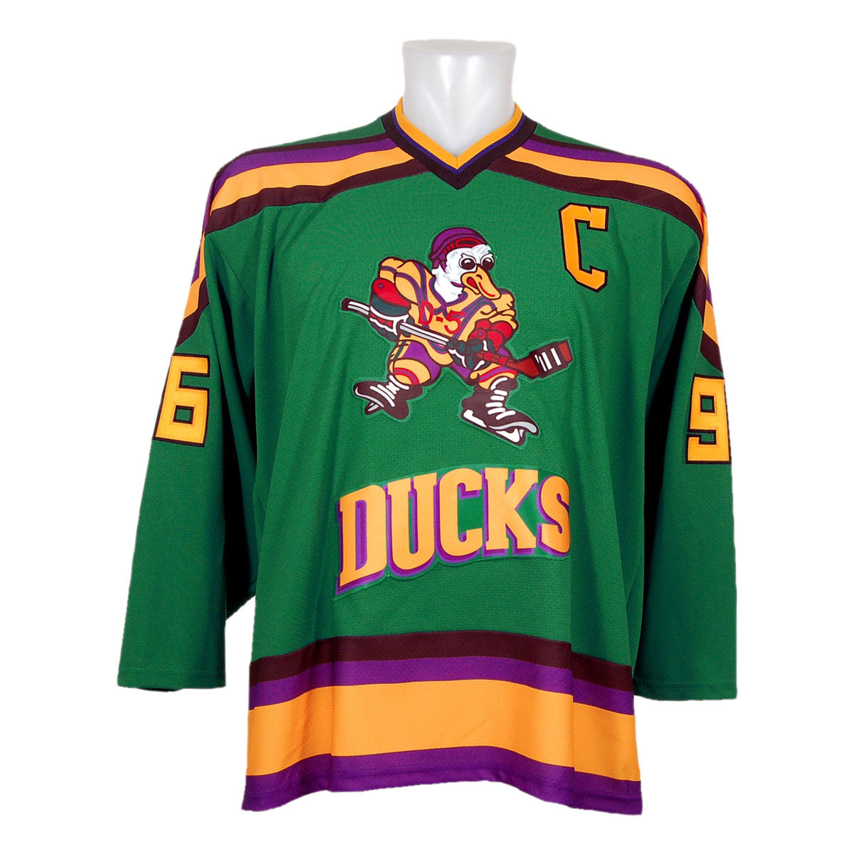
I like the Mighty Ducks logo more. Webbed D isn't bad, but the original logo just overshadows it.
I think a good middle ground is to have the original purple jersey as an alternate jersey. I'm sure Disney wouldn't be so opposed to letting their old team use the logo in that limited capacity. They already use it on their shoulder patches anyway.
I think a good middle ground is to have the original purple jersey as an alternate jersey. I'm sure Disney wouldn't be so opposed to letting their old team use the logo in that limited capacity. They already use it on their shoulder patches anyway.
I kinda like the Webbed D personally. The original logo was cool but it's understandable they decided to go in another direction after the team was sold.
Anyways I think we can all agree that the Panthers have the worst logo...
Related: it's really lame how many Canadian teams' logos are basically just Cs
Anyways I think we can all agree that the Panthers have the worst logo...
Related: it's really lame how many Canadian teams' logos are basically just Cs
TheGreatMightyPoo
Banned
The webbed logo is more "modern" and "edgy" and arguably very clever but like many of you have said, don't fix what isn't broken.
I think the concept of it is better than the actual impact it has.
I think the concept of it is better than the actual impact it has.
SmackCrackleNPop
Member
That's a jersey I'd wear.
TheGreatMightyPoo
Banned
That's a jersey I'd wear.
Obviously not good but not ridiculous enough to be so bad it's cool either.
CreeperBlocks
Banned
Nah. The logo itself is fine. Their original logo just happens to be a lot better.
It's probably because everyone grew up with the Original Logo. It's a very Iconic logo.
Alright, what's everyone's Top 5 NHL Logos? Mine are:
- Montreal
- Chicago
- Colorado
- Anaheim(Original)
- New York Islanders
Honorable Mentions:New York Rangers,Toronto,Philadelphia,St. Louis
TheKaeptain
Banned
Kings need to bring back the Chevy logo.
SmackCrackleNPop
Member
no hockey tonight. Horseshit.
Billy Joel's gotta play his hits tonight at MSG.
Bette Midler is singing hers tomorrow at the Ponda Center. Can't piss her off
TheKaeptain
Banned
I'm okay with no Hockey tonight. I need to work on some stuff that I might be pitching soon.
TheGreatMightyPoo
Banned
Oops.
TheGreatMightyPoo
Banned
It's probably because everyone grew up with the Original Logo. It's a very Iconic logo.
Alright, what's everyone's Top 5 NHL Logos? Mine are:
- Montreal
- Chicago
- Colorado
- Anaheim(Original)
- New York Islanders
Honorable Mentions:New York Rangers,Toronto,Philadelphia,St. Louis
1. Blackhawks
2. Oilers
3. Devils
4. Redwings
5. Penguins
It's probably because everyone grew up with the Original Logo. It's a very Iconic logo.
Alright, what's everyone's Top 5 NHL Logos? Mine are:
- Montreal
- Chicago
- Colorado
- Anaheim(Original)
- New York Islanders
Honorable Mentions:New York Rangers,Toronto,Philadelphia,St. Louis
1. Red Wings
2. Flyers
3. Canadiens
4. Blackhawks
5. Oilers
...
26. Blue Jackets
27. Penguins
28. Ducks
29. Lightning
30. Capitals
Coldnoodle
Member
1. Red Wings
2. Flyers
3. Canadiens
4. Blackhawks
5. Oilers
...
26. Blue Jackets
27. Penguins
28. Ducks
29. Lightning
30. Capitals
FUCK YOU FROG
SmackCrackleNPop
Member
#1 in your heart:
Billy Joel's gotta play his hits tonight at MSG.
Bette Midler is singing hers tomorrow at the Ponda Center. Can't piss her off
Damn right.
https://www.youtube.com/watch?v=u3lH9DnOzWY
TheKaeptain
Banned
#1 in your heart:
It and the Chevy logo are my favorite of all time. Habs logo is current #1. I still want that hat Subban was wearing last year.
WordYou sound bitter.
I for one welcome the Keslord hoisting it.
Ducks > Hawks > Rags/Tampa
Except:
Ducks > Tampa > Rags > Hawks
Word
Except:
Ducks > Tampa > Rags > Hawks
I'm dissapointed in you two.
Also Anaheim has never had a good logo/colours.
That's a jersey I'd wear.
my favorite too, quack quack
SmackCrackleNPop
Member
I knew Sefskills had my back.
TheKaeptain
Banned
I knew Sefskills had my back.
?
what did sef do?
I just noticed he had Heretic's avatar, and that Heretic is banned.

CreeperBlocks
Banned
lololol sef wtf
Cup Final thread is going in the OT, right.
Sure
Make it about Dan Cleary
TheKaeptain
Banned
ohhhhhhh
hahahaha
hahahaha
CreeperBlocks
Banned
I knew Sefskills had my back.
Wait what happened.
SmackCrackleNPop
Member
heretic why'd you get yourself banned
http://www.neogaf.com/forum/showpost.php?p=165453176&postcount=993
Basically that I believe
ill be stepping in for heretic in his absence
Sefskillz being inserted into our lineup while hrtc sits for a bit
LOL
You can't possibly like your team's logo
The retro looks good, I know it literally just says capitals, but it's nice to look at. The new one is just edgy for no reason.
Sure
Make it about Dan Cleary
I wasn't suggesting I do it. Just asking if it's gonna be in the OT instead of OT Community.
National Cleary League: Cleary Cup Finals - Cleary Gonna Cleary
NHL: National Hocleary League. Stanley Clear Finals. Go For Cleary.
CreeperBlocks
Banned
I wasn't suggesting I do it. Just asking if it's gonna be in the OT instead of OT Community.
Oh okay.
I think last years thread was in the OT no?
So many Kings fans banned on that first page, too.
haha damnit
Pickles! What'd he do?!
Calamari41
41 > 38
I'm dissapointed in you two.
Also Anaheim has never had a good logo/colours.
I've always loved the original logo and colors, but I remember the 90's when everybody made fun of them. This recent phenomenon of everybody looking back and loving it doesn't jive with history as I lived it.
SmackCrackleNPop
Member
People definitely hated the jade and eggplant back then. But we were also officially named The Mighty Ducks. Maybe it was the combination of the two.