A fresh and refined look for Remedy Entertainment

IbizaPocholo

NeoGAFs Kent Brockman

Creating a new logo and a refreshed visual identity for Remedy was an emotional journey, like anything to do with art. For longtime Remedy followers, you surely know how vital artistic direction is for us. Not just in our games but from the standpoint of how our studio identity looks. Not to mention our hoodies!

As a game development studio, we have come a long way since 1995 when we got our start. Remedy is constantly evolving.

The bullet in the letter R in the old logo represented the era of Max Payne, but the Remedy of now is much bigger than a single game; we have a whole portfolio of games, new and old.

It was time to update and redefine our visual identity to bring more consistency, showcase our evolution over the years, and better express our vision of today's Remedy.

The Remedy logo means a lot to us, but we know it also means a lot to you. Like the games we create at Remedy, we approached this process with great care, consideration and a lot of passion!

We want to create memorable worlds, stories, and characters for you to experience through our games. We wanted our new logo to reflect how we constantly evolve and continue creating exciting games with the very best people. However, it's all still one Remedy where courageous creativity thrives. We hope you like the new look.

The new Remedy Entertainment logo
 
Karen GIF by moodman
 
Im calling it now.

There logo screen is gonna have that R come firing out from the Left screen edge toward the center of the screen accompanied bye a Gun shot sound. Then the 2 other R fragments will pop out from behind it accompanied bye a chick, chick sound.
 
Never even noticed that it was supposed to be a bullet in the old logo until I read this and finally saw it, lol.

Anyway, it was a neat logo. This new one is basic as fuck.
 
Last edited:
Usually these logo updates are pretty awful (lmao Ubisoft), and I was expecting the same for this, but I like this one. I think it's an upgrade. Makes me think of shimmering glass.
 
When your printer is having issues but it's easier to just change the company logo than trying to fix it.
 
Is there some some dual meaning to that logo or is it just vertical screen tearing? I feel like I'm being dumb and not noticing something obvious.
 
Last edited:
I actually like it. Something about it kind of reminds me of their games. Very fitting visually imo.
 
Last edited:
Oh wow, looks like a corrupted JPEG

Toughies Delete GIF


It was surely "an emotional journey" to the ugliness guys, seriously, just open your eyes Remedy.

Sexy Hot Girl GIF by Cappa Video Productions
 
Last edited:
Is there some some dual meaning to that logo or is it just vertical screen tearing? I feel like I'm being dumb and not noticing something obvious.

I actually like it.
To me it evokes a sort of alteration of reality, a weird shift that's awkward to look at and makes you double check to figure out why it looks awkward
Which I think fits their current style of games focusing on the supernatural, parallel realities, time travel, etc.

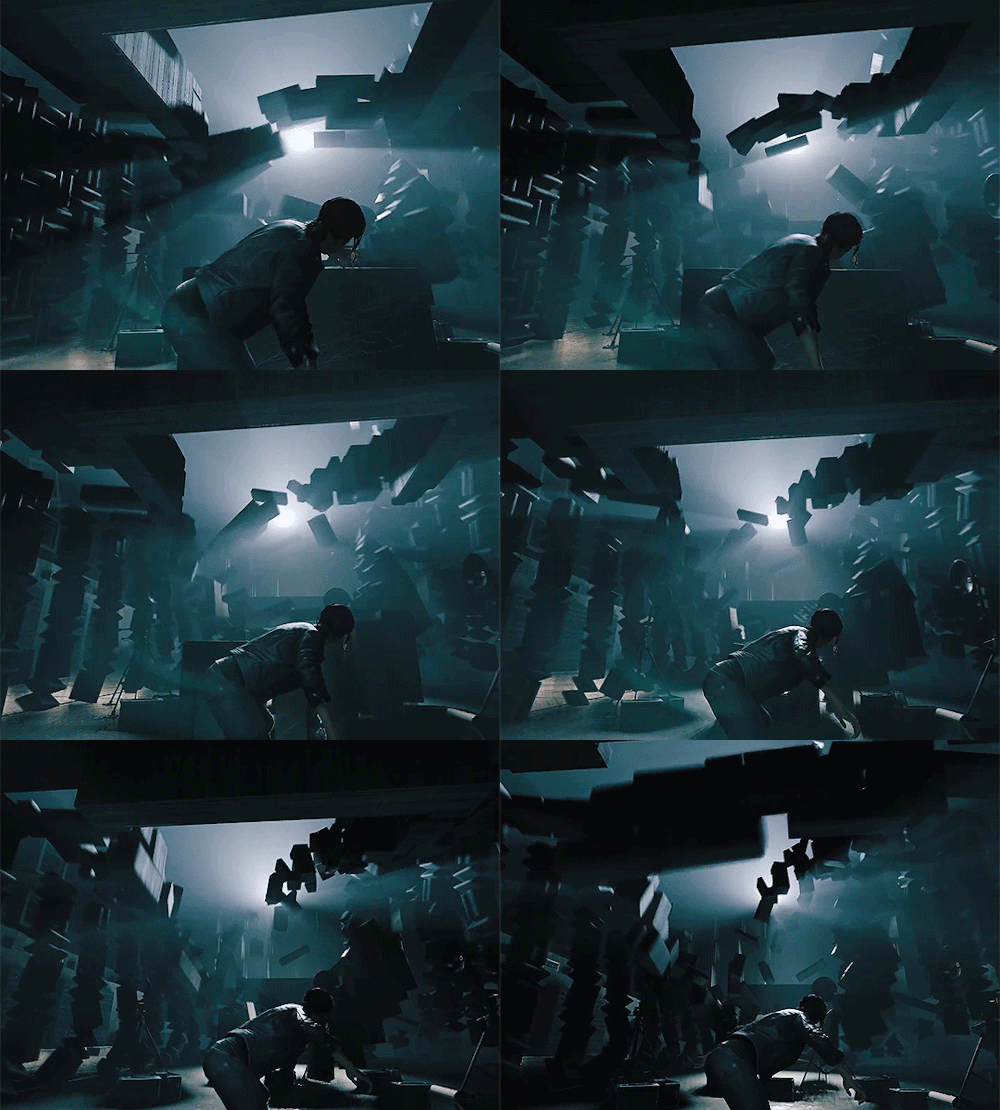
I actually can picture the games of a company with that logo looking like this:
tumblr_pa7xr2eIHw1qgojgxo5_500.gif

lSV5GTh.gif


Man i love some quantum break. My favourite developer of all time. Love their games
 
Terrible, I hope they didn't stress themselves too much because it wasn't worth it for that. Honestly don't care though since it's the game I want to play and when the corporate logos show up I am to fixated on hitting X, A, or the space bar to try and get past that crap to get to the game.
 
Top Bottom