You are using an out of date browser. It may not display this or other websites correctly.
You should upgrade or use an alternative browser.
You should upgrade or use an alternative browser.
Avowed New Trailer Revealed. Coming Early 2024 | Xbox Showcase 2023
Negotiator101
Member
PS3 come on? Just making things up nowThis was the biggest disappointment for me at the show but at least they showed actual gameplay. Huge drop in art styles and looks like a PS3 game at times. Just look at that skeleton scene.
Umbasaborne
Banned
Looks good, looks like a game and not a cg trailer, but i still think it's a sharp looking game
Torrent of Pork
Banned
Some of you people seem to be stuck in the PS360 days, and want nothing more that dull green, brown, and sepia filter.
marjo
Member
Obsidian is one my favourite studios, and I'm excited for a new Obsidian RPG regardless of how it looked, but I agree that the visuals weren't particularly impressive. After watching the trailer again, I think the biggest let down is with the lighting. It seemed to be flat with a lack of proper ambient occlusion.
Go look at the trailer when the skeletons start marching.PS3 come on? Just making things up now
adamsapple
Or is it just one of Phil's balls in my throat?
PS3 come on? Just making things up now
To be fair, he also doesn't know the difference between a real and fake controller, so I would give it a pass.
Last edited:
Gorgon
Member
The graphics are a step back, but the game obviously has a lot of work left. It still looks like a fun game. I like the first person magic casting aspect of it. Hopefully the RPG mechanics are well done.
Frankly, it looks like a different game than the dark, creepy environment that was shown in the reveal. I was kind of digging that vibe and now it's like someone spilled paint everywhere. That doesn't mean it looks bad, but much different than I was expecting.
The graphics quality are ok-ish, I don't live or die by that in a game like this. But art direction, tone, atmosphere, etc is totally off from the first trailer, which was what got me interested in the first place, so pretty much in agreement with you. Everything else the devs said (focus on story, NPC interactions, smaller environments, etc) is good, no issues there on my side. Also, I found the animations perfectly fine.

I'm sorry but the artstyle looks like ass. This is Microsoft first-party and it doesn't even look as good as the first Horizon game...
This. I mean, if that's what people want then fine, I don't want to spoil the party for anyone, but the above is miles away from the vibe of the first trailer. And I'm not talking about graphic quality.
The reason why Avowed doesn't look like the first reveal is that key people left the studio and the game was rebooted multiple times. It lost its identity after the initial reveal.

Avowed Has “Been Rebooted Several Times” – Schreier
Though unsure of its appearance at today's showcase, Bloomberg's Jason Schreier said the project went through agamingbolt.com
Well, there you have it. Too bad (for me) that it took a turn into this. Happy for those that were plesantly surprised. I'll still play it on Game Pass and I'm sure the game will be OK.
Looks really generic.
It does, unfortunately. And what doesn't look generic doesn't look that inspired either.
But let's wait and see what comes out of it in the end. I just don't expect the end product to change things significantly in terms of tone.
Unrivaledx88
Member
This look Meh out of 10.
Microsoft needs to manage these studies better .
Microsoft needs to manage these studies better .
Sethbacca
Member
I think the problem is we were shown a high fantasy dungeon crawler with an art style to match, and what we're getting is Outer Worlds Skyrim. I think this would have been a lot better received without the previous teaser having ever been released. I re-watched the trailer this morning and I'll have fun with it on release I'm sure, I'm still disappointed in what it is vs what I thought it was going to be though.Some of you people seem to be stuck in the PS360 days, and want nothing more that dull green, brown, and sepia filter.
Roberts
Member
While it clearly doesn't look realistic, it doesn't try to be. There are a few spotty shots in the trailer but I really dig the overall look of this. Sure, it looks like Outer Worlds cousin, but there is something about the art design that I have never seen in a game before and I really dig it.
Fools idol
Banned
DeepEnigma
Gold Member
Bro, those animations are 2-3 gens behind. Look at the stiff ass walking/gliding on the terrain.PS3 come on? Just making things up now
Hopefully that gets another animation pass before launch, and the benefit of the doubt is that it's still early and not done. Art direction is another issue. Something I noticed has been suffering the past few years with a lot of eastern (with western influence i.e. Forespoken) and western studios.
Last edited:
SEGAvangelist
Member
This was a disappointment for me. Feels like an art direction lead peaced out right after the first reveal. Being right next to games with beautiful and distinct art styles like Clockwork Revolution, South of Midnight, Fable, Starfield and the Capcom and Atlus stuff didn't help.
Salty Popsicle
Banned
I don't understand why people are saying there is a wide difference in art direction between the gameplay we saw yesterday and the CG reveal trailer from a few years ago. I never got the sense from the initial teaser that this game was aiming for hyper-realistic graphics. Hell, even the skeleton warriors in that CG trailer look like your run-of-the mill fantasy enemy type which already informed me of what to expect.
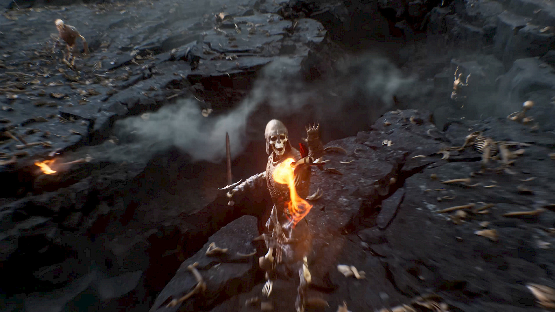
In fact, if you look at the gameplay representation in the CG trailer, it does not look much different at all from the actual gameplay shown yesterday when using the magic in one hand and sword in the other.
CG Trailer:
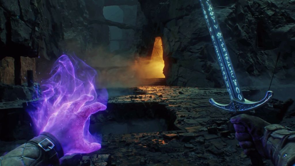
Gameplay:


In fact, if you look at the gameplay representation in the CG trailer, it does not look much different at all from the actual gameplay shown yesterday when using the magic in one hand and sword in the other.
CG Trailer:

Gameplay:

Feel like I got catfished, I honestly thought I was looking at something else. The entire tone is different from the original trailer, maybe this is why we shouldn't be announcing games years in advance.
That trailer is so god damn good. And singlehandedly put it at the top of my list of games I was looking forward to. I feel catfished as well.
Kurotri
Member
Normally I don't want to add to piles like this thread but I want to say I'm confused as well. It seems like the whole game got rebooted. I thought I was looking at ESO for a second. To me the whole show was a fantastic "A," but this one managed to be the only question mark throughout. I hope the actual meat of the game is still high quality.
93xfan
Banned
Interested in seeing the gameplay for it Tuesday before writing anything off.Normally I don't want to add to piles like this thread but I want to say I'm confused as well. It seems like the whole game got rebooted. I thought I was looking at ESO for a second. To me the whole show was a fantastic "A," but this one managed to be the only question mark throughout. I hope the actual meat of the game is still high quality.
Sethbacca
Member
The graphics are one thing, the tone is a whole other. I think most are disappointed by the change in tone.I don't understand why people are saying there is a wide difference in art direction between the gameplay we saw yesterday and the CG reveal trailer from a few years ago. I never got the sense from the initial teaser that this game was aiming for hyper-realistic graphics. Hell, even the skeleton warriors in that CG trailer look like your run-of-the mill fantasy enemy type which already informed me of what to expect.
In fact, if you look at the gameplay representation in the CG trailer, it does not look much different at all from the actual gameplay shown yesterday when using the magic in one hand and sword in the other.
Gudji
Member
The CGI one has a darker tone while the current game is more colorful and "cartoon like". It's very simple to understand actually.I don't understand why people are saying there is a wide difference in art direction between the gameplay we saw yesterday and the CG reveal trailer from a few years ago. I never got the sense from the initial teaser that this game was aiming for hyper-realistic graphics. Hell, even the skeleton warriors in that CG trailer look like your run-of-the mill fantasy enemy type which already informed me of what to expect.

In fact, if you look at the gameplay representation in the CG trailer, it does not look much different at all from the actual gameplay shown yesterday when using the magic in one hand and sword in the other.
CG Trailer:

Gameplay:

Salty Popsicle
Banned
How can you decipher any type of tone from that first CG trailer? It literally only involved some unknown character with a cool gruff voice stating exposition that only someone who played a previous Pillar of Eternity title would possibly understand while an arrow shot across a battlefield.The graphics are one thing, the tone is a whole other. I think most are disappointed by the change in tone.
Riky
$MSFT
I don't understand why people are saying there is a wide difference in art direction between the gameplay we saw yesterday and the CG reveal trailer from a few years ago. I never got the sense from the initial teaser that this game was aiming for hyper-realistic graphics. Hell, even the skeleton warriors in that CG trailer look like your run-of-the mill fantasy enemy type which already informed me of what to expect.

In fact, if you look at the gameplay representation in the CG trailer, it does not look much different at all from the actual gameplay shown yesterday when using the magic in one hand and sword in the other.
CG Trailer:

Gameplay:

Exactly, until we see a similar indoor cave section it's hard to tell how much it has changed.
Last edited:
Kurotri
Member
Wait, theres more coming?Interested in seeing the gameplay for it Tuesday before writing anything off.
Sethbacca
Member
Just look at the two screenshots above for a taste. In one it's darkly lit with the character lit by their own spell on their arm and the runes on their sword, the second looks like a full bright Fortnight weapon by comparison. Then the environmental lighting between the two, again completely different. It just looks brighter and less high fantasy vs the previous reveal. That's all I can really say.How can you decipher any type of tone from that first CG trailer? It literally only involved some unknown character with a cool gruff voice stating exposition that only someone who played a previous Pillar of Eternity title would possibly understand while an arrow shot across a battlefield.
Salty Popsicle
Banned
The CG trailer is barely more than a minute long and takes place in a castle, open field, and a dungeon area. Just because the final game has playable spaces that go beyond that and has color doesn't mean its suddenly a cartoon tone.The CGI one has a darker tone while the current game is more colorful and "cartoon like". It's very simple to understand actually.
Salty Popsicle
Banned
The first instance takes place inside a literal dungeon deep underground. Of course there is no light there. The gameplay screenshot seems to be right outside a cave entrance, which means the sun is lighting the world. Are you telling me that because the game has outdoor areas with light and color that the entire tone of the game has changed? LMAOJust look at the two screenshots above for a taste. In one it's darkly lit with the character lit by their own spell on their arm and the runes on their sword, the second looks like a full bright Fortnight weapon by comparison. Then the environmental lighting between the two, again completely different. It just looks brighter and less high fantasy vs the previous reveal. That's all I can really say.
Funnily enough that's kind of accurate to the game's setting.Just look at the two screenshots above for a taste. In one it's darkly lit with the character lit by their own spell on their arm and the runes on their sword, the second looks like a full bright Fortnight weapon by comparison. Then the environmental lighting between the two, again completely different. It just looks brighter and less high fantasy vs the previous reveal. That's all I can really say.
From Pillars lore about the living lands:
. Walk down a hillside into a valley and you will find lush, verdant hills. Climb the next rise and you might see nothing but rock and boiling mineral springs.
Robb
Gold Member
I can only speak for myself, but the first teaser gave me LotR vibes. Felt darker in tone and more serious to me, even if short. The final sequence could be straight out of Moria.How can you decipher any type of tone from that first CG trailer? It literally only involved some unknown character with a cool gruff voice stating exposition that only someone who played a previous Pillar of Eternity title would possibly understand while an arrow shot across a battlefield.
Not really sure what to make of the latest footage, but it definitely doesn't feel like LotR.
Last edited:
Sethbacca
Member
Yeah I haven't played those soFunnily enough that's kind of accurate to the game's setting.
From Pillars lore about the living lands:
Don't mind my post, just a bit of trivia.Yeah I haven't played those so. There's absolutely a tone shift in the art style. I'm not the only one who's saying it.
It's not surprising there's some change. The art director changed through development.
Last edited:
cripterion
Member
That trailer was pretty bad imo and turned me off the game. Overall, it just looks goofy.
I'd rather have PoE 3 isometric turned based running on UE5 than this but it is what it is...
I'd rather have PoE 3 isometric turned based running on UE5 than this but it is what it is...
Sethbacca
Member
Yeah no worries. I expect fans of the series will be the most critical/receptive of it. I actually rather enjoyed Outer Worlds for what it was so this will probably be alright regardless.Don't mind my post, just a bit of trivia.
It's not surprising there's some change. The art director changed through development.
Trogdor1123
Gold Member
Same. It felt like a different game. Pretty disappointedThis was the biggest disappointment for me at the show but at least they showed actual gameplay. Huge drop in art styles and looks like a PS3 game at times. Just look at that skeleton scene.
SportsFan581
Member
The trailer was interesting. The pistols are certainly a surprise for the setting.
Riky
$MSFT
POE had guns, they're just very basic ones. So it makes sense they are in this game when it's set in that universe.The trailer was interesting. The pistols are certainly a surprise for the setting.
SportsFan581
Member
POE had guns, they're just very basic ones. So it makes sense they are in this game when it's set in that universe.
Ok, not really familiar with that at all.
Jack Videogames
Member
After Outer Worlds preachy story, barebones gameplay, and 20h-when-soaking-wet duration, I'm cautiously pessmistic
Sanepar
Member
Initial reveal has a dark tone, gameplay is set on Super Mario World.I don't understand why people are saying there is a wide difference in art direction between the gameplay we saw yesterday and the CG reveal trailer from a few years ago. I never got the sense from the initial teaser that this game was aiming for hyper-realistic graphics. Hell, even the skeleton warriors in that CG trailer look like your run-of-the mill fantasy enemy type which already informed me of what to expect.

In fact, if you look at the gameplay representation in the CG trailer, it does not look much different at all from the actual gameplay shown yesterday when using the magic in one hand and sword in the other.
CG Trailer:

Gameplay:

Varteras
Member
The reason why Avowed doesn't look like the first reveal is that key people left the studio and the game was rebooted multiple times. It lost its identity after the initial reveal.

Avowed Has “Been Rebooted Several Times” – Schreier
Though unsure of its appearance at today's showcase, Bloomberg's Jason Schreier said the project went through agamingbolt.com
Being rebooted multiple times, with key people leaving after that CG trailer was made and shown 3 years ago? Yeah. That doesn't bode well for a game supposedly releasing next year. Not necessarily a sure disappointment, but games that go through that don't usually turn out well. Probably explains why I was disappointed with what I saw.
hyperbertha
Member
Graphically, it's somewhat next gen, having watched the 4k version. The polygonal detail is damn good, impossible on PS4. But the art direction is what's putting people off.
It's going to be a cartoony game. The characters are going to mostly be caricaturish rather than realistic, and the animations will be more Disney rather than avatar.
It's going to be a cartoony game. The characters are going to mostly be caricaturish rather than realistic, and the animations will be more Disney rather than avatar.
Gorgon
Member
Don't mind my post, just a bit of trivia.
It's not surprising there's some change. The art director changed through development.
Looks like the new art director loves plasticine.
Puscifer
Member
Point still stands, the tonal shift in art style and even dialog skew more towards that zoomer humor. I don't mind colorful art styles, not in the slightest, but they set a particular expectation and it looks and sounds like medieval Outer Worlds, that being said it's obsidian so I'm going to play it regardless because they haven't let me down yetThat's one of those CG trailers from years ago they got a lot of shit for. That trailer doesn't have any in-game, in-engine etc tags anywhere on it.
The entire art style of the game has changed and they just said in an interview today that they changed the style of the game to be less like Skyrim and more their own take over the development, so that trailer is a relic of its time and not a representative of what Obsidian want the game to be right now in any form.
Last edited:
Nothing1234
Banned
The art style did a 180 from the CG trailer tbh.
93xfan
Banned
I think they're going to do more gameplay at the extended Xbox event tomorrowWait, theres more coming?
Gorgon
Member
I think they're going to do more gameplay at the extended Xbox event tomorrow
Not sure if they're actually going to show more gameplay, though.
