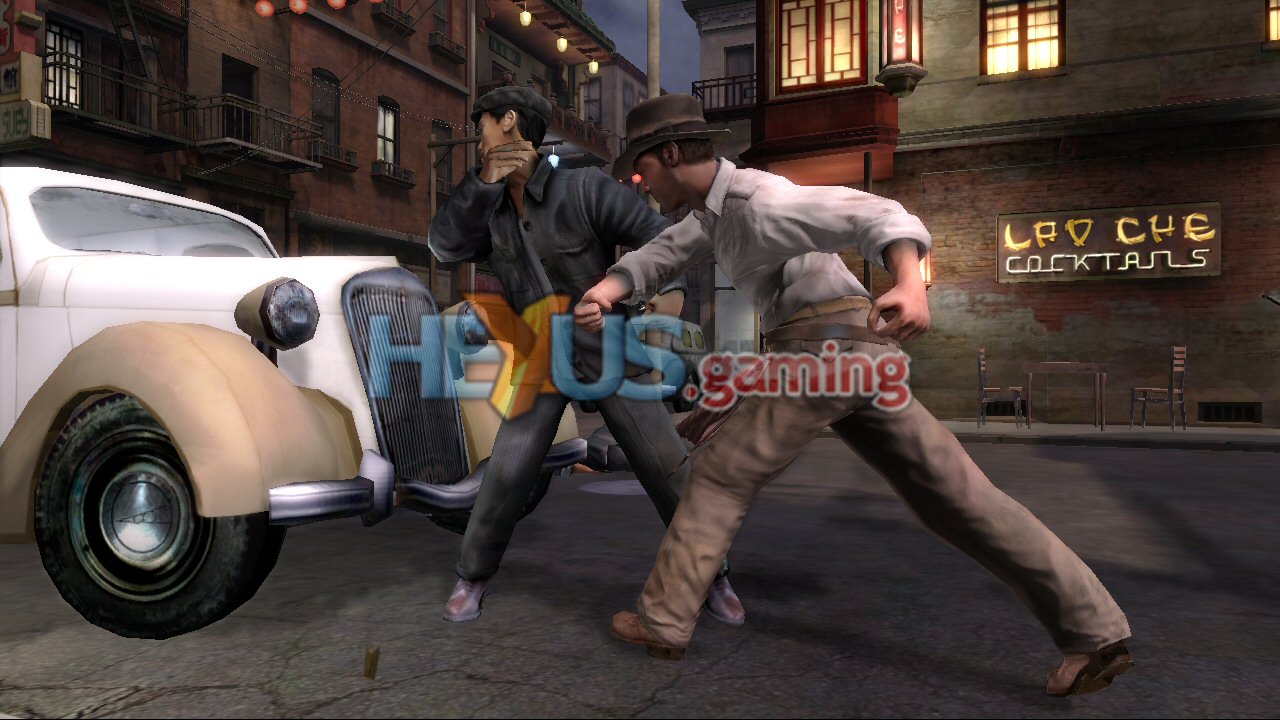
Biggest downgrades from initial reveal?

This is a serious question. But why are developers/publishers allowed to get away with this?

It is downright false advertising, and is text book bait and switching. It is illegal pretty much everywhere.

If a hotel publishes pictures advertising they are situated next to a beach or have a swimming pool, but actually don't, then they will be absolutely destroyed by lawyers.

In the UK we have the Advertising Standards Agency, which state ""before distributing or submitting a marketing communication for publication, marketers must hold documentary evidence to prove all claims, whether direct or implied, that are capable of objective substantiation" and that "no marketing communication should mislead, or be likely to mislead, by inaccuracy, ambiguity, exaggeration, omission or otherwise".

Why games are exempt from this, I have no fucking clue.
 
I think you are really wrong here. Pre record are choice because the hardware can't handle in real time the graphic. I find useless pared back something prerecord which can't handle to the hardware in real time in any case. What consistancy you missing in the gameplay graphic with better shadows or lightening in the cutscenes? Cutscenes are always better, even in real time.

And if you do them in real time you have to load hundreds of megabytes of data, verses streaming a couple megabytes per second, pre-recorded cutscenes wether does as gameplay or not are a great opportunity to load data.
 
I could only find in low quality, but I remember very vividly back them: The final game had a tremendous increase in poly counts, texture quality, shaders, lighting, animation. And extra effects like some minor fluid simulation, motion blur and depth of field that were completely absent before.

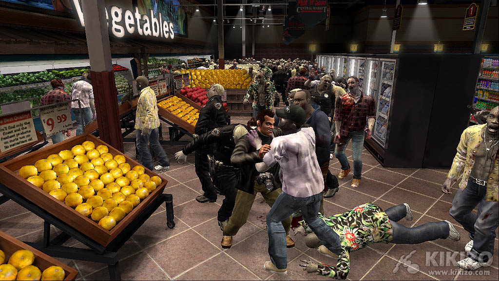
The only time where there seems to be many zombies is in the parking lot, that area in the final game also is quite packed with zombies (though it doesn't seem to match the reveal count)

https://www.youtube.com/watch?v=F78EygSnxVQ

Edit: In higher res shots from the reveal you can see how even the texture is actually pretty bad:

09.jpg


capcom-announces-dead-rising-xbox-360-screenshots-20050517024510341.jpg

Thanks for posting that video. I've actually never seen that one before.

The video I'm speaking of is very different. It was 10 years ago so I don't remember too much about it aside from the panning shot of the truck from the picture I've shown.
1116956387.jpg


I just remembered thinking there were going to be a lot more zombies on screen (like in the video I saw), but they were significantly reduced.
 
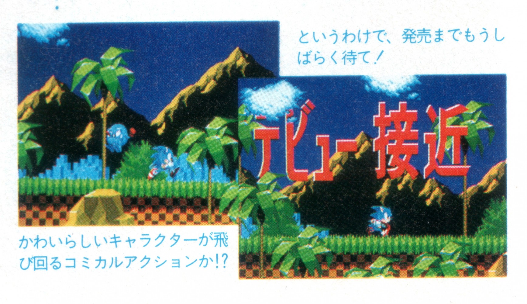
Ah, but here's the thing, the Japanese version actually makes full use of those extra layers of parallax.

I actually bought a JP copy for that reason as the NA and Euro versions of Sonic have very simple backgrounds in comparison. The JP version was released later and features massively improved parallax scrolling on every level.

The rest of the games in the series use more complex backgrounds thankfully. Only the original releases of Sonic 1 were limited in this regard.

I just remembered thinking there were going to be a lot more zombies on screen (like in the video I saw), but they were significantly reduced.
I would say they would have been removed for gameplay purposes. That many zombies would not be fun to deal with using the mechanics of Dead Rising.
 
They did mention it was real time but it wasn't gameplay. The Videos QD does are real time as well. The games never look as good because there are more to process in an actual game.

Doesn't QD usually surpass what they show in their tech demos? I mean, Heavy Rain certainly looked a lot better than "The Casting" (or whatever it was called).
 
I know most of the examples in this thread is newish stuff, but I remember being pretty disappointed by Killer Instinct and Crusin' USA at the arcade vs. N64. It was supposed to be a pretty close port. Plus those target pre-renders....
 
The first one looks like an upgrade and the other two look neutral.

Not if you start taking a look at the shadow casting on the characters (self shadowing?).
Some people are saying that the Uncharted 3 downgrade is debunked but they have not shown or explained how.

There's some in this thread where you go, yeah they definitely lied to us. Whereas some you can see and go, okay, they tuned it down because they couldn't get it running as well. I have no issue with the latter.

Let me be blunt, no one cares if you do not take issue with it. This thread is about downgrades regardless of circumstance.
 
Serious question - is "downgradeaton" really a term being used or was it supposed to be a typo?

Well it's a word here now :P

Much like the "-gate" suffix, we'll put "-ton" (from "megaton bomb" announcements) on anything and see if it sticks, like betrayalton, and now downgradeaton.
 
Not if you start taking a look at the shadow casting on the characters (self shadowing?).
Some people are saying that the Uncharted 3 downgrade is debunked but they have not shown or explained how.

The thing is that that's a prerendered cutscene, it already looks better than the in-game sections. What's the point in downgrading them?

Most of the differences, to me, are given by different models, camera angles and time stamps.
 
This is a serious question. But why are developers/publishers allowed to get away with this?

It is downright false advertising, and is text book bait and switching. It is illegal pretty much everywhere.

If a hotel publishes pictures advertising they are situated next to a beach or have a swimming pool, but actually don't, then they will be absolutely destroyed by lawyers.

In the UK we have the Advertising Standards Agency, which state ""before distributing or submitting a marketing communication for publication, marketers must hold documentary evidence to prove all claims, whether direct or implied, that are capable of objective substantiation" and that "no marketing communication should mislead, or be likely to mislead, by inaccuracy, ambiguity, exaggeration, omission or otherwise".

Why games are exempt from this, I have no fucking clue.
They pretty much always put a disclaimer that the stuff they show is subject to change.
 
The thing is that that's a prerendered cutscene, it already looks better than the in-game sections. What's the point in downgrading them?

Most of the differences, to me, are given by different models, camera angles and time stamps.

The game has been out for years, we have the exact same shots freely available to compare and you can see that the lighting during cutscenes seemingly took a hit.

It is just proof that Naughty Dog was not kidding when they said that they made those cutscenes to run realtime on ps3 and then recorded them for streaming considerations.
 
Ah, but here's the thing, the Japanese version actually makes full use of those extra layers of parallax.

I actually bought a JP copy for that reason as the NA and Euro versions of Sonic have very simple backgrounds in comparison. The JP version was released later and features massively improved parallax scrolling on every level.

The rest of the games in the series use more complex backgrounds thankfully. Only the original releases of Sonic 1 were limited in this regard.

I heard there is a PAL revision similar to the JAP release [edit: according to the second link, the revision was later launched on all regions]? I found this video where they showcase the three different versions there are:

http://www.youtube.com/watch?v=_1dhUxzvNI0

And more info on the revisions:

http://info.sonicretro.org/Sonic_the_Hedgehog_(16-bit)#Game_Revisions
 
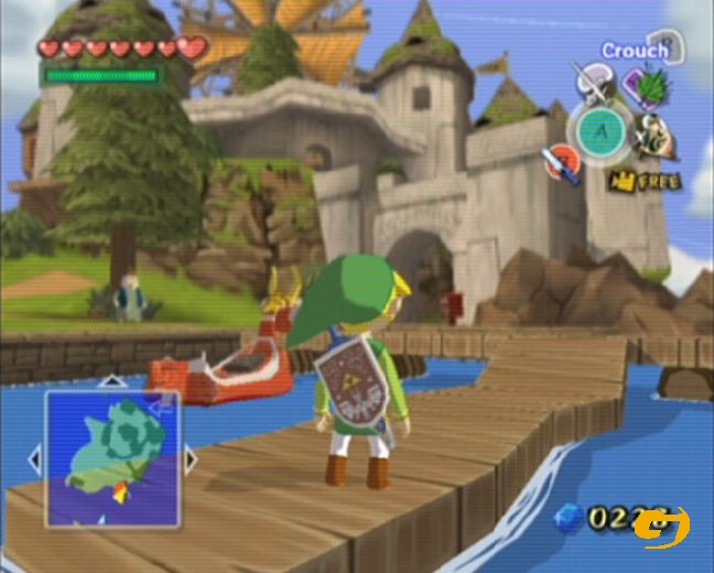
AH YES, this one.. I remember the disappointment. This was the reason I never gave a crap about Zelda EVER again.. And the beginning of my disinterest of my gamecube when I bought it..

So you lost interest because they decided to make one of the most beautiful games of all time?

Juniors man. Can never tell if they're plain trolling or just prone to ridiculous hyperbole.
 
So you lost interest because they decided to make one of the most beautiful games of all time?

Juniors man. Can never tell if they're plain trolling or just prone to ridiculous hyperbole.
Beautiful? Yes (judging just from the style, not from i.e. the often painfully empty areas/"islands" in this game). Good? Well:

It all comes down to personal preference.
 
ßthePenguin;103936962 said:
Beautiful? Yes (judging just from the style, not from i.e. the often painfully empty areas/"islands" in this game). Good? Well:

It all comes down to personal preference.

The thing is, he was saying that he lost interest purely on the visuals. And that's just insane.

Although the islands were far too barren. At least the fundamental mechanics weren't as broken as Skyward Sword though. My biggest disappointment since DMC2. Having a controller that can't tell the difference between a slash and you just repositioning was maddening. Especially when they threw in enemies that would punish a single mis-directed strike and changed block stance frequently.

But that's beside the point. Although, speaking of visual downgrades, the 'jump' from DMC1 to DMC2 was pretty shocking. Not many sequels come out looking worse.
 
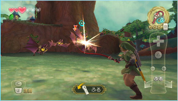
Zelda Skyward word

E3
RVL_ZeldaSS_05ss05_E3.png


Final game when released was much less colorful and more grey ish =/
zelda2.jpg
I'll never understand why Nintedo renders their screenshots in 4000k resolution with perfect anti-aliasing. They're not fooling anyone. No Wii games look like that.

Seriously, showing it off at native res (and with Wii IQ) would've been better.
 
Top Bottom