You are using an out of date browser. It may not display this or other websites correctly.
You should upgrade or use an alternative browser.
You should upgrade or use an alternative browser.
Consoles screenshots thread (PS4/Xbone/WiiU) [Up: Thread rules in OP]
- Thread starter Peterthumpa
- Start date
Phreakuency
Banned
Dualshockers did a comparison, they look identical to each other graphically.
I disagree. The AA on PS4 isn't very impressive. Or should I say, aliasing is very visible.
Other than that, they are very similar yes.
Some more NBA Live on PS4. The last pic shows the differences in texture resolutions between Live and 2K. All of Live's visual flaws aside, it has much more impressive textures than 2K (at least up close). I also say from most angles, Live's Lebron looks more like real life Lebron than 2K's (2K's detail is second to none but the likeness falls short).


xenogenesis
Member
I disagree. The AA on PS4 isn't very impressive. Or should I say, aliasing is very visible.
Other than that, they are very similar yes.
I haven't played the PC version but yeah AA is probably the only difference between the two versions that I can see (other than the ability to have a higher resolution but that's a given with PC).
MidgarBlowedUp
Member
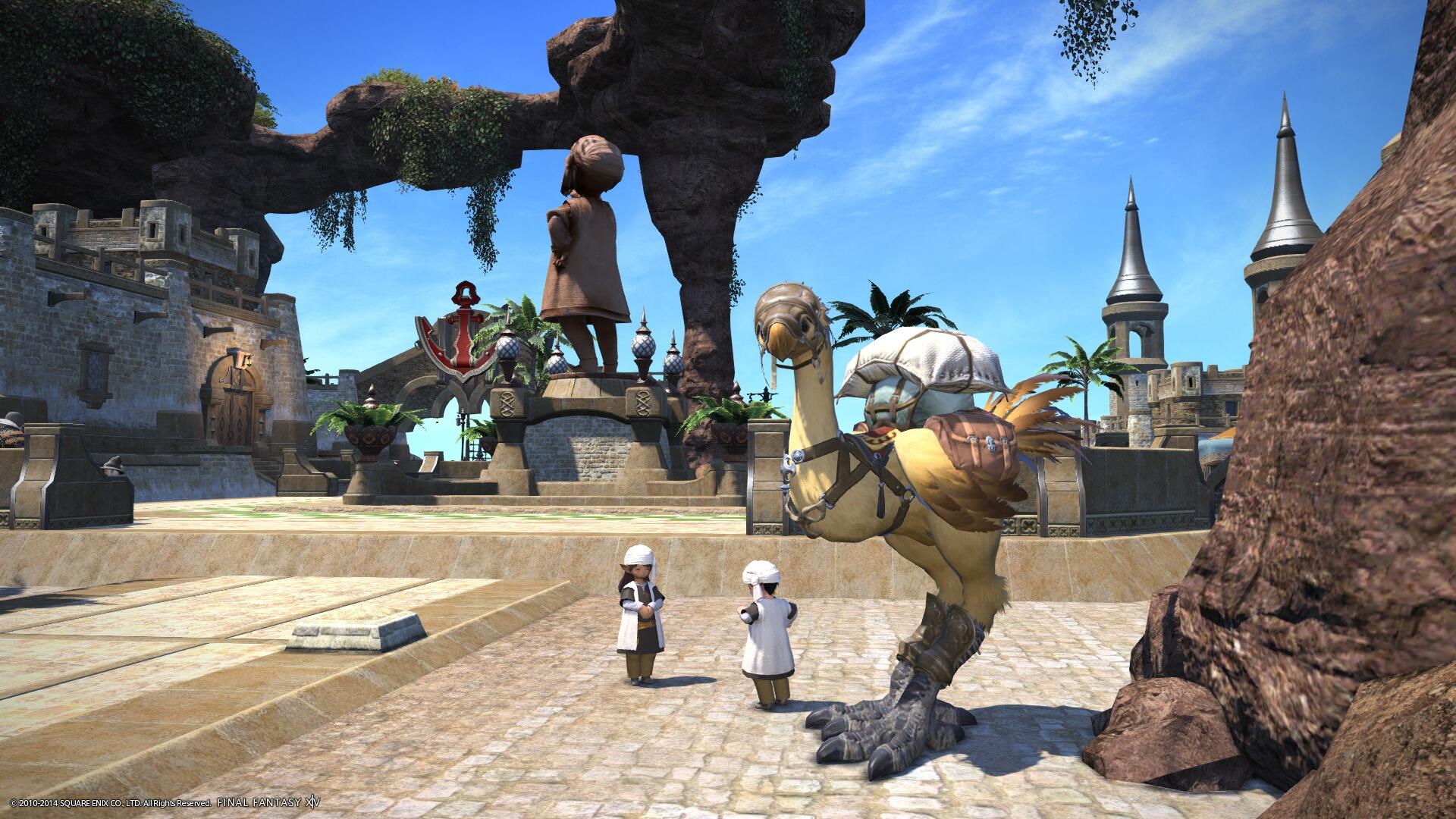
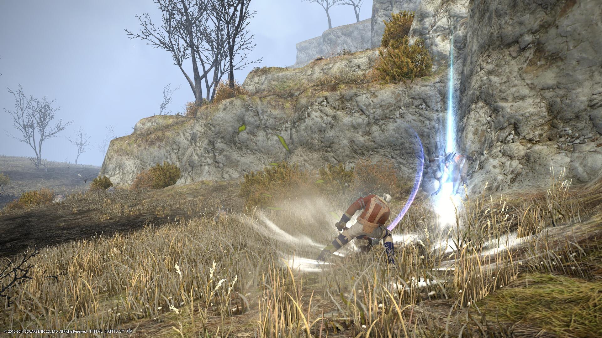
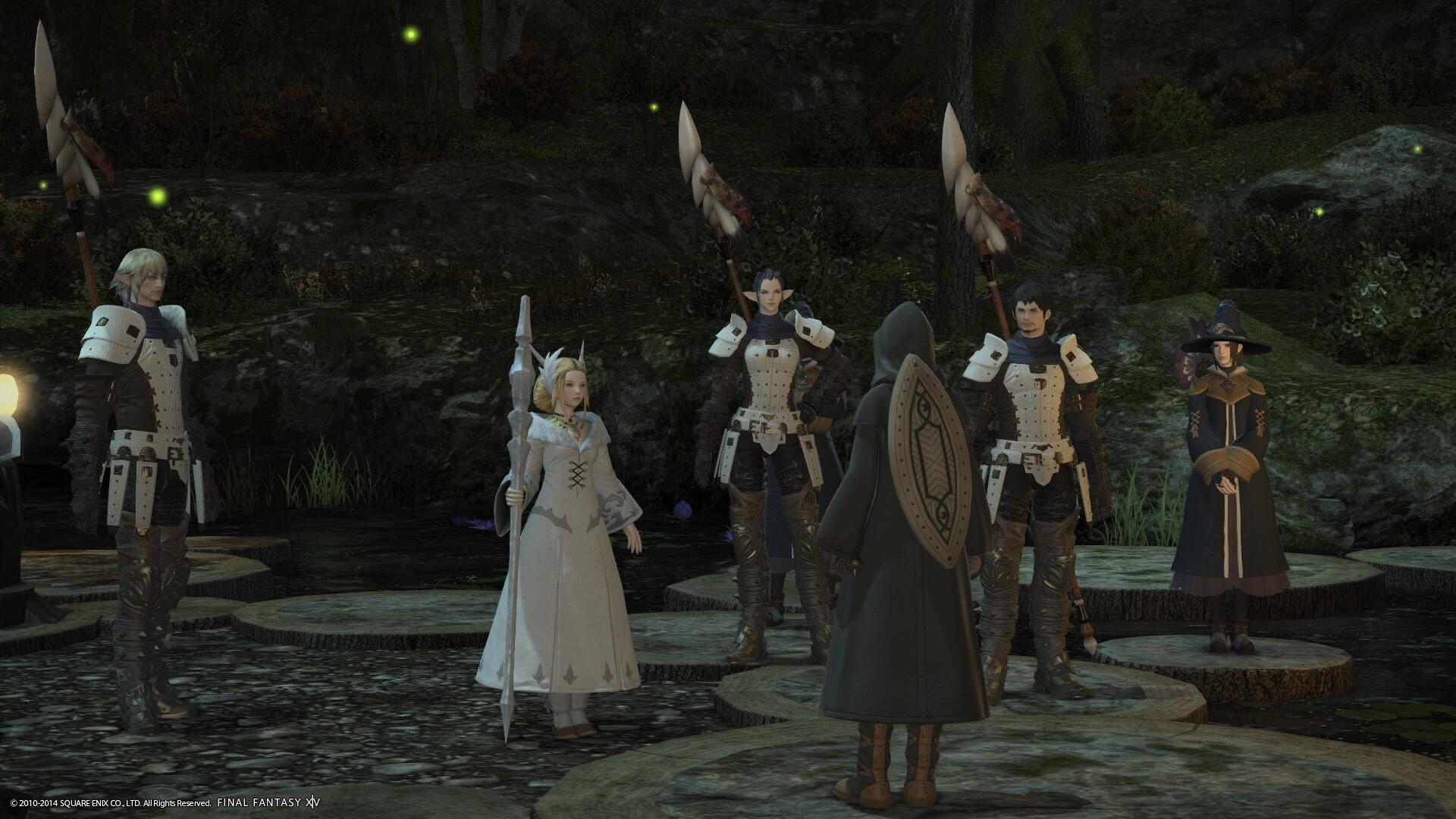
FFXIV looks neat on PS4. How does it compare to the PC version?
PS3/PC and PS4 beta owner here and I've played them all on the same display.
IMO from what I've played:
*PC has better texture filtering (32xAF).
*PS4 hardly ever, if at all, hits 60fps.
*PS4 does a good job staying above or near 30fps though.
*PC @ 1600x900 maxed out looks better than PS4 @ 1080p. (I'm not sure why, could be internal scaling on the GPU of the PS4 and/or coupled with lack of high Anisotropic Filtering.)
-Other than that it looks really nice on PS4. They really should offer PS4 owners some graphic options in the final build.
LOL! Can't blame you two for having roughly the same idea though, that level is simply gorgeous.
Ok, this game has finally wowed me.=O
Uncle Rupee
Banned

The fur in this game is great to look at, especially in motion. Very glossy and soft.
Aha, so they are using the same "shell" technique as Starfox Adventures, Shadow of the Colossus, Conker's 360, and others... just more layers... interesting...
I disagree. The AA on PS4 isn't very impressive. Or should I say, aliasing is very visible.
Other than that, they are very similar yes.
Some more NBA Live on PS4. The last pic shows the differences in texture resolutions between Live and 2K. All of Live's visual flaws aside, it has much more impressive textures than 2K (at least up close). I also say from most angles, Live's Lebron looks more like real life Lebron than 2K's (2K's detail is second to none but the likeness falls short).

You say live details looks better up close but then in the pick with Damion, in 2k14 he looks 100x way more detailed. The jersey, skin, hair, all those textures look way better in 2k14. Only thing that looks off in 2k14 is his tatoo because of the different angle. Live looks terrible, even though in live damions face might be more accurate it still looks fake and terrible because of the terrible graphics.
moltonasty
Member
I love seeing the Wii U pictures in here. It always makes me want to go and buy one.

Are people still posting screens without titles in them?
Not really. Most are in the post header, as outlined in the OP.
Wishmaster92
Member


If anyone that's been following this thread closely can comment on if my screens are getting better, I'd appreciate it. I'm new to the whole screenshot taking thing and I'm trying to improve.
They look Pretty good to me Robo. I will join in as soon as mgs: gz releases. The best version ofc.
Phreakuency
Banned
You say live details looks better up close but then in the pick with Damion, in 2k14 he looks 100x way more detailed. The jersey, skin, hair, all those textures look way better in 2k14. Only thing that looks off in 2k14 is his tatoo because of the different angle. Live looks terrible, even though in live damions face might be more accurate it still looks fake and terrible because of the terrible graphics.
Nothing to do with the angle of that 2K pic. Almost all of their tattoos are using old assets, all blurry and lacking detail.
Owning and exploring both game's up close, Live has better texture. 2K is technically stunning, but in creating some of the most detailed human models ever, it has sacrificed a number of things. 2K almost uses no skin texture at all (other than the face), rather a really great toning and superior lighting. Live has better skin texture. I never said it was better overall.
And calling something fake and terrible (twice) isn't really a constructive post either...
freakzilla3000
Junior Member
I love seeing the Wii U pictures in here. It always makes me want to go and buy one.
DO it., do it, do it.
xenogenesis
Member


It always seems to be raining on this game for me.
It hasn't rained yet from what I played so far.It always seems to be raining on this game for me.
Wishmaster92
Member
Reduced image size to reduce compression cause Xbox One doesn't have screencap function yet:


The game has the most realistic eyes in a videogame i have ever seen so far. Only in cutscenes though, the eyes don't look the same during gameplay, looks like they swap them.
It's one thing i want next gen to improve upon; realistic eyes. So far Ryse takes the whole cake.


The game has the most realistic eyes in a videogame i have ever seen so far. Only in cutscenes though, the eyes don't look the same during gameplay, looks like they swap them.
It's one thing i want next gen to improve upon; realistic eyes. So far Ryse takes the whole cake.
Phreakuency
Banned
2K has some realistic looking eyes (ignore the shoulder textures...)


Incitemaybe
Member
efyu_lemonardo
May I have a cookie?
GAF, can I borrow $450? It's for a good cause, I promise.
Wishmaster92
Member
It is beautiful but those are all pre-rendered scenes.
megabytecr
Member
GAF, can I borrow $450? It's for a good cause, I promise.
lol, all I can say is that it feels great to be a Wii U owner!! My first and only next gen system at the moment. I am actually set with it. I would like another system but in my case it would be too much to handle, maybe later.
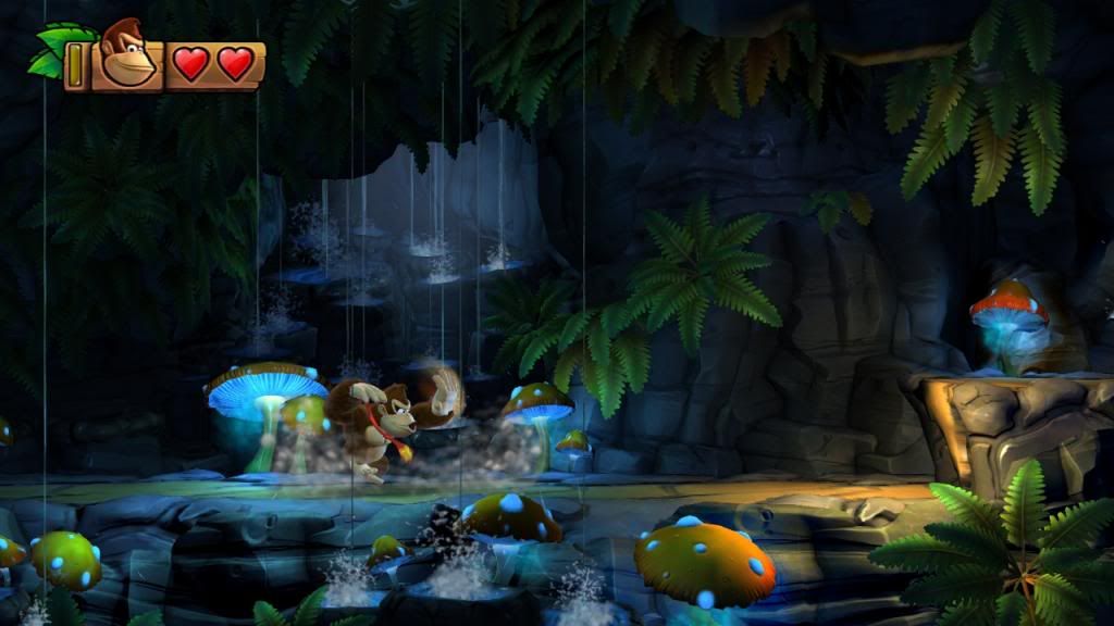
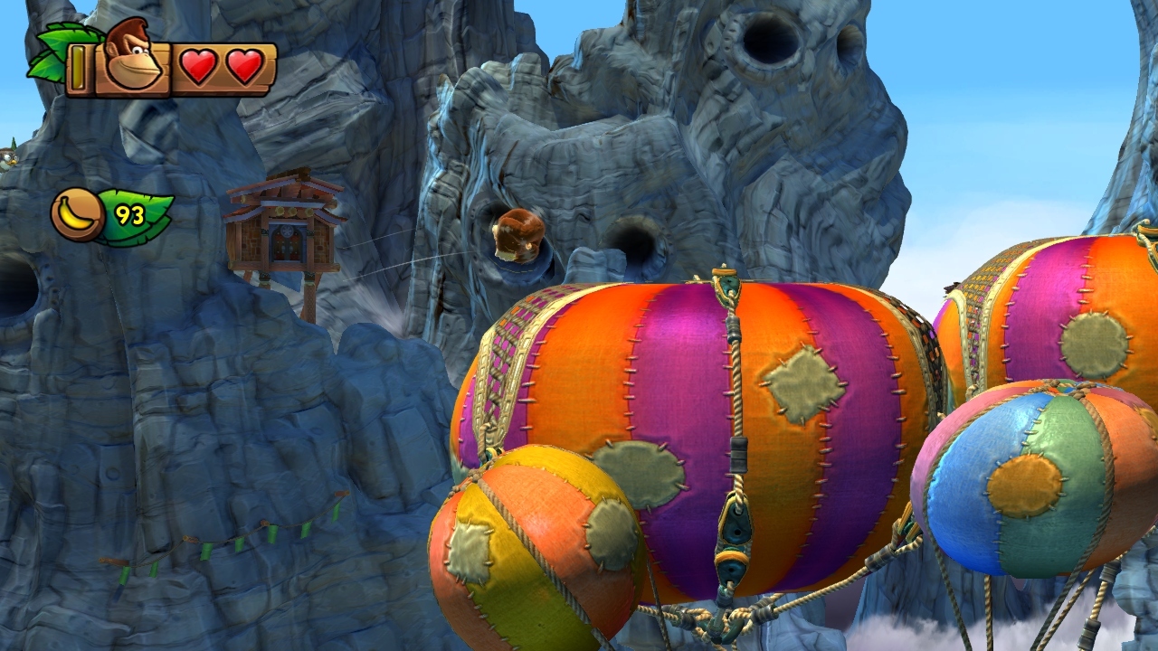
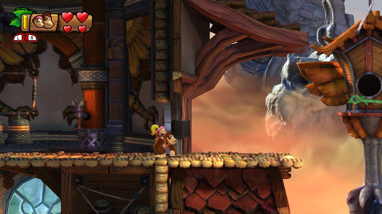
DKTF continues to impress!
Wishmaster92
Member
The character models look the same however the eyes look better during the cutscenes and shadows do also. Cutscenes also have better contrast/color compared to realtime which looks a little duller. Maybe the cutscenes have better shaders/effects?It is beautiful but those are all pre-rendered scenes.


More comparisons:
http://i.minus.com/iVXQLwTm69ewG.png
http://i.minus.com/iZYzc0sBVC16y.png
http://i.minus.com/ibtuQeoSqzdOA9.png
http://i.minus.com/iUUnKIR0ZjUOB.png
Dictator93
Member
Those pre-rendered cutscenes ONLY have more hand placed lighting in them to show off character faces. Crytek has stated multiple times that the cutscene and game charactermodels/shading are all the same. They apparently had the cutscenes not be realtime due to time constraints at the release (i would also imagine some of those scenes would have varying framerates too).The character models look the same however the eyes look better during the cutscenes and shadows do also. Cutscenes also have better contrast/color compared to realtime which looks a little duller. Maybe the cutscenes have better shaders/effects?
For example, here is a non-prerendered cutscene:

pretty done
Member
While Donkey Kong looks really nice, Rayman Legends just blows it away. It's a shame that game bombed so hard 
Wishmaster92
Member
Those pre-rendered cutscenes ONLY have more hand placed lighting in them to show off character faces. Crytek has stated multiple times that the cutscene and game charactermodels/shading are all the same. They apparently had the cutscenes not be realtime due to time constraints at the release (i would also imagine some of those scenes would have varying framerates too).
For example, here is a non-prerendered cutscene:

ah must be that then. Whoever modeled Vitallions face deserves a prize. He looks damn near real.
I remember that was a b3d post from one of the developers, hopefully the next Ryse game will have more realtime cutscenes.
Phreakuency
Banned
While Donkey Kong looks really nice, Rayman Legends just blows it away. It's a shame that game bombed so hard
Yeah I really disagree with you on that
iamaustrian
Member
While Donkey Kong looks really nice, Rayman Legends just blows it away. It's a shame that game bombed so hard
I disagree. Having played both on the same set up I can say that
DK is a league above Rayman.
There is SO much stuff going on in DK. it also makes heavy use of tons of graphic FX.
they have pretty different artstyle though, so I'm not sure if we should compare them at all.
Oh I know, I did the DF article for Ryse so I've spent a LOT of time looking very closely at it.The character models look the same however the eyes look better during the cutscenes and shadows do also. Cutscenes also have better contrast/color compared to realtime which looks a little duller. Maybe the cutscenes have better shaders/effects?
I believe the use of pre-rendered scenes has more to do with hiding loading times than anything else in order to keep the game moving (ala Uncharted series). It wouldn't have been an issue if their video compression had been better.
Also, some of the pre-rendered scenes display more enemies, dynamic lights, and other effects simultaneously than anything you see in realtime. I'd imagine the framerate would have buckled during some of those scenes.
It's still an amazing looking game, though.
A league above? In what way?I disagree. Having played both on the same set up I can say that
DK is a league above Rayman.
There is SO much stuff going on in DK. it also makes heavy use of tons of graphic FX.
They really are so different so it's tough to compare but Rayman is one of the best looking 2D platformers ever made and is devoid of any visual flaws, I'd argue. DK is beautiful, but the scene geometry is still often too angular for my tastes. There are times when it looks just incredible but other times when it looks like a higher resolution Wii game. It's very hit or miss for me. Still, the fact that it never drops frames is a BIG deal.
Steve McQueen
Member
While Donkey Kong looks really nice, Rayman Legends just blows it away. It's a shame that game bombed so hard
Disagree. DKTF looks awesome all the time, while some levels in Legends look dull and aren't as colorful as DK. It's all about opinions I know, but DKTF looks better to me.
Heh, funny. I just wrote the opposite (I think DK looks rough in some spots while Rayman is flawless throughout). I love forums!Disagree. DKTF looks awesome all the time, while some levels in Legends look dull and aren't as colorful as DK. It's all about opinions I know, but DKTF looks better to me.
Man, what's with all the Rayman slamming? It's an insanely beautiful game. A mastery of 2D design work.
Boy Wander
Member
While Donkey Kong looks really nice, Rayman Legends just blows it away. It's a shame that game bombed so hard
Assuming you mean visually, I Just put both games on one after the other to check your statement. Please proceed to your nearest opticians.
Boy Wander
Member
Can we post videos as well? I got the entire Glou Glou musical level from Rayman Legends off GameDVR on the Xbox One last night on Skydrive.
Pretty sure this is specifically a screenshot thread.


