• Hey, guest user. Hope you're enjoying NeoGAF! Have you considered registering for an account? Come join us and add your take to the daily discourse.

Consoles screenshots thread (PS4/Xbone/WiiU) [Up: Thread rules in OP]

Assuming you mean visually, I Just put both games on one after the other to check your statement. Please proceed to your nearest opticians.

lol ok sure

I'm trying to find a Wii U cheap to play it, but I'm sure the comparisons wouldn't be any better blown up on a 42 inch, especially considering Rayman is native and DK isn't. I still think DK looks great, but in some screens like the water levels it looks clearly below Rayman in image quality. Artstyle is subjective and I think Rayman's is much better. Then again I think King of Fighters 13 (real 2D) looks leagues and leagues above SF4 (2.5D, similar to DK)
 

MYE

Member
wiiu_screenshot_tv_01l0uyd.jpg


wiiu_screenshot_tv_01mouns.jpg


Lawd

lol ok sure

I'm trying to find a Wii U cheap to play it, but I'm sure the comparisons wouldn't be any better blown up on a 42 inch, especially considering Rayman is native and DK isn't. I still think DK looks great, but in some screens like the water levels it looks clearly below Rayman in image quality. Artstyle is subjective and I think Rayman's is much better. Then again I think King of Fighters 13 (real 2D) looks leagues and leagues above SF4 (2.5D, similar to DK)

The thing is, everything moves in DK.
The world absolutely feels alive and in this case 3D is actually giving it an advantage in terms of animation over Rayman. And there is a lot of superb animation here.

You will see it if you ever play the game.
 

Neiteio

Member

I love these two shots -- the glittering sheen of the pipes in Frozen Frenzy, and the luscious fur of Harold (what a great name for an old hare!).

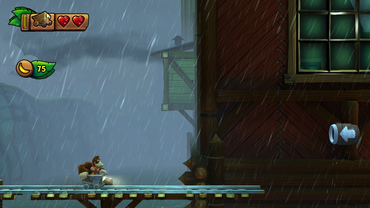
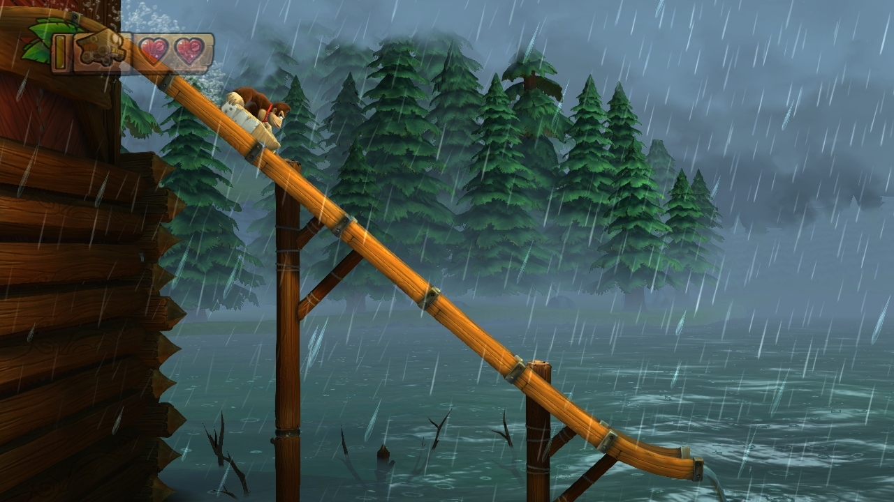
Here are a few of my own, from Sawmill Thrill (2-4). I love the rain-drenched atmosphere, the switch-up between the mine cart and log flume, the contrast between the cold outdoors and the warm sawmill, and the architecture, from the mill to the beaver dams. Of course, it's impossible to capture in stills how wild and dynamic this stage is, in particular how at one point you're riding on pieces of wood as they're flung out of the chipper!

Note how the blast barrel is dripping in the rain in the first shot, and how the stands of pine on the distant lake shore are partially obscured by the swirling fog in the third shot. I also like the ambiance of the second shot, with the window in the background opening onto the rainy landscape.

wiiu_screenshot_tv_013jp3n.jpg

wiiu_screenshot_tv_01rbqg9.jpg

wiiu_screenshot_tv_014rpxh.jpg

.
 

Neiteio

Member
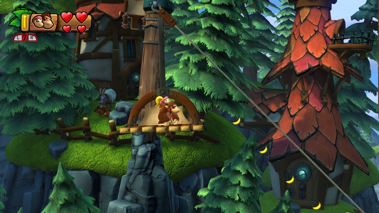
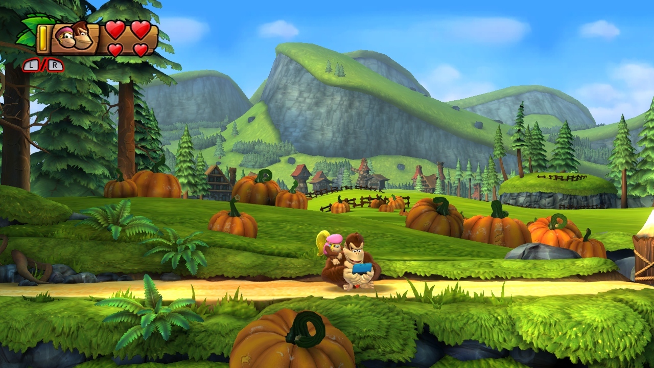
Another three shots from Donkey Kong Country: Tropical Freeze.

The first shot is from Windmill Hills (2-1). I love the texture of the shingled rooftops, the slanting pines, and the velvety grass on the rocks (as well as the disgruntled goat grazing upon them)! The second shot is from Mountain Mania (2-2), with DK's 3DS-playing idle animation, as Dixie begins to groom his fur. I love the pumpkin patch, the Bavarian influences giving way to Swiss alps (and later, Tibetan monasteries). And last we have Horn Top Hop (2-3), which true to its namesake, has lovely alpine horns blasting hot air and sporting intricate gilded motifs. The waxen white bark of the birch trees also contrasts nicely with the smoldering golds and reds of the drifting autumnal leaves, while the dense canopy casts a twilit shadow over the underbrush far below. :)

wiiu_screenshot_tv_016arxg.jpg

wiiu_screenshot_tv_01k5qia.jpg

wiiu_screenshot_tv_0148ovp.jpg
 

chadboban

Member
Here are a few of my own, from Sawmill Thrill (2-4). I love the rain-drenched atmosphere, the switch-up between the mine cart and log flume, the contrast between the cold outdoors and the warm sawmill, and the architecture, from the mill to the beaver dams. Of course, it's impossible to capture in stills how wild and dynamic this stage is, in particular how at one point you're riding on pieces of wood as they're flung out of the chipper!

Note how the blast barrel is dripping in the rain in the first shot, and how the stands of pine on the distant lake shore are partially obscured by the swirling fog in the third shot. I also like the ambiance of the second shot, with the window in the background opening onto the rainy landscape.

The first shot is from Windmill Hills (2-1). I love the texture of the shingled rooftops, the slanting pines, and the velvety grass on the rocks (as well as the disgruntled goat grazing upon them)! The second shot is from Mountain Mania (2-2), with DK's 3DS-playing idle animation, as Dixie begins to groom his fur. I love the pumpkin patch, the Bavarian influences giving way to Swiss alps (and later, Tibetan monasteries). And last we have Horn Top Hop (2-3), which true to its namesake, has lovely alpine horns blasting hot air and sporting intricate gilded motifs. The waxen white bark of the birch trees also contrasts nicely with the smoldering golds and reds of the drifting autumnal leaves, while the dense canopy casts a twilit shadow over the underbrush far below. :)

Dude, can I just say that I really love the commentaries you include with your shots. :)
 
Looking at these shots I almost feel sorry for the Retro artists. Much of their good work breezes by in a moment and most people won't even notice it. Definitely a game where stills make you appreciate the graphical work that went into it more.
 

III-V

Member
Those pre-rendered cutscenes ONLY have more hand placed lighting in them to show off character faces. Crytek has stated multiple times that the cutscene and game charactermodels/shading are all the same. They apparently had the cutscenes not be realtime due to time constraints at the release (i would also imagine some of those scenes would have varying framerates too).

For example, here is a non-prerendered cutscene:
iBlmCTO6sW31R.png

Ryse really looks quite nice.
 

imae

Member
A few I took while playing ZombiU a while back, this game really surprised me all round.
They did a great job with the atmosphere in the game, particularly in some environments.

ixu8Mmr.jpg


z4VPR4G.jpg


K8YbjYm.jpg
 

Lord Error

Insane For Sony
Oh I know, I did the DF article for Ryse so I've spent a LOT of time looking very closely at it.

I believe the use of pre-rendered scenes has more to do with hiding loading times than anything else in order to keep the game moving (ala Uncharted series). It wouldn't have been an issue if their video compression had been better.

Also, some of the pre-rendered scenes display more enemies, dynamic lights, and other effects simultaneously than anything you see in realtime. I'd imagine the framerate would have buckled during some of those scenes.

It's still an amazing looking game, though.
Yeah, it looks like the hiding of load times and framerate are the reasons they went with pre-recording cutscenes. When they show an actual real time rendered cutscene in the game it does seem to look the same as those pre-recorded ones. However, the gameplay does not look quite as good as the cutscenes do, for the reasons Wishmaster counted, shadow resolution being the most obvious one.
 

Neiteio

Member
The following several pics were taken by The Xtortionist -- I hope he doesn't mind me sharing.

To think the scenic detail in the screenshots below all blur by in the blink of an eye -- a silky-smooth 60 fps. The same assets are seldom (if ever) seen again.

I really dig the ice-glazed cabling and fogged glass in Frozen Frenzy (6-7). The other two shots are from Beehive Brawl (5-A), taking you from the dusky exterior with its manicured pathways and mangling mass of vines, down into the heart of the hive, where shimmering honey spills like a slow-motion waterfall, thick and congealing.

wiiu_screenshot_tv_01a0sty.jpg

wiiu_screenshot_tv_01s4knk.jpg

wiiu_screenshot_tv_01atkby.jpg
 

kizmah

Member
Looking at these shots I almost feel sorry for the Retro artists. Much of their good work breezes by in a moment and most people won't even notice it. Definitely a game where stills make you appreciate the graphical work that went into it more.

Ironically, the stills don't do it justice. The world is so alive that you actually need to see it in motion to fully appreciate it. Sure, you speed by all these amazing little detailes and flourishes, but you usually replay a level several times. Sometimes many, many times...
 

Exile20

Member
Heh, funny. I just wrote the opposite (I think DK looks rough in some spots while Rayman is flawless throughout). I love forums! :p

Man, what's with all the Rayman slamming? It's an insanely beautiful game. A mastery of 2D design work.
I respectfully disagree completely and confidently.

Dkctf is just so good. Rayman just doesn't compete.
 

stitch512

Banned
Hm, getting an urge to play tomb raider watching all these screens.

Is it worth it?

If you have not played it before the answer is a 100% yes. I am playing it on the xbox one and loving it. It is pretty much Uncharted but honestly I think its better.
 

Icomp

Member
If you have not played it before the answer is a 100% yes. I am playing it on the xbox one and loving it. It is pretty much Uncharted but honestly I think its better.

Sounds interesting.

Didn't like the combat at all in uncharted, is that part better?
 

VanWinkle

Member
DKCTF is a GREAT looking game, no doubt about it, but Rayman Legends is art in motion. DK can't compete with that. Rayman is flawless, while low-res assets stick out often in DK, and 720p makes for an unfortunate upscaled image. Still an awesome looking game.
 
DKCTF is a GREAT looking game, no doubt about it, but Rayman Legends is art in motion. DK can't compete with that. Rayman is flawless, while low-res assets stick out often in DK, and 720p makes for an unfortunate upscaled image. Still an awesome looking game.

That's more artstyle preference than graphical superiority though. I'm sure a 2D DK game with cartoon style assets could be done and would look as clean as Rayman. But they're 2 different things. One has a ton of stuff going on at multiple levels of the parallax scrolling and has tons of effects like fur, water etc. One has a cartoon style with crisper graphics but less going on. They both are great examples of their style but I wouldn't say one is 'better' than the other if you take personal artstyle preference out of the equation.
 
That's more artstyle preference than graphical superiority though. I'm sure a 2D DK game with cartoon style assets could be done and would look as clean as Rayman. But they're 2 different things. One has a ton of stuff going on at multiple levels of the parallax scrolling and has tons of effects like fur, water etc. One has a cartoon style with crisper graphics but less going on. They both are great examples of their style but I wouldn't say one is 'better' than the other if you take personal artstyle preference out of the equation.
True
 

VanWinkle

Member
That's more artstyle preference than graphical superiority though. I'm sure a 2D DK game with cartoon style assets could be done and would look as clean as Rayman. But they're 2 different things. One has a ton of stuff going on at multiple levels of the parallax scrolling and has tons of effects like fur, water etc. One has a cartoon style with crisper graphics but less going on. They both are great examples of their style but I wouldn't say one is 'better' than the other if you take personal artstyle preference out of the equation.

Right, but upscaling and some low-res assets DO have a negative effect on the overall visual impact. Rayman is so clean and clear. Really, BOTH games just ooze details, animated and not, EVERYWHERE, so I don't think Rayman is necessarily better in that regard either.

Don't get me wrong, though. DKCTF looks FANTASTIC. Its just that some levels didn't impress me at all, while every level impressed me in Rayman.
 
My first attempt at posting some 'next-gen' screens.

Killzone: Shadow Fall - PS4.

BhafSSDIAAEByHD.jpg:large


BhagdV9IYAAWsfJ.jpg:large


BhandiFIcAIGZQd.jpg:large


Through Twitter so compression is horrible. Any better way to do this without capture cards?
 

-griffy-

Banned
One has a ton of stuff going on at multiple levels of the parallax scrolling and has tons of effects like fur, water etc.

What gets me is that this describes Rayman very well too. There is A LOT of stuff going on in any given Rayman level, in multiple depths (and very often you are flying between those different depths). It seamlessly blends 3D elements into the 2D world as well. There is a lot of subtle stuff going on with lighting and animation. It's really stunning in motion.
 

VanWinkle

Member
What gets me is that this describes Rayman very well too. There is A LOT of stuff going on in any given Rayman level, in multiple depths (and very often you are flying between those different depths). It seamlessly blends 3D elements into the 2D world as well.

Yup.

iy1RltwiInE1Y.gif
 
Right, but upscaling and some low-res assets DO have a negative effect on the overall visual impact. Rayman is so clean and clear. Really, BOTH games just ooze details, animated and not, EVERYWHERE, so I don't think Rayman is necessarily better in that regard either.

Don't get me wrong, though. DKCTF looks FANTASTIC. Its just that some levels didn't impress me at all, while every level impressed me in Rayman.

Some early pics released by Retro did show signs of being upressed ports from a Wii build.
 

Neiteio

Member
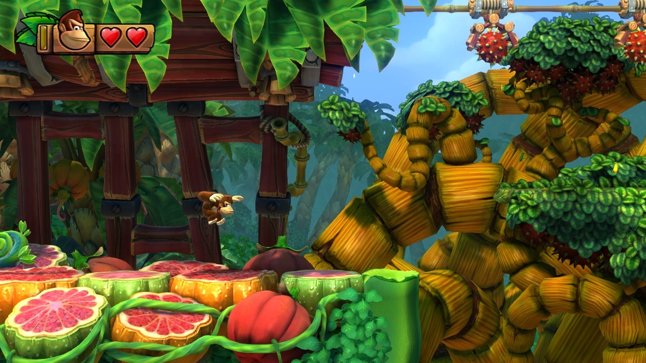
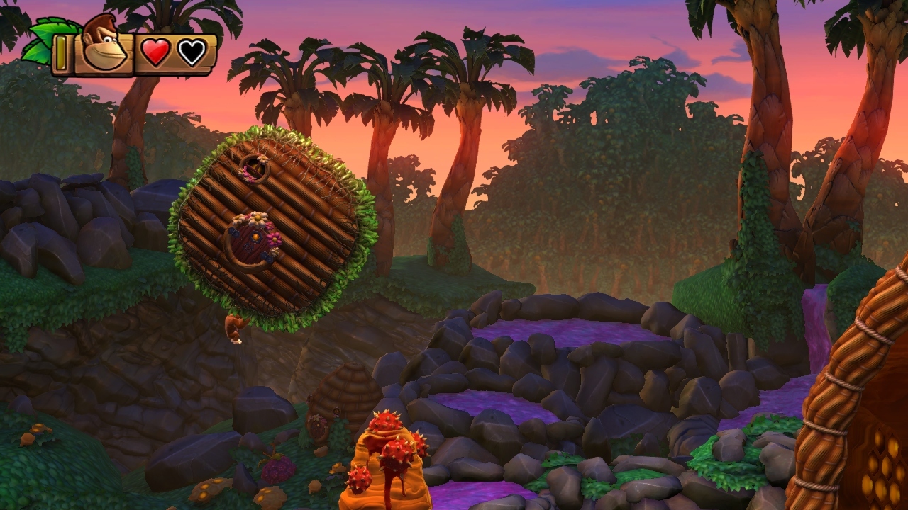
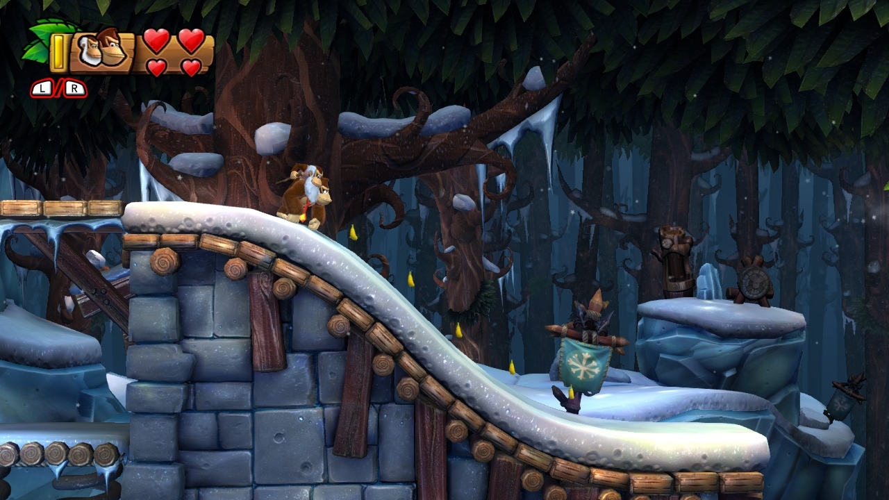
The following screenshots were taken by 1) Outtrigger888, 2) The Xtortionist, and 3) EatsChildren:

Such soothing atmosphere! You have sunken pirate ships silhouetted in the kelp forests of Amiss Abyss... DK clinging to a beehive in Beehive Brawl, as the honeycombed household flies over a babbling brook of juice, the jungle awash in twilit hues... And the snow-compacted boardwalks and parapets under the ice-glazed canopy of Forest Folly -- check out the solidity of the snow, the sculpted stone and coarse woodwork, all stylized with a real sense of weight. :)

Ef2G8H.jpg

wiiu_screenshot_tv_01bcuz7.jpg

wiiu_screenshot_tv_01luyqz.jpg
 

Neiteio

Member
I'm obsessed with Tropical Freeze at the moment, and can't get enough of the game's art direction, but I just wanted to chime in and say that Thief and Tomb Raider: Definitive Edition both look really nice.

Realistic graphics can be dull as dishwater if not handled correctly, but those games really nail atmosphere -- the feelings of cold and warmth, the "lived in" look, etc. Very nice, and I'm interested to try both games when I get my PS4.

Likewise, I hope the people into those games give Tropical Freeze a try. The game looks remarkably solid and colorful in stills, but it's a whole different beast when you see it fully animated, the stages transforming in real-time, everything breezing by at a silky-smooth 60 fps.

Tell that to me, I am dying to get it and this screens look amazing, cannot keep up with the hype!!
 
What gets me is that this describes Rayman very well too. There is A LOT of stuff going on in any given Rayman level, in multiple depths (and very often you are flying between those different depths). It seamlessly blends 3D elements into the 2D world as well. There is a lot of subtle stuff going on with lighting and animation. It's really stunning in motion.

I have both games on Wii U and I don't disagree. To my eye, there's 'more' going on in DK but they're both great looking games.
 

Sipheren

Banned
I really want to show some Ryse screenshots but I can't seem to do it on the Xbox, so here is some video using the DVR (click on the image for video, looks a bit nicer).

The game has some really amazing looking stuff. Seeing some of the KZ screens as well, Next gen is very cool.


Top Bottom