You are using an out of date browser. It may not display this or other websites correctly.
You should upgrade or use an alternative browser.
You should upgrade or use an alternative browser.
Consoles screenshots thread (PS4/Xbone/WiiU) [Up: Thread rules in OP]
- Thread starter Peterthumpa
- Start date
CheezyMac88
Member
Really disappointed with Driveclub's IQ. Doesn't look like what was advertised on the videos.
arhra
Member
The photomode runs at 30 fps though. He didn't get the angle right for capturing the gameplay so the scenes aren't perfect but this thread is apparently OK with real time photomode (infamous ss/TLOU:R) so it's valid.
I'm pretty sure that the photomode cheats a little - you can interact with it smoothly at 30fps (at which point it'll have the usual in-game image quality), but once you stop moving it bumps up the image quality (you can see this most obviously by how the motion blur/DoF draw in after you stop moving), albeit to a lower quality level than the exports (seems to be similar quality for edges, but motion blur and DoF clearly have way more samples on the exported images).
And here's the incredibly sad start menu for Sniper Elite V2 since that's the only thing you can screenshot because Rebellion was so clever as to auto-pause the game and pull up the pause menu screen once you press the HOME button, making taking screenshots completely impossible even when it is theoretically not disabled. So stupid.
Well ain't that just the dumbest...
No wonder I haven't been seeing any Wii U screens of that one.
I never liked the palette choice for this game. Has a mucky clay-like tone to everything(eww, just like Infamous:SS). That kills it, aesthetically. Like I said a couple posts back, Forza Horizon 2 really nailed the aesthetics, and side by side comparisons will reveal how important it is to have great art and proper use of colors to complement your tech. Now that we're finally able to judge them side by side, I see the complaints are targeting Forza's 'enhanced' photo mode, even though it's obvious how gorgeous the game looks during gameplay, and cutscene pics. The coming days gonna be pretty interesting around here.Really disappointed with Driveclub's IQ. Doesn't look like what was advertised on the videos.
Yeah but you can also turn both those off in photo mode. They aren't automatic. (Shutter speed to 0 and aperture to 0)I'm pretty sure that the photomode cheats a little - you can interact with it smoothly at 30fps (at which point it'll have the usual in-game image quality), but once you stop moving it bumps up the image quality (you can see this most obviously by how the motion blur/DoF draw in after you stop moving), albeit to a lower quality level than the exports (seems to be similar quality for edges, but motion blur and DoF clearly have way more samples on the exported images).
Makoto-Yuki
Banned
those drive club screens are disappointing.
the game looked amazing in videos. what the hells happening with the actual game? or are we expecting the dynamic weather patch to fix it?
the game looked amazing in videos. what the hells happening with the actual game? or are we expecting the dynamic weather patch to fix it?
Summer Haze
Banned
I never liked the palette choice for this game. Has a mucky clay-like tone to everything(eww, just like Infamous:SS). That kills it, aesthetically. Like I said a couple posts back, Forza Horizon 2 really nailed the aesthetics, and side by side comparisons will reveal how important it is to have great art and proper use of colors to complement your tech. Now that we're finally able to judge them side by side, I see the complaints are targeting Forza's 'enhanced' photo mode, even though it's obvious how gorgeous the game looks during gameplay, and cutscene pics. The coming days gonna be pretty interesting around here.
But that wasn't important to Evo. What was important to them was to make it look as realistic as possible. FH2's vibrant and super-colourful palette would never suit DC, just like DC's more natural tone wouldn't suit FH2, because they both aim for different things aesthetically.
those drive club screens are disappointing.
the game looked amazing in videos. what the hells happening with the actual game? or are we expecting the dynamic weather patch to fix it?
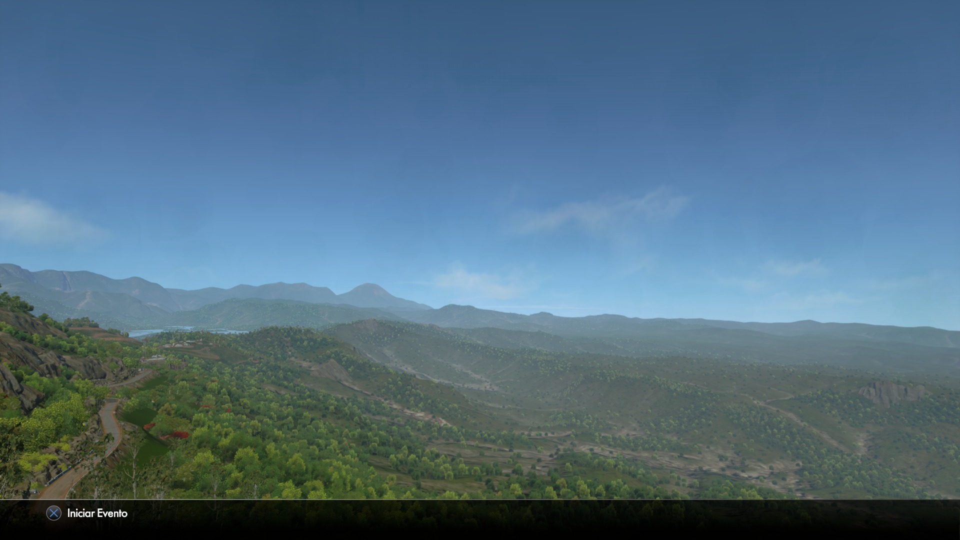
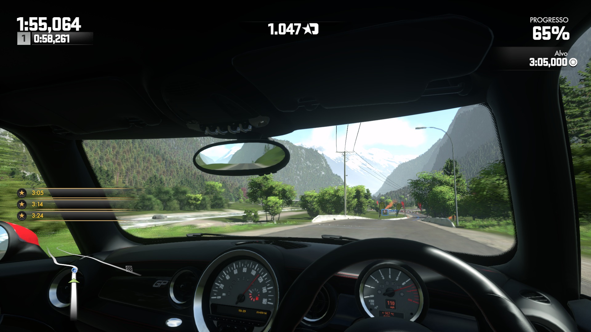
According to lots of first impressions in the Driveclub OT, it does look amazing. Apparently some of the beginning stages don't look as good as others, though.
Edit: Ha, funnily enough, this is what see as soon as I go back to the DC OT:
1) Do not judge the game visuals by the first race. Get the stars and move on. Pretend it never happened
2) Play the Chile race next
3) MOTHERFUCKING PROFIT
Seriously, WTF. Shit looks insane.
Quite a few people are also saying it looks way better in motion than in stills. Take that as you may.
Summer Haze
Banned
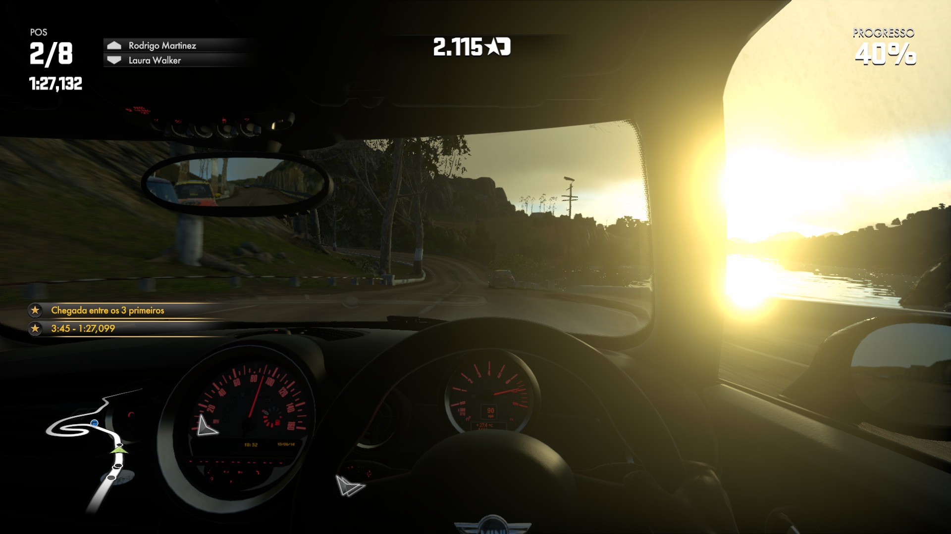
Holy shit, that last screenshot is really unflattering.
TAJ
Darkness cannot drive out darkness; only light can do that. Hate cannot drive out hate; only love can do that.
Quite a few people are also saying it looks way better in motion than in stills. Take that as you may.
Those same people are also saying that the mere act of screenshotting makes the game look drastically worse even in situations where nothing is moving.
In other words they're fucking delusional.
Some people have even tried to damage control by claiming Share screenshots are 720p. It's pathetic.
nelsonroyale
Member
Holy shit, that last screenshot is really unflattering.
Haha yeah, I always wonder why people would even bother posting photos like that. I mean you can take photos of any game and make it look like crap, but why post it?
Taj: I don't think it is even up for debate at this stage whether the game looks good? It looks really impressive. AA is the only think I think that lets the side down a little. Asset wise it is ahead of any other racing game on the market. To my mind this the first racing games where environmental detail has truly received a massive bump. In fact, having been to pretty much all the places where the tracks are set, I am getting a bit of an uncanny valley sense, which is a first in a racing game.
Summer Haze
Banned
Those same people are also saying that the mere act of screenshotting makes the game look drastically worse even in situations where nothing is moving.
In other words they're fucking delusional.
Some people have even tried to damage control by claiming Share screenshots are 720p. It's pathetic.
I don't think those are the same people....at all.
TAJ
Darkness cannot drive out darkness; only light can do that. Hate cannot drive out hate; only love can do that.
They definitely were on the day shots started showing up. I've been avoiding the OP for a while because people would freak out if I gave my honest opinions in there.
I think that basically everything in the game looks ugly if you look closely. And not just the assets. The effects are low-quality, too. The motion blur in particular is just gross.
That said, the devs have a scarily good grasp on what makes your brain believe something is real and the reason the assets suck is that they've spent a lot of power on things that other devs would never have thought to include.
Normally when people say that a game looks better in motion I just roll my eyes and think "So does every game." but in this case it lets you miss the pile of flaws and take in all the touches they've added subconsciously.
Basically, it's a full-on Monet.
Haha yeah, I always wonder why people would even bother posting photos like that. I mean you can take photos of any game and make it look like crap, but why post it?
Taj: I don't think it is even up for debate at this stage whether the game looks good? It looks really impressive. AA is the only think I think that lets the side down a little. Asset wise it is ahead of any other racing game on the market. To my mind this the first racing games where environmental detail has truly received a massive bump. In fact, having been to pretty much all the places where the tracks are set, I am getting a bit of an uncanny valley sense, which is a first in a racing game.
I think that basically everything in the game looks ugly if you look closely. And not just the assets. The effects are low-quality, too. The motion blur in particular is just gross.
That said, the devs have a scarily good grasp on what makes your brain believe something is real and the reason the assets suck is that they've spent a lot of power on things that other devs would never have thought to include.
Normally when people say that a game looks better in motion I just roll my eyes and think "So does every game." but in this case it lets you miss the pile of flaws and take in all the touches they've added subconsciously.
Basically, it's a full-on Monet.
nelsonroyale
Member
They definitely were on the day shots started showing up.
I think that basically everything in the game looks ugly if you look closely.
That said, the devs have a scarily good grasp on what makes your brain believe something is real and the reason the assets suck is that they've spent a lot of power on things that other devs would never have thought to include.
I don't agree. Textures are at least as good as the other racing games, and environmental geometry is clearly very impressive. I personally think the rendering engine is better as well.
Summer Haze
Banned
They definitely were on the day shots started showing up.
I think that basically everything in the game looks ugly if you look closely. And not just the assets. The effects are low-quality, too. The motion blur in particular is just gross.
That said, the devs have a scarily good grasp on what makes your brain believe something is real and the reason the assets suck is that they've spent a lot of power on things that other devs would never have thought to include.
Normally when people say that a game looks better in motion I just roll my eyes and think "So does every game." but in this case it lets you miss the pile of flaws and take in all the touches they've added subconsciously.
Basically, it's a full-on Monet.
Haha, loving the edit. You went from small flaws, to a "pile" of flaws.
I have to ask, are you this critical of every game, or just DC?
And in regards to the people saying it looks better in motion being the same people who said the things you're accounting them of saying. You're 1005 wrong. How would you know what they've been saying if you just admitted to not going to the OT for a while? You can't just assume they're the same people based on nothing.
TAJ
Darkness cannot drive out darkness; only light can do that. Hate cannot drive out hate; only love can do that.
Haha, loving the edit. You went from small flaws, to a "pile" of flaws.
I have to ask, are you this critical of every game, or just DC?
I went from "pile of small flaws" to "pile of flaws" because they're not so small. If this were a game where you moved very slowly it would be possibly the ugliest game on the console. OK, not the ugliest. That Tinker game looks fucking atrocious. Fortunately you're driving sports cars.
Every game.
Summer Haze
Banned
I went from "pile of small flaws" to "pile of flaws" because they're not so small. If this were a game where you moved very slowly it would be possibly the ugliest game on the console. OK, not every game. That Tinker game looks fucking atrocious. Fortunately you're driving sports cars.
Every game.
Oh, wow. Ok.
Lol, ninja edit again.
why Forza Horizon looks better than Driveclub? :\
Take a look at some of the most recent shots in the Driveclub OT.
icecold1983
Member
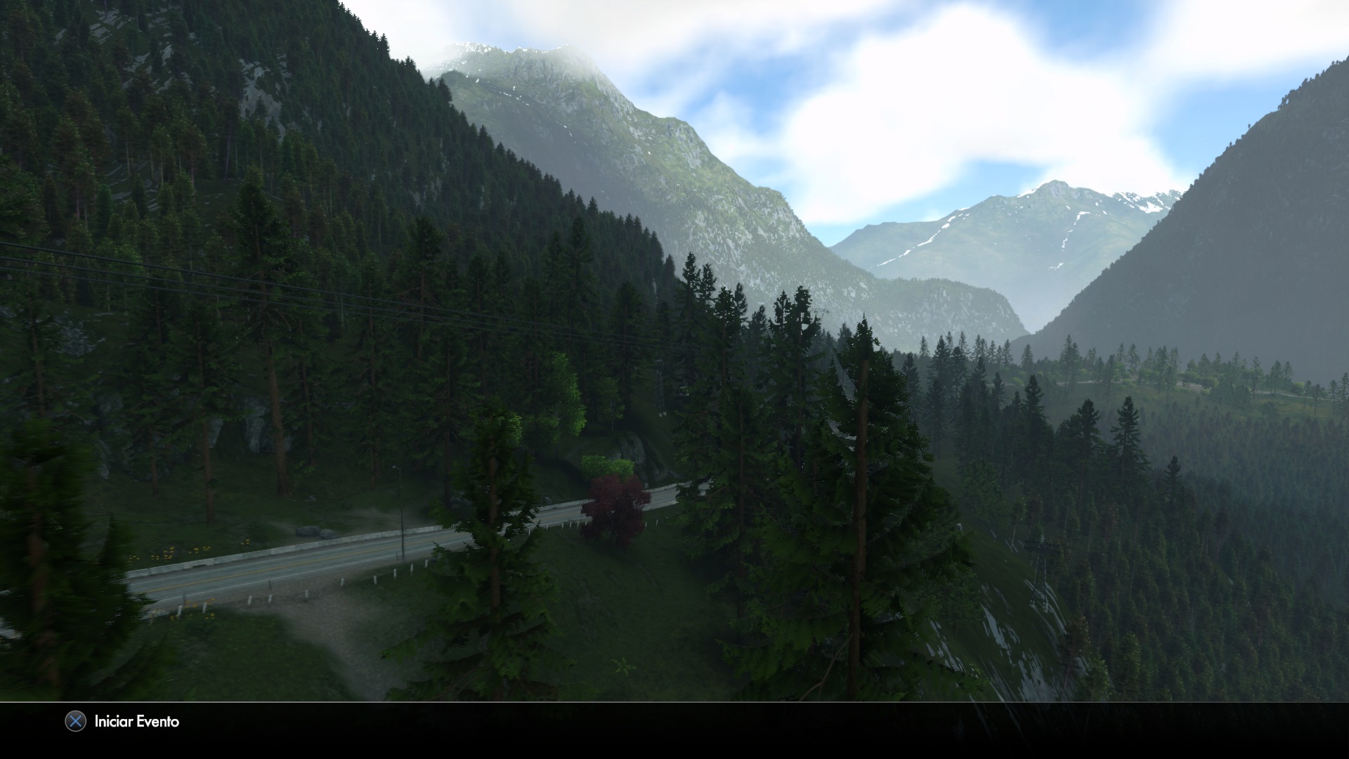
driveclub has the most convincing looking environments ive ever seen in a video game, and by a landslide. the tree models are a huge leap forward
TAJ
Darkness cannot drive out darkness; only light can do that. Hate cannot drive out hate; only love can do that.
Oh, wow. Ok.
Whatever. I was hyped for this game a week ago. It was the only game I listed in the "What are you buying in October?" thread.
driveclub has the most convincing looking environments ive ever seen in a video game, and by a landslide. the tree models are a huge leap forward
Tree models a huge leap forward? are we looking at the same screens?
icecold1983
Member
Tree models a huge leap forward? are we looking at the same screens?
id like to know what game you think has better trees.
Cyborg
Member
Tree models a huge leap forward? are we looking at the same screens?
Yes you are only difference is that you forgot you glasses
Summer Haze
Banned
I wouldn't say the tree models are a huge leap forward, but I find the variety of vegetation impressive.
nelsonroyale
Member
Tree models a huge leap forward? are we looking at the same screens?
Well, considering how many it is rendering, I would say it is for a driving game. 2d trees pissed me off something fierce in GT5, so it is nice to see a game rendering masses of them in 3d. Otherwise I agree with what he said about the environments, these are the most convincing landscapes I have seen in a game.
AF is the other thing I wish they would improve.
Tree models a huge leap forward? are we looking at the same screens?
In motion they are very convincing looking, very dense and packed with detail, especially in terms of all the individual branches casting their own shadows.
http://a.pomf.se/jcpebv.gif
Zeuanimals
Member
id like to know what game you think has better trees.
Crytek games are the obvious ones, but they're not racing games. These trees are a leap forward for racing games, but they're not amazing. What looks really amazing are the forests, not the individual trees.
Edit:
In motion they are very convincing looking, very dense and packed with detail, especially in terms of individual branches casting their own shadows.
http://a.pomf.se/jcpebv.gif
I take that back. Those trees look amazing and much better than these:

ninjablade
Banned
I went from "pile of small flaws" to "pile of flaws" because they're not so small. If this were a game where you moved very slowly it would be possibly the ugliest game on the console. OK, not the ugliest. That Tinker game looks fucking atrocious. Fortunately you're driving sports cars.
Every game.
I'm gonna have to agree with you. direct feed pics are the best way to judge how technically impressive a game graphics are, although lighting is best judged while a game is in motion, DC has amazing lighting, everything else not so much.
I'm gonna have to agree with you. direct feed pics are the best way to judge how technically impressive a game graphics are, although lighting is best judged while a game is in motion, DC has amazing lighting, everything else not so much.
That's not true at all.
I take that back. Those trees look amazing and much better than these:
http://i1.minus.com/iZdSLvmVNYnVu.jpg
Yeah, some of the different tree types have rather poor texture filtering, but it doesn't apply to all of them.
Dombrowski
is responsible for the well-being of this island.
Christ! Please tell me it's just that one track. :\
Yo guys calm down, holy shit
Forest density/variety is good from the distance and the all together effect is really nice
Statement was "Tree Models - huge leap forward" that i don't see, up close they're not that impressive at all
oh ffs
Forest density/variety is good from the distance and the all together effect is really nice
Statement was "Tree Models - huge leap forward" that i don't see, up close they're not that impressive at all
Yes you are only difference is that you forgot you glasses
oh ffs
Caayn
Member
Edit: Why do people keep ignoring the 3 screenshots per post rule  Too much talk not enough screenshots (This time it's not my fault
  )
)


--------
Skylanders Trap Team looks great, more please.


--------
Skylanders Trap Team looks great, more please.
Ouch.
eso76
Member
I guess i'll have to see how DC looks on my setup.
I can see how that IQ can break it for a lot of people and how someone might genuinely think FH2 looks better. I guess a lot of it really depends on the setup.
A few weeks ago i read an article mentioning the various AA techniques in place but now i wonder if they are still in the game or had to be cut.
@ Caayn can we get those screens in native res 1080p though ?
mercenar1e
Member
Edit: Why do people keep ignoring the 3 screenshots per post rule


--------
That's an excessive amount of blur..
Summer Haze
Banned
That's an excessive amount of blur..
It works really well in-game.
icecold1983
Member
Crytek games are the obvious ones, but they're not racing games. These trees are a leap forward for racing games, but they're not amazing. What looks really amazing are the forests, not the individual trees.
Edit:
I take that back. Those trees look amazing and much better than these:

the trees in driveclub are better than any crytek game IMO, and theres an absurd amount of them being rendered
eso76
Member
That's an excessive amount of blur..
this isn't ?
both games use the right amount of blur
I don't think either dev just used an arbitrary shutter angle, i think Evolution and Playground are sticking to real life values. A camera filming at 30fps will produce that much motion blur, depending on how fast things are moving on the screen, obviously.
Not gonna answer since it clearly upsets peoplethe trees in driveclub are better than any crytek game IMO, and theres an absurd amount of them being rendered
Caayn
Member
As far as I know you can only capture video in 720p with the Game DVR, so no.@ Caayn can we get those screens in native res 1080p though ?
I might just pick-up a capture card soon. Still doubting about purchasing one.
Game DVR compression makes it look worse than it really isThat's an excessive amount of blur..
eso76
Member
As far as I know you can only capture video in 720p with the Game DVR, so no.
Ah, ok didn't know stills were captured from the DVR.
ninjablade
Banned
this isn't ?
both games use the right amount of blur
I don't think either dev just used an arbitrary shutter angle, i think Evolution and Playground are sticking to real life values. A camera filming at 30fps will produce that much motion blur, depending on how fast things are moving on the screen, obviously.
DC has an IQ problem, even while not moving the game is blurry.
nelsonroyale
Member
DC has an IQ problem, even while not moving the game is blurry.
Do you have the game?
eso76
Member
DC has an IQ problem, even while not moving the game is blurry.
looks a bit on the soft side yeah, which i personally don't mind at all (see FH1).
The problem is that the softness doesn't get the game rid of the jaggies and pixel crawling.
Oh well. Picking up my copy tomorrow and will see how it looks on my F8500
El-Pistolero
Member
I'm gonna have to agree with you. direct feed pics are the best way to judge how technically impressive a game graphics are, although lighting is best judged while a game is in motion, DC has amazing lighting, everything else not so much.
Better car models and environments than its competitors as well. The only aspect that could have been a bit better is IQ...The rest is really impressive.
ninjablade
Banned
Do you have the game?
Nope but by looking at direct feed pics, i can see the IQ is one of the worse on nextgen consoles. for example this pic, look at the environment, behind the car, all the detail is lost, everything looks blurry.

nelsonroyale
Member
Nope but by looking at direct feed pics, i can see the IQ is one of the worse on nextgen consoles. for example this pic, look at the environment, behind the car, all the detail is lost, everything looks blurry.

Well, I do think that AF could be better, but the same could be said of the forza screens above. Their is a very obvious loss in detail further into the background. I would say the environmental geometry looks better in DC for sure.
Well, I do think that AF could be better, but the same could be said of the forza screens above. Their is a very obvious loss in detail further into the background. I would say the environmental geometry looks better in DC for sure.
Pretty sure AF wouldn't help those poor trees.


