• Hey, guest user. Hope you're enjoying NeoGAF! Have you considered registering for an account? Come join us and add your take to the daily discourse.

Consoles screenshots thread (PS4/Xbone/WiiU) [Up: Thread rules in OP]

There's something about the little village/town areas in FH2 that look flat. I think it's a lack of AO? I'm not sure. But I think those areas are the weakest areas of the game graphically.

I'm talking about daytime, btw. They look awesome at night.

Vegetation LoDs are very obvious in stills as well. Obviously far less of an issue in motion.
 
Vegetation LoDs are very obvious in stills as well. Obviously far less of an issue in motion.

Yeah, they remind me of the trees from Forza 5. In fact, I think they might share the same assets. But don't quote me on that.

Oh, and is there any way for me to retrieve my screenshots online? I don't have a capture card.
 

TAJ

Darkness cannot drive out darkness; only light can do that. Hate cannot drive out hate; only love can do that.
That's not even remotely true. There are quite a few technically impressive games that result into poor screenshots. The Metro titles being some that come to mind. The screenshots for Ryse don't look as good as the game in motion.

I think that Metro comes across better in screenshots. The animation in those games sucks.
 

KKRT00

Member

Names of those shots are hurting me badly ;\

---

Thats not ingame.

---

Ugh, so DriveClub does not have AF after all ...
 

Noobcraft

Member
Anyone else down for more pictures and less wars?
Forza Horizon 2 (Photomode)
GetPhoto.ashx

GetPhoto.ashx

GetPhoto.ashx
 

Peterthumpa

Member
There's not even the pilot in there.. isn't this a car placed on the side? If so, why bother to post a screen of it?
Wait, so this wasn't the player car? I knew that there was obviously something really wrong but posting a screen like this is basically trolling and should deserve a ban. This was done to ignite fanboyism. Stupid.
 

Timu

Member
Hmm, quite a debate here on DriveClub, I'll add my two cents:

Graphically, it might be a wee bit on the inconsistent side in some areas but it's a pretty good looking game all around(definitely the environments, cars and lighting), it's a shame about it's IQ as I notice many jaggies in various shots.

Also I knew PS4 Share wouldn't be able to handle it in screens since games that rely on being in fast motion(like racers) would suffer a lot because the PS4 has to encode everything. If only I were buying the game I could do uncompressed...unless I feel like getting PSN+.
 

Timu

Member
That's not even remotely true. There are quite a few technically impressive games that result into poor screenshots. The Metro titles being some that come to mind. The screenshots for Ryse don't look as good as the game in motion.
It is true.That's the fault of the capture device because there are capture devices that do uncompressed and do games perfectly in screenshots.

Also Metro looks amazing in screens and Ryse suffers from being upscaled to 1080p despite being a 900p game resulting in some blurriness in screens.
 

Noobcraft

Member
Ok, I fixed whatever that screen size issue was
Looks great in motion. I'm considering trading in bf4 at best buy for $25 and putting that towards a PSN gift card ($20). Driveclub doesn't look like it's worth $60 to me but the PS+ discount -$20 seems well worth it.

Edit: Best Buy is also offering $40 for Destiny trade-ins
 
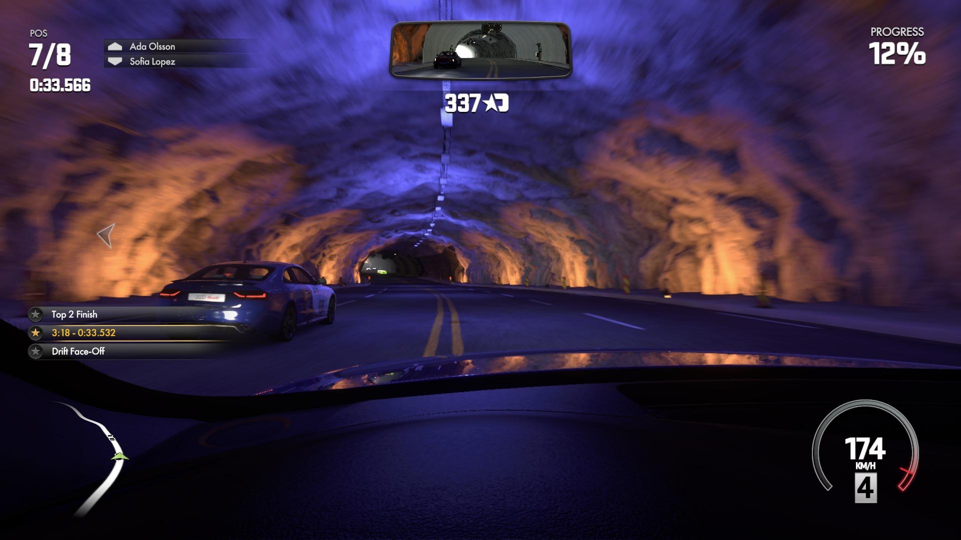
They've nailed the lighting. Especially in the cockpit of the car in the last tunnel shot. The subtle light on the aluminium wheel trim, the luminosity and the way the dials glow.

I've never played a game where driving under repeating street/tunnel lights feels as realistic as this. The pulsing lighting throughout the cockpit and windshield reflections are spot on. Not to mention the lighting from brakelights ahead of you.
 
The foliage was not made for screenshots though, at least not without photomode. This is definitely a game that shines in motion. Makes taking good screens in the tree heavy spots kinda difficult.

pGBjOw.jpg


Db6JkK.jpg


4OEL7I.jpg
 

OryoN

Member
But that wasn't important to Evo. What was important to them was to make it look as realistic as possible. FH2's vibrant and super-colourful palette would never suit DC, just like DC's more natural tone wouldn't suit FH2, because they both aim for different things aesthetically.

Realistic as possible? Realistic claymation perhaps? :p

Seriously, there's nothing realistic about that mucky, washed out, clay-like look that persists everywhere in the shots/videos we're been seeing up to this point. The pics that popped up after my last post really hilights the poor taste palette choice, or perhaps shaders in general. Proper use of colors doesn't have to mean unrealistic either. DC is still a good looking game, don't get me wrong. Evolution went with a rendering style they thought could product the realistic results they wanted. It seem to work in some areas/settings in the game, but for the most part, I can't say they've nailed it, based on what I've seen so far. If we're simply discussing beautiful images, though - which we are - without the slightest hesitation, I'd give the nod to FH2.
 
Realistic as possible? Realistic claymation perhaps? :p

Seriously, there's nothing realistic about that mucky, washed out, clay-like look that persists everywhere in the shots/videos we're been seeing up to this point. The pics that popped up after my last post really hilights the poor taste palette choice, or perhaps shaders in general. Proper use of colors doesn't have to mean unrealistic either. DC is still a good looking game, don't get me wrong. Evolution went with a rendering style they thought could product the realistic results they wanted. It seem to work in some areas/settings in the game, but for the most part, I can't say they've nailed it, based on what I've seen so far. If we're simply discussing beautiful images, though - which we are - without a the slightest hesitation, I'd give the nod to FH2.

We are? Says who? I'm comparing them on a technical level, and without the slightest hesitation, I'd give the nod to DC. What's appealing to the eye is completely subjective, also.

@Net_Wrecker

Awesome shots, man. That's more like it. :D

Edit: Holy shit I didn't realise that the shot of DC that was posted earlier was of a non-player controlled car. I wondered why it looked so bad. Why the hell would someone post that?
 

shandy706

Member
Realistic as possible? Realistic claymation perhaps? :p

Seriously, there's nothing realistic about that mucky, washed out, clay-like look that persists everywhere in the shots/videos we're been seeing up to this point.


So I'm not crazy?

I've not mentioned it, but "clay" was my thought too. A lot of rocks and stone cliff faces have that "look".

Glad I'm not the only one. I figured I was.

It's not every shot/scene, but a lot of stuff looks like high quality "claymation".

It's the only way I could relate it in my head.
 
Great screenshots Nutwrecker. I think this is the ideal car game for someone who is not particularly a fan of the genre, but loves me some awesome visual details. When the screenshot and weather hits is when I will pick it up.
 

OryoN

Member
We are? Says who? I'm comparing them on a technical level, and without the slightest hesitation, I'd give the nod to DC.

Um, the nature of the thread, Lukas? The posting of beautiful images of current consoles' game. If this was meant to simply be a thread based on technically based merits alone, then there'd probably be much less Wii U pics. But, it's a screen-shot thread, and it's been holding it's own pretty well - and will continue to - for that very reason. But now we're getting slightly off-topic, so I'll leave it at that.

Jeeez guys....please take the FH2/ DC debate elsewhere please.

Sorry, wasn't really my intention. I started out that last discussion by highlighting how much great art and good use of colors adds so much beauty to a game, comparing Shadow of Mordor to Infamous SS, and Drive Club to Foza H2. I could care less about how each game achieved their looks technically. I thought it was one of those things you can't help but underscore in a screenshot thread. My bad bro. That's done now though.
 
Um, the nature of the thread, Lukas? The posting of beautiful images of current consoles' game. If this was meant to simply be a thread based on technically based merits alone, then there'd probably be much less Wii U pics. But, it's a screen-shot thread, and it's been holding it's own pretty well - and will continue to - for that very reason. But now we're getting slightly off-topic, so I'll leave it at that.

I disagree. The nature of this thread is to simply post screenshots. Not to only post beautiful screenshots. There are a wide variety of shots here from a wide variety of games, with different purposes. Some are to show off how beautiful a game looks (which is subjective), and others are to show off a games technical aspects, and some are both. For example, when The Last of Us: Remastered released, I came here to see extreme close-ups of Joel's face, to see the detail of the character models, but I also came here to see some beautiful environmental shots.

This will be my last reply on the matter also.


Awww yissss. These are awesome. Much, much better looking shots.
 
Man, I really need to play Shadow of Mordor.

Knack has some nice looking rocks, also. Actually, it's a nice looking game overall. I really like the art style and pixar-like graphics.
 

jett

D-Member
Haha yeah, I always wonder why people would even bother posting photos like that. I mean you can take photos of any game and make it look like crap, but why post it?

Honestly, most of the direct feed Driveclub screens I've seen are pretty ugly. It's like there's a graphical pass missing or something. I think the most egregious effect missing in the game compared to the Driveclub bullshots and trailers is the cinematic color grading. If they could add that in the game it would help a lot to make the game more vibrant and pop out more.
 
Honestly, most of the direct feed Driveclub screens I've seen are pretty ugly. It's like there's a graphical pass missing or something. I think the most egregious effect missing in the game compared to the Driveclub bullshots and trailers is the cinematic color grading. If they could add that in the game it would help a lot to make the game more vibrant and pop out more.

I think it pops pretty well in person. It's not an easy game to make legit screens of though which is why gifs are like the best way to show off Driveclub. You just can't get that sense of all the lighting, reflective, and shadow effects working together through screenshots. Plus motion blur hides some of those grimy trees in your periphery.

Wrecker, you're using a capture card? All your shots are superb, best shots I've seen of the game. Driveclub is immensely detailed.

Thanks, but nope, no capture card here. All share button shots.

zCKTJf.jpg


IpBpTU.jpg


JbxwyI.jpg
 
Top Bottom