Reizo Ryuu
Member
I always set gears to 'vivid'
/thread.Whatever fits the game.
/thread.
Like others have said it depends on the game.
Souls games need a gloomy look to capture that oppressive atmosphere.
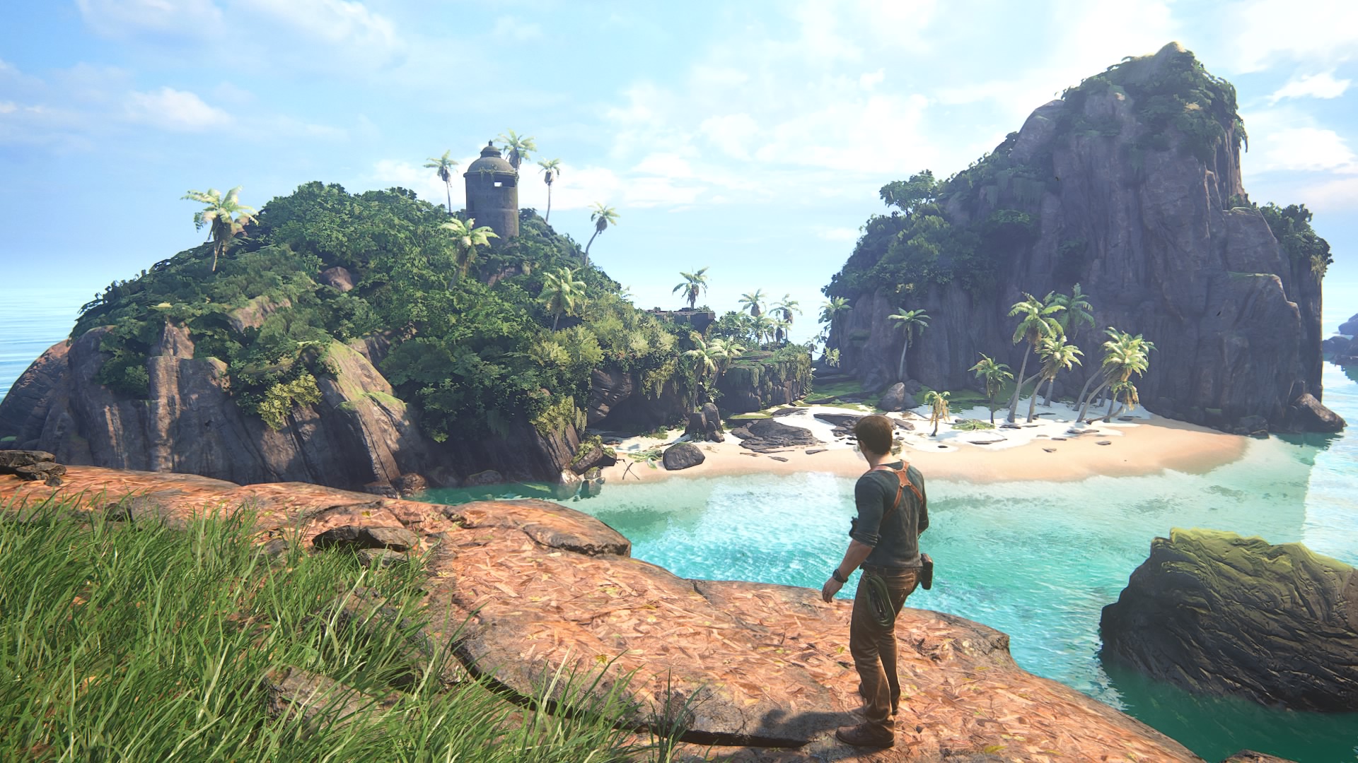
Something like Mario needs to be colorful and cheery.
Games like Metroid and Ori have a lot natural elements and have a variety of biomes that cover both dank and gloomy and bright and beautiful.
Can't choose sorry.allow me to repeat my question or paraphrase it actually
games like Mario are of course built on the premise of vivid colours, no doubt about that (still we did have Luigi's Mansion)
but if you were given the choice to choose between the two for a game that can have both, which style would you pick?
I understand but more often than not developers or even movie directors opt for a darker tone and visual style but end up getting harshly criticised for their choices regarding the design, the atmosphere, the colour palette, ...It doesn't matter, just needs to fit the tone of the game, design, atmosphere...What the creator wants us to experience.
Honestly, good artists knows the tone they have to use.I understand but more often than not developers or even movie directors opt for a darker tone and visual style but end up getting harshly criticised for their choices regarding the design, the atmosphere, the colour palette, ...
e.g. Mass effect 3 (ending), RE5, Dues Ex HR ("piss filter"), TLOU2 (character design), Batman Vs. Superman movie (atmosphere and colour palette)
therefore I am afraid people are less flexible and willing than they think they are to accept the developer's choice
")
Sometimes, colors in contrast with horror could be good if done well.I thought OP was going to have examples of timeless colourful art styles in Nintendo games like various Mario games, but instead we got examples that are the same realistic leaning stuff but daytime vs nighttime.
My answer is colourful, and most games are improved by negating the filters thrown over their nice colourful assets, (Fallout 3, RE5, RE2make), but you wouldn't have a colourful art style in Silent Hill.
most games are improved by negating the filters thrown over their nice colourful assets

Fallout's a weird one. They spent so much time and effort making it look bland and dead, but one look at how green and colourful Chernobyl is in a fraction of the time since the Fallout bombs dropped and people have realised how unnecessary it all is. Greenery mods for F4 are more popular than ever, and for good reason. That series doesn't really lean into dark and gloomy so much anyway.Both are in a 'gritty' post apocalyptical brown/gray wasteland, yet fallout 4 below has actual normal looking contrast between the rocks, grass,sky,clothes etc, rather than the filter over fallout 3making everything yellowish.
Fallout 4, while more colourful, still looks post apocalyptic prooving the 'oh it has to be all one big brown color pallet because that would be realistic' is nonsense.
fallout 3 & 4
I agreeSometimes, colors in contrast with horror could be good if done well.


for some reason, I liked Dishonoured 1's graphics and mood better than the second one. D2 was too bright and not compatible with photorealism as much it thought it wasDishonored 2's oil painting style and it's kind of muted / washy colour scheme was down right beautiful to behold. Dunwall was atmospherically great but Karnaca in DH2 was something else.
I honestly doubt I will love a games aesthetics and art more than that. The artists, most notably Cedric Peyravernay and Sergey Kolesov, are incredibly talented. The oversized and strangely pointy character designs, were not only amazing to look at in concept art, but translated brilliantly as models in game. The oversized hands and features made them very distinct at distances which is really hard to do in games. The slender and sharp silhouettes of the evil aristocrats and the bulky, brutish lump soldiers and guards were all masterfully put together.
The actual colours and themes over the top was just icing on already marvellous cake.
so if you were the director and they asked you "how would you like to approach the feel and the atmosphere of your game, in terms of visuals", you would have no preferences because your mood vaies?Neither. It's a superficial question that has literally nothing to do with the quality of the art and so can't be answered properly. Any answers are meaningless.
Someone's disposition, which varies day to day, has more to do it.
It would depend on what mood I was trying to evoke but I wouldn't be trying to get anyone to like the game because of a particular "style".so if you were the director and they asked you "how would you like to approach the feel and the atmosphere of your game in terms of visuals", you would have no preferences because your mood vaies?
huh... I think being biased here is better than being undecided at least
because of the plot, certain levels in RDR2 have a poignant mood to them therefore RS opted for a much more somber visual style for them (weather, lighting, ...)It would depend on what mood I was trying to evoke but I wouldn't be trying to get anyone to like the game because of a particular "style".
But that isn't the question. The question is how do I like my graphics? -- And that's a dumb one that predisposes that people are all into a particular "style" in the first place.
What's a Mario Ghost House Level? is is dark and gloomy or bright and colourful? It seems to be both! Personally I would have though Red Dead 2 wasn't bright and colourful given that it's main aim is to be realistic and gritty.
This sort of question is the domain of teenagers, and once you grow out of that phase you realise how pointless and superficial these sorts of questions are (except to pass the time arguing about them on message boards of course).
The question isn't answerable in any meaningful way and can only really cause conflict.
I am curious, which direction would go with for, let's say, Crysis 4Bright and colorful are always superior. PS3/x360 era was too dark and grey and that still sucks to this day.
Edit:.Hollow Knight is a very dark, atmospheric bleak game and it's colorful in a non cheerful way. Making stuff dark and grey to represent bleakness is boring, lazy and overdone.
and also conditioned by circumstances and inclined towards individualismWe are literally biologically predisposed to prefer bright and colorful.
Gameplay still wins overall...inside, bloodborne, fallout 3 are 3 of my top 5...so even tho I prefer a bright world if the gameplay in a gloomy game is better its going to be preferred.and also conditioned by circumstances and inclined towards individualism
but I appreciate what you mean

I always reminisce about FO3 and Vegas but I would never describe them as dark. all I remember about them is Creation Engine and how bad it was and still is. hope that will change with Starfield and TESVIGameplay still wins overall...inside, bloodborne, fallout 3 are 3 of my top 5...so even tho I prefer a bright world if the gameplay in a gloomy game is better its going to be preferred.
Ha! No, I won't do that, despite your insistence. I enjoy discussion.because of the plot, certain levels in RDR2 have a poignant mood to them therefore RS opted for a much more somber visual style for them (weather, lighting, ...)
and yes that's exactly what I am suggesting, that there are predispositions and that's what sets Barlog or Kojima apart from the rest. (they both have a particular taste for graphics, mood and cameras)
and yes it is a pastime, nobody is here by obligation. next time if you see something "stupid" just ignore it and do not spend time leaving comments enlightening others