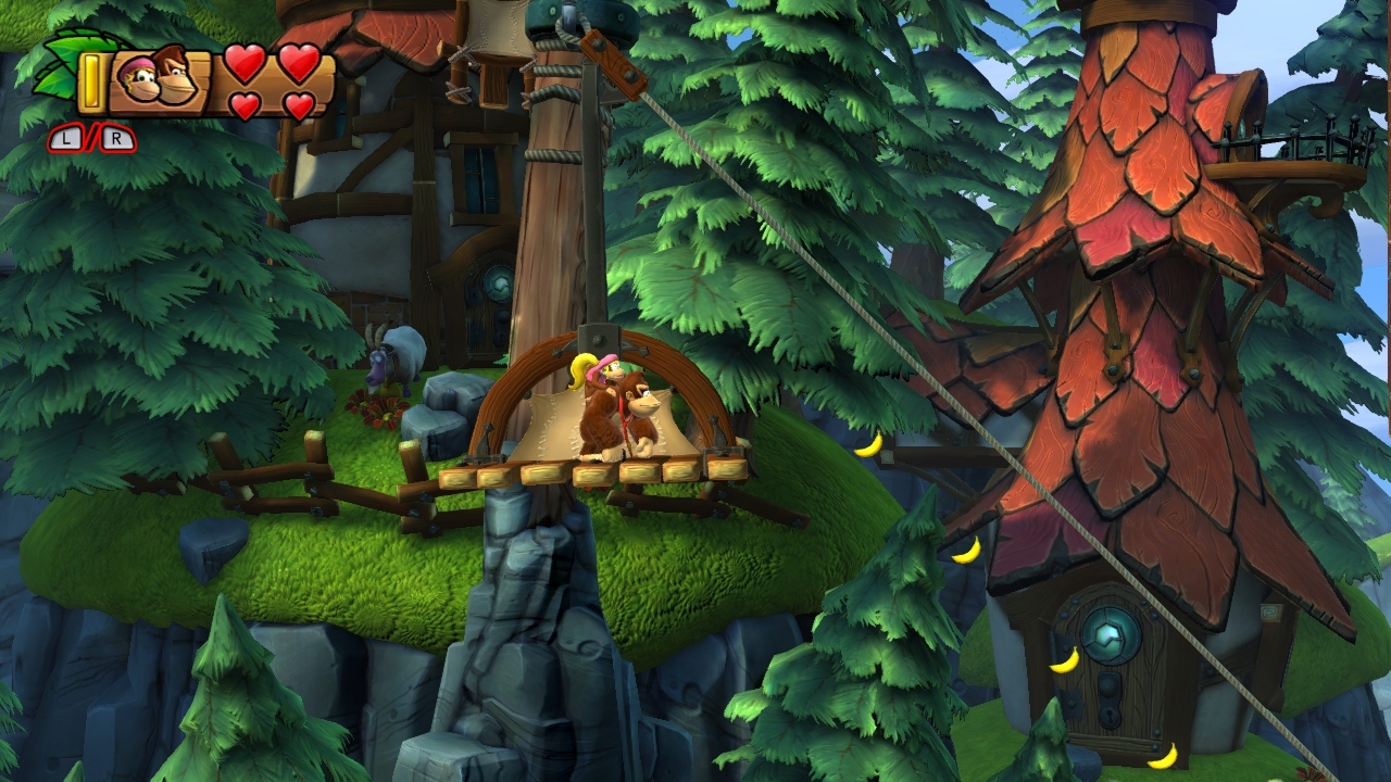
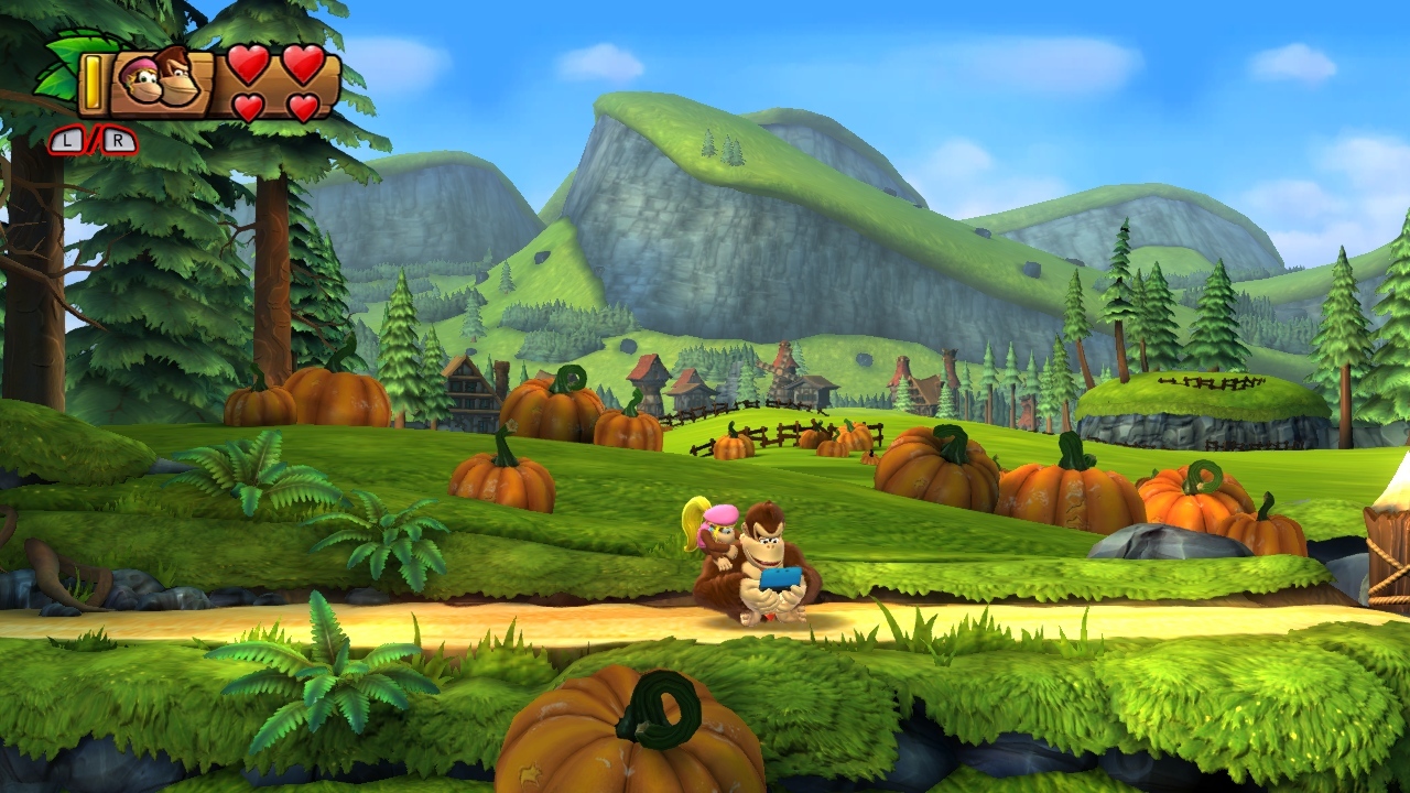
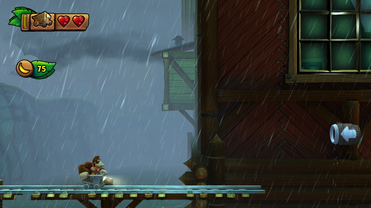
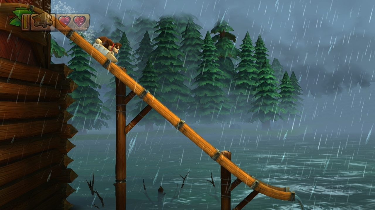
Retro's greatest strength in terms of art design is that they don't reuse structural assets (or at least, they keep it to a minimum). It's exemplified in those 5-1 screenshots. You won't find that geometry recycled in the exact same way anywhere else in the level. From start to finish, every element is placed with artistic purpose. Like this here:
Look at the curling vine at the bottom. That vine doesn't exist anywhere else. The specific curl, and three leaves come out in a bunch, then two, then one, then another one, then two after that. They have a whole toolbox of assets and they place each and every one of them in unique bunches and patterns. The fruit in the background trees will be placed slightly differently in each tree, the vines hung in custom patterns. Leaves overlay the foreground in non-repeating bunches.
All of this comes together to create an actual
place. Like a real place, nothing repeats! Sure, they're the same leaves, the same trees, but they don't just repeat on a grid like they do in the NSMB games. Or hell, like the 3D Marios. It's what's most immediately distinct between Retro's art and a lot of EAD's. You can see it in all three Metroid Primes, and both DKs. Virtually nothing is recycled, nothing repeats.
And it's almost entirely distinct from the FUNCTION of the level, too. There's a huge amount of environmental interaction in these levels sure, but even if they were completely static, they could still look the same. Which I think helps to counter an argument that this art style is paired with a "scripted" kind of feel that would go against something like a Mario game. To the contrary, I think you could have a Mario level play exactly the same, but absolutely implement this kind of artistic design. I think it'd be extremely interesting to hear the actual people behind Retro's and EAD's in-game visual designs talk about how they approach these things. We never really get to hear from them. The closest we get are concept artists, but those aren't the people actually placing the elements in the levels. Gimme those people!
The world is practically a single cohesive piece of art rather than a series of generic boxes and columns click-copied and dragged around to populate the scenery because space has to be filled.
Yeah! I think that's a good way to put it.
...and I bet that's why the filesize for DKCTF is so much larger than that of NSMBU. Each level is basically a unique asset, vs a series of block assets used to build a variety of levels.


