so what do you think GG needs to find that balance? (I'm not up to date with modern anime trends/expectations)
I'm not sure to be honest and it's hard to be objective about the series as I'm an old fan and I didn't like Xrd that much. My opinion is maybe a bit harsh but I think the lack of balance comes from a combination of two things: not being limited as they were before + lost/lack of talent/touch.
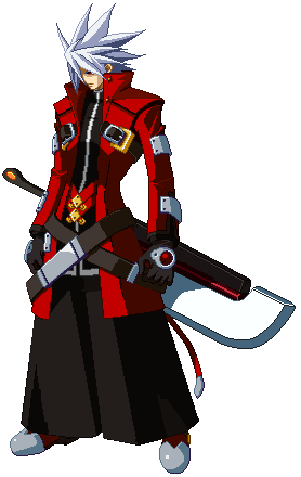
Anyone that made some creative work knows that having limitations is a good thing. It forces you to go right straight to the point and prevents you from taking the wrong way. Xrd in my opinion didn't put his limitations where they should have been. The visual part lost a lot by going 3D as many small details were lost in the process or even character concepts were simply abandoned for technical or stylish reasons (Millia's arms or Potemkin's collar for example). But at the same time other big "LOOK AT ME" things were added while redesigning characters: giant buckles, cliché patterns, muscles for everyone, giant swords...
GG art was the kind to get straight to the point but Ishiwatari's style evolved in the unfortunate "more is better" that you saw a lot these past years, BlazBlue being one of the best representative (look at GG2 Ouverture to see what I mean). Xrd art is still GG and it's still Ishiwatari but the execution is really poor. The concepts are very cool: a character hooked to a living bed, a savage/feline girl with a living coat, a bride with guns, a king lion-like with swords tied to his hands. That sounds to me as cool as a loser haunted by sadako, a livingdead girl in love with a key or a samurai woman with only one arm.
But for Xrd, the concept of the characters are poorly executed. Bedman is ugly and covered with patterns everywhere, his living bed has a catholic/papal crown for no reason other than being flashy. And his only purpose is to explain plot holes in the story mode when nobody knew how to justify something. Ram is probably the most well done. She has a cool design with great designed leg moves and feline attitude. The coat attacks are cool too. But she carries two giant plastic/neon swords because... no reason. Swords are cool maybe? Oh and she is a kind of "no emotion girl n°100000 you see in every anime". Once again a great idea/concept is wasted by added something that is too much. It's like being modest or efficient is not enough.
Elphelt is the same. Once you get used to her positive attitude the character can be pleasant and her moves are fun to watch. But they added too much things on her, making her design unreadable. Hat with rabbits ears, giants rings and belts on the dress for no reason than filling the design. It's like they are afraid of emptiness. As for Leo his design and attitude is cool but his sprites are so badly done it's a shame. His stance is ridiculous but well why not? Look at zappa! But his moves lacks definition, clarity and originality. It's very hard to animate this kind of character and find good ideas when you start from an idle stance that is so complicated but again... Zappa is here to show they had the talent to do it before.
So again, it's my opinion and I perfectly understand you can like these characters or the redesigns. I just feel, as an old fan of GG and as someone who studied art/design and praised a lot Ishiwatari's works, that they missed it with Xrd even if the starting point is still as great as before. For me they were so free of technical/drawing problems they stopped asking themselves some questions about coherent design and efficiency and went nuts with filler. And sometimes, they lacked the talent to do something great with their concepts. For me they need to calm down a bit and forget about the BB design trend, continue to have great and original concept characters but execute them with more care. They also need to stop doing shitty storymode where everyone is "gentle and sweet and cool but has so many problems that makes life so complicated". GG was precisely the game with very borderline characters and it was toned down too much.
There, a wall of text again. :|
Sorry about pronouns CPS2. :|
Edit : just remembered something. I like a lot UNIEL design and they went an interesting road. Even if French Bread was a more dojin/simple character design style, it seems they took a lot of time thinking about it. They started with simple designs, then added a lot of "cool filler things" and came back to a middle ground between efficiency with only details that matters and a touch of style. This Hyde work in progress explains it very well:
UNIEL character concepts are way less original than Guilty Gear but just from a design balance, they are better done in my opinion.


 marvel dabess
 )
)