Triple Da G.O.D!
Member
Gintoki said:Here you go.
Thank You so very much.
Gintoki said:Here you go.

 )
)orangecaramel said:
I think your avatar looks great as it is. Things are going to be a bit blocky when scaled down so much. You could maybe put a small black stroke around the ship (ideally like a 1-2 pixel stroke on the original size one) to make it pop a bit more but really I don't think you need to change anything. You've done a good job =]Mistle said:Okay, I attempted making this for myself but I think somebody here could do it better. I want it to look like my attempt (avatar i'm using at the moment), but with smoother outlines and general appearance. It looks a taaaaad messy at the moment... the lines are a bit disjointed and the colours not as blocky as they could be. If anybody knows what I mean and can improve upon it, i'd be really grateful. Thanks!
http://i.imgur.com/OVYS4.png
NOTE (things I changed): Removed text, rotated a bit so it fix 120x100 perfectly, changed blimp to light blue colour #6fb3ff, and got rid of Conan's beard (don't worry about this though as I already removed it from the large version!
Toppot said:
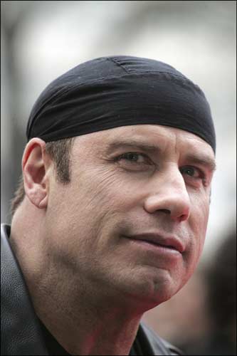
Infamous Chris said:Do you think it's possible to put that small white symbol on Marcus' durag onto this picture of John Travolta, and then add the little crimson omen at the bottom (same side) as well?
http://www.20minutos.es/data/img/2007/06/01/602497.jpg
Would be so awesome.
")


Rotating is always going to give you slightly off line thickness and so on. Also, it's best to choose a resolution which is an integer scaling of 100*120 to avoid issues that odd resolutions can cause. Here's my attempts at improving it:Mistle said:Okay, I attempted making this for myself but I think somebody here could do it better. I want it to look like my attempt (avatar i'm using at the moment), but with smoother outlines and general appearance. It looks a taaaaad messy at the moment... the lines are a bit disjointed and the colours not as blocky as they could be. If anybody knows what I mean and can improve upon it, i'd be really grateful. Thanks!
http://i.imgur.com/OVYS4.png
NOTE (things I changed): Removed text, rotated a bit so it fix 120x100 perfectly, changed blimp to light blue colour #6fb3ff, and got rid of Conan's beard (don't worry about this though as I already removed it from the large version!


Gintoki said:

DJ88 said:I'm really getting frustrated because I spent a long ass time making this avatar, I save it as a gif or png for it to be transparent, and it shows up with this f'ing gray background. Figures the most obscure shit always happens to me. The image is transparent anywhere else but when I use it as an avatar it turns gray for no reason. Here it is transparent.
<<<<And there it is with the stupid gray background. Does anyone know how to fix this?

DJ88 said:weekend warrior you are the best, and I'm sure yours would've worked too orangecaramel. Many thanks to both of you. I had a hunch it may have been the image size (which I had stupidly mixed up and made 120X100 instead of 100X120). Question though. How did you guys resize it so easy? When I tried resizing it in photoshop, the sprite turned all blurry/fuzzy.
DJ88 said:Derp, I can't believe I didn't think about just cropping the sides haha. I went back and checked though and it was in RGB mode. Here's some shots:
Any idea why it does this?
Something like this?randomwab said:Could someone help me out with this one, I have absolutely no Photoshop skill at all.
I want the characters from this as my cut out and where the background was be invisible, so the forum colours show through...if you know what I mean.
If anyone could whip this up, I'd really appreciate it!

Clipper said:Edit: And DJ88, I'm just checking... you did understand that weekend_warrior cropped your image to the right size instead of scaling it, right?
DJ88 said:Derp, I can't believe I didn't think about just cropping the sides haha.
Use Google, find us an image you like, post it here and we'll crop/resize it for you.Kermit The Frog said:Could someone make me a cool Kermit the frog avatar please?


Fuzzy said:Something like this?
ResidentDante said:Like so?
Thanks guys, I think I'll go for the transparent one.Gintoki said:Transparent background if you want:

Went ahead and made a set of three with a red logo and three with a black one.Toppot said:Just saw you wanted the gears logo, not just the dorag xD if you can pick one of the ones above you like and I can put the gears logo, or cog etc ontop or someone else can (Damn social life xD =P)


Narolf said:


")


