• Hey, guest user. Hope you're enjoying NeoGAF! Have you considered registering for an account? Come join us and add your take to the daily discourse.

GAF Indie Game Development Thread 2: High Res Work for Low Res Pay

Status
Not open for further replies.

Ito

Member
It´s a weird problem as horizontally the tiles are good, but vertically they show a 1 or 2px gap. Everything else is scaled correctly. This looks like a very obvious bug in GM, I mean, I´m just using basic stuff.
I guess I´ll have to use surfaces then, Thanks!

BTW I didn´t know now GM draws by default to a surface, that´ll save a lot of work.

I remember having this problem back when I used pixel art graphics, I think there's a solution here: https://www.yoyogames.com/tech_blog/8

@SquirrelWide nice triple post man, use the "edit" button xD
 
Been playing around with graphics ideas. Not sure how viable it is but I think it's kind of cool?

Low resolution rendering + wireframe shader (there are multiple ways to achieve a wireframe but shaders are the most efficient). There is an angle where it can be a bit obscured but I can clean that up.

They're spaceships, the first one is one I got off opengameart, second is one I tried to model, I have very intermediate knowledge when it comes to 3D modelling so it was just something I threw up in 3-5 mins.

This might be worthwhile as a special mode (akin to eagle vision in the Assassin's Creed series), but it would quickly become eye straining if used as the main mode.
 
Does anyone here know if this book on Game Programming patterns is any good? http://www.amazon.com/dp/0990582906/?tag=neogaf0e-20

or know any other good resources for something similar?

I've read through about half this book. Definitely solid. He says in the intro that he's seeking to extend http://www.amazon.com/dp/0201633612/?tag=neogaf0e-20. That book still applies to game programming, but the book you're looking at is going to have more of a game ... flavor.
 

Durante

Member
Goddamnit, this shader is starting to shit me off.

I'm gonna throw my issue here and see if anyone has had experience with this, if not, it's a rant post :( Win-win situation!

(I'm using Shader Forge by the way)

I'm literally missing one thing, replacing bands of shadow with a Hatch texture.

This is what I'm trying to acheive

example1.jpg


Basically what I'm trying to do is remap the Normal Dir/Light Dir dot product into the darkest shade, clamp it, then lerp that as the Time value between the regular Diffuse Texture and the Hatch Texture.

Now after that I'm completely stumped.

I've tried tooling around with it, blending it, multiplying it ,adding it, subtracting it into the rest of the nodes right before the plug goes into Custom Lighting but either it does nothing, or overlays the entire texture over the material, irrespective of angle or light.

So, I'm pretty much banging my head against the wall because I don't know where to go from here.
I did a crosshatching experiment back in 2009.

What I used is a "progressive hatching" texture like this:
hatchgak2v.png

(imagine all of those in one texture)

I basically calculated the brightness based on a normal lighting model, and then blend between different stages of hatching based on that brightness. HTH.
 

PirateHearts

Neo Member
Looking great, ever consider an NES version?

Thanks, it's something that's been at the back of my mind for a while since I've been building with the NES's technical limitations in mind. I'm knowingly breaking the rules in some places (no limit to total number of palettes/colors on screen, no limit to sprites on screen, and so on), but I'd imagine a reasonably accurate port could be done. It would have to be rebuilt from the ground up, and I don't have any real NES dev experience to speak of, but it could be fun to tackle someday.
 

DNAbro

Member
I've read through about half this book. Definitely solid. He says in the intro that he's seeking to extend http://www.amazon.com/dp/0201633612/?tag=neogaf0e-20. That book still applies to game programming, but the book you're looking at is going to have more of a game ... flavor.

thanks, I'm most likely taking a class on Design Patterns in my next semester so I wanted something a bit more specific for personal reading.
 

Razlo

Member
Thanks, it's something that's been at the back of my mind for a while since I've been building with the NES's technical limitations in mind. I'm knowingly breaking the rules in some places (no limit to total number of palettes/colors on screen, no limit to sprites on screen, and so on), but I'd imagine a reasonably accurate port could be done. It would have to be rebuilt from the ground up, and I don't have any real NES dev experience to speak of, but it could be fun to tackle someday.

I went on the NES Dev forum and I've commissioned a coder to port my game to NES, Love seeing new NES games, and yours looks cool and possible with adjustments, so was just asking.
 
Today I got some simple aiming and shooting done plus a nice little laser sight for when aiming.

I'm really happy how fast the basics of this are coming along.


cbdc58e1c8.gif
 

ZServ

Member
Hey guys :)

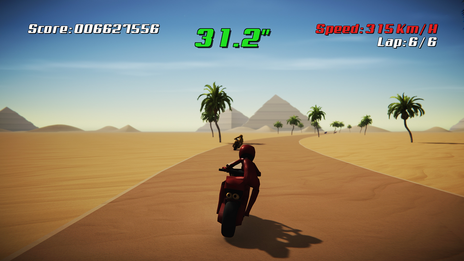
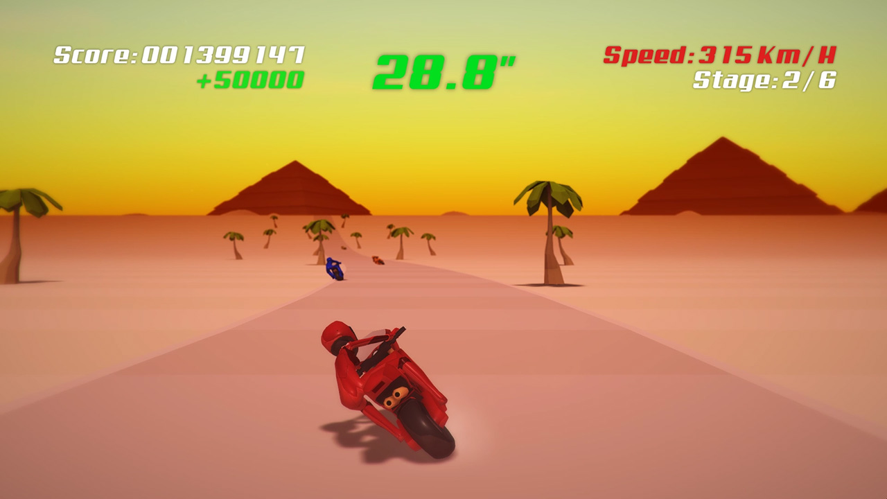
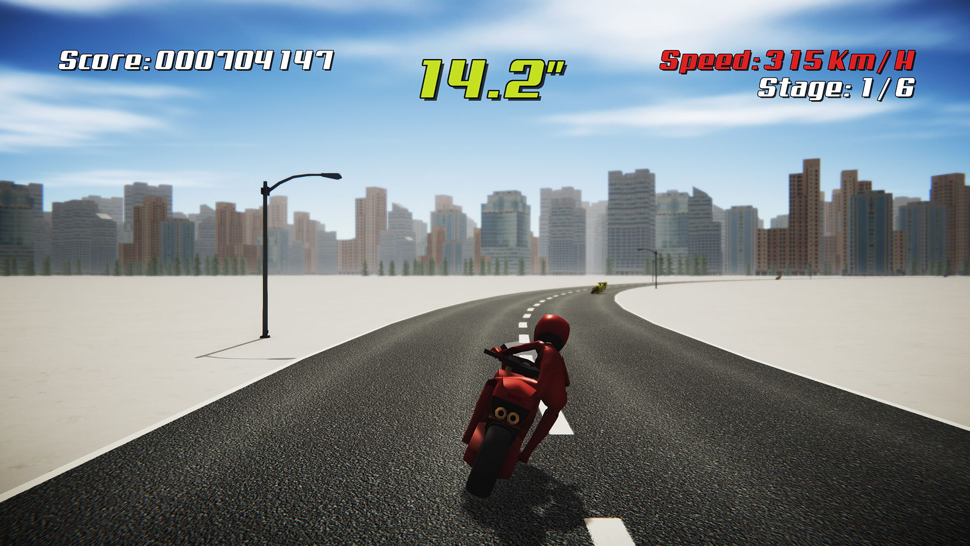
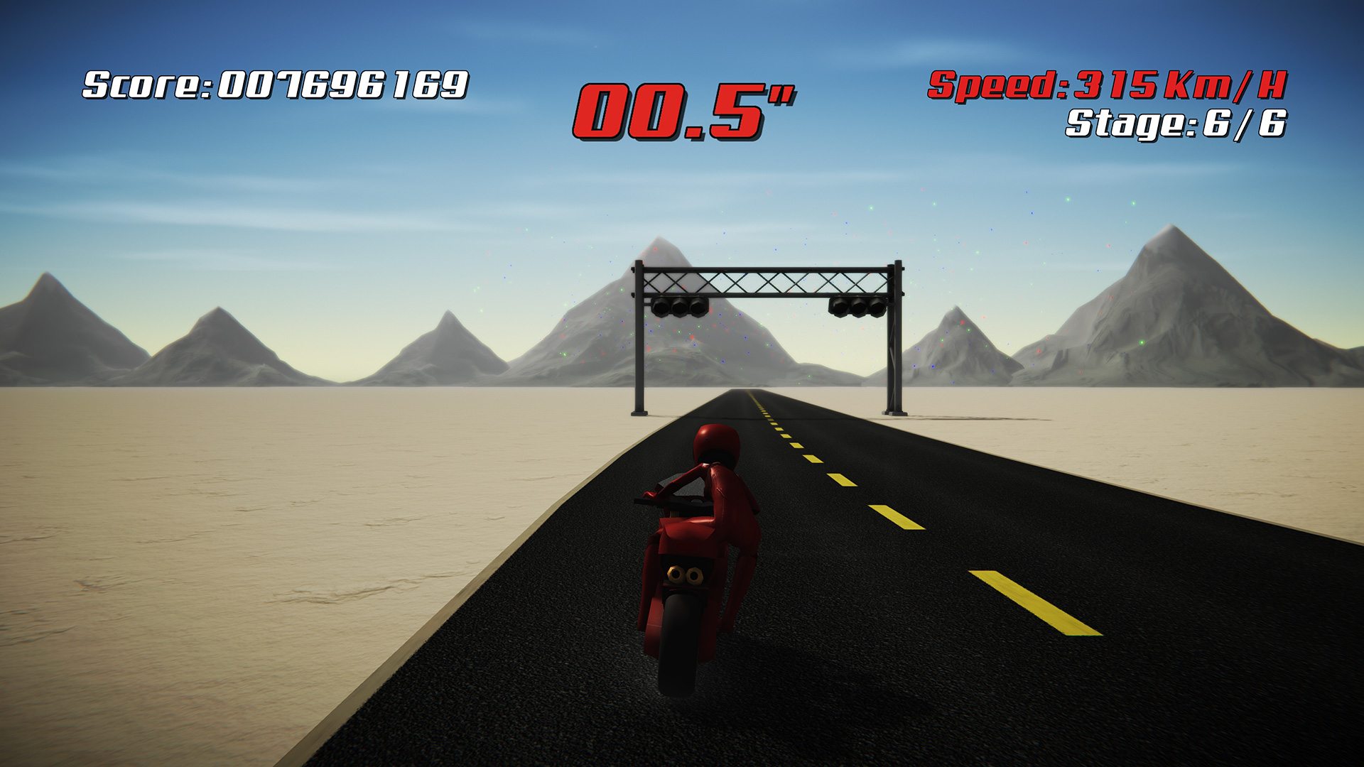
Super Night Riders
has been Greenlit! Awesome :)

I've released the 1st trailer on YouTube. Please check it out!
http://www.youtube.com/watch?v=XEl01buKqm0

Any thoughts?

This looks FUCKING AWESOME. I mean, the game *has* looked awesome but the music and the gameplay just.. perfect 90s feel.

The ONLY thing I have to say that could be even perceived as negative is that during that night race, the racers are a tad hard to see as you come up on them. Perhaps more bloom on the tail lights?

Also, your hud is *functional.* Not what I would call "Great," merely "good enough."

BUT HOT DAMN THAT MUSIC WAS BUMPIN'


Spent most of last night thinking about what wing 2 of dungeon 3 will play like. Still not happy with any of the concepts I've come up with yet. So, I've been working on that "psuedo-random" idea. Essentially, I've created a chunking system. Say, for example, that you have a town with 3 houses. Whenever the player starts the game for the first time, I'll assign each house a number, and then based on what number that house is given (which is random), the houses layout, whose it is, where windows are, etc. is changed. This was done as a "proof of concept" that someone as stupid as I am could do it. Currently have 4 "house" chunks, and then each of those chunks has elements (tiny or big) that change based on which house they're assigned to in the town.

End goal is to do that, except with the "overworld" as well. Create a series of defined spaces that have indistinct exits that could be connected without feeling "off," and then randomly attach them to "make a random overworld." All without giving the player any idea that this is happening, so that if they beat the game without discovering this somehow, upon replaying it, they'll get a totally different experience. :)
 
I did a crosshatching experiment back in 2009.

What I used is a "progressive hatching" texture like this:
hatchgak2v.png

(imagine all of those in one texture)

I never thought to maybe throw in a pure white and pure black texture at the extreme points of lighting! Hmm, that might be something to try.
The problem I'm finding is that it usually bakes over the entire material if I use the
NdotL > Posterize > Remap >Clamp 0-1 > Lerp > Multiply back into the rest of the node graph

I basically calculated the brightness based on a normal lighting model, and then blend between different stages of hatching based on that brightness. HTH.

This is the part where I don't understand :/ How would you normally go about sampling brightness in something like a node-based shader editor or is this something that would have to be done in code instead.

The second part is when you say blend, is that literally Blend (with Source and Destination) or is that more of a term to mean blending it back into the material with Multiply or Add? (I ask this because everyone uses that term a lot and I keep thinking they literally mean to use the Blend node)

Would it be rude of me to share my node graph via PM and have a look over and see what you think?
 
Hey guys :)

Super Night Riders
has been Greenlit! Awesome :)

I've released the 1st trailer on YouTube. Please check it out!
http://www.youtube.com/watch?v=XEl01buKqm0

Here's a few new screenshots:

http://neko.works/upload/425.jpg[img]

[img]http://neko.works/upload/438.jpg[img]

[img]http://neko.works/upload/439.jpg[img]

[img]http://neko.works/upload/441.jpg[img]

Any thoughts?[/QUOTE]

I loved hang on and games like it so it's nice to see another game like this.

Have you tried adding blonde hair to the player's character? it feels like it's missing compared to the artwork and I think it would look cool if you could add something like that without it looking silly or stiff. Just a suggestion though.
 

Blizzard

Banned
Hey guys :)

Super Night Riders
has been Greenlit! Awesome :)

I've released the 1st trailer on YouTube. Please check it out!
http://www.youtube.com/watch?v=XEl01buKqm0

Here's a few new screenshots:

425.jpg


438.jpg


439.jpg


441.jpg


Any thoughts?
I didn't check this out until someone else mentioned the music. The music indeed does go great with the game, and makes it feel F-Zero-esque! Are you using the same sort of music ingame?

Also, I agree with the earlier suggestion -- the graphics look fine in all cases but at night. Other riders are very hard to see there. You could try something simple and silly like a blob light on the road underneath them, and see how that looks.
 

Ranger X

Member
I love it too. I would have magnified the hills though. The game seems flat compared to some classic games of the genre like Rad Racer 2 or again, Top Gear.
 

oxrock

Gravity is a myth, the Earth SUCKS!
Hey guys :)

Super Night Riders
has been Greenlit! Awesome :)

I've released the 1st trailer on YouTube. Please check it out!
http://www.youtube.com/watch?v=XEl01buKqm0

Here's a few new screenshots:

http://neko.works/upload/425.jpg

http://neko.works/upload/438.jpg

http://neko.works/upload/439.jpg

http://neko.works/upload/441.jpg

Any thoughts?
I spent so much time as a kid playing hang on, so a game like this was just really cool to see. I don't know how that kind of gameplay holds up to today's standards but you hit the nostalgia button hard for me.
 

SeanNoonan

Member
You know something I realised this week? I've never really asked for feedback regarding my pixel art. Jack B. Nimble is literally my first attempt at it too... for all I know it could be awful. I don't think it is, but then I've never asked for advice.

It was a weird realisation.

Anyway. Water level is almost done.

U0ZvBox.gif
 

udivision

Member
You know something I realised this week? I've never really asked for feedback regarding my pixel art. Jack B. Nimble is literally my first attempt at it too... for all I know it could be awful. I don't think it is, but then I've never asked for advice.

It was a weird realisation.

Anyway. Water level is almost done.

U0ZvBox.gif

The pixel art seems perfectly fine to me. The lighthouse and water look really nice.

I've watched that gif like 20 times now.
 

Sparse

Member
You know something I realised this week? I've never really asked for feedback regarding my pixel art. Jack B. Nimble is literally my first attempt at it too... for all I know it could be awful. I don't think it is, but then I've never asked for advice.

It was a weird realisation.

Anyway. Water level is almost done.

-snip-
That water kick-up... love it!
 

neko.works

Member
382.png


1st post about one of my upcoming games: Super Night Riders, a retro arcade racing game inspired by 80's classics, mostly Hang-On from SEGA. My goal is to have a similar gameplay with modern visuals.

This looks FUCKING AWESOME. I mean, the game *has* looked awesome but the music and the gameplay just.. perfect 90s feel.

The ONLY thing I have to say that could be even perceived as negative is that during that night race, the racers are a tad hard to see as you come up on them. Perhaps more bloom on the tail lights?

Also, your hud is *functional.* Not what I would call "Great," merely "good enough."

BUT HOT DAMN THAT MUSIC WAS BUMPIN'

Thanks for your feedback!

I loved hang on and games like it so it's nice to see another game like this.

Have you tried adding blonde hair to the player's character? it feels like it's missing compared to the artwork and I think it would look cool if you could add something like that without it looking silly or stiff. Just a suggestion though.

Good idea about the hair. Might give it a try!

I didn't check this out until someone else mentioned the music. The music indeed does go great with the game, and makes it feel F-Zero-esque! Are you using the same sort of music ingame?

Also, I agree with the earlier suggestion -- the graphics look fine in all cases but at night. Other riders are very hard to see there. You could try something simple and silly like a blob light on the road underneath them, and see how that looks.

Happy that you liked the music! Yep, this is one of the tracks available in-game, there's 4 musics to choose from, or you could mute the music and set your personal soundtrack!

I'll experiment adding a halo effect in the back of the rivals at night.

That looks super clean and polished!

Thanks!

I love it too. I would have magnified the hills though. The game seems flat compared to some classic games of the genre like Rad Racer 2 or again, Top Gear.

There's up and down hills currently, depending on the stage of course. But yes, they might be too light. I'll check it out.

I spent so much time as a kid playing hang on, so a game like this was just really cool to see. I don't know how that kind of gameplay holds up to today's standards but you hit the nostalgia button hard for me.

That's my goal with this project: Experiencing the fun of the early arcades with nowadays hardware! Unlike Outrun which had many decent sequels and indie tributes, Hang-On didn't receive much love since the 80s :/

Important news: Super Night Riders is now available on Windows 10 PCs!
microsoft.com/store/apps/9nblggh5gk48

Coming soon on PS4, Xbox One, Wii U, Steam (Windows, Mac, Linux), Vita and Mobile.
 

DNAbro

Member
You know something I realised this week? I've never really asked for feedback regarding my pixel art. Jack B. Nimble is literally my first attempt at it too... for all I know it could be awful. I don't think it is, but then I've never asked for advice.

It was a weird realisation.

Anyway. Water level is almost done.

U0ZvBox.gif

It's actually really fantastic. That background is pretty stunning and the foreground looks great too.
 
You know something I realised this week? I've never really asked for feedback regarding my pixel art. Jack B. Nimble is literally my first attempt at it too... for all I know it could be awful. I don't think it is, but then I've never asked for advice.

It was a weird realisation.

Anyway. Water level is almost done.

U0ZvBox.gif
I think it looks great. Certainly a zillion times better than any of my attempts XD
 

ephemeral

Member
You know something I realised this week? I've never really asked for feedback regarding my pixel art. Jack B. Nimble is literally my first attempt at it too... for all I know it could be awful. I don't think it is, but then I've never asked for advice.

It was a weird realisation.

Anyway. Water level is almost done.

U0ZvBox.gif

A lot of interesting games in this thread. I grew up with a gameboy and I really love the look of your game, especially that hat animation where it looks like it will fly off, and that animated lighthouse - talk about attention to detail.

Don't take this the wrong way, but I think that such an excellent presentation deserves more than the gameplay of a running game. It looks really tight and polished though. Just my opinion :).
 

Belstras

Member
You know something I realised this week? I've never really asked for feedback regarding my pixel art. Jack B. Nimble is literally my first attempt at it too... for all I know it could be awful. I don't think it is, but then I've never asked for advice.

It was a weird realisation.

Anyway. Water level is almost done.

U0ZvBox.gif

Nice work, looks atmospheric and i like how the things move.
 

correojon

Member
You know something I realised this week? I've never really asked for feedback regarding my pixel art. Jack B. Nimble is literally my first attempt at it too... for all I know it could be awful. I don't think it is, but then I've never asked for advice.

It was a weird realisation.

Anyway. Water level is almost done.

U0ZvBox.gif

That looks awesome! I love how the water splashes when you run on it.
 

Noaloha

Member
You know something I realised this week? I've never really asked for feedback regarding my pixel art. Jack B. Nimble is literally my first attempt at it too... for all I know it could be awful. I don't think it is, but then I've never asked for advice.

It was a weird realisation.

Anyway. Water level is almost done.

U0ZvBox.gif

Looks awesome. I don't mean to be unpleasantly critical, but I'd love you to do something more interesting with the mid-ground layer (that scrolling pillar-ey rock formation). For me at least, it doesn't 'fit', both in a depth sense and a place sense.
 

Belstras

Member
eRvfh0g.png

Have been lurking on this thread a bit but would like to share some stuff ive been doing. Hope its ok.
This pic is suppose to be a render for a sort of point and click game. Don't know if I should use this style though might go for regular 2d since i don't have access to motion capture right now :/
 

SeanNoonan

Member
Wow. Awesome replies! Let me jump on them :eek:

The pixel art seems perfectly fine to me. The lighthouse and water look really nice.

I've watched that gif like 20 times now.
It's actually really fantastic. That background is pretty stunning and the foreground looks great too.
Thanks :D I did the lighthouse/water first and built the level around that, each layer forwards.

That looks awesome! I love how the water splashes when you run on it.
That water kick-up... love it!
It looks better when the player jumps out rather that the tide dying down - see this old vine: https://vine.co/v/O9eV52gUhQU
...but I'll take the compliment :D

I think it looks great. Certainly a zillion times better than any of my attempts XD
Thanks, brah - means a lot.

A lot of interesting games in this thread. I grew up with a gameboy and I really love the look of your game, especially that hat animation where it looks like it will fly off, and that animated lighthouse - talk about attention to detail.

Don't take this the wrong way, but I think that such an excellent presentation deserves more than the gameplay of a running game. It looks really tight and polished though. Just my opinion :).
First, thanks. The hat animation is literally the reason he has a hat in the first place - I wanted an more interesting jump animation :D

Second, you're not the first person to say that. This was my first solo game jam (and game) so I wanted to keep a tight scope. A runner seemed like the best option, but I've had feedback from people saying I'm "wasting" the art on such a limited game. I take it as positive feedback - it just means I should scope up a little next time :)

Nice work, looks atmospheric and i like how the things move.
Movement is always the goal - anything that isn't purely for navigation or a hard surface needs to feel alive. I've got so few pixels and colours to work with, I need to get that detail in somehow.

Looks awesome. I don't mean to be unpleasantly critical, but I'd love you to do something more interesting with the mid-ground layer (that scrolling pillar-ey rock formation). For me at least, it doesn't 'fit', both in a depth sense and a place sense.
It used to fit a lot better when there were background platforms as well, but during tests they confused players when the game speed got too intense. I might flag the rock formation asset as something to look at in the future. Thanks!

Also, I did a quick vine of the level I was working on last week: https://vine.co/v/iizrzPQzT2j

And a quick pixel daily...

l0NwuITD7LjIWBHxu.gif


Kinda Grim Fandango... or at least it was supposed to be :D
 

Noaloha

Member
It used to fit a lot better when there were background platforms as well, but during tests they confused players when the game speed got too intense. I might flag the rock formation asset as something to look at in the future. Thanks!

Maybe it's that I associate (perhaps wrongly) that type of rock structure with desert biomes, so it overlaid with a big ol' pretty lake is triggering something. Again I hate to be negative, but something(s) about that layer feels 'off' to me.

The overall aesthetic is delicious though. But you know that already, you talented bugger you. x
 
I'm loving procedural stuff . Why make every level by hand when you can just get the computer to choose it for you . Doesn't work for story focused games but for mine it fits pretty well

Everything here is random

- map layout
- map height
- map colours
- weather
- type of trees
- colour of trees
- colour of the sky
- amount of light in the map

RVCV0Ph.jpg


Also finished the first of my new mech units

JIHcLVl.jpg
 
I've been forgetting to post in this thread recently, but I'm making a ton of progress on a vertical slice for Gunmetal Arcadia Zero. I'm hoping to have that milestone wrapped up by the end of next week, with a playable test build to follow as time permits.

Eyo25If.gif


3krGJKd.gif


X7jdWUH.gif

This looks excellent, definitely far closer to the NES than my games. Really the only limitation I follow is the virtual resolution, tile size, and the color palette. I wanted to do something really strictly NES, and then I started playing with parallax scrolling and other very non-NES features, and it broke pretty far away from that.

If I wasn't a few weeks away from releasing, your gifs would have me very tempted to go back and rework all my backgrounds and art to be more NES like.
 
Hey guys :)

Super Night Riders
has been Greenlit! Awesome :)

I've released the 1st trailer on YouTube. Please check it out!
http://www.youtube.com/watch?v=XEl01buKqm0

Here's a few new screenshots:

Any thoughts?
Congrats :D
I was never a huge super hang-on fan so I'm not the best person to give feedback but I agree with someone's suggestion earlier about maybe bringing the hair in somehow because right now it feels like there's a disconnect between the anime pic and the actual model :eek:

Today I got some simple aiming and shooting done plus a nice little laser sight for when aiming.

I'm really happy how fast the basics of this are coming along.


cbdc58e1c8.gif
Love the dancing guard XD
I really need to look into positional blending stuff sometime. I've mostly been getting by, by chopping up the motion capture unity handed out for free :p

You know something I realised this week? I've never really asked for feedback regarding my pixel art. Jack B. Nimble is literally my first attempt at it too... for all I know it could be awful. I don't think it is, but then I've never asked for advice.

It was a weird realisation.

Anyway. Water level is almost done.

U0ZvBox.gif
Looking good as always, though I almost feel the lighthouse is a bit too much :eek:

I'm loving procedural stuff . Why make every level by hand when you can just get the computer to choose it for you . Doesn't work for story focused games but for mine it fits pretty well

Everything here is random

- map layout
- map height
- map colours
- weather
- type of trees
- colour of trees
- colour of the sky
- amount of light in the map

RVCV0Ph.jpg


Also finished the first of my new mech units

JIHcLVl.jpg
I like the lightning effect :D
 

Belstras

Member
Movement is always the goal - anything that isn't purely for navigation or a hard surface needs to feel alive. I've got so few pixels and colours to work with, I need to get that detail in somehow.
Nice pixel daily XD ehm yeah I see what you mean, making the most of limited specs. Looks professional!
Hey guys :)

Super Night Riders
has been Greenlit! Awesome :)

I've released the 1st trailer on YouTube. Please check it out!
http://www.youtube.com/watch?v=XEl01buKqm0

Here's a few new screenshots:

Any thoughts?
Cool music, nice guitar playing

I'm loving procedural stuff . Why make every level by hand when you can just get the computer to choose it for you . Doesn't work for story focused games but for mine it fits pretty well

Everything here is random

- map layout
- map height
- map colours
- weather
- type of trees
- colour of trees
- colour of the sky
- amount of light in the map


Also finished the first of my new mech units
Impressed how people can do stuff like that. Hexagonal tiles are nice. Looks interesting!
 

Lautaro

Member
Anyone with experience modelling mecha? (anime style mechs) any tips?

I'm trying to combine pieces made by me (in blue) with others of a store asset (in black) so I can just model and leave the animation to a existing skeleton... still, I'm far from happy with the results:

IMT95fA.png


I still think programming is easier, art requires so much patience and I have little.

Anyway, recently I quit my job (again) so I can start another project and one of my ideas involve a tactical RPG with mecha, does that idea sounds interesting to you?
 
Impressed how people can do stuff like that. Hexagonal tiles are nice. Looks interesting!

Thanks , I've relied on alot of excellent unity extensions in the store to give me a boost . Here's another unit . I'm not an artist so I make do with asset store stuff but I hope to find an artist to polish it abit

b7iutmn.jpg
 

_machine

Member
You know something I realised this week? I've never really asked for feedback regarding my pixel art. Jack B. Nimble is literally my first attempt at it too... for all I know it could be awful. I don't think it is, but then I've never asked for advice.
Honestly it would be hard for me to point out which areas could use improving; the game visually reminded me immediately of a Jurassic Park game on Gameboy, and my memory tells me it's one of the better looking games of the era, so I'd say it's been in point visually right from the start. I really like the water kick-up a lot, too.
 

SeanNoonan

Member
Thanks, people. I feel more confident; at least in regards to aesthetics.
Maybe it's that I associate (perhaps wrongly) that type of rock structure with desert biomes, so it overlaid with a big ol' pretty lake is triggering something. Again I hate to be negative, but something(s) about that layer feels 'off' to me.

The overall aesthetic is delicious though. But you know that already, you talented bugger you. x
Thanks! And yeah, perhaps they are more typical to deserts but they seemed (at the time) the right aesthetic choice. But they're definitely the weakest element of the scene, so I might go back to them at some point.

Looking good as always, though I almost feel the lighthouse is a bit too much :eek:
I can see that - though you barely notice it while playing ;D

Honestly it would be hard for me to point out which areas could use improving; the game visually reminded me immediately of a Jurassic Park game on Gameboy, and my memory tells me it's one of the better looking games of the era, so I'd say it's been in point visually right from the start. I really like the water kick-up a lot, too.
Haha, I remember that game - that menu in the dinosaurs mouth XD

l0NwJlPexJplOdFza.gif


Nice pixel daily XD ehm yeah I see what you mean, making the most of limited specs. Looks professional!
That animation is really cute :D
Thanks :D
 
Before I even show anything, can I just say how gorgeous everyone's games in this thread looks?

It would take up the entire page if I quoted everyone so know that, DAMN.


This screenie doesn't have any of the shaders that I've been working on, nor any of the little visual details that I'm planning for it.
I'm not sure if it's going to be in the "demo" yet, there's still a bit of work to be done for it (skybox, music, getting rid of some effects and adding a few effect and alterations, especially the terrain map)

Basically it's the first "area" of the chapter that you enter.

outpost.png


Sidenote, I went back today and played a bit of older games to see if it could jump start my level design mentality and it's made me think of all these little visual touches that'll add to the progression of the player.

The overall puzzles have been done for the hostile area, now it's a matter of putting them in :p

That looks great. What sort of game is it? A puzzle game like the witness?
 
That looks great. What sort of game is it? A puzzle game like the witness?

It's kind of a mishmash of a lot of things.

It's an RPG but the puzzles are a weird mashup of Zelda and Curse of Monkey Island.

It'll probably make more sense once I put together a trailer and I can talk about it a bit more.
Hopefully soon, the three "locations" are ramping up.
The most amount of work to do are actually the battles themselves :p
 

correojon

Member
With all the latest talk about level editors I decided to start developing one for my game. It´s taken far less work than I expected, but it´s still lacking many things:
UHzfayO.png

It already has almost all the basic functionalities: zoom, tabs for element grouping, some bars for quick navigation, autoscrolling with the mouse, add & delete elements...And most of all, instant switch between edit and play modes: you can play directly in the editor panel and add or modify elements at the same time.
 
Status
Not open for further replies.
Top Bottom