• Hey, guest user. Hope you're enjoying NeoGAF! Have you considered registering for an account? Come join us and add your take to the daily discourse.

GAF Indie Game Development Thread 2: High Res Work for Low Res Pay

Status
Not open for further replies.

LordRaptor

Member
That must look great in movement, almost thought the robots were 2D.

jCJqJfx.gif


I have a bunch of weight painting and cleanup of bones to do, but I'm going ALL IN on toon-shaded
 

Pehesse

Member
Finding this balance will be the key and it´s going to be very hard. Anyway, I sent you a PM ;)

I haven´t played ZX3. Is the ZX series good, compared to the X and Z series?

Replied! Though about ZX: there is no ZX3, unfortunately! As for the other two, ZX is a little more exploration based than Zero (itself way more than X), basically taking the structure of Zero 1 (a big interconnected world segmented into stages) and expanding upon it through more intricately interconnected stages and some branching paths, though not on any Castleroid level. Advent, as I recall, is slightly more mission based, through the levels still have connections - it's more concerned about the player transformations and weapon powerups, though it was a bit disappointing how it didn't affect the traversal as much as it could've.

They're still cool games I'd recommend playing just for the fun factor, though :-D
 

missile

Member
One of those old monsters I spoke about recently is Paul Heckbert's median-cut
algorithm [1] for color quantization 24-bit images -- your parachute for landing
onto an 8-bit colored world out of an 24-bit sky. xD I've implemented this old
algorithm to see how it holds up against graphics I want to throw at it.

I composted sort of an extrem image of many colors and some highlights.

Here is the result;

4WqM5Zs.png

original

BEi0QEo.png

median-cut after Heckbert '80

Despite the median-cut algorithm can deliver many colors/shades, it cannot deal
so good with highlights (few yet important colors). This isn't a huge problem
if you quantize natural scenes which are virtually absend of any highlights so
to speak. However, synthesized computer generated images do generate isolated
colors (more often than not) which are quite important for the visual
appearance of the whole image. In the 80s there weren't that much computer
synthesized images which needed their few important colors to be tracked. It
seems that the median-cut algorithm was more or less developed towards natural
images which can also be inferred from the choice of test images chooses by
Heckbert in his thesis. However, the algorithm isn't usually as bad as shown
above. If I would take away some of the many similar colors in my synthetic
image, the highlights will come up to a given degree.

Without stong single highlights, color reproduction is quite good;

9FRtpiZ.png

original

pJqW7pf.png

median-cut

However, for synthesized images it becomes a different game. The algorithm needs
some tuning to include colors which are only a few in amount, yet are very
important for the whole image. Of course, including such significant colors into
the palette, we have to leave some others out. That's what I'm up next, i.e.
adapting the algorithm in such a way that one can adjust the inclusion of
important colors like highlights etc..

What's good for?
Well, I want to have at least one quantizer for my low-res adventure which is
able to (quasi-) optimal down convert 24-bit images into <= 8-bit palette images
without distorting the image way too much. When doing low-res graphics it is
good to have a way to gently de-rez 24-bit images.

Ref:
[1] Heckbert, Paul: "Color image quantization for frame buffer display" (1980)


Edit:
some specific details
- 24-bit 3d histogram used
- color translation via minimum euclidean distance
(exhaustive search through the optimal palette)
 

LordRaptor

Member
If I remember correctly, the source of that image is actually from playboy, but there were complaints so it was cropped appropriately.
On a semi-related note, the first ever torrent file was a porn movie, and when it started getting big they changed it to a linux distro as a proof of concept for swarming distribution of large files.

Programmers, eh? XD
 
Hey fellow devs. Just wanted to announce that GunWorld 2 launched today on Xbox One and is currently getting reviews all 7+ out of 10. Anxious and happy and overwhelmed to have the game out.
 

Pehesse

Member
Hey fellow devs. Just wanted to announce that GunWorld 2 launched today on Xbox One and is currently getting reviews all 7+ out of 10. Anxious and happy and overwhelmed to have the game out.

Congrats! :) I wasn't sure about your marketing direction from what I could see on twitter (even ironically, "sequel no one wanted" sounded like a pretty dangerous tagline) but it looks to be paying off!

Also, I'm amazed you managed to complete two games since I started making *one*, but I'll take that as a sign I should get moving faster!

If I remember correctly, the source of that image is actually from playboy, but there were complaints so it was cropped appropriately.
On a semi-related note, the first ever torrent file was a porn movie, and when it started getting big they changed it to a linux distro as a proof of concept for swarming distribution of large files.

Programmers, eh? XD
Indeed.

Lena is an icon of computer graphics, like a few others.

Thats... highly specific trivia :-D
 

Minamu

Member
Man, I've heard that getting a foot in the door was gonna be rough, but this is getting ridiculous. First I fall through the cracks (literal excuse I got) and didn't get a design internship. And now I can't even get an entry-level QA gig at the moment, even with a relevant education, plenty of portfolio material and QA experience both inside and outside of school :lol

Good news is, I managed to follow along with a camera collision tutorial and impressed my small team of programmers with it and we're trying to implement it in our own project :D Having a project and seeing it transform and getting better is such a cool feeling, I love it so much :)
 

missile

Member
It didn't happen =P?


My son is starting to fuss so I can't link all of the reviews, but check www.m07games.com and I've posted all but one of the released reviews so far. The one I didn't post there you can find on my twitter.
You spite these games fast! I like the simple style and the music. Some
funny ideas in there. Btw; did you made the music all by yourself, too?
 
You spite these games fast! I like the simple style and the music. Some
funny ideas in there. Btw; did you made the music all by yourself, too?

I was very involved with and helped direct and flow the music, but I didn't compose it myself. I had a buddy help.

GunWorld 1 actually came out in late 2014, so GunWorld 2 wasn't really done *that* fast. For a lot of people it just seems really fast because while I was working on GunWorld 2, I also did the Xbox One port of GunWorld 1, which released last September.
 

missile

Member
I was very involved with and helped direct and flow the music, but I didn't compose it myself. I had a buddy help.

GunWorld 1 actually came out in late 2014, so GunWorld 2 wasn't really done *that* fast. For a lot of people it just seems really fast because while I was working on GunWorld 2, I also did the Xbox One port of GunWorld 1, which released last September.
Still looks fast from over here. ;)


Congratulations :)

Actually, one of my games, Super Night Riders is also available for pre-order on Xbox One today!

447.png
Congrats! Looks pretty smooth. Yet I think the game needs some more "bumps",
because looking at it in motion somehow feels like looking at a still images
at times. ;)


No flashy screenshots yet, but I managed to pull myself away from DOOM long enough to stream some development: https://www.twitch.tv/sean_noonan/

Stop by, say hi :D
Hi! xD Well, I've put that on my watchlist!


On the other news;
Before optimizing the median-cut color quantizer (posterizer as it is known in
some programs) for the highlights, I'm going to implement another quantizer
over the weekend based on an octree, i.e. searching the RGB space for optimum
colors while partitioning it into an octree, which should give at least more
balanced color allocation for the color palette than the media-cut algorithm
given the frequency of the colors occurrence in the image. However, this won't
address the highlight issue either, but I think it will be easy to tag those
partitions in the tree which have low frequency color, perhaps determined by a
threshold, to be included in the color map while still getting uniform
allocation for all the others.

I'm interested to know whether any of the graphics tools ever lets you adjust
the quantizer/posterizer to optimize for the highlights? A quick look at
Gimp's Image to Indexed Mode reveals nothing of this kind. Another interesting
feature would be to let the artist actually select colors (s)he definitely
wants to have in the color palette after quantization. Never saw something
like this, despite it seems trivial to implement given that one just needs to
artificially increase the color's frequency within the 3d histogram. So for
example, if you want to quantize an image of a human face you can select some
colors around the eyes such that the eyes will keep strong even after
quantization. Uh, that's interesting!
 
hey fellow gafdevs :) i have spent a bit of time this weekend rejigging my game style.

Previously it was a standard turn based game with minimilist scifi mecanic but i want to make it stand out abit more.

My plan is to give it a kind of brutal sports game , letting you build attack/defense plays on the fly and throwing in some brutal violence :) . The goal is to make it very much a pickup and play quick match style game like rocket league.

Finally found an artist willing to help me with a makeover so these are kind of placeholder but kind of shows the style i am going for

  • Tentative Title of Bullet Bowl
  • Build your team on the fly, Want two quarterbacks ? Can do that but it will use up most of your money. Money is slowly tricked out each turn.
  • Plan to have traps layered around the arena
  • Plan to have bonus tiles which the player special bonuses
  • Dynamically changing arena, with the arena slowly being destroyed every turn
  • Different Countries and arenas to choose from

2EwZMHL.gif


jtm15T3.gif
 

missile

Member
... My plan is to give it a kind of brutal sports game , letting you build attack/defense plays on the fly and throwing in some brutal violence :) . The goal is to make it very much a pickup and play quick match style game like rocket league. ...
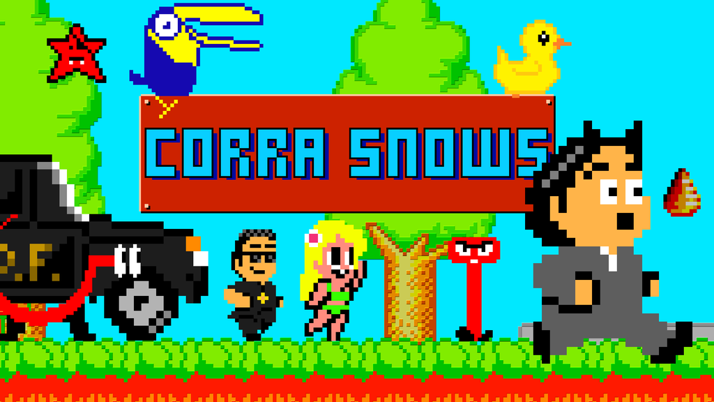
Uhhh, now we are talking! :+
 

Speely

Banned
hey fellow gafdevs :) i have spent a bit of time this weekend rejigging my game style.

Previously it was a standard turn based game with minimilist scifi mecanic but i want to make it stand out abit more.

My plan is to give it a kind of brutal sports game , letting you build attack/defense plays on the fly and throwing in some brutal violence :) . The goal is to make it very much a pickup and play quick match style game like rocket league.

Finally found an artist willing to help me with a makeover so these are kind of placeholder but kind of shows the style i am going for

  • Tentative Title of Bullet Bowl
  • Build your team on the fly, Want two quarterbacks ? Can do that but it will use up most of your money. Money is slowly tricked out each turn.
  • Plan to have traps layered around the arena
  • Plan to have bonus tiles which the player special bonuses
  • Dynamically changing arena, with the arena slowly being destroyed every turn
  • Different Countries and arenas to choose from

2EwZMHL.gif


jtm15T3.gif

That is... quite a change in direction. I like it, though. I am officially asking for updates and any peeks into your development pipeline for the game this has become. Also, best of luck! It's a cool idea.
 
That is... quite a change in direction. I like it, though. I am officially asking for updates and any peeks into your development pipeline for the game this has become. Also, best of luck! It's a cool idea.

Thanks it is a fairly big change but I feel the older build was a little too generic , whilst tactically it played well I feel it had a fairly boring rts look to it .

Can see the older look here :

https://youtu.be/o8GIWIY-_Ho

f98c1ft.jpg


With some minor tweaks to the game rules and some bigger art changes I feel like it could be abit more noticeable .

Anyway I'm looking for some artists and unity coders to get it to where it needs to be but I'm Hopefull it can become a nice quick / action sports game.

Something abit like frozen end zone but with guns and more violence :) . Plus throwing in arenas with traps , a constantly changing arena it could be something unique .
 

KOCMOHABT

Member
Haven't posted in a while, haven't had much time to work on the game lately.

I am experimenting with more postprocessing.

I sample the depth map and distort all the stuff that is further away than threshold to simuate some desert heat. Obviously not a hard cut.

Stuff like muzzleflashes etc. are also distorted. Well, it's a start.

y6BAXpc.gif


Apart from that I tweaked the bloom.
I was thinking about how to change the distance things blur.

Usually bright things would blur all the same, just with different intensities.

My idea was to not work with thresholds and stuff, but instead blur everything BUT with a twist. Sample the luminance at the current position and have the blur distance based on the inverse of said luminance (with some min and max, i can't divide by zero obviously)

That means dark pixels sample from very far away, while bright pixels sample from closer distances.

I don't know, early tests look promising, but I haven't spent too much time on that, yet.

Most of the time I have been improving stuff "behind the scenes", a lot of systems are more efficient now.

Apart from that, I implemented filmic s-curves at one point, and I tried out a variety of them, but wasn't very happy with the results. At one point I may have to make a switch to HDR rendering with filmic tonemapping, but I'm not really sure I need to do that.

Lately, with the introduction of some new post processing modules, I thougth about contrast/s-curves again, but this time on the (still LDR image) post.

I love some s-curves in photoshop and put together a function in Theta which looked a bit like what i want.

The website is awesome btw: http://thetamath.com/app/y=x-sin(x*2*3.14)*0.05

(Maybe more interesting? http://thetamath.com/app/y=x-sin(x*2*3.14)*0.05+sin(x*3.14)*0.2 or http://thetamath.com/app/y=x^((1)/(1.8))+sin(x*2*3.14)*0.05)

The question then was - how do I apply the changes?

I can read the brightness of a pixel in several different ways.

For example, i can read luminance (more emphasis on green value) or simply add all color values and divide by three OR take the maximum value when comparing RGB.

Each of these will produce different results, and I liked the max one the most.

Anyways, here are the results (going from -0.1 to 0.1)

8UuIZW0.gif


It turned out I like the image more with less contrast, looks cleaner, something I didn't expect beforehand.

EDIT: Wow i don't usually make blog posts here on GAF. Just liked to write stuff, now it's a wall of text -.-
 

shaowebb

Member
Adventures of Shuggy (has a free demo) is a pretty interesting platformer from the 'cautionary tale' side of things, because it honestly doesn't get anything wrong, is absolutely bursting with mechanics, and jam packed full of levels applying those mechanics in interesting ways.

You've probably never heard of it, let alone played it.

e:
Crap, top of page... uhh.... here's some robots making funny faces I made
vSQQ27z.jpg

jCJqJfx.gif

Nice stuff coming out of your art style with this toon shading. If you wanna see some fun stuff check out ramp shaders with the outliner effects turned on. You get some killer stuff that way.

I know I said I'd never reveal my art because of the whole Potemkin ripping off Panzerfaust thing but here's a cropped comparison shot of some old armor work I did using ramp shaders on whites and blacks only with outliner effects turned on.

6fa3LnU.jpg

dyyeGDB.jpg


What I'm using up there is in fact some HEAVILY TWEAKED .MTL files for zbrush that someone developed that utilizes rampshader principles like a toonshader on the second one. You can honestly recreate all that by spending time tweaking your settings on falloff and such in zbrush and stopping when it gets to how you like it. I'm currently having to adjust these per object anyhow. The top is pure rampshader and produces nearly the same effects.Sorry its not a BPR and is kind of grainy. Like I said...early cropped screenshots but you should get what I'm trying to say here from these examples on how to get those effects using ramp shaders.

You can get some SERIOUS pop happening for your stuff using ramp shaders. This is all just from the ramp shader and outliner too with no additional maps or any photoshop texture painting yet which means I could paint a bunch of patterns and designs on this for the UV's and it'd still get these effects on top of them. General rule of thumb I've found is if you go from one extreme to the other (white then black then gray) you get a metallic effect because it puts the white as a rim highlight followed by a very sharp falloff all the way to black that fades out to grays. This is how chrome works. You go from a highlight to heavily warped refraction that creates a sudden divide to black. As the distortion fades across the object it goes gray. With color it'd be Lightly tinted white then either a dark or primary color fading into a neutral less saturated and less dark version of the color.

For more plasticy stuff just go a normal ramp and go from dark to light on the gradient setup for the ramp shader's colors. The ramp shader will put those hard less transitional comic book/cartoonish edges between the shades as it ramps through the gradient across your model.

I'm still experimenting to see if I can add ramp effects to lights themselves to create unique effects on scenes as they spill light over objects, but its not working as I'd hoped. As far as shaders for objects go I highly recommend ramp shaders. Experiment and have fun.
 

shaowebb

Member
I guess while I'm at it I may as well give an update on stage work.
These are some lighting tests on some textures my wife did up in photoshop. We both paint comic book style shading but she's better than me so she's helping me out. What you see below has no depth map, no diffusion, no specular...no NOTHING. Thats a solid rectangular with just a texture map and an area light in Blender. We're gonna combine textures hand painted like this, with the material shaders, and if we hand paint any blacks we will make those into different maps to overlay and appear only when the lighting is appropriate on the model to trigger those shadows to appear. All that plus more shading painted permanent onto the models to give us a Platinum games style TMNT shading style.


Thoughts so far on how the shading tests are coming?
 

JulianImp

Member
Today was a really taxing day, mentally speaking. The small indie team I joined a little over a month ago had a really serious meeting where we had to decide whether we'd let the game be and release it even if it was bad, or spend some more time to actually rethink the base mechanics and game design to give it a second selling point besides "it looks pretty". Turns out part of the team was burnt out on the project due to a broken work pipeline that led to them over-iterating art while the game design was kept as-is and they never got the time to actually polish it to make a fun and appealing game.


Thankfully, me joining the team afforded them an "outsider" point of view to spur a debate on whether everyone was actually happy with the product they were making, and we ended up deciding on overhauling the design but doing so by putting a cap on how long we'd keep the artists and the other programmer working on this project, so that we'd lock things in asset-wise and they could begin brainstoriming stuff for the next project while we work level designs.

Talking about game design it was really hard for the game designer, who was really burnt out due to having to play the role of producer/PR guy, but that wasn't all. The flawed pipeline and his relative inexperience in game and level design were two pretty big issues, but then I also learned that they originally set out to make it as a free mobile game (which justified the very simple design) until they saw it'd look and play much better on PC; the constrained design space was already set in place by then, which stunted the game's growth in the design department even though the platform change did allow the art to look way better due to the bigger screen resolution.

Right now we've set the goal of releasing a demo for a local indie games showcase to be held next Saturday, and we'll try our best to see if we can take a demo of Drop Alive that's as close as possible to being the full game and showcasing it at this year's Tokyo Game Show as part of their new latin developers area. I'm really hoping things work out well and the team ends up with a good game to show for it that also makes each one of us glad that we worked on its art, music, design, code or PR.
 
This game looks super cool but I'm honestly not feeling the chromatic aberration. It's something I've noticed is really overused and in fantasy games (Witcher 3 did it) or what looks like post-apocalyptic like this, I don't really know if it's appropriate? Like, it's a techy, sci-fi display effect, not something I'd associate with predominantly natural environments like you have here.
 

Jumplion

Member
Today was a really taxing day, mentally speaking. The small indie team I joined a little over a month ago had a really serious meeting where we had to decide whether we'd let the game be and release it even if it was bad, or spend some more time to actually rethink the base mechanics and game design to give it a second selling point besides "it looks pretty". Turns out part of the team was burnt out on the project due to a broken work pipeline that led to them over-iterating art while the game design was kept as-is and they never got the time to actually polish it to make a fun and appealing game.

Thankfully, me joining the team afforded them an "outsider" point of view to spur a debate on whether everyone was actually happy with the product they were making, and we ended up deciding on overhauling the design but doing so by putting a cap on how long we'd keep the artists and the other programmer working on this project, so that we'd lock things in asset-wise and they could begin brainstoriming stuff for the next project while we work level designs.

Talking about game design it was really hard for the game designer, who was really burnt out due to having to play the role of producer/PR guy, but that wasn't all. The flawed pipeline and his relative inexperience in game and level design were two pretty big issues, but then I also learned that they originally set out to make it as a free mobile game (which justified the very simple design) until they saw it'd look and play much better on PC; the constrained design space was already set in place by then, which stunted the game's growth in the design department even though the platform change did allow the art to look way better due to the bigger screen resolution.

Right now we've set the goal of releasing a demo for a local indie games showcase to be held next Saturday, and we'll try our best to see if we can take a demo of Drop Alive that's as close as possible to being the full game and showcasing it at this year's Tokyo Game Show as part of their new latin developers area. I'm really hoping things work out well and the team ends up with a good game to show for it that also makes each one of us glad that we worked on its art, music, design, code or PR.

Yeah, it's always important to take a step back every now and then to figure out if the game is going in a good direction. Always sucks to worry that you've wasted months of your time, sunk cost fallacy is a fun one to deal with, but at least you're salvaging what you can. Best of luck in turning it around, first step fixing a problem is admitting it exists.
 

KOCMOHABT

Member
This game looks super cool but I'm honestly not feeling the chromatic aberration. It's something I've noticed is really overused and in fantasy games (Witcher 3 did it) or what looks like post-apocalyptic like this, I don't really know if it's appropriate? Like, it's a techy, sci-fi display effect, not something I'd associate with predominantly natural environments like you have here.

Thanks For the feedback.

No worries, I know many people hate it, I will leave it up to the player to toggle on or off.

As of right now I obviously don't have a lot of content and as I am working on special effects I have to exaggerate them at first, just so I can see/evaluate them properly / determine artifacts and other problems

Stuff like vignette, CAs, blur, bloom, high/low contrast etc will probably end up a lot more subtle.
 

correojon

Member
loving the almost candy like look! I love those wind effects too... almost considered doing some for my game today.

The enemy usefulness reminds me a bit of how Braid did it which is a great thing.
Glad youl like it :) I think your game and mine are totally opposite regarding art: yours highlights the dark parts and I´m trying to make it more colorful and cartoony, they really are like night and day when seen side by side. What engine are you using? If you´re using GMStudio I can post the code for the wind effect if you want it.

The enemy thing was based on Mario (just Goombas coming out of pipes) but now that you mention Braid, I just beat it 2 days ago so maybe it´s subsconsciously affected the design without me noticing. Nice eye!

Today was a really taxing day, mentally speaking. The small indie team I joined a little over a month ago had a really serious meeting where we had to decide whether we'd let the game be and release it even if it was bad, or spend some more time to actually rethink the base mechanics and game design to give it a second selling point besides "it looks pretty". Turns out part of the team was burnt out on the project due to a broken work pipeline that led to them over-iterating art while the game design was kept as-is and they never got the time to actually polish it to make a fun and appealing game.


Thankfully, me joining the team afforded them an "outsider" point of view to spur a debate on whether everyone was actually happy with the product they were making, and we ended up deciding on overhauling the design but doing so by putting a cap on how long we'd keep the artists and the other programmer working on this project, so that we'd lock things in asset-wise and they could begin brainstoriming stuff for the next project while we work level designs.

Talking about game design it was really hard for the game designer, who was really burnt out due to having to play the role of producer/PR guy, but that wasn't all. The flawed pipeline and his relative inexperience in game and level design were two pretty big issues, but then I also learned that they originally set out to make it as a free mobile game (which justified the very simple design) until they saw it'd look and play much better on PC; the constrained design space was already set in place by then, which stunted the game's growth in the design department even though the platform change did allow the art to look way better due to the bigger screen resolution.

Right now we've set the goal of releasing a demo for a local indie games showcase to be held next Saturday, and we'll try our best to see if we can take a demo of Drop Alive that's as close as possible to being the full game and showcasing it at this year's Tokyo Game Show as part of their new latin developers area. I'm really hoping things work out well and the team ends up with a good game to show for it that also makes each one of us glad that we worked on its art, music, design, code or PR.
Very interesting post, thanks for sharing the insides of your team. I remember Phil Fish saying in IndieGame: The Movie that while making Fez he had spent 2 years looking closely at a small window and that he was terrified he had lost all ability to perceive any glaring flaws in the game. Getting an outside opinion about the game is really important, it´s cool you could provide that. Now go and make a great game!
 

LordRaptor

Member
You can get some SERIOUS pop happening for your stuff using ramp shaders.

I had a pretty good result with more complex models with some ramp shaders and a 'crosshatching' style shadow texture to get a roughly similar effect to Hotel Dusk (but still visibly 3D) but I'm interested in going even more abstract and less detailed than I already am...
I'm humming and hahing over whether the cartoon faces I made are too much detail in fact, and thinking about if I could simplify further and just use a pair of lights Eve from Wall-E style while still being able to convey facial expressions...

e:
A picture is a better explanation
DHKJxjk.jpg


e2: also doing it this way solves my previous issue about duplicating faces and having a second transparent material 'face' texture - I can just use a regular material for the face map, and not care about my albedo colouring on the rest of the model, as it will always be a faux-glossy black panel. I'd probably remodel slightly too, and make it a bevelled flat face
 

shaowebb

Member
I had a pretty good result with more complex models with some ramp shaders and a 'crosshatching' style shadow texture to get a roughly similar effect to Hotel Dusk (but still visibly 3D) but I'm interested in going even more abstract and less detailed than I already am...
I'm humming and hahing over whether the cartoon faces I made are too much detail in fact, and thinking about if I could simplify further and just use a pair of lights Eve from Wall-E style while still being able to convey facial expressions...

e:
A picture is a better explanation
DHKJxjk.jpg


e2: also doing it this way solves my previous issue about duplicating faces and having a second transparent material 'face' texture - I can just use a regular material for the face map, and not care about my albedo colouring on the rest of the model, as it will always be a faux-glossy black panel. I'd probably remodel slightly too, and make it a bevelled flat face

Oh I like this much better. Its super cute. Definitely try this :)
 

correojon

Member
I had a pretty good result with more complex models with some ramp shaders and a 'crosshatching' style shadow texture to get a roughly similar effect to Hotel Dusk (but still visibly 3D) but I'm interested in going even more abstract and less detailed than I already am...
I'm humming and hahing over whether the cartoon faces I made are too much detail in fact, and thinking about if I could simplify further and just use a pair of lights Eve from Wall-E style while still being able to convey facial expressions...

e:
A picture is a better explanation
DHKJxjk.jpg


e2: also doing it this way solves my previous issue about duplicating faces and having a second transparent material 'face' texture - I can just use a regular material for the face map, and not care about my albedo colouring on the rest of the model, as it will always be a faux-glossy black panel. I'd probably remodel slightly too, and make it a bevelled flat face
This looks awesome, go for it!
 

LordRaptor

Member
I do like the 'eyes only' version, my big concerns are;
1) It's a bit too 'on the nose' in similarity to Eve from Wall E (pic below) and I reeeeeeeally don't want to get into infringement territory with Disney of all people
Wall_e_eve.jpg

2) 'eyes only' emoting is really hard to do.

Conceptually I like it, I might just have to keep experimenting with it

e: I mean, I figure Wall E and Futurama are probably the first mental port of call for comparison for personality based robots in terms of pop culture references
 

missile

Member
... I sample the depth map and distort all the stuff that is further away than threshold to simuate some desert heat. Obviously not a hard cut.

Stuff like muzzleflashes etc. are also distorted. Well, it's a start.

y6BAXpc.gif
...
Nice stuff. Keep it coming! Playing with the depth map should really lead to
some interesting results. Your are right about to exaggerate effects,
initially, to see the effects working. I will also use HDR rendering for
creating some nice glow or overbright lights further down the road.

I'm already working out of an HDR buffer (32-bit) even for my retro graphics
adventure, yet I have to see how this will translate into low colors, but for
one things its really important even while not using glow and stuff, i.e. for
reducing color banding. On really soft gradients you can still see the banding
even in 24-bit true color mode. With dithering applied afterwards, the bands
become very pronounces esp. when in motion. However, with a 32-bit buffer and
the right dither pattern (random works very good for stills, yet flickers when
in animation, 8x8 Bayer is good, but bands can still be seen a little bit),
one can eliminate all of these bands on very smooth shaded graphics, like a
sunrise which goes over the entire screen or something. On low color mode,
these bands become very noticeable.


On the other news;
Got my octree color quantizer working and it really gives some improvements
over median-cut;

5dTcxta.png
XoAspQp.png

quantizer: median-cut (256 colors)

hUl7yrn.png
6aA84oX.png

quantizer: octree based (256 colors)

So my octree solution produces more colors/shades. That's nice!

My first results with the octree were quite similar to the median-cut, if not
exactly the same, but I could improved the code for combining all the subnodes
of the tree together in such a way that colors within each node combine with
the best possible other color node in the tree while reducing the tree to 256
nodes in total for the entries of the optimal color palette. This optimization
gave me the extra shades (smaller bands) one can see in the image. I think
this situation can still be improved by using different weighting strategies
resp. some simple human perception metrics etc. I will see if I have more time
doing so. I will do one further optimization to bring the highlights up again
and then I think I have a pretty darn good quantizer at my hands. Yeah!

One may wonder if these additional shades will really help that much given
that median-cut produces good results already? Well, it helps, indeed. I've
let Lena run through the octree and she came out a little bit more soft in
color and shape than running with the median-cut. Anyhow, the difference isn't
very huge, at least not for this image. I think the difference will show up
much more when optimizing for the highlights, because the highlights will take
away colors from the color palette and it's the octrees strength to be able
to find the best ones.

But there are already some improvements considering retro graphics. These
additional colors really help when dithering such images. One can dither down
the image into a 32³ cube and than map the resulting colors into the
previously computed optimal color palette. The additional colors really help
to lessen the burden on the dither patterns to counter the banding as can be
seen here;

kgADNkZ.png
vs.
j7H7iHd.png

octree vs. median-cut on dithering
(256 colors)

The octree quantizer looks much softer, does it?
Keep in mind that these pictures are quite artificial ones to exacerbate the
effects, i.e. to show the quantizers strengths and weaknesses. For more
natural pictures the bands won't be that pronounced. For example;

GbFt2Il.png

original

tlpHNzZ.png
vs.
9RWDzXb.png

(256 colors)

Btw; Which is which? Of course, if you know where to look (
highlights
), you
will spot the difference more easily.


This was my Mass for the weekend. xD
 

missile

Member
I had a pretty good result with more complex models with some ramp shaders and a 'crosshatching' style shadow texture to get a roughly similar effect to Hotel Dusk (but still visibly 3D) but I'm interested in going even more abstract and less detailed than I already am...
I'm humming and hahing over whether the cartoon faces I made are too much detail in fact, and thinking about if I could simplify further and just use a pair of lights Eve from Wall-E style while still being able to convey facial expressions...

e:
A picture is a better explanation
DHKJxjk.jpg


e2: also doing it this way solves my previous issue about duplicating faces and having a second transparent material 'face' texture - I can just use a regular material for the face map, and not care about my albedo colouring on the rest of the model, as it will always be a faux-glossy black panel. I'd probably remodel slightly too, and make it a bevelled flat face
Cool stuff bro, really like it!
 

correojon

Member
I do like the 'eyes only' version, my big concerns are;
1) It's a bit too 'on the nose' in similarity to Eve from Wall E (pic below) and I reeeeeeeally don't want to get into infringement territory with Disney of all people
Wall_e_eve.jpg

2) 'eyes only' emoting is really hard to do.

Conceptually I like it, I might just have to keep experimenting with it

e: I mean, I figure Wall E and Futurama are probably the first mental port of call for comparison for personality based robots in terms of pop culture references

I don´t think you should worry about infringement over this, I´d say robots using a screen for the face is a concept that´s been around as long as robots themselves, it´s not something Disney invented with Eve.

About the difficulty of emote eyes I think you can plenty of things...besides it´s a screen, think outside the box and use the screen itself. For example, when the character sees something he can´t comprehend you can turn the whole face into a BSOD lol
 

shaowebb

Member
I do like the 'eyes only' version, my big concerns are;
1) It's a bit too 'on the nose' in similarity to Eve from Wall E (pic below) and I reeeeeeeally don't want to get into infringement territory with Disney of all people
Wall_e_eve.jpg

2) 'eyes only' emoting is really hard to do.

Conceptually I like it, I might just have to keep experimenting with it

e: I mean, I figure Wall E and Futurama are probably the first mental port of call for comparison for personality based robots in terms of pop culture references

But thats the thing...you aren't "eyes only emoting" you have their body to work with too and hands are incredibly expressive for emotions. Tons of people talk with their hands and do things with them when they talk.

Check this italian guy goin into some things they do with their hands in conversations

That sorta stuff coupled with the eyes and posture will give you all you should need and it'll make your dudes really animated and lively.

Heres what it looks like in every day life

This eyes only face design you came up with is really really good and I think you should go with it. Hopefully this stuff helps you run with it.
 
Status
Not open for further replies.
Top Bottom