Antiwhippy
the holder of the trombone
I'm teaching myself InDesign.
Any tips?
Do any formatting through character styles and paragraph styles.
ANY formatting.
I'm teaching myself InDesign.
Any tips?
I'm teaching myself InDesign.
Any tips?
They are both very lethargic on getting any branding done and keep hiding behind "once we get xx sorted out, we'll focus on branding" which inevitably leads to never getting anything done. How can I get them to understand the importance of a good brand? In my mind this is something that should have been done a long time ago.
My second problem is this (quote to see):
It makes me physically angry to look at. This is what is being used as a signature to every email sent out to clients, it's also on all the paperwork that gets sent to clients to sign. My sisters husband fancies himself some kind of 'creative' and comes up with these atrocities against humanity without so much as seeking my expertise. How can I explain to him how awful this is?
I trying to bust out a logo for my friend who is now a practicing lawyer. Trying so hard not to be corny. His initials are MR, he is not going into the schlocky law stuff so we cant call him MRLAW which would have been awesome. Just been brainstorming basic MR logos maybe with a hint of law stuff like a book or scale.
Confront him and tell him that you have a degree in design and he doesn't.TL;DR - My sister has a company with no brand despite employing someone (me) with a degree in design while her husband shits on every piece of design philosophy that ever existed.
Yea, some people just don't know what's good.Fellow design GAF, I'm in an awkward position design-wise and need some help. I have a degree in graphic design but I'm currently working in administration for my sisters nursery. It's been successful, they've opened two branches and are interested in a third but have no brand identity, including logo, company materials etc.
This is the logo (as a start-point) I did for them (quote to see):
They are both very lethargic on getting any branding done and keep hiding behind "once we get xx sorted out, we'll focus on branding" which inevitably leads to never getting anything done. How can I get them to understand the importance of a good brand? In my mind this is something that should have been done a long time ago.
My second problem is this (quote to see):
It makes me physically angry to look at. This is what is being used as a signature to every email sent out to clients, it's also on all the paperwork that gets sent to clients to sign. My sisters husband fancies himself some kind of 'creative' and comes up with these atrocities against humanity without so much as seeking my expertise. How can I explain to him how awful this is? Just how mind-blowingly, earth-shatteringly disgusting it is? And how can I get him to keep his taste-destroying mitts off any future design that gets done? And UK GAF, yes that is just Sainsbury's slogan, reversed.
TL;DR - My sister has a company with no brand despite employing someone (me) with a degree in design while her husband shits on every piece of design philosophy that ever existed.

Also - how do you guys "practice"? You know, build a portfolio?
God I've been slaving over my own website for months now, but evertime I think I nailed the style I change my mind.
Not to mention coding the whole thing was a brutal process since I have no relevant education in webdesign or whatever, I janked everything from googling and random books I found.
How did you guys handle this? Thinking of a satisfactory design for myself is the hardest thing ever haha. I have a general idea of what direction I want to go, I made a logo for myself and thought of the right color schemes I want to use. But other than that..
Also - how do you guys "practice"? You know, build a portfolio?
Hmm. Make sure your text isn't rasterized but Photoshop tends to play tricks on you when zoomed out but you say you view it as a PDF so I'm not sure.I converted an ad I made in Photoshop into a PDF, and for some reason some of the text displays a slight white outline when I view it as a PDF. Any ideas? The more I zoom into it, the less it appears.
Hmm. Make sure your text isn't rasterized but Photoshop tends to play tricks on you when zoomed out but you say you view it as a PDF so I'm not sure.
Look at this guy's blog and he lists fonts on the side.Hey bros, any tips on what font(s) to use for my own portfolio site?
I'm not a designer, the site will just have some links to some projects I've worked on, apps/code not graphics.
Right now, it's just got a static image background, with some left-aligned and centered text, that has my name and some text, I can PM anyone the link if you want to see.

This is really confusing me. Let's say I'm doing a logo where a shape blends into a character of a certain word. In order to manipulate the typeface appropriately, I've created outlines so that the characters are no longer editable as text. I've then gone on to scale groups of these characters, and suddenly they start doing weird things, where certain bits don't scale in line with everything else. It seems to happen when stuff goes very small... am I just reaching some kind of precision limitation?

Not sure what 'strokes' are exactly, but I created the shapes with the basic pen tool, and adjusted some of the lettering with the direct selection tool once I'd converted the text to outlines. Having that box checked hasn't helped unfortunately.Do you have strokes on anything?
Make sure you have this enabled in illustrator.
Everything is definitely selected, as it was grouped and then pasted into a new document.
[edit] and just to make sure, I tried scaling it in the original document too, in case it was the pasting that was causing problems, and it also screws up.
")

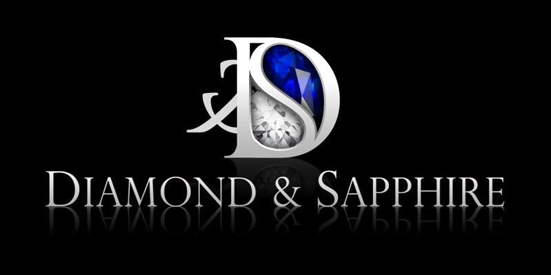
edit: whats that behind the D to the left?
I personally hate reflections, especially on the D considering it's above the name of your company, it physically makes no sense.
I like the second one, though I would make the logo a tad smaller, maybe 3/4 of its current size. You are close though, nice!
^^ @ Flek, I'm pretty sure that's the " & "
Yeah, I'd drop the reflections too. To be honest, I'd also drop the ampersand in the logo - I think it's distracting, borderline legible and your D/S letterform is stronger without it.
I prefer the version without the gem, but that's more personal preference (my wife likes that version!) and I think having both would be good (one reproduces better in B&W for faxes/letters etc., and the other would be appropriate for full-colour pieces etc.).
Nice work though!
EDIT:
I see your comment about balance and symmetry, but I think it works without it, and a little asymmetry is more pleasing than the effect you've got now. I hope this doesn't sound too harsh; your piece is strong IMO and a touch of judicious trimming will make it all the stronger.
Ok, I'll play around with it. I do agree regarding cleanliness without the reflections. Will try a combination of versions. I did have a version without the ampersand, but as mentioned, that left side of the main image was too linear and sudden. But I'll tinker with it.
But yea, general consensus thus far seems to be to drop the reflections.
I'll be interested to see how you get on. Good work though!
It looks great!To expand my graphic design portfolio I (re)designed Spotify. See it as a lite version. I hate the Spotify interface (it's ugly and way too full with useless features like the social tab).
It's still a work in progress, I need to change a few things like:
1. The colours (a few parts are too dark)
2. Stuff isn't really aligned yet
3. A bit more space at the top bar (with the bio)
It's just my own creative take on the interface, not an exact copy with the same features... What do you guys think of it?

To expand my graphic design portfolio I (re)designed Spotify. See it as a lite version. I hate the Spotify interface (it's ugly and way too full with useless features like the social tab).
It's still a work in progress, I need to change a few things like:
1. The colours (a few parts are too dark)
2. Stuff isn't really aligned yet
3. A bit more space at the top bar (with the bio)
It's just my own creative take on the interface, not an exact copy with the same features... What do you guys think of it?
Need some help/advice design GAF. I'm having a pretty big creative block at the moment, which is annoying because after designing so many logo's I'm stuck on the one I'm doing now for my own company.
Not completely satisfied with any of them, and would have preferred something more creative and modern, but going from a general consumer perspective, from the multiple people I've asked (potential customers), they all seem to prefer the stuff with added fluff.
Here are the one's I've got so far. Better with or without the stones? Both? (I could use the non stone version as my hallmark on my jewellery). Or a complete re-design? Any advice, alternatives or opinions would be much appreciated

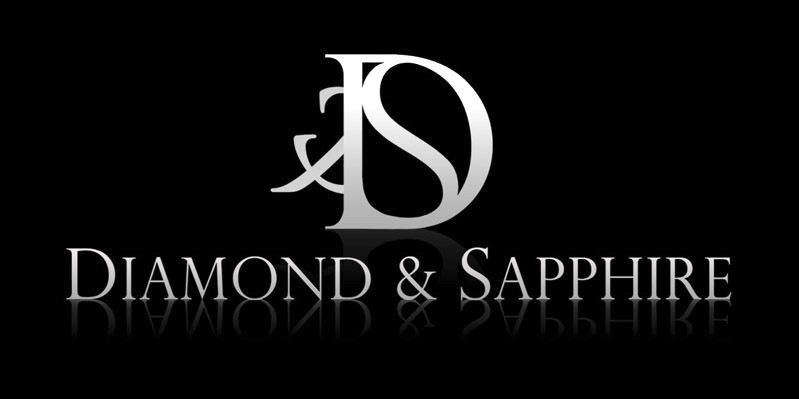
Quick and dirty mock up of a black version.
Cut out the background and show the interface in higher resolution. It's hard to critique when it's so small!
For me, I'd make sure all your text lists have the same line height. I notice that the songs are squished together more than on the left hand side. If you give yourself more breathing room I think it'll improve the look/feel and flow of the app.
You may also want to add in a way to see which song is currently playing. I see that the first song is playing, but there's no indication of that in the song list. In the top section, the album name placement also wouldn't work with the icons on the right hand side for albums with longer names.
Overall nice clean design though, I'd love to see it in higher res.
Yeah well, I didn't thought about that to be honest because the design was just for fun. I'm trying to fix it so it could work.First thing I wondered, what happens when you play an artist with a name longer than 'Burial'?

